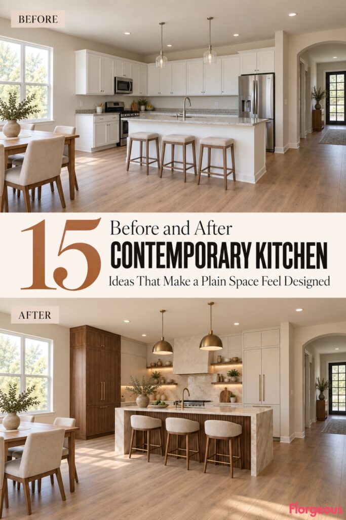
A builder-grade kitchen can be perfectly usable and still feel visually unfinished. Pale cabinetry, neutral counters, exposed appliances, basic lighting, and bare walls create a clean starting point, but there is usually nothing that makes the room memorable.
That is why the same simple room is such an interesting canvas for a Contemporary Kitchen makeover. Instead of changing its walls, openings, ceiling height, or floor footprint, these 15 transformations explore completely different design ideas through architecture, material, shape, transparency, craftsmanship, lighting, and spatial composition.
Each makeover begins with the same plain kitchen, but every AFTER has its own identity. Some are warm and tactile, others sculptural, artistic, graphic, atmospheric, or almost gallery-like. The goal is not simply to swap cabinet colors. Each design introduces a visual idea strong enough to become the defining feature of the room.
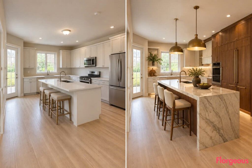
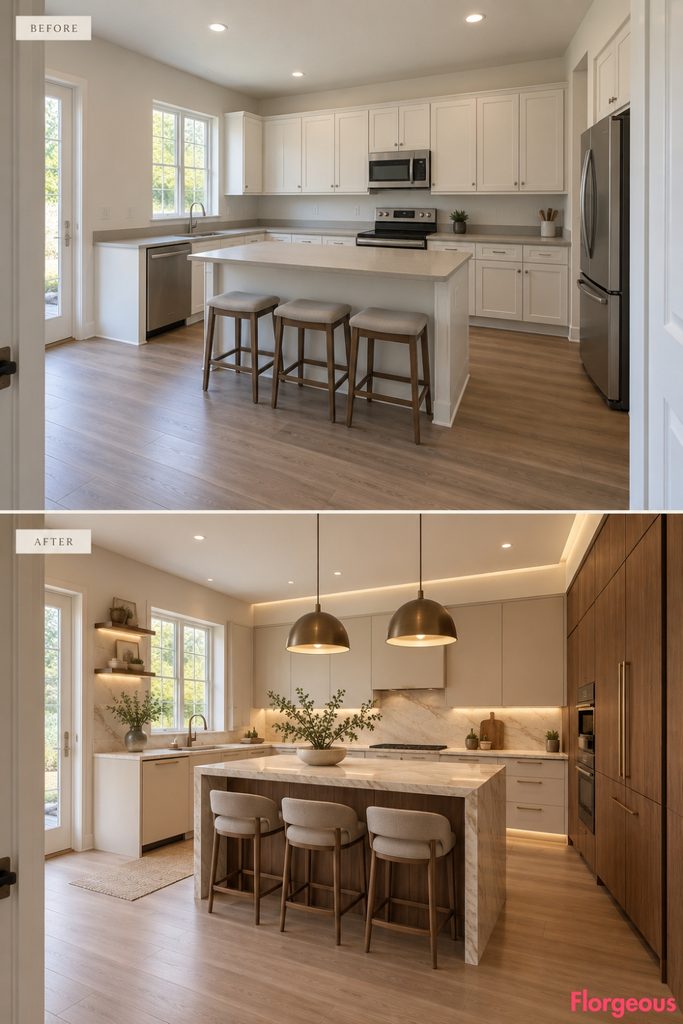
1. Wrap the Kitchen in Walnut and Creamy Quartzite
Warm walnut gives this first transformation richness without pushing the room toward traditional styling.
Before: The kitchen has pale builder-grade cabinetry, neutral countertops, visible standard appliances, plain walls, a basic ceiling fixture, bare surfaces, and soft natural daylight.
After: A full-height walnut storage wall creates one strong architectural plane. Warm-white cabinetry keeps the sink side lighter, while creamy quartzite flows across the counters and a substantial central island. Slim brushed-bronze details and concealed lighting add warmth without becoming decorative.
Why it works: The room is divided into clear material zones rather than covered in the same finish. Dark timber creates depth, while pale stone prevents the kitchen from feeling heavy.
Try this: If replacing every cabinet is unrealistic, concentrate real or veneered walnut on one tall storage wall and leave the remaining cabinetry neutral.
2. Turn the Center of the Room Into a Sculptural Curve
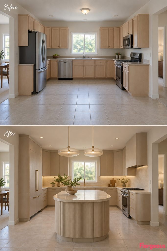
Instead of relying on expensive decorative finishes, this direction makes geometry the focal point.
Before: The same pale kitchen has straight cabinet runs, ordinary rectangular counters, visible appliances, and an empty central floor area.
After: Soft plaster-beige cabinetry surrounds a capsule-shaped island with rounded ends. Exposed cabinet corners are gently radiused, the countertop flows continuously around the curves, and two flattened oval glass pendants echo the shape from above.
Why it works: Repeating one geometry makes the room feel intentional. The curves also contrast strongly with the unchanged rectangular room shell.
Try this: Rounded island corners can deliver much of the effect even if the perimeter cabinets remain straight.
3. Make the Pantry Wall Look Like a Fluted-Glass Gallery
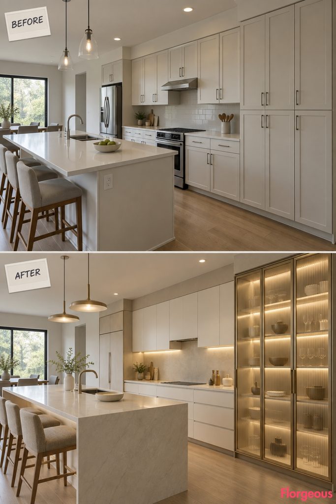
Storage becomes something to look at rather than something to hide.
Before: Flat pale cabinet doors blend into the surrounding walls and give the kitchen no strong focal feature.
After: A concentrated wall of translucent ribbed-glass cabinetry is framed in slim champagne-colored metal. Matte ivory lower units sit beneath it, while carefully integrated shelf lighting reveals softened silhouettes of ceramics and glassware behind the textured doors.
Why it works: Transparency gives the storage wall depth while the ribbed surface blurs visual clutter.
Try this: Use fluted glass on only one cabinet group. Too much textured glass can make the kitchen visually restless.
4. Create a Refined Stainless-Steel Culinary Atelier
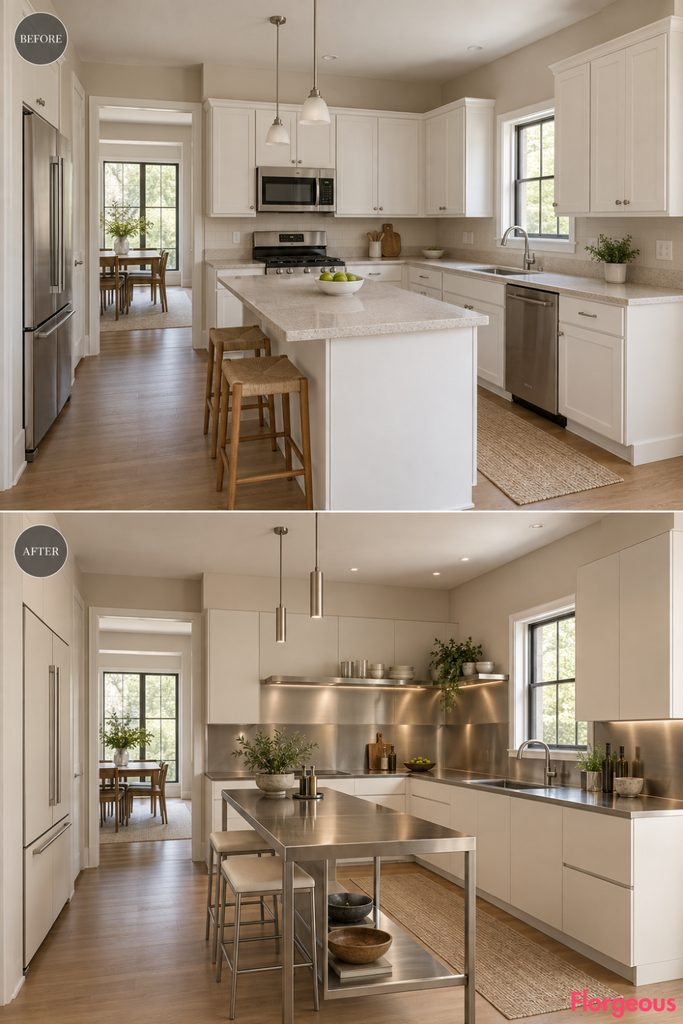
This kitchen borrows the precision of a professional workspace without becoming industrial.
Before: Pale cabinetry and neutral counters make the preparation zone visually forgettable.
After: Matte ivory cabinets frame one continuous brushed stainless-steel work surface and backsplash. A narrow stainless shelf floats above the counter, while a slim worktable-style island brings the material into the center of the room.
Why it works: Stainless steel is limited to functional surfaces, so it reads as precision rather than decoration.
Try this: Combine steel with warm white, oak, or plaster tones instead of black industrial fittings.
5. Build the Island Like a Contemporary Terrazzo Sculpture
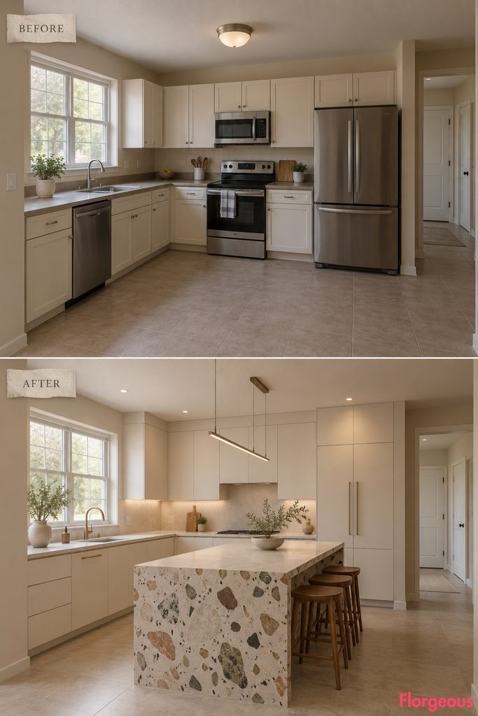
Rather than using another dramatic stone slab, this concept turns terrazzo into a freestanding art object.
Before: The center of the plain kitchen is visually empty.
After: Quiet chalky-white cabinets surround a chunky terrazzo island with an exaggerated plinth base. Oversized mineral fragments in muted clay, charcoal, cream, and sage create an abstract composition, while a thin pale countertop seems to float above the heavier body.
Why it works: The island becomes a piece of functional sculpture, while the rest of the kitchen remains quiet enough to support it.
Try this: For a lower-cost interpretation, use large-format terrazzo-look porcelain on the island faces instead of solid terrazzo.
6. Compose the Cabinetry Like a Black-and-Ivory Graphic Artwork
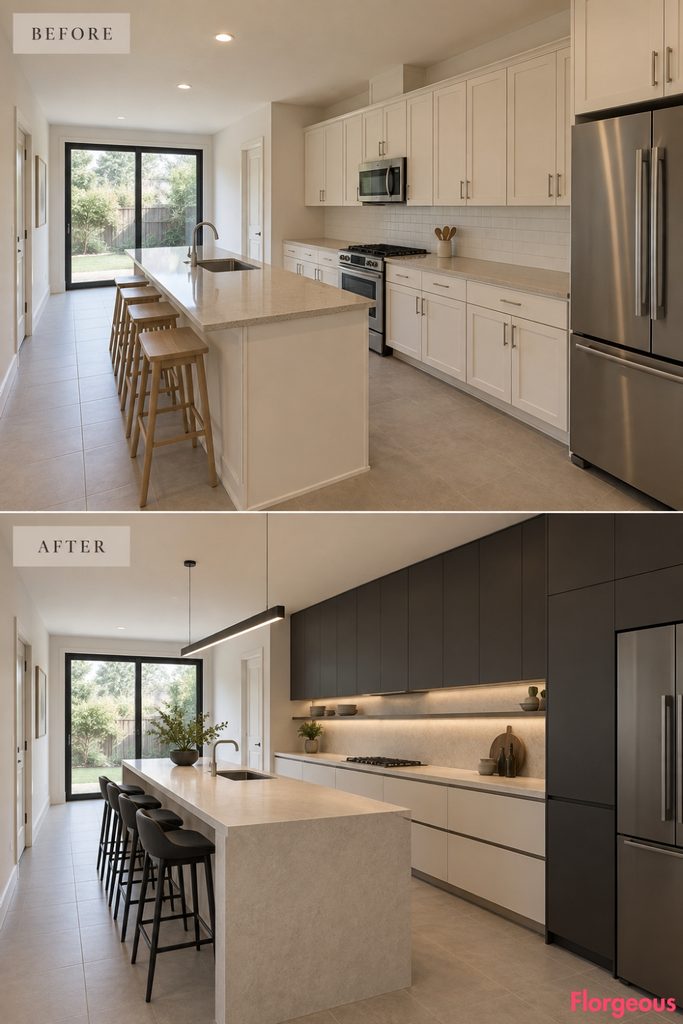
This transformation is about line, rhythm, and proportion.
Before: Pale cabinets visually merge together, making the kitchen look generic and flat.
After: Deep charcoal tall storage forms one vertical block, while ivory lower cabinetry creates a long horizontal band. Narrow shadow gaps outline the panel divisions with almost mathematical precision. A thin linear pendant and one floating shelf continue the geometry.
Why it works: The contrast turns ordinary storage into an architectural composition without requiring ornamental detailing.
Try this: Keep hardware almost invisible. Prominent handles would interrupt the graphic lines.
7. Create an Architectural Oak Ribbon Across the Ceiling
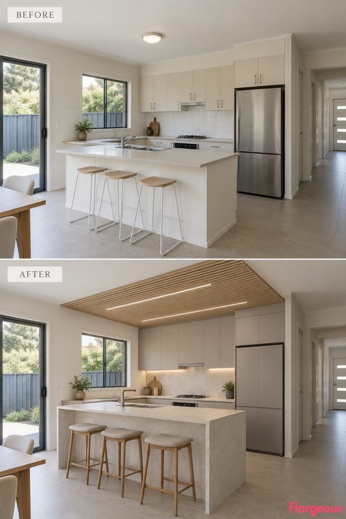
Instead of placing the visual statement on a wall, this makeover looks upward.
Before: The kitchen has a completely flat white ceiling with one ordinary light fixture.
After: A shallow pale-oak batten field stretches across the island and preparation zone like a controlled architectural ribbon. Fine recessed linear lights sit precisely between selected battens, visually connecting the island below with the ceiling above.
Greige cabinets and quiet pale counters keep attention on the overhead feature.
Why it works: The ceiling becomes part of the kitchen composition without lowering or rebuilding the actual room structure.
Try this: Restrict the timber to one zone. Covering the whole ceiling can make the idea less distinctive.
8. Replace the Built-In Island With a Furniture-Like Worktable
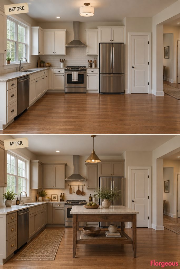
This idea deliberately makes the kitchen feel less fitted.
Before: The center of the room is empty, surrounded by ordinary pale cabinets.
After: Muted clay-beige perimeter cabinetry provides a calm backdrop for a freestanding dark-oak preparation table. Tapered legs, a thick pale-stone worktop, and an open shelf underneath make it look like a substantial piece of furniture rather than a block of cabinetry.
Why it works: The visible floor beneath the table makes the center of the kitchen feel lighter and more relaxed.
Try this: A sturdy vintage or contemporary worktable can give an existing kitchen a similar personality without a major renovation.
9. Turn the Backsplash Into a Hand-Glazed Ceramic Mural
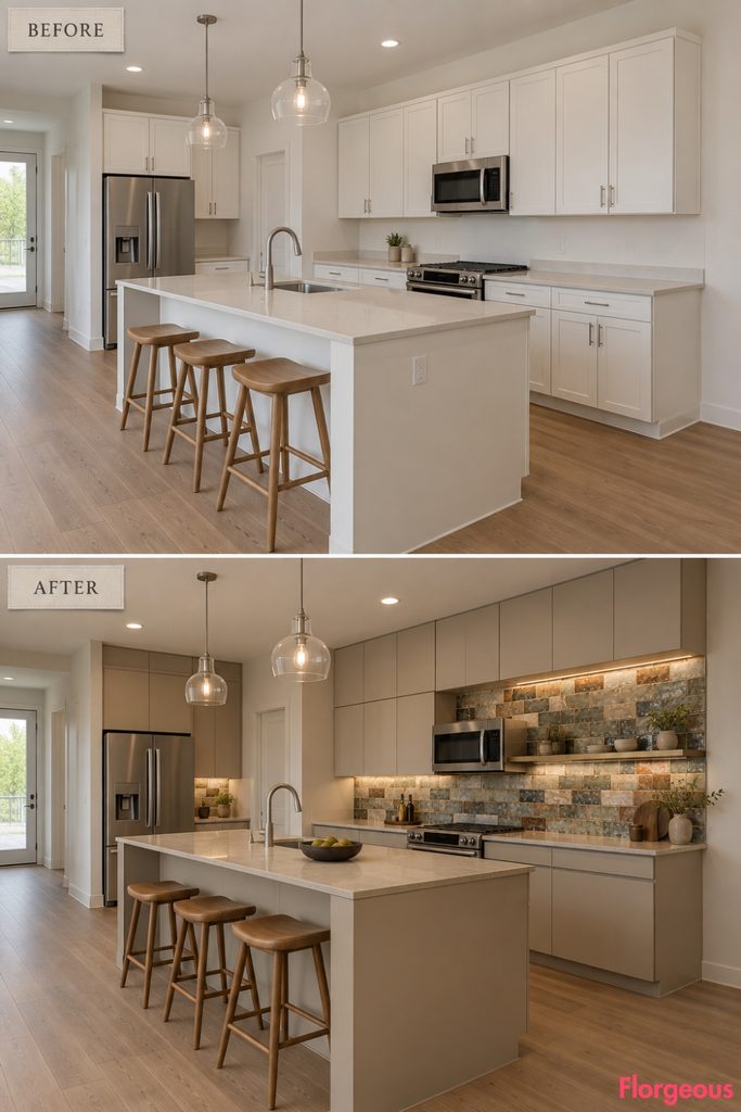
This concept uses craft and irregularity as the visual event.
Before: The wall behind the worktop is plain and contributes almost nothing to the room.
After: Warm putty cabinetry frames a wide backsplash composed from individually glazed tiles in moss, chalk, tobacco, pale blue-gray, and burnt clay. Instead of a repetitive pattern, the tiles are arranged as a loose tonal field with subtle movement across the wall.
Why it works: The backsplash reads like a ceramic artwork while still functioning as a durable working surface.
Try this: Choose adjacent colors with similar saturation so the wall feels sophisticated rather than patchwork.
10. Make a Suspended Extractor Canopy the Room’s Main Sculpture
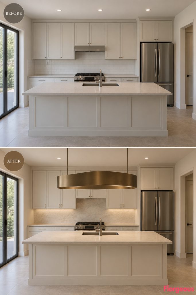
Instead of hiding the hood, this kitchen celebrates it.
Before: The cooking area has ordinary cabinetry and no meaningful focal point.
After: A large but carefully proportioned suspended canopy floats above the cooking zone. Its softly folded matte-bronze shell has a thin profile and subtle curved underside, creating something closer to a contemporary light sculpture than a standard extractor.
The surrounding cabinetry stays warm white with pale counters and minimal joints.
Why it works: One functional object carries the entire visual identity of the kitchen, allowing everything around it to remain calm.
Try this: Keep an oversized hood visually lightweight. A thin edge and generous space around it prevent it from overwhelming the room.
11. Take the Kitchen Into a Smoked-Oak Night Mood
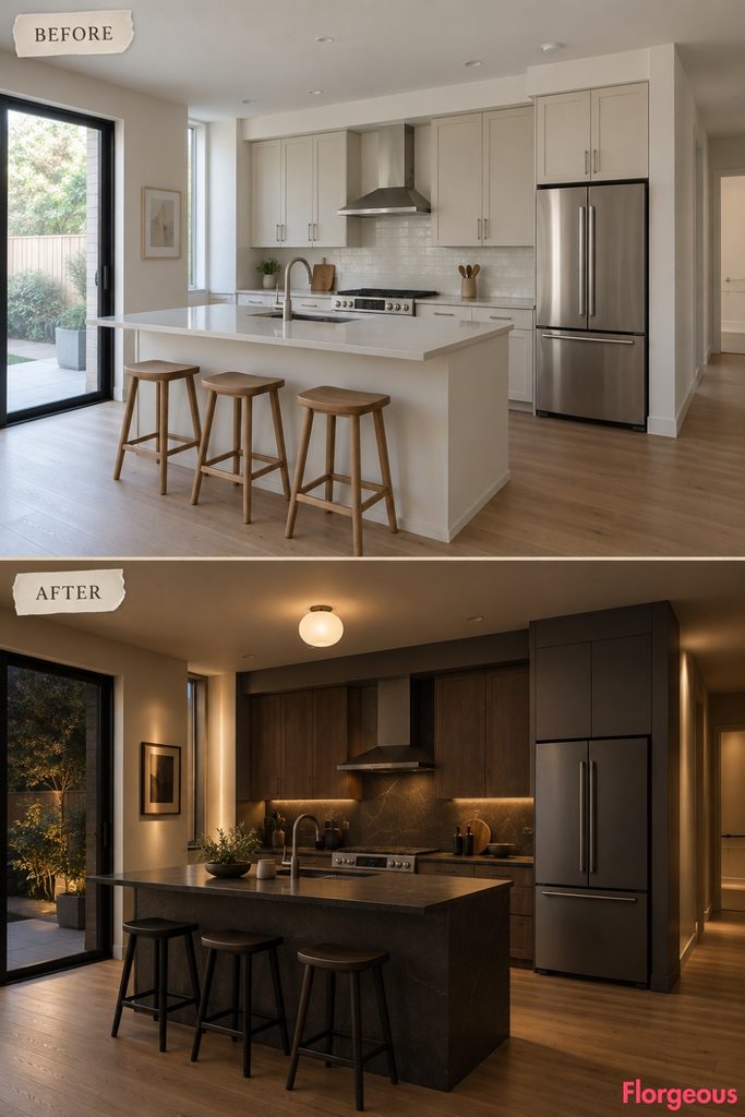
This version uses darkness as atmosphere rather than simply changing the cabinet color.
Before: Pale finishes and flat lighting make the kitchen bright but visually anonymous.
After: Smoked-oak cabinetry sits against honed charcoal-basalt counters and a deep graphite storage block. Narrow wall-grazing light washes reveal the grain and mineral textures, while a single milky opaline fixture adds a soft focal glow.
Why it works: Layered low-level lighting creates depth between similarly dark surfaces.
Try this: Keep the ceiling and at least one wall light so the darker cabinetry does not flatten the whole room.
12. Carve the Kitchen Into a Seamless Mineral Monolith
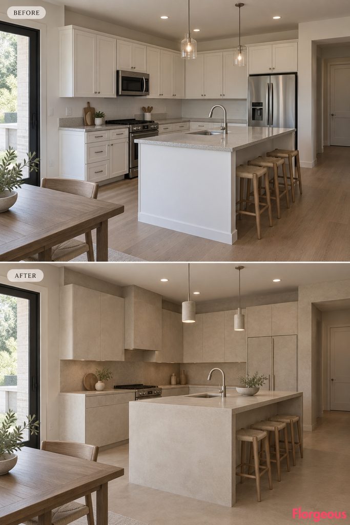
This design moves in the opposite direction from the furniture-style kitchen. Almost everything becomes one continuous architectural surface.
Before: Small cabinet doors, handles, exposed appliances, and multiple material changes make the builder-grade room feel fragmented.
After: Warm clay-beige mineral surfacing flows across selected cabinet fronts, the backsplash, island exterior, and adjacent wall planes. Joints are minimized, hardware nearly disappears, and the island feels as though it has been carved directly from the room.
Why it works: Reducing visible transitions makes familiar kitchen elements read as architecture rather than individual pieces of furniture.
Try this: A similar look can be achieved with microcement-effect panels if true continuous mineral finishing is impractical.
13. Use Oxblood Lacquer Like a Single Saturated Artwork
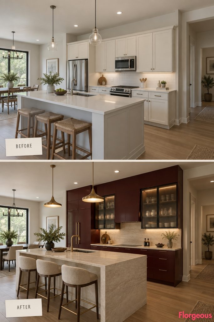
Bold color works best when it is disciplined.
Before: The same pale kitchen has no color hierarchy or visual tension.
After: One complete cabinet wall is finished in deep oxblood lacquer. Smoked-glass display cabinets create a dark translucent layer beside it, while creamy limestone counters and a restrained pale island prevent the saturated color from taking over the whole room.
Why it works: Treating color as one large architectural field feels more sophisticated than scattering small colorful accents around the room.
Try this: Test dark red finishes under both daylight and evening lighting. Burgundy can shift dramatically depending on surrounding undertones.
14. Hide an Entire Breakfast Kitchen Behind Pocket Doors
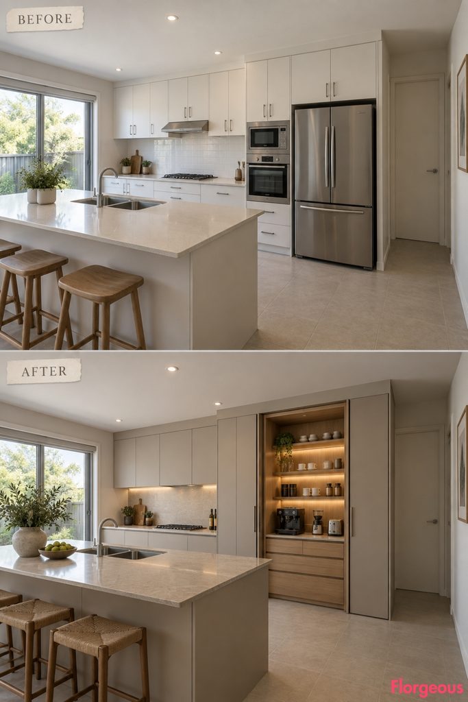
This makeover changes how the room behaves, not just how it looks.
Before: Standard cabinets and small appliances remain permanently visible on the counter.
After: One tall wall becomes a seamless expanse of soft putty-colored panels. Two retracting pocket doors open to reveal a richly detailed timber-lined breakfast station with coffee equipment, appliance storage, drawers, shelves, and concealed lighting.
Closed, the kitchen looks extremely calm. Open, it reveals a warm working interior.
Why it works: The design creates a deliberate contrast between a minimal exterior and a functional, layered interior.
Try this: Plan power outlets, appliance ventilation, and working depth before specifying pocket-door cabinetry.
15. End With a Translucent Resin Island That Feels Like Contemporary Art
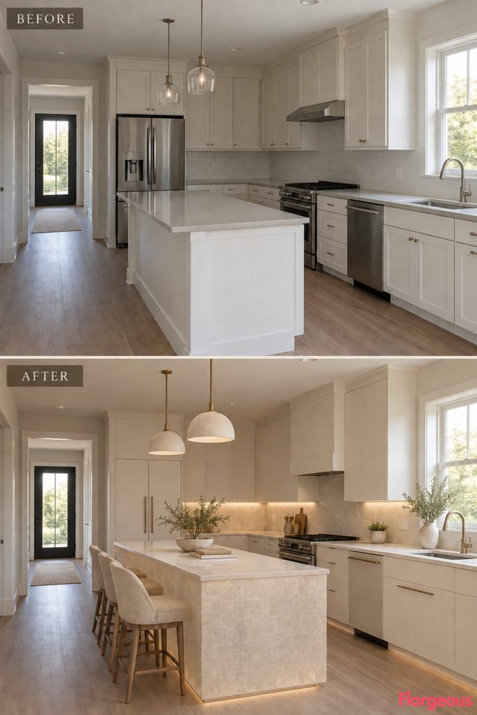
The final design introduces a material rarely used as the main kitchen focal point.
Before: The center of the plain room contains either empty floor space or an ordinary builder-grade island.
After: A simple ivory kitchen surrounds a sculptural island faced with warm translucent resin panels containing fine embedded linen-like fibers. Natural daylight passes softly through the material, while a discreet internal base light gives the island a gentle evening depth without making it appear self-luminous.
A pale solid-surface worktop keeps the functional area clean and practical.
Why it works: The island changes character between day and night, giving the kitchen a gallery-like quality without relying on patterned stone or bold paint.
Try this: Use translucent material only on vertical faces. Keep the actual worktop durable, opaque, and easy to maintain.
How to Choose the Right Contemporary Direction
The strongest Contemporary Kitchen designs usually begin with one clear idea. That idea might be sculptural geometry, transparency, craftsmanship, a ceiling installation, an atmospheric lighting strategy, a concealed function, or one unexpected material.
Choose the focal concept before selecting every finish. If the island is the artwork, let the cabinetry stay quiet. If the backsplash carries the color, avoid competing stone patterns. If the ceiling is architectural, keep the walls restrained.
For an existing kitchen, you also do not need to reproduce an entire concept to borrow its strongest lesson. Cabinet fronts can establish a new material language, a freestanding table can replace an expensive island, handmade tile can turn one wall into art, and carefully planned lighting can completely change how familiar surfaces read after dark.
Before ordering anything, bring your stone, timber, paint, metal, tile, and cabinet samples into the actual room. View them in morning light, afternoon daylight, and artificial light. Contemporary interiors often look simple precisely because the relationships between materials have been considered so carefully.