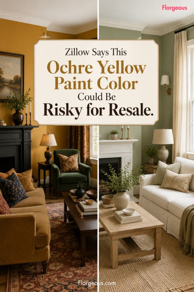
A new Zillow 2026 Paint Color Analysis is giving homeowners a reason to pause before painting every room in a warm golden shade.
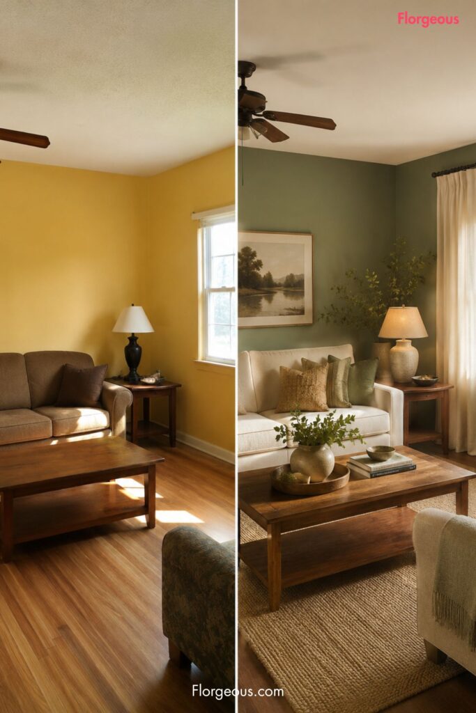
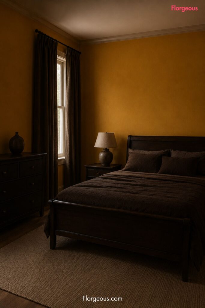
According to Zillow’s analysis, ochre yellow painted throughout a home may be associated with a major drop in buyer offer price, with the report suggesting it could shave about $18,164 off a home’s value.
That does not mean the ochre yellow paint color is automatically bad. It does mean that color choices can carry more visual weight when a home is being judged by buyers.
The bigger takeaway is more interesting than one risky shade. Zillow’s analysis suggests warm, nature-inspired tones are still performing well in several rooms, but the safest colors are the ones that feel grounded, livable, and easy for buyers to imagine around their own furniture.
What Zillow’s Paint Color Analysis Says
Zillow’s 2026 Paint Color Analysis points to ochre yellow as a potentially risky choice when it is painted throughout a home.
The key phrase is “painted throughout.” A single ochre accent, a golden-toned textile, or a small powder room moment is very different from covering an entire home in a strong yellow shade.
According to the analysis, ochre yellow throughout a home can shave about $18,164 off a home’s value. For sellers, that is a large enough number to make the color worth reconsidering before listing.
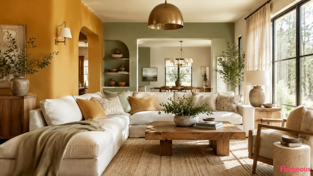
The report also suggests a broader shift in buyer-friendly color preferences. Warm, nature-inspired tones performed better than stark white in several rooms, which is an important detail. Buyers may not be asking for cold, blank interiors. They may simply be responding better to warmer colors that feel calmer, softer, and easier to live with.
Zillow also says sage green ranked in the top tier across every room. Pale blue performed well in living rooms, charcoal gray performed well in kitchens, and chocolate brown performed well in bedrooms.
The Florgeous interpretation is simple: warmth is not the problem. The wrong kind of warmth, used too heavily, may be. You can see more tips in our latest home decor color trends.
Why Ochre Yellow Is Getting Attention Now
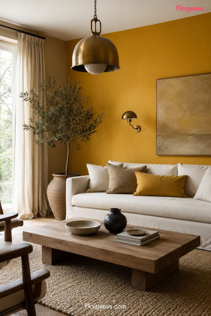
Ochre yellow sits in a tricky place on the color wheel. At its best, it can feel earthy, historic, Mediterranean, rustic, or sun-washed. At its strongest, it can also feel heavy, dated, or visually loud.
That tension matters in resale.
A buyer walking through a home is not only looking at walls. They are imagining their sofa, dining table, bedding, artwork, curtains, rugs, and lighting inside the space. A strong yellow cast throughout the home can make that mental picture harder.
Ochre yellow can also change dramatically depending on natural light. In a bright room, it may feel golden and warm. In a darker hallway or shaded bedroom, it may read as muddy, mustard, or overly saturated.
That is where paint becomes emotional. Some colors create a sense of calm and openness. Others ask the buyer to have a very specific taste.
For a homeowner decorating for themselves, that may be fine. For someone preparing to sell, it becomes a risk.
Better Warm Paint Color Alternatives to Consider
The lesson from Zillow’s analysis is not that every home needs to be white. In fact, the report suggests warm, nature-inspired tones can perform better than stark white in several rooms.
The safer move is to choose warmth with flexibility when it comes to your interior design and decor.
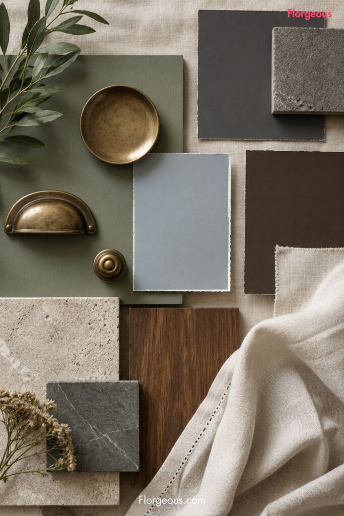
Sage green
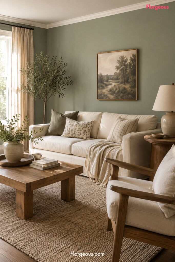
Sage green is the most useful alternative because Zillow says it ranked in the top tier across every room. It feels natural without being too loud. It also works with cream, oak, walnut, black metal, aged brass, linen, stone, and woven textures.
In a living room, sage green can soften the space without making it feel dark. Use it with ivory curtains, a warm neutral sofa, pale wood furniture, and a textured rug.
Pale blue
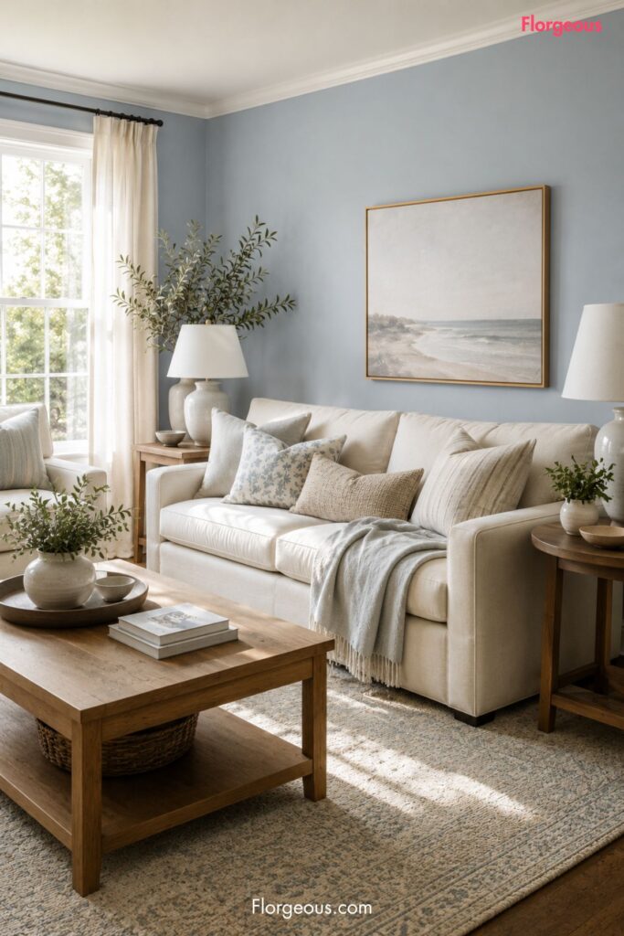
Pale blue is another strong option for living rooms, according to Zillow’s analysis. The best version is soft and airy rather than overly coastal or baby blue. It can help a living room feel calm, clean, and easy to furnish.
Pair pale blue walls with oatmeal upholstery, warm wood tables, white trim, ceramic lamps, and framed artwork in soft neutral tones.
Charcoal gray
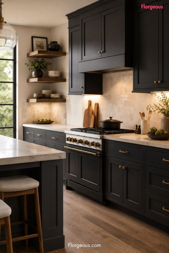
Charcoal gray performed well in kitchens, which makes sense visually. A deep gray kitchen can feel tailored and grounded, especially when balanced with warm metal hardware, stone counters, and good lighting.
The key is contrast. Charcoal gray looks best when it has cream walls, light stone, warm wood shelves, aged brass pulls, or a pale backsplash to keep the room from feeling flat.
Chocolate brown
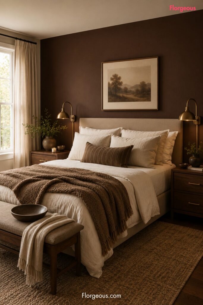
Chocolate brown performed well in bedrooms, according to Zillow’s analysis. It is a richer choice, but in the right room it can feel cocooning and expensive-looking.
Use chocolate brown behind a bed, with ivory bedding, walnut nightstands, aged brass lamps, linen curtains, and a soft neutral rug. That combination makes the color feel intentional rather than heavy.
How to Use Warm Color Without Hurting the Room
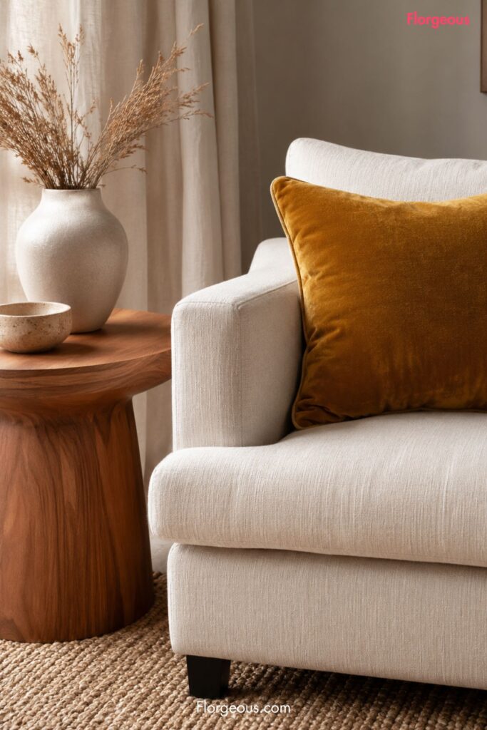
If you love ochre yellow, you do not have to remove it from your home completely. The smarter approach is to use it where it can act as an accent instead of taking over the entire interior.
Try ochre yellow through artwork, a velvet pillow, a ceramic lamp, a woven throw, or one vintage-style rug. These pieces can add warmth without affecting the entire visual impression of the home.
For walls, test a softer related shade first. Warm beige, muted clay, creamy tan, pale gold, and soft greige can give you the same sun-warmed feeling in a more flexible way.
Use undertones carefully. A yellow with too much green can feel muddy. A yellow with too much orange can feel intense. A softer golden beige often feels easier to live with than a full ochre wall.
Lighting matters too. Warm white bulbs can make ochre feel richer, but they can also intensify yellow walls. Natural light, flooring, and trim color all change how paint behaves.
Before painting a whole room, test a large sample board and move it around the home. Look at it in the morning, afternoon, and evening. The color that looks charming at noon may feel much stronger under lamps at night.
What You Should Avoid
The biggest mistake is painting an entire home in ochre yellow because it feels warm in a small swatch.
Paint chips do not show scale. A color that looks stylish on a card can become overwhelming across four walls, a hallway, a ceiling line, and multiple connected rooms.
Avoid using ochre yellow in rooms with limited natural light unless you are intentionally creating a moody look for yourself. In resale spaces, dark corners and yellow undertones can make the room feel smaller or less fresh.
Do not pair strong ochre walls with too many cool gray finishes. The contrast can feel accidental, especially in homes with gray flooring, silver hardware, or cool-toned stone.
Avoid using paint only because it may affect resale value. A home still has to feel personal and livable. The goal is not to remove every interesting color. The goal is to use color in a way that helps the room feel finished, balanced, and easy to love.
The Florgeous Take
The Florgeous take: ochre yellow works best as a supporting character, not the whole story.
It can be beautiful in small doses, especially in a sunlit reading nook, a vintage rug, a patterned cushion, a ceramic vase, or artwork with warm golden tones. It brings personality, history, and warmth.
But for whole-home paint, the safer design direction is softer and more nature-inspired. Sage green, pale blue, charcoal gray, and chocolate brown all give buyers a clearer emotional signal when used in the right rooms.
Sage green feels calm and adaptable. Pale blue feels airy in living spaces. Charcoal gray can make kitchens look tailored. Chocolate brown can make bedrooms feel grounded and restful.
That is the practical design lesson. Warmth is still desirable, but it needs balance, room-by-room intention, and enough neutrality for buyers to imagine themselves living there.
A Practical Way to Try It First
Before repainting an entire home, start with one room, one wall, or one large textile.
If you love ochre yellow, try it in decor first: a throw pillow, framed art, a lamp base, a rug border, or a small upholstered bench. Then surround it with cream, warm wood, stone, linen, and soft green.
If the goal is resale, choose paint colors that create a warm but flexible backdrop. A room should feel styled without feeling too specific.
That is why sage green, pale blue, charcoal gray, and chocolate brown are worth watching. They give the home personality while still leaving space for the buyer’s imagination.
FAQs
Is ochre yellow a bad paint color for resale?
Not always. Zillow’s analysis suggests ochre yellow painted throughout a home may be associated with a lower buyer offer price. Used in small accents, it can still look warm and stylish.
What is a safer alternative to ochre yellow paint?
Sage green is one of the strongest alternatives because Zillow says it ranked in the top tier across every room. Soft beige, muted clay, and warm greige can also create warmth in a more neutral way.
Should I repaint ochre yellow walls before selling?
If the color is used throughout the home, it may be worth reconsidering. A more resale-friendly neutral or nature-inspired shade could help the home feel easier for buyers to imagine.
What warm colors performed well in Zillow’s analysis?
Zillow says sage green ranked in the top tier across every room. Pale blue performed well in living rooms, charcoal gray performed well in kitchens, and chocolate brown performed well in bedrooms.
The Takeaway for Your Home
The ochre yellow paint color warning is not really about banning yellow from interiors. It is about understanding scale, buyer psychology, and how strongly a whole-home paint color can shape the way a property feels.
For decorating your own home, ochre can still be beautiful in the right dose. For resale, the safer move is to choose warm, nature-inspired colors that feel calm, polished, and easy to live with.