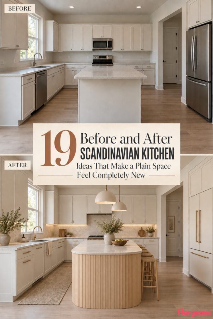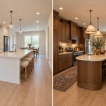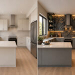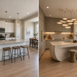
A builder-grade kitchen can be perfectly functional and still feel visually anonymous. Pale cabinets, neutral counters, standard appliances, and basic ceiling lighting provide a clean starting point, but they rarely create a memorable room.
That is exactly why a Scandinavian Kitchen makes such an interesting before-and-after study. Nordic design is not limited to white cabinetry and pale oak. It can be sculptural, tactile, graphic, craft-focused, quietly experimental, or deeply connected to natural materials.
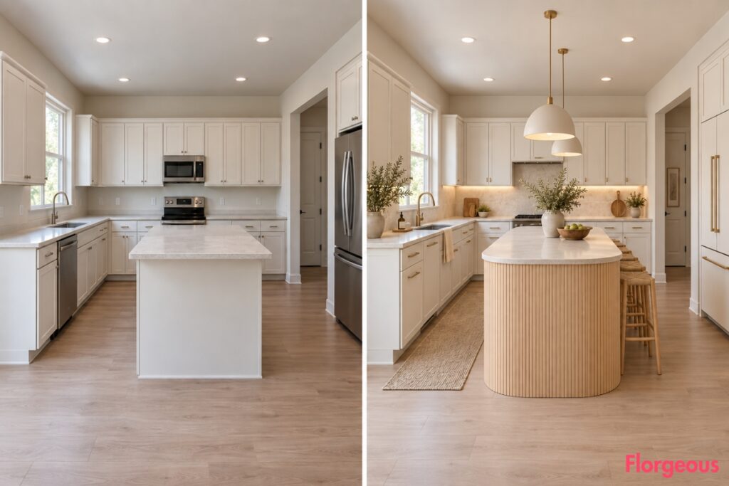
Every transformation below begins with the same plain builder-grade kitchen. The walls, windows, doors, ceiling, floor footprint, and basic architecture remain unchanged. What changes is the design idea.
The goal is not to create 19 variations of one look. Each makeover uses a different spatial gesture, material language, craft technique, or functional feature so every AFTER image has its own identity.
1. Shape the Center of the Kitchen With a Curved Birch Ribbon Island
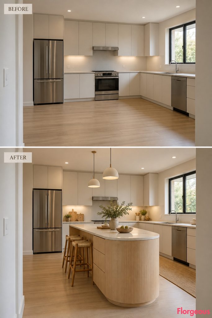
This Copenhagen-inspired direction begins with form rather than color.
Before: Pale builder-grade cabinetry, neutral worktops, visible appliances, plain walls, warm flooring, and no focal point.
After: A compact laminated-birch island curves continuously around one rounded end, with the timber apron flowing into concealed drawers. Quiet warm-white perimeter cabinetry and pale stone allow the sculptural birch form to dominate.
Why it works: The curve breaks the rigid cabinet grid while retaining Scandinavian simplicity.
Try this: Keep at least one side of a compact island straight so storage and appliance clearances remain practical.
2. Turn the Preparation Wall Into a Modular Birch Peg Landscape
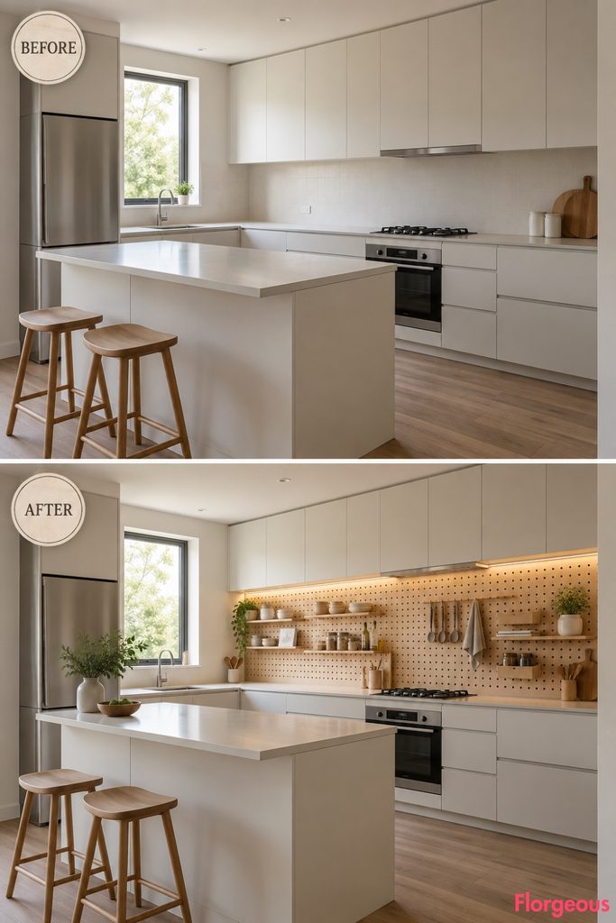
Instead of traditional open shelves, this makeover creates an adaptable wall system.
Before: The same basic pale kitchen with a blank, underused preparation wall.
After: A large finely perforated birch panel sits above the worktop. Removable timber pegs support small shelves, utensil bars, spice trays, and one compact task lamp, creating a precise geometric composition that can evolve over time.
Why it works: Storage becomes visual rhythm without filling the wall with permanent cabinetry.
Try this: Limit the objects on the peg wall to items used frequently so the system stays functional rather than decorative.
3. Build a Gotland-Limestone Cooking Ledge
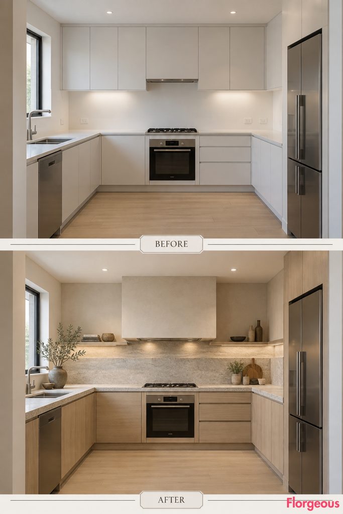
This kitchen uses horizontal stone planes instead of a conventional decorative backsplash.
Before: Neutral counters meet a plain wall behind the cooking area.
After: Thick pale-gray limestone slabs form a low continuous cooking ledge, backsplash, and shallow upper display shelf. A simple plastered hood disappears into the wall above while soft ash cabinetry sits below.
Why it works: Heavy stone is balanced by simple timber and empty wall space.
Designer Tip: Use honed rather than polished stone for a softer Nordic finish and fewer distracting reflections.
4. Soften the Cabinetry With Woven-Linen Glass Screens
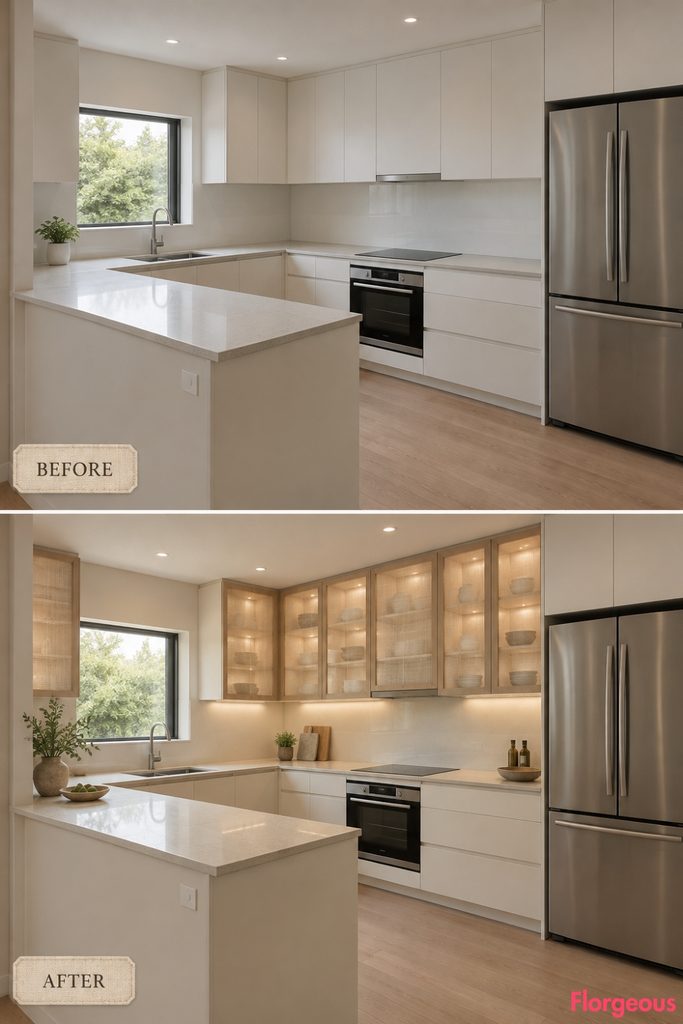
This transformation introduces textile texture without adding fabric near working surfaces.
Before: Plain hinged upper cabinets and standard closed storage.
After: Selected upper cabinet doors use woven natural linen safely laminated between translucent glass panels. Slim pale-oak frames give the doors structure, while warm light behind them creates a soft fabric-like glow without revealing clutter.
Why it works: It brings softness into a hard-working kitchen through a durable architectural material.
5. Create a Warm Cork-Clad Pantry Monolith
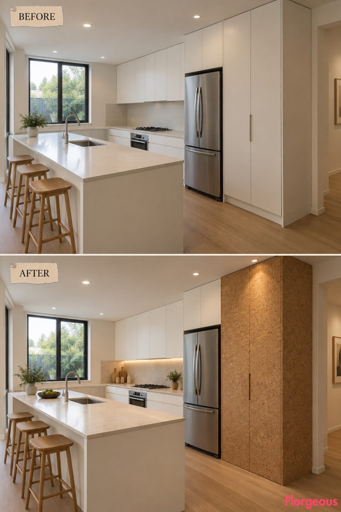
Instead of treating pantry storage as another bank of cabinets, make it read as one tactile volume.
Before: Generic tall cabinetry and a visually weak utility area.
After: One existing tall cabinet run is visually unified with fine-grain natural cork panels extending across the doors and cabinet ends. Flush finger pulls disappear into the surface while adjacent cabinetry stays chalky white.
Why it works: Cork introduces warmth, acoustic softness, and strong texture without ornamental detailing.
Try this: Use high-density sealed cork on kitchen joinery so it can be cleaned easily.
6. Reimagine the Sink Wall Around a Finnish Dish-Drying Cabinet
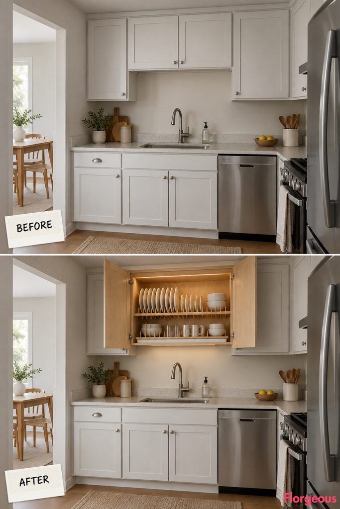
This makeover turns a famously practical Nordic idea into the visual focus.
Before: A standard sink with conventional closed upper cabinetry.
After: Above the sink, a purpose-built birch drying cabinet contains open slotted shelves that allow washed dishes to drip directly into a concealed removable tray. Fold-back warm-white doors hide the system when it is not in use.
Why it works: A practical everyday ritual becomes part of the design rather than something hidden awkwardly on the counter.
7. Make Painted Floorboards the Graphic Artwork
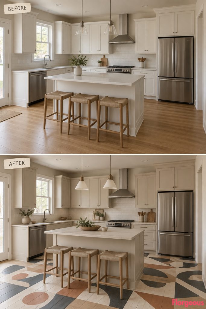
Here, the visual drama stays below eye level.
Before: Warm but generic light flooring beneath pale cabinetry.
After: Existing-style timber floorboards become a broad Nordic geometric composition using chalk, muted clay, charcoal, and natural timber strips. Cabinetry remains quiet in soft bone so the floor becomes the room’s artwork.
Why it works: Large graphic shapes add personality without competing with storage or working surfaces.
Budget Version: Durable matte floor paint can create the effect without replacing sound timber flooring.
8. Create a Topographic Wall of Stepped Cabinetry
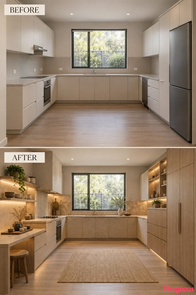
Instead of one continuous cabinet height, this design creates a controlled staircase of volumes.
Before: An ordinary run of uniform-height cabinetry.
After: Cabinet modules gradually rise from a low tea counter to standard preparation height, then into medium storage and finally full-height pantry cabinets. The progression is finished in warm sand mineral tones with ash work surfaces.
Why it works: The changing heights create sculptural rhythm while assigning a different function to each level.
9. Draw a Continuous Plaster Ribbon Around the Corner
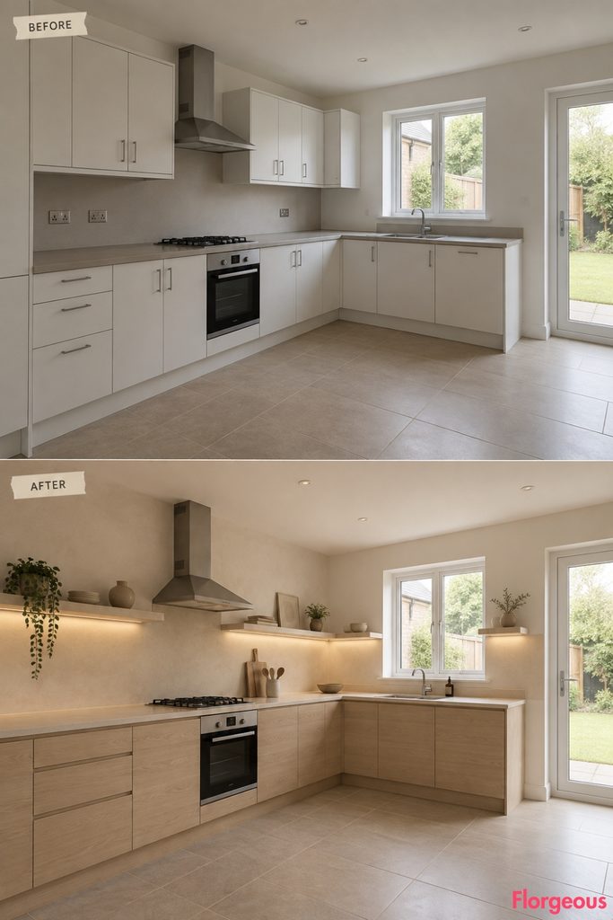
This concept uses one horizontal gesture to connect two walls.
Before: A blank corner with separate cabinets and no visual relationship between the planes.
After: A thick but shallow lime-plaster shelf begins above one preparation counter, turns the corner, and continues along the adjacent wall. Its softly rounded profile incorporates concealed lighting beneath and a few carefully spaced ceramics above.
Why it works: The continuous line makes the room feel composed without introducing another large cabinet.
10. Build an End-Grain Oak Mosaic Behind the Sink
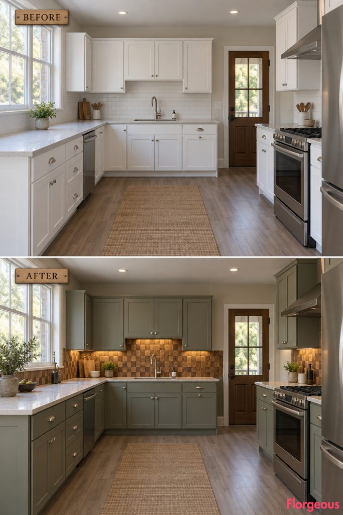
Wood becomes a graphic craft surface rather than conventional cabinetry.
Before: Plain backsplash and standard pale storage.
After: Small sealed end-grain oak blocks create a tightly composed mosaic backsplash behind the sink. Subtle variation in grain direction produces texture without printed pattern, while deep olive-gray cabinetry provides a quiet background.
Why it works: The visual interest comes from craftsmanship and natural variation.
Try this: Use a properly sealed, splash-resistant installation and avoid placing untreated timber directly beside intense heat.
11. Turn One Cabinet Bay Into a Nordic Herbarium
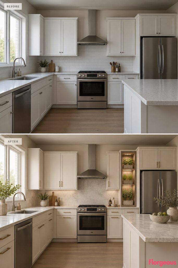
Instead of scattering small plants around the worktop, consolidate greenery into one functional growing feature.
Before: A generic cabinet bay with bare surfaces.
After: One existing cabinet-width zone becomes a glazed herbarium with slim ash framing, adjustable shelves, concealed grow lighting, removable trays, and neatly contained culinary herbs.
Why it works: Greenery becomes architecture rather than styling clutter.
12. Treat the Cabinet Fronts Like a Linoleum Marquetry Artwork
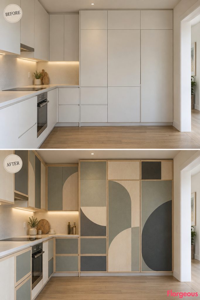
Color appears here through craft rather than conventional painted cupboards.
Before: Flat pale cabinet fronts with no visual rhythm.
After: Selected drawer and door fronts are inset with furniture-grade linoleum in large abstract geometric panels of muted brick, moss, charcoal, oatmeal, and dusty blue. Fine birch borders separate the shapes like modern marquetry.
Why it works: The cabinetry becomes graphic art while the palette remains soft and Nordic.
13. Create a Curved Breakfast Cocoon Instead of an Island
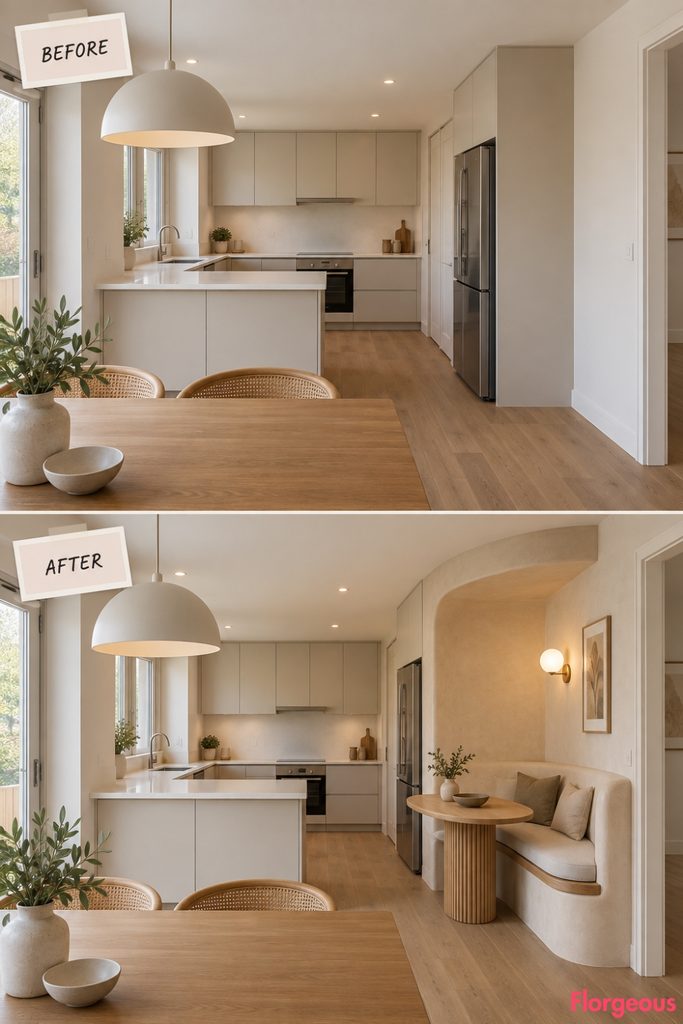
Rather than occupying the room center, this design develops the edge of the kitchen.
Before: An unused wall section beside the working area.
After: A shallow curved lime-plaster surround frames an ash banquette with a compact oval table. The backrest follows the curve and a small opaline wall light turns the zone into an intimate breakfast pocket.
Why it works: It adds social function without compromising the main circulation route.
14. Carve the Sink and Drainboard From One Soapstone Slab
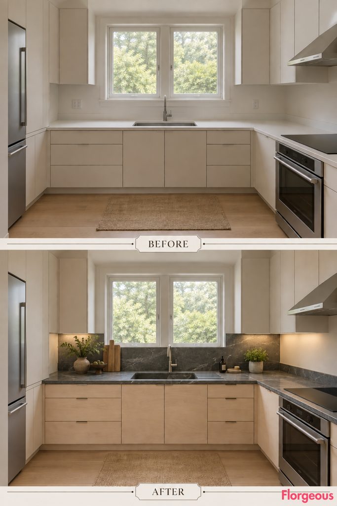
The sink becomes the craft centerpiece.
Before: A standard drop-in or undermount sink inside a generic neutral counter.
After: A long honed soapstone slab is carved to form the sink basin, draining grooves, and surrounding preparation surface as one continuous object. Pale birch drawers beneath keep the heavy stone visually grounded.
Why it works: Functional detail and natural material become the decoration.
15. Bring in a Bentwood Nordic Display Hutch
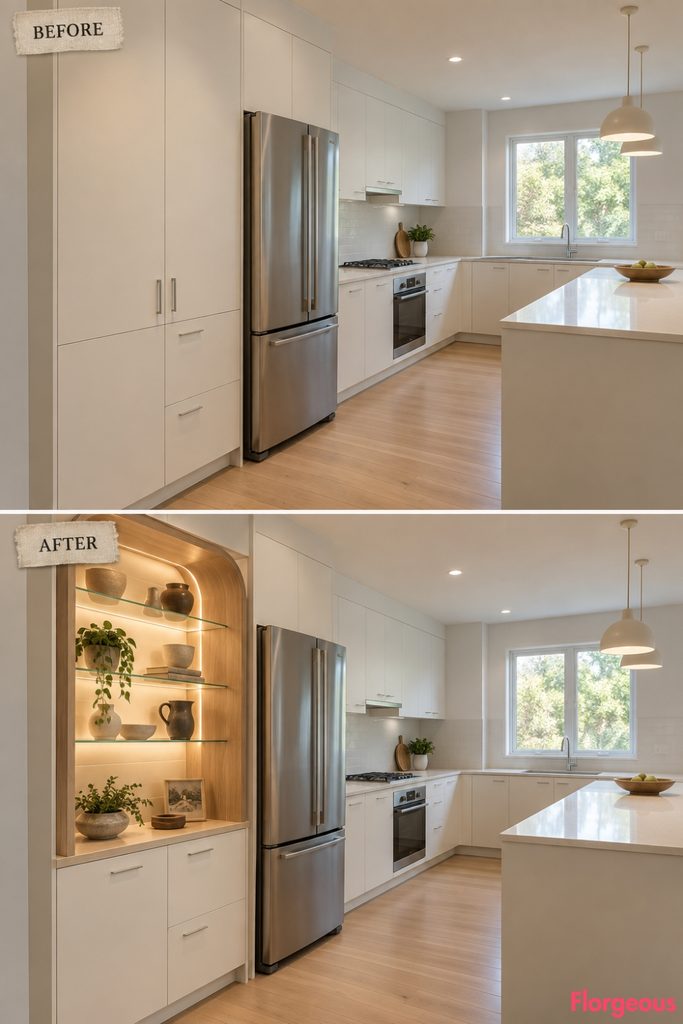
This section has the warmth of a vintage Scandinavian cabinetmaker piece without becoming rustic.
Before: A blank upper-wall area and standard fitted cabinets.
After: A shallow built-in display hutch uses gently bowed ash uprights, thin glass shelves, and rounded upper corners. Its lighter silhouette contrasts with the squared kitchen cabinetry below.
Why it works: One furniture-like element softens the rigid geometry of the room.
16. Suspend an Opaline Light Beam Over the Work Zone
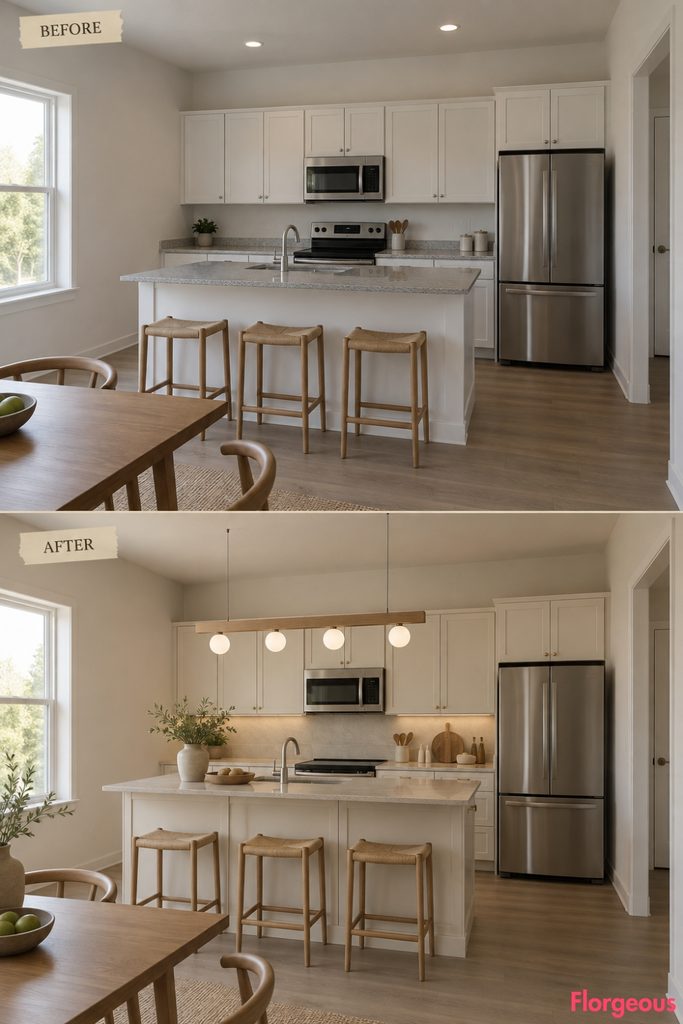
Instead of several separate pendants, this kitchen uses one precisely composed luminous object.
Before: A basic flush ceiling fixture provides flat general light.
After: A slender ash beam hangs horizontally above the preparation zone, carrying a series of small opaline glass globes at carefully spaced intervals. Warm-white cabinetry and pale mineral walls allow the fixture to read almost like functional sculpture.
Why it works: The rhythm of repeated globes gives the room identity without visual clutter.
17. Ground a Freestanding Worktable on Rough Nordic Granite Trestles
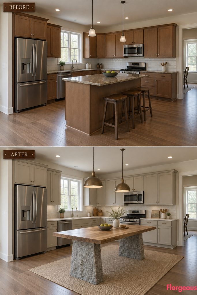
This makeover pairs refined cabinetry with something deliberately geological.
Before: A generic open center with no useful preparation surface.
After: A narrow solid-oak worktop rests on two substantial rough-finished gray granite trestles. The stone bases resemble simplified landscape forms, while the oak surface remains straight, smooth, and practical.
Why it works: Raw stone and precise timber create a strong Nordic material contrast.
Try this: Stone-clad structural bases can recreate the visual weight without using solid blocks.
18. Float Sculptural Wool Acoustic Sails Above the Dining Edge
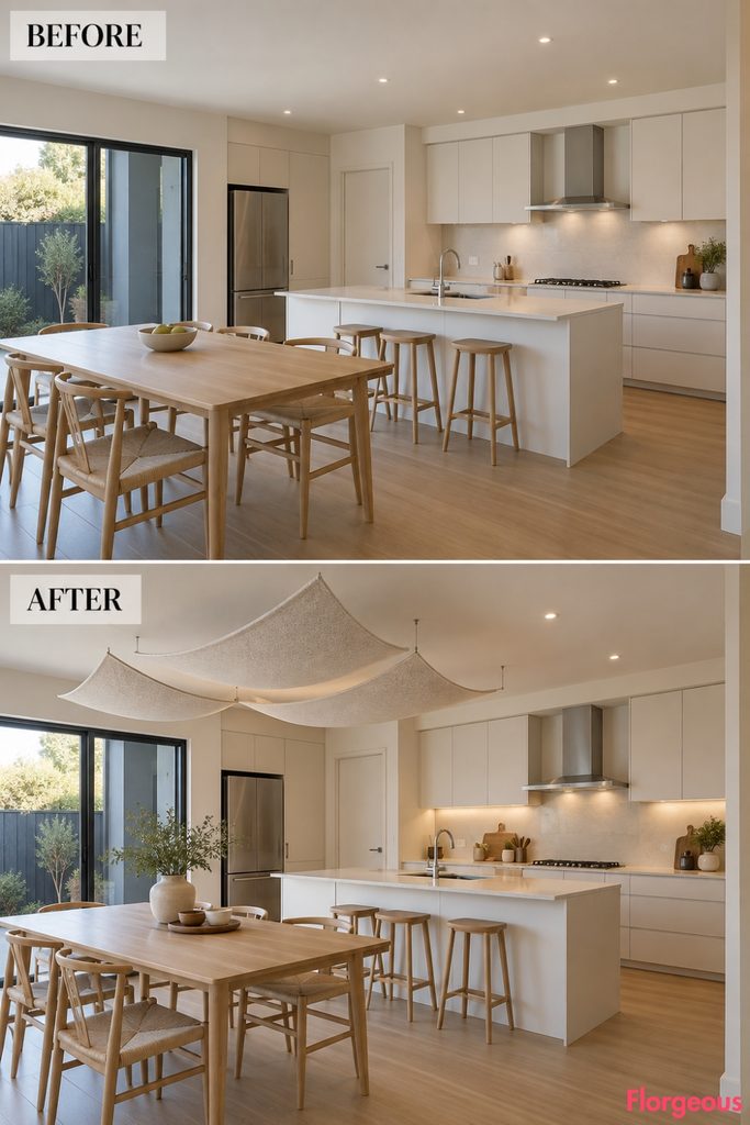
This concept uses softness overhead without changing the actual ceiling.
Before: A flat ceiling and hard finishes make the room visually plain.
After: Three shallow kitchen-suitable wool acoustic panels hang as gently curved sails over the dining-side edge of the kitchen, away from steam and direct cooking heat. Their oatmeal texture softens both sound and light.
Why it works: Textile texture appears in an unexpected plane while leaving counters completely uncluttered.
19. Finish With Exposed Dovetail Joinery as the Architectural Detail
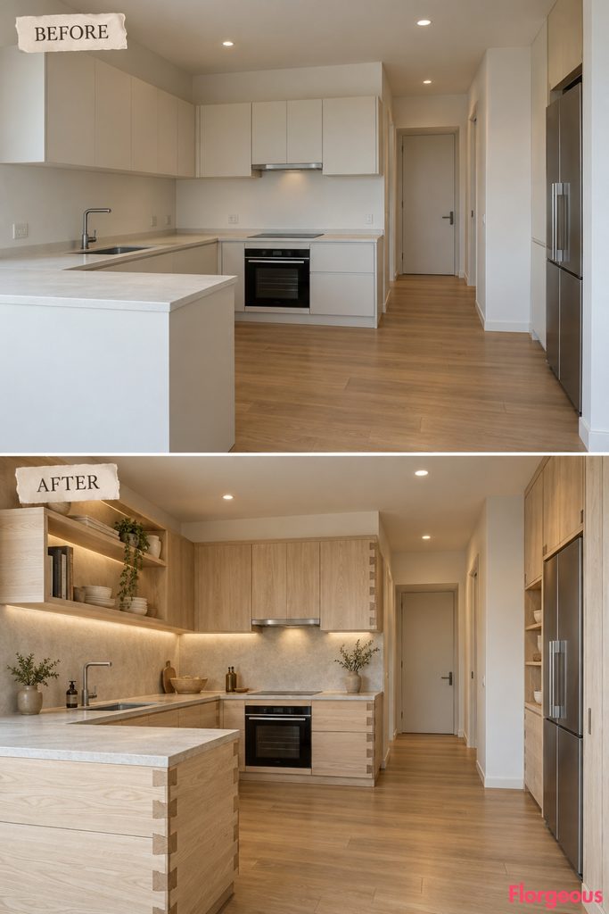
The final makeover makes construction itself the decoration.
Before: Standard slab cabinetry hides every connection and feels generic.
After: Selected pale-elm cabinet corners expose oversized but precisely cut dovetail joints. Open box shelves repeat the same joinery, creating a visible craft language across the room without carved ornament or applied decoration.
Why it works: It celebrates Scandinavian cabinetmaking through structure rather than styling.
How to Choose the Right Scandinavian Direction
The most convincing transformations here are not built by layering multiple trends together. Each one starts with a single strong idea, then lets quieter materials support it.
For your own Scandinavian Kitchen, begin with the fixed room shell. Identify the doors, windows, appliance connections, work zones, natural-light direction, and clear walking routes before choosing any decorative feature.
Then decide what should carry the room visually. It might be curved birch joinery, a tactile cork volume, carved soapstone, graphic flooring, visible cabinetmaking, a modular work wall, or a carefully designed lighting object.
Storage and cooking function should still come first. A beautiful feature is only successful if cabinet doors open properly, work surfaces remain useful, appliances are safely positioned, and circulation stays comfortable.
Finally, give the main feature enough space to breathe. Scandinavian interiors tend to feel strongest when one or two carefully resolved ideas are allowed to dominate instead of filling every wall and surface.