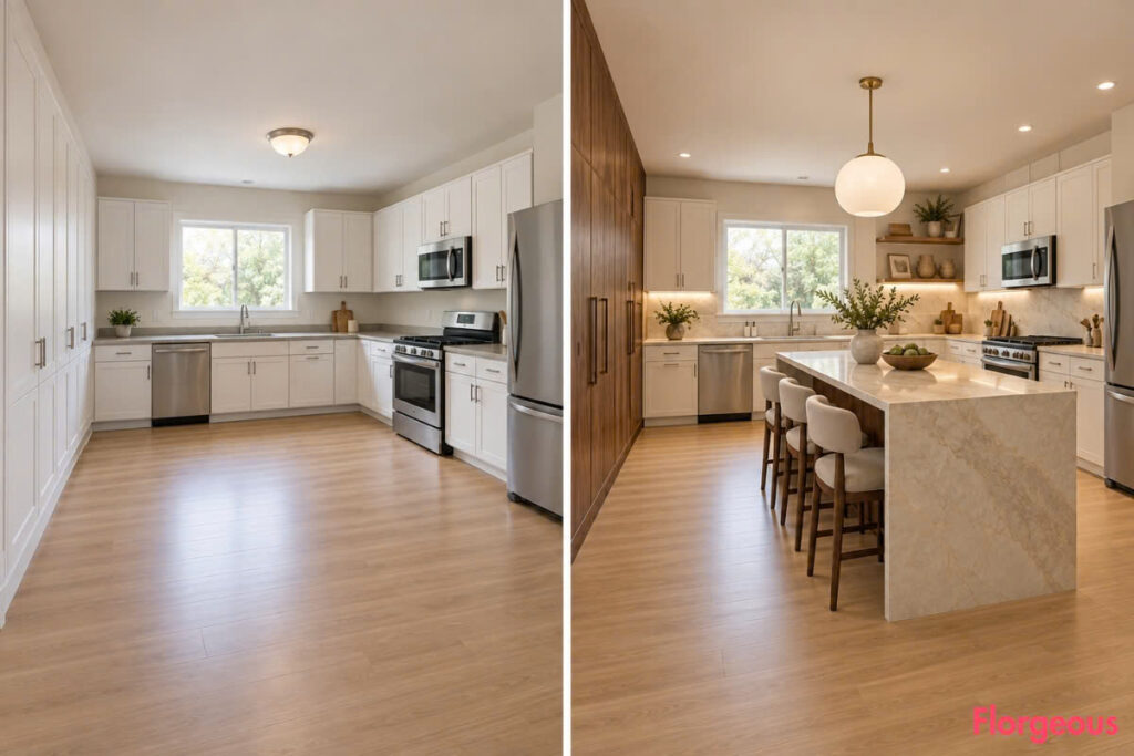
A builder-grade kitchen can be perfectly usable and still feel like something is missing. Plain cabinetry, neutral counters, one basic ceiling light, and barely styled surfaces often leave the room without a real point of view.
For these Modern Kitchen makeovers, every idea begins with exactly the same kitchen: a medium rectangular room with a left-side entry, one fixed window above the sink, basic L-shaped cabinetry along the back and right walls, pale neutral countertops, warm light-oak flooring, plain white walls, and a flat ceiling.
The architectural shell never changes. The doorway, window, walls, ceiling height, floor footprint, cabinet zones, and proportions stay consistent. Only the AFTER design changes.
That means each transformation has to earn its impact through a genuinely different design idea. Walnut architecture, monolithic stone, stainless steel, translucent glass, sculptural curves, bold lacquer, ceiling treatment, concealed storage, graphic contrast, furniture-inspired design, and statement lighting each take the same plain kitchen in a new direction.
1. Turn a Plain Kitchen Into a Warm Walnut Architectural Space
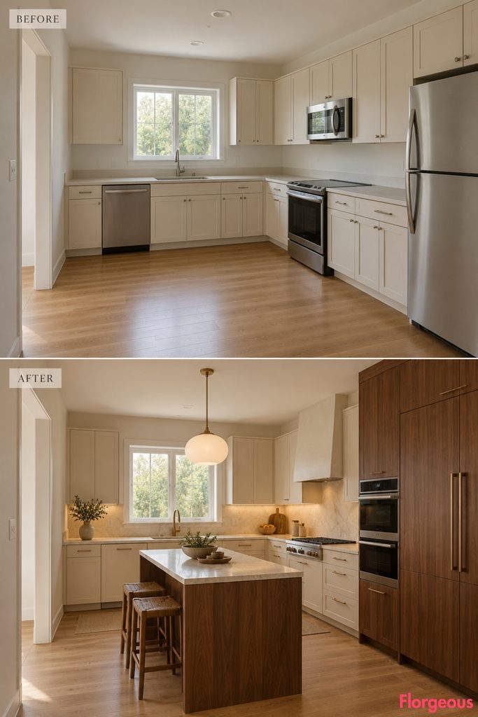
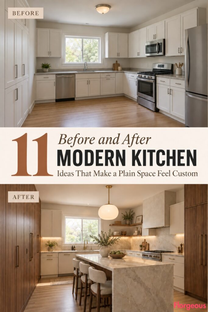
Warm wood can make a modern kitchen feel substantial without adding decorative clutter. Here, walnut is treated as part of the architecture rather than simply appearing as a small accent.
Before: The same plain kitchen has basic pale L-shaped cabinetry, neutral countertops, warm light-oak flooring, white walls, a fixed window above the sink, simple lighting, bare surfaces, and no strong focal point.
After: A full-height walnut composition takes over the right wall, concealing appliances and tall storage behind clean flush fronts. The sink wall stays warm white, while creamy quartzite surfaces and a slim walnut-based island balance the darker timber.
Why it works: Concentrating the walnut on one major architectural plane creates warmth and depth without making every surface compete for attention.
Try this: If full walnut cabinetry is beyond the budget, use real-wood veneer on the island, cabinet end panels, or one tall storage section while keeping the remaining cabinets painted.
2. Make a Monolithic Stone Island the Main Focal Point
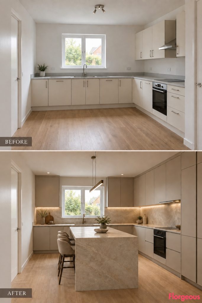
This transformation removes visual noise and allows one large material gesture to define the entire room. Instead of layering several statement finishes, the kitchen is built around a single substantial stone volume.
Before: The same plain base kitchen has pale builder-grade cabinets, neutral counters, warm light-oak flooring, plain white walls, a window above the sink, simple lighting, and minimally styled worktops.
After: Quiet matte putty cabinetry creates a subdued backdrop for a large pale limestone island wrapped continuously across the top and sides. The same limestone appears as a restrained backsplash, while hardware and decorative accessories nearly disappear.
Why it works: One oversized stone feature feels more intentional than several smaller competing focal points, especially in a clean modern room.
Try this: Porcelain slab can create a similar monolithic look with less maintenance than some natural limestones. Choose a subtle surface rather than exaggerated printed veining.
3. Reimagine the Room as a Refined Stainless Steel Chef’s Kitchen
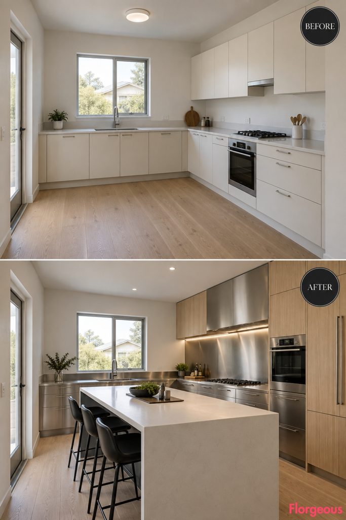
A professional kitchen influence can work beautifully at home when the harder surfaces are balanced with something warmer. This concept focuses on performance, precision, and exposed material honesty.
Before: The same neutral kitchen starts with basic pale cabinetry, neutral counters, light-oak flooring, white walls, standard lighting, the fixed sink window, and no meaningful focal point.
After: Brushed stainless steel wraps the lower working cabinetry and cooking backsplash. Pale-oak tall cabinets soften the room and conceal larger appliances, while a crisp white composite prep island creates a bright visual break in the center.
Why it works: Stainless steel adds a completely different texture from painted cabinetry or stone, while pale oak stops the room from becoming too commercial.
Try this: Use stainless only in the hardest-working zones. A steel backsplash or selected base cabinets can achieve the effect without turning the whole kitchen into a restaurant prep area.
4. Create a Luminous Kitchen With Ribbed Glass and Slim Aluminum
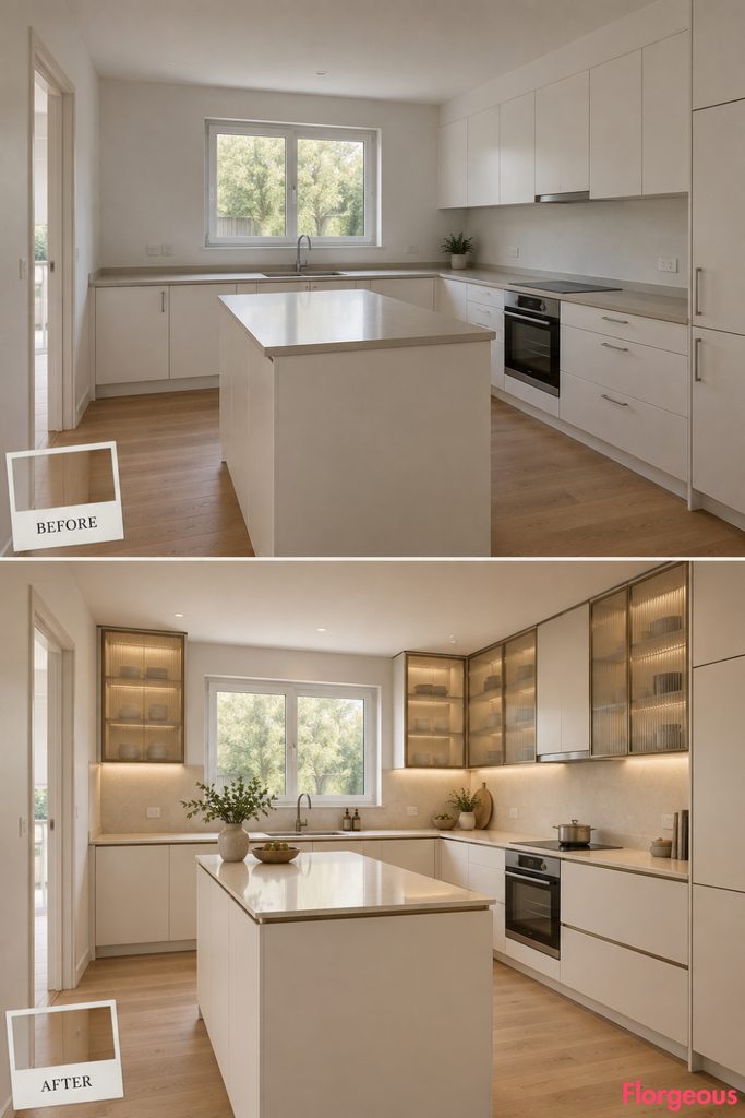
This kitchen gets its identity from translucency rather than solid color or heavy natural materials. Light, glass, and fine metal framing become the decorative language.
Before: The same base room has plain pale cabinetry, neutral worktops, basic lighting, warm oak flooring, bare surfaces, and the original sink window and left-side doorway.
After: Selected upper cabinets use ribbed translucent glass held inside slim champagne-aluminum frames. Matte ivory lower cabinets and pale solid-surface counters keep the room bright, while discreet lighting inside the glass cabinetry creates depth.
Why it works: Translucent surfaces break up large areas of opaque cabinetry and make a modern kitchen feel visually lighter without relying on open shelving.
Try this: Keep objects behind ribbed glass simple and tonal. Glass will blur their forms, but strong colors and clutter can still show through.
5. Replace Boxy Geometry With a Sculptural Curved Island
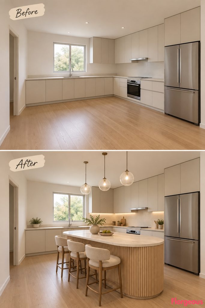
Most fitted kitchens are made almost entirely from rectangles. Introducing one confident curve can therefore make the same room feel completely new.
Before: The locked base kitchen has simple pale cabinets, neutral countertops, a warm light-oak floor, flat ceiling, fixed sink window, plain lighting, and an unremarkable open central area.
After: Mushroom-beige perimeter cabinetry stays deliberately straight and understated. In the center, a long island has two generous rounded ends, vertically fluted pale-oak cladding, and a cream stone top following the same curved profile.
Why it works: The curved island introduces a different visual rhythm without requiring the entire kitchen to become sculptural.
Try this: If fully curved custom cabinetry is too expensive, soften only the two exposed island corners with a generous radius.
6. Give the Kitchen a Deep Oxblood Lacquer Makeover
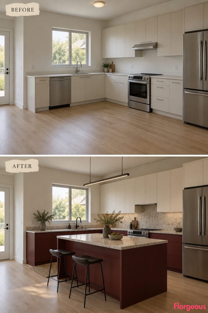
Instead of relying on neutral finishes, this concept makes color the architectural statement. The shade is rich and earthy rather than bright, keeping the result sophisticated.
Before: The same plain kitchen has pale basic cabinets, neutral counters, warm oak flooring, white walls, standard lighting, and minimal styling.
After: Deep oxblood lacquer covers the lower cabinetry and island base. Warm-ivory upper cabinets keep the composition balanced, while pale terrazzo counters introduce subtle mineral texture and blackened metal details sharpen the edges.
Why it works: Limiting the saturated color to lower volumes keeps the kitchen grounded while preserving visual lightness above eye level.
Try this: Sample deep reds in both daylight and evening light. Burgundy, clay, and brown undertones usually work more comfortably than clear primary red.
7. Turn the Ceiling Into the Architectural Feature
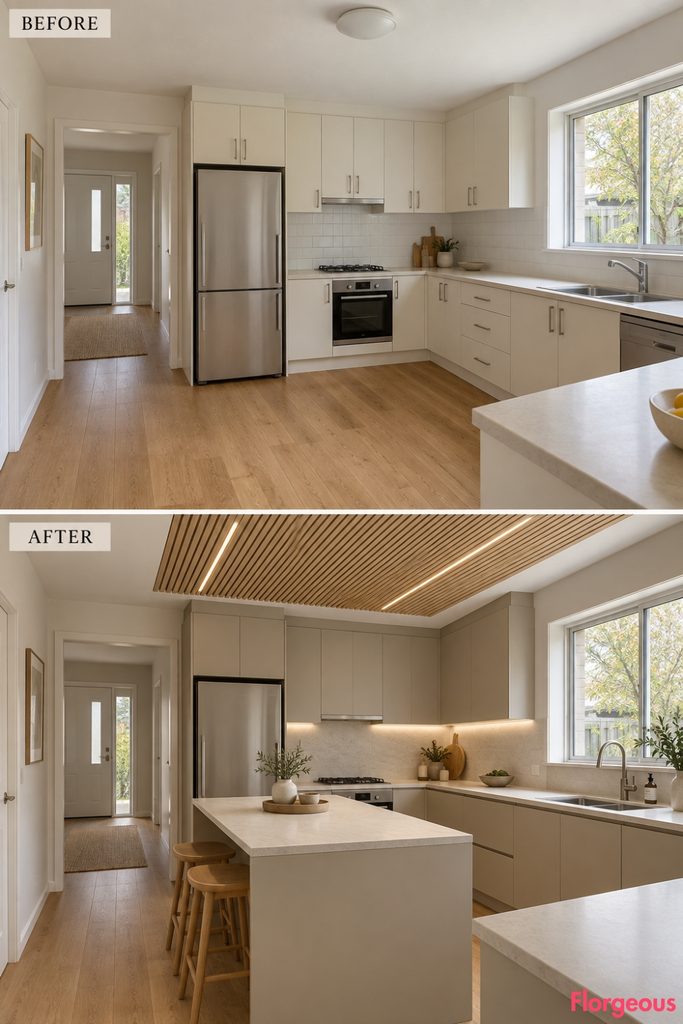
Instead of adding another statement backsplash or dramatic island, this makeover moves the visual focus overhead. It is especially effective when the rest of the kitchen stays intentionally quiet.
Before: The original room has a completely flat white ceiling with one basic fixture, simple pale cabinets, neutral counters, white walls, and warm oak flooring.
After: A defined central field of narrow pale-oak battens runs lengthwise across the existing ceiling plane. A recessed linear light follows the same axis, while matte greige cabinetry and pale quartz surfaces below remain deliberately understated.
Why it works: The ceiling introduces architecture without taking away storage, counter space, or circulation.
Try this: Cover only a controlled ceiling zone rather than the entire room. This makes the treatment feel integrated and keeps material costs lower.
8. Hide Everyday Clutter Inside a Pocket-Door Utility Wall
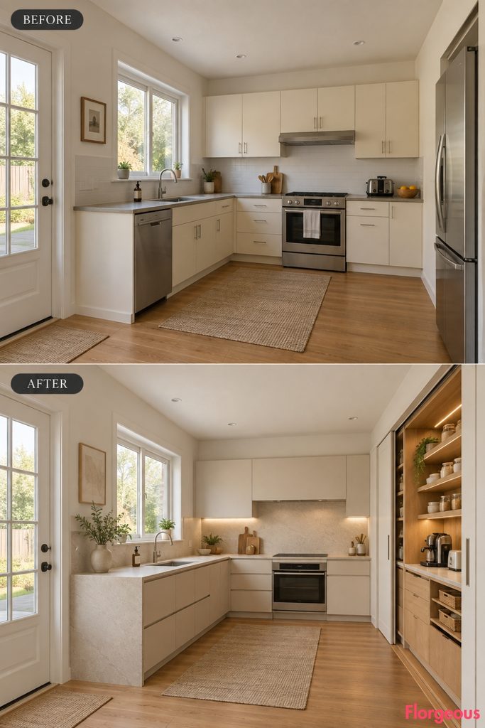
This transformation is driven by how the kitchen functions rather than by a statement finish. The visual drama comes from making an entire working zone disappear.
Before: The same kitchen shows basic cabinets, exposed small appliances, neutral counters, bare walls, simple lighting, and a generally unfinished feel.
After: The right wall becomes a full-height warm-white utility wall. Large pocket doors retract completely to reveal an oak-lined breakfast station containing the coffee machine, toaster, preparation surface, outlets, pantry storage, and task lighting.
Why it works: Frequently used appliances remain accessible without permanently occupying the visible countertops.
Try this: Pocket doors are most useful when they retract fully into the cabinetry. Standard hinged doors can obstruct the working aisle when left open.
9. Create a Graphic Black Frame Around a Bright Stone Work Zone
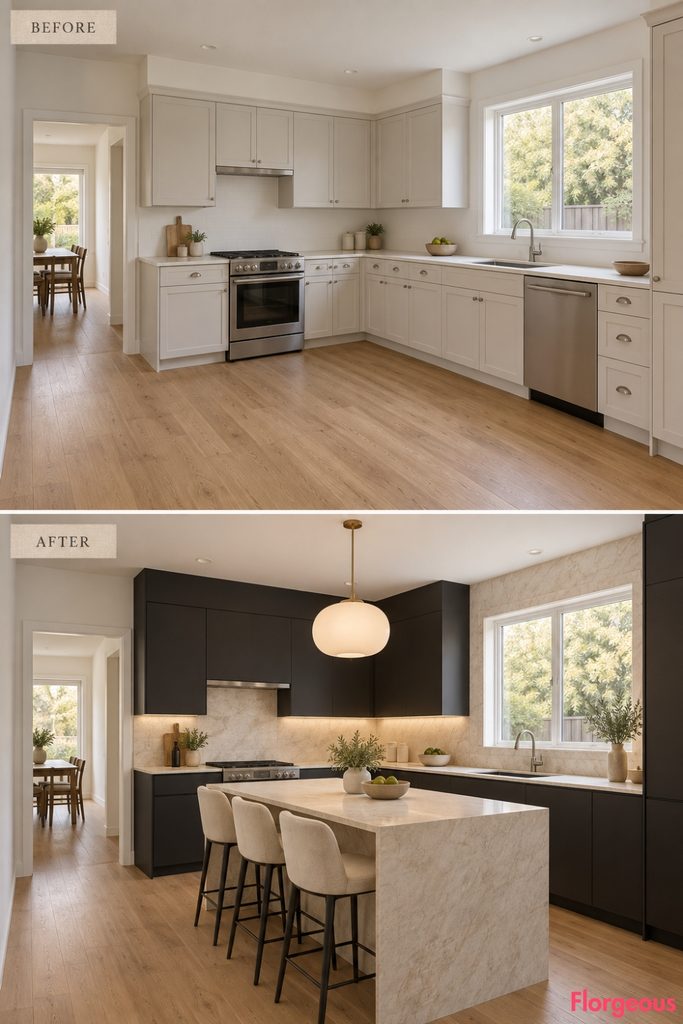
Dark cabinetry does not have to make a kitchen feel gloomy. This idea uses near-black surfaces as a deliberate frame around a much lighter central working area.
Before: The original kitchen remains pale, neutral, minimally styled, and visually flat, with its fixed sink window and simple L-shaped cabinet layout.
After: Near-black flat-front cabinetry occupies the outer storage zones, while the sink wall, backsplash, and island switch to pale luminous stone. Thin black cabinet reveals sharpen the geometry, and a large milk-glass pendant softens the contrast.
Why it works: The light surfaces stay concentrated around the areas where work happens, allowing dark cabinetry to add definition without swallowing the room.
Try this: Add strong under-cabinet and preparation lighting before committing to a dark palette. Decorative pendants alone are rarely enough for kitchen tasks.
10. Replace the Built-In Island With a Furniture-Like Prep Table
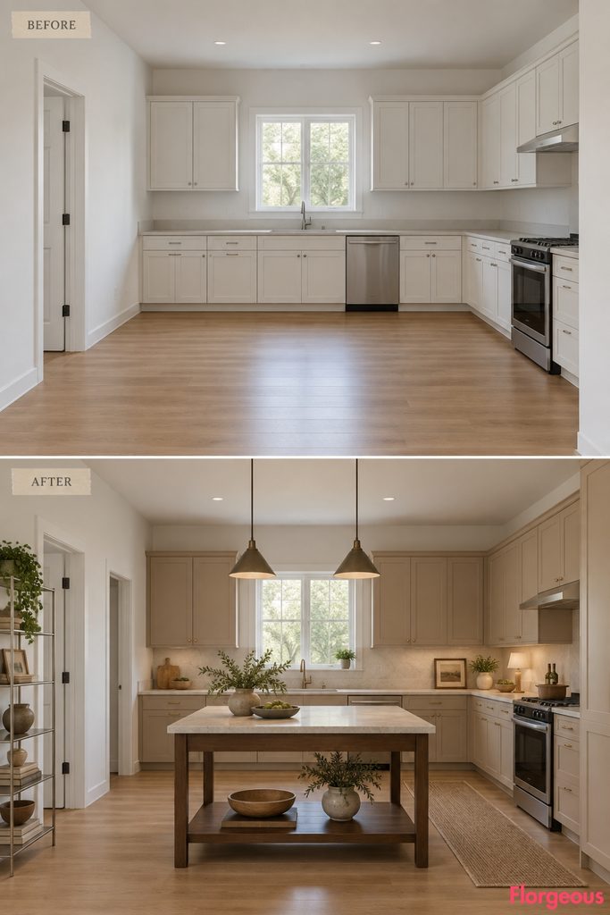
This concept questions one of the most familiar elements in a modern kitchen. Instead of adding another heavy block of cabinetry, the center of the room gets a lighter piece that feels closer to furniture.
Before: The base kitchen has plain L-shaped cabinets, neutral countertops, warm oak flooring, a fixed window and doorway, minimal lighting, and an empty central zone.
After: Muted clay-beige perimeter cabinets frame a freestanding dark-oak preparation table with slim legs, a thick pale stone top, and a lower timber shelf. One slender stainless-steel wall shelf adds a precise contemporary detail without visually filling the room.
Why it works: Seeing more floor beneath the prep table makes the middle of the kitchen feel lighter and more flexible than a conventional island.
Try this: Keep plumbing and major appliances on the perimeter if you want a genuinely furniture-like central table that could be replaced later.
11. Turn the Kitchen Into a Gallery With Sculptural Lighting
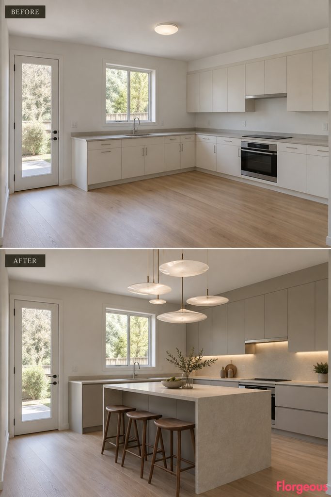
The final transformation avoids relying on colorful cabinetry, bold stone, exposed metal, or unusual storage. Instead, the light fixture itself becomes the artwork.
Before: The same plain base kitchen has generic pale cabinetry, neutral counters, minimal styling, flat lighting, warm oak flooring, white walls, and no memorable visual feature.
After: Soft mineral-gray cabinetry and seamless creamy counters create an extremely quiet backdrop. Above a simple central island hangs an asymmetric composition of thin opaque glass discs at varied heights, supported by discreet hardware and accompanied by a subtle wash of light behind the sink.
Why it works: Restrained cabinetry gives the sculptural fixture enough negative space to become the obvious focal point without making the kitchen feel crowded.
Try this: If lighting is the hero, remove competing objects from the island beneath it. Empty space becomes part of the design.
How to Choose the Right Modern Kitchen Direction
The eleven makeovers feel different because each one begins with a different design priority. One uses walnut as architecture, another makes stone the hero, while the others focus on stainless steel, translucent glass, curved geometry, saturated color, ceiling design, concealed utility storage, graphic contrast, freestanding furniture, or sculptural lighting.
That is a useful way to plan your own Modern Kitchen. Decide which single element should define the finished room before choosing every cabinet color, light fixture, backsplash, and accessory.
If the island is the statement, let the perimeter cabinetry become quieter. If cabinetry carries a strong color, reduce competing patterns. If hidden storage matters most, make organization part of the architecture rather than adding decorative features around it.
Before finalizing any layout, check the practical clearances too. Appliance doors, cabinet doors, stools, preparation zones, and people need room to coexist. A visually beautiful island is not successful if it creates an uncomfortable route through the kitchen.
You also do not need to copy an entire makeover. One strong idea, such as changing the cabinet fronts, concealing countertop appliances, introducing a furniture-like prep table, adding a controlled ceiling treatment, or choosing a more sculptural light, can be enough to give a plain kitchen a much clearer identity.