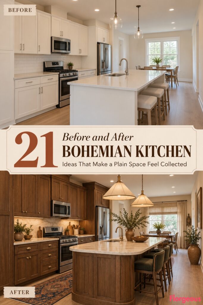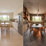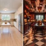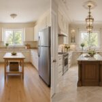
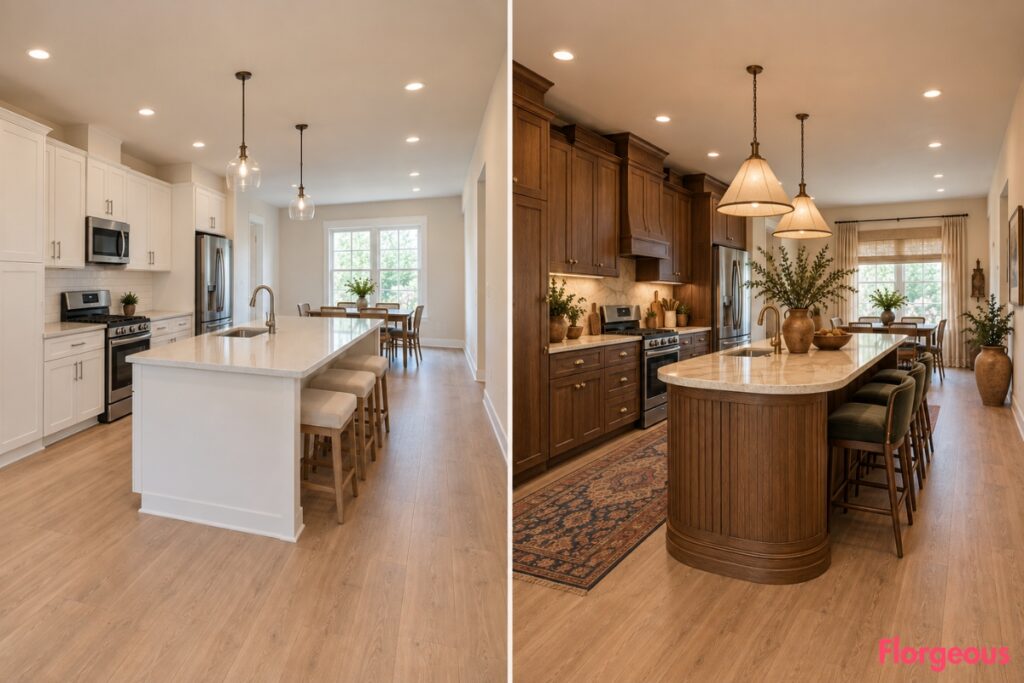
A builder-grade kitchen can be perfectly functional and still feel strangely anonymous. Pale cabinets, neutral countertops, standard appliances, basic lighting, and empty surfaces provide a useful starting point, but very little personality.
That is where a Bohemian Kitchen can become much more interesting. The strongest versions are not rooms filled with random baskets and plants. They combine expressive color, tactile materials, crafted furniture, textiles, lighting, and collected details into one coherent visual story.
For every makeover below, imagine the same medium-size kitchen with simple pale cabinetry, neutral countertops, standard visible appliances, a wide rear window near the sink, warm off-white walls, warm light flooring, a flat ceiling, basic ceiling lighting, mostly bare counters, and soft natural daylight.
The architectural shell stays locked. Walls, wall lengths, corners, windows, doorways, ceiling height and geometry, floor footprint, major appliance locations, plumbing zones, and practical circulation remain exactly where they started.
Everything decorative and interior-facing in the AFTER can change. Cabinets, finishes, countertops, backsplash treatment, island appearance, hardware, lighting, stools, textiles, window treatments, rugs, storage details, accessories, and styling should work together to create a complete new kitchen.
1. Turn the Plain Kitchen Into a Sun-Baked Desert Atelier
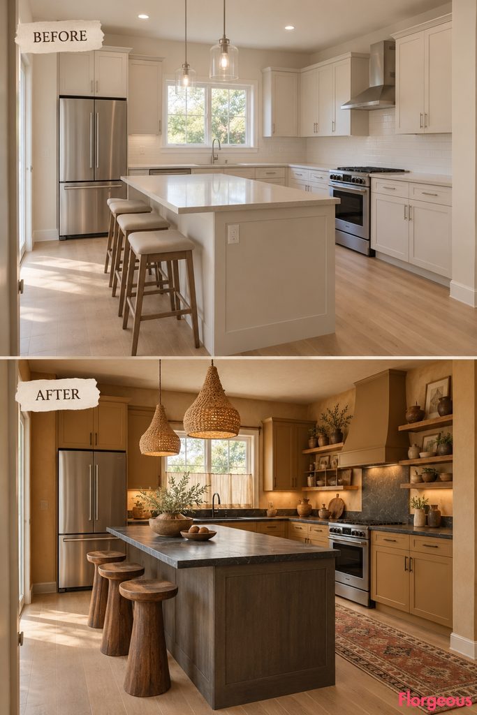
This first makeover feels like a working artist’s studio warmed by desert colors.
Before: Pale cabinets, neutral counters, basic lighting, and bare surfaces make the room feel generic.
After: Redesign the full kitchen with matte ochre cabinetry, honed charcoal soapstone worktops, a smoked-ash island, sculptural ash stools, dark bronze hardware, braided linen pendant lights, an abstract sand-and-rust flatweave runner, and a small group of oversized hand-thrown vessels.
The rear window gets a simple flax café curtain, while the surrounding styling stays deliberately loose and tactile.
Why it works: The dark stone grounds the ochre and prevents the earthy palette from feeling overly rustic.
Try this: Repeat your strongest color no more than three times across the room.
2. Create a Peacock Jewel-Box Kitchen
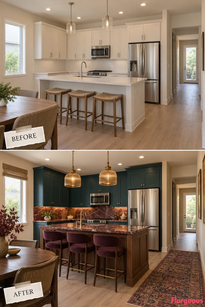
This direction goes richer and more glamorous without losing the collected bohemian feeling.
Before: The pale kitchen has very little contrast or atmosphere.
After: Use deep peacock blue cabinetry, burgundy-veined quartzite counters, a walnut island base, antique brass hardware, amber ribbed-glass pendant lights, dark plum upholstered stools, and a faded jewel-toned runner.
Keep the walls warm cream so the saturated colors have room to breathe.
Why it works: Dark blue, burgundy, walnut, and amber create depth without relying on busy pattern.
3. Make It a Chalk-and-Charcoal Artisan Kitchen
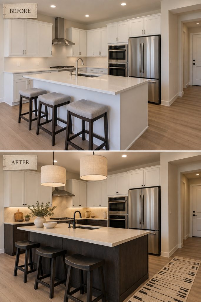
This version is quieter, graphic, and almost monochromatic.
Before: Basic pale finishes give the room very little depth.
After: Combine charcoal-stained oak lower cabinetry with chalk-white uppers, warm ivory microcement worktops, an integrated pale backsplash, blackened metal hardware, large linen drum pendants, simple black timber stools, and a cream runner with hand-drawn charcoal lines.
A few pale ceramics soften the graphic palette.
Why it works: Variation comes from texture, grain, and contrast rather than decorative clutter.
4. Build a Saffron and Indigo Textile House
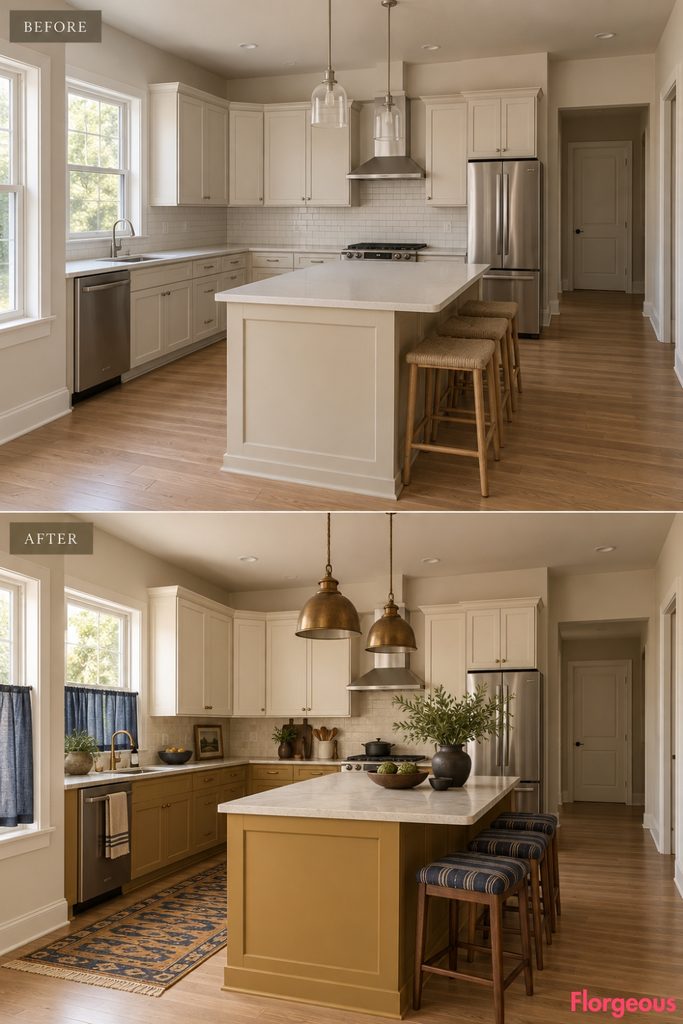
This kitchen takes its character from cloth, upholstery, and warm saturated color.
Before: The original room has no visual rhythm and almost no soft material.
After: Finish the lower cabinetry and island in muted saffron, keep the uppers warm ivory, use creamy stone worktops, add walnut stools with indigo-striped upholstered seats, an indigo linen café curtain, aged brass lighting, and a long woven runner mixing saffron, ink blue, tobacco, and cream.
Decorate with only a few dark timber boards and matte ceramics.
Designer Tip: Keep patterned textiles away from heat and splashes, then let them carry color in the dry zones.
5. Give the Kitchen a Rosewood and Pearl Terrazzo Mood
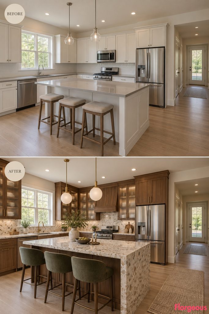
This makeover feels warmer, richer, and slightly mid-century without becoming a retro kitchen.
Before: Standard cabinetry and neutral surfaces lack material variation.
After: Introduce rosewood-toned cabinet fronts, pearl terrazzo counters with large creamy aggregate, champagne-toned ribbed-glass uppers, soft bronze hardware, opaline globe pendants, moss-green stools, and an oatmeal wool runner.
Keep accessories restrained so the rosewood grain remains prominent.
Why it works: Terrazzo, glass, timber, and metal all have different textures but share a softly polished finish.
6. Mix Celadon With Dark Leather and Walnut
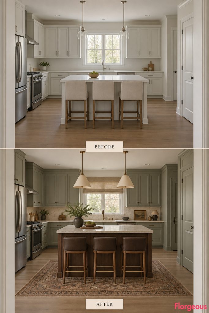
This direction feels collected and slightly scholarly.
Before: The kitchen has pale anonymous surfaces and generic seating.
After: Redesign it with muted celadon cabinetry, pale mineral stone worktops, a dark walnut island, oxblood-brown leather stool seats, aged bronze hardware, parchment-colored pendants, a faded cream and tobacco runner, and a simple linen window shade.
Use dark pottery and a few amber vessels to deepen the palette.
Why it works: The pale green keeps heavy walnut and leather from making the room feel too formal.
7. Create a Verdigris and Blonde Maple Workshop
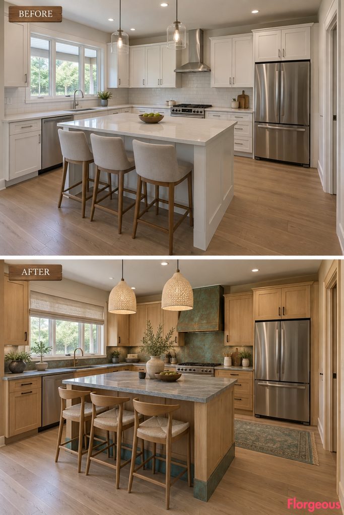
This Bohemian kitchen feels experimental and craft-driven.
Before: Pale builder cabinetry provides no tactile contrast.
After: Use blonde maple cabinetry with carefully controlled verdigris copper accents on the island plinth, range surround, and selected hardware details. Add cool gray stone counters, blackened metal pulls, maple stools, cream woven pendant shades, and a soft gray-green runner.
The verdigris appears as a repeating accent rather than covering the whole kitchen.
Why it works: Patinated metal adds age and irregularity to otherwise clean timber surfaces.
8. Pair Dusty Apricot With Deep Green Soapstone
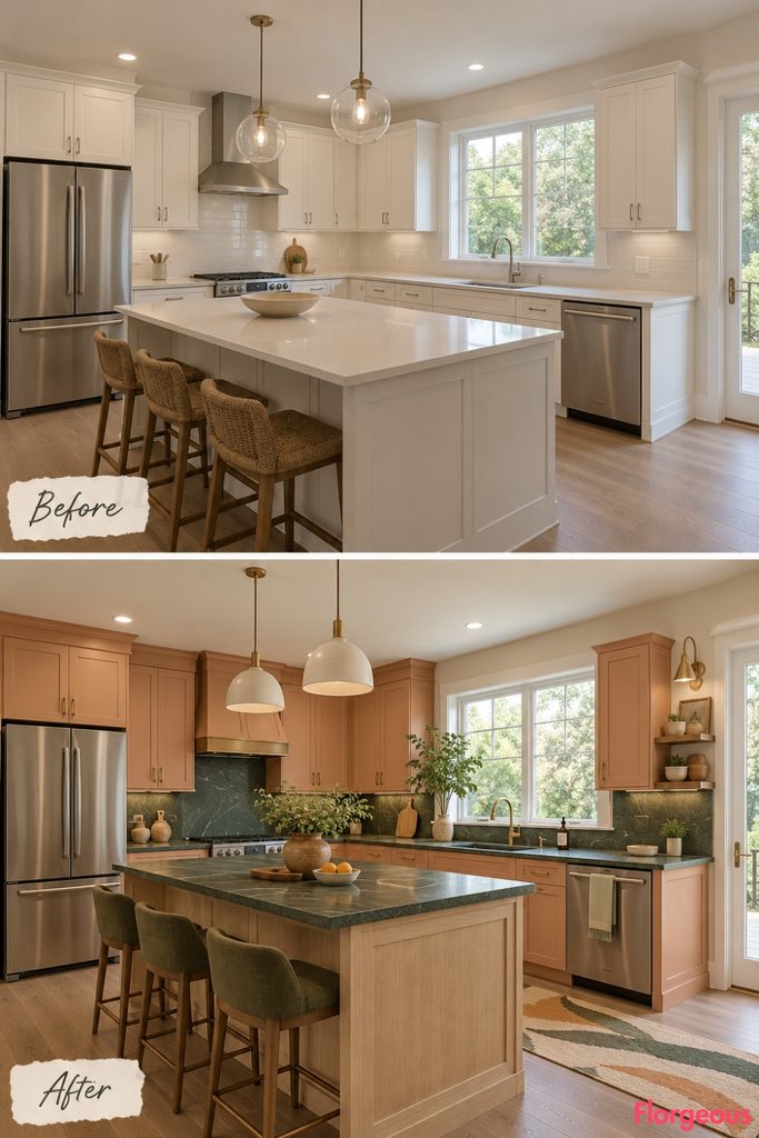
This palette is colorful but still grounded in natural materials.
Before: The pale kitchen feels flat and cool.
After: Use dusty apricot cabinetry, deep green soapstone worktops, bleached oak on the island and open furniture details, warm brass hardware, pale ceramic pendants, olive-toned stool upholstery, and a cream runner with loose green and apricot bands.
Add one tall leafy plant beside the window, safely outside the working counter zone.
9. Create a Cobalt and Tobacco Collector’s Kitchen
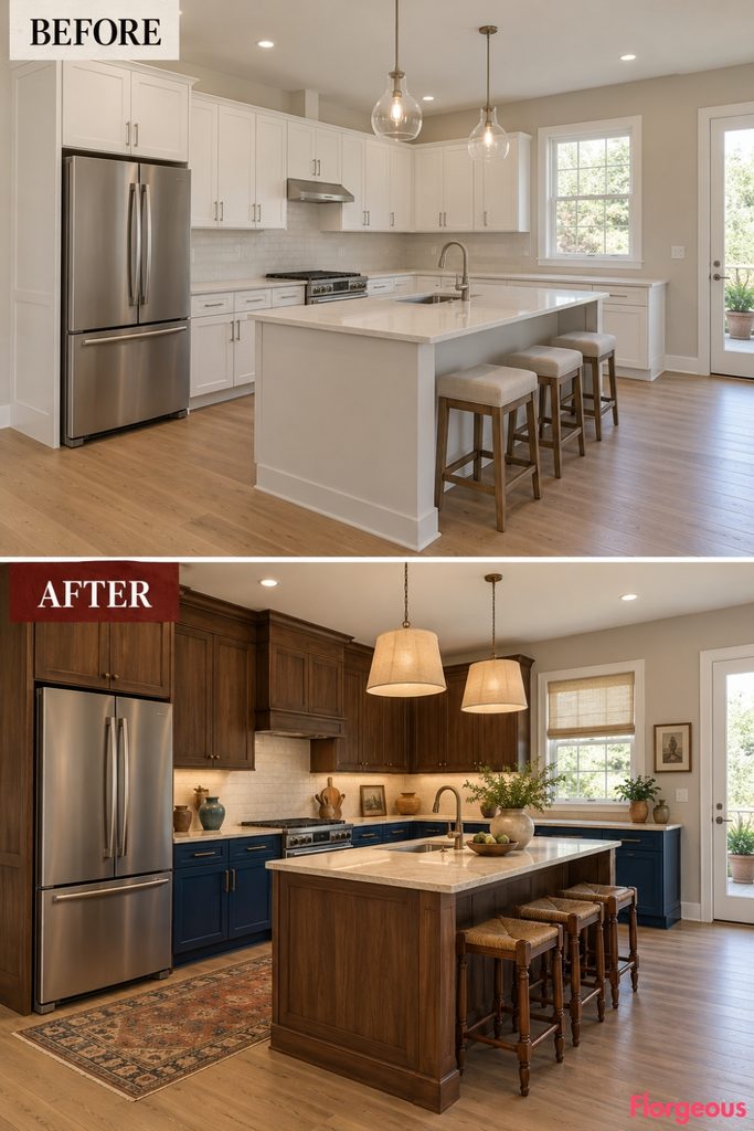
This version feels like a room assembled slowly from pieces with history.
Before: Everything in the builder-grade kitchen belongs to the same pale neutral family.
After: Use deep cobalt lower cabinetry, tobacco-stained timber uppers, pale cream worktops, dark bronze hardware, a medium walnut island, linen pendants, antique-looking timber stools, and a long faded runner mixing blue, brown, cream, and muted red.
A few mismatched ceramic pieces make the styling feel collected, not staged.
10. Ground the Room With an Olive and Red-Oxide Palette
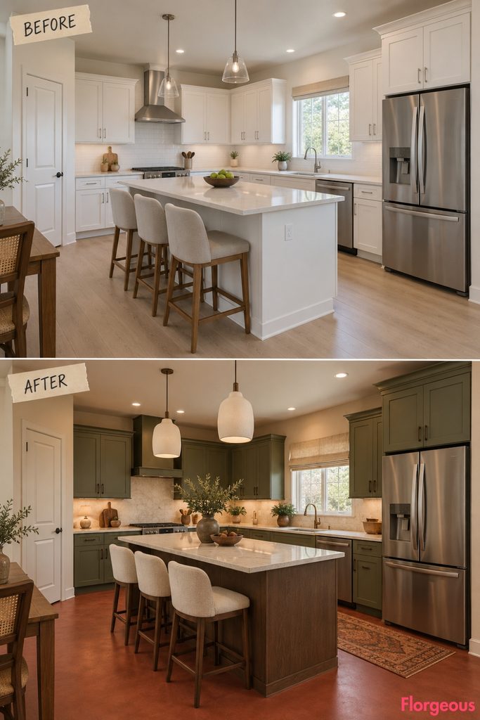
Here, the floor becomes part of a complete earthy composition rather than an isolated feature.
Before: Warm light flooring and pale cabinetry make the room feel unfinished.
After: Use a matte red-oxide microcement floor across the original footprint, olive cabinetry, pale quartz counters, a smoked-oak island, blackened bronze hardware, off-white plaster pendants, cream stools, and a narrow faded rust runner in the dining side only.
Keep the window treatment simple and flax-colored.
Why it works: Olive and iron-rich red sit naturally together, while cream stops the palette becoming heavy.
11. Try a Dusty Lilac and Walnut Eclectic Kitchen
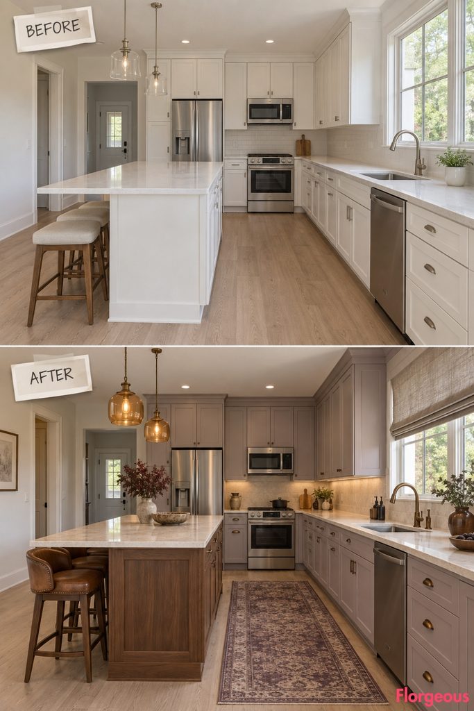
Lilac becomes surprisingly sophisticated when treated as a muted mineral color rather than a pastel.
Before: The neutral kitchen has no memorable color story.
After: Use dusty gray-lilac cabinetry, a walnut island, pale limestone counters, aged bronze fittings, amber pendants, tobacco leather stool seats, and a muted plum-and-cream runner.
Finish the rear window with a simple warm-gray linen shade.
Why it works: Walnut and bronze make lilac feel earthy rather than sweet.
12. Give Bohemian Style an Industrial Satin-Aluminum Twist
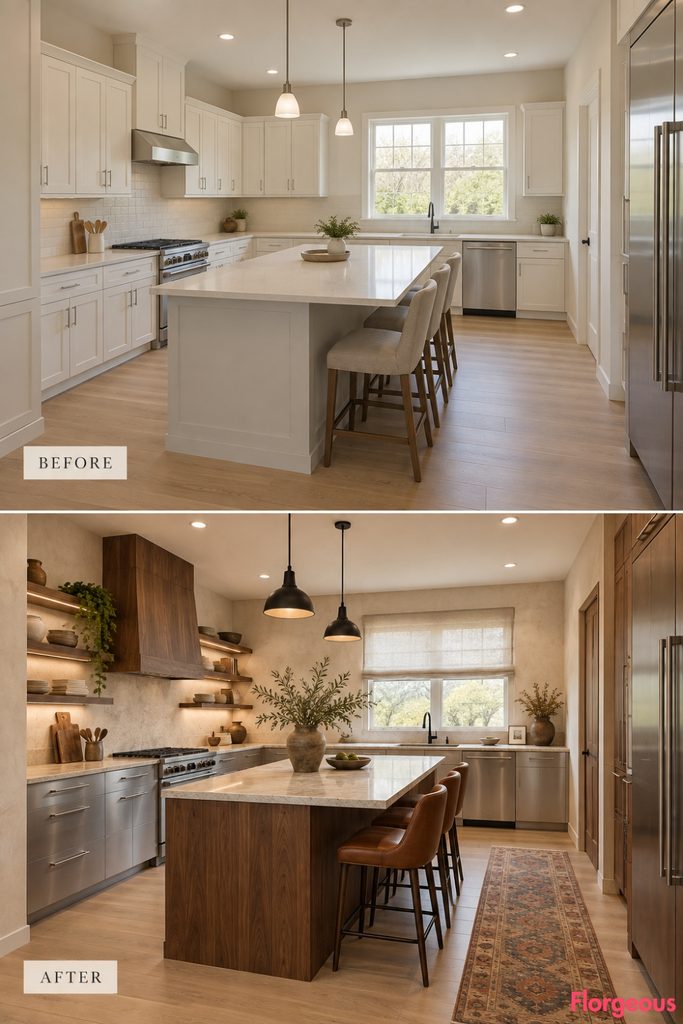
This is a more contemporary bohemian direction built around contrast between warm and cool materials.
Before: Standard pale cabinet fronts make every surface feel similar.
After: Use satin aluminum on selected lower cabinet fronts, walnut on the island and tall storage, pale honed stone counters, cream textured walls, matte black task lighting, cognac leather stools, and a faded geometric wool runner.
Add soft linen at the window to keep the metal from feeling clinical.
Style Note: Warm timber, leather, and textiles are essential when using large amounts of metal in a boho space.
13. Pair Burgundy Cabinetry With Figured Maple
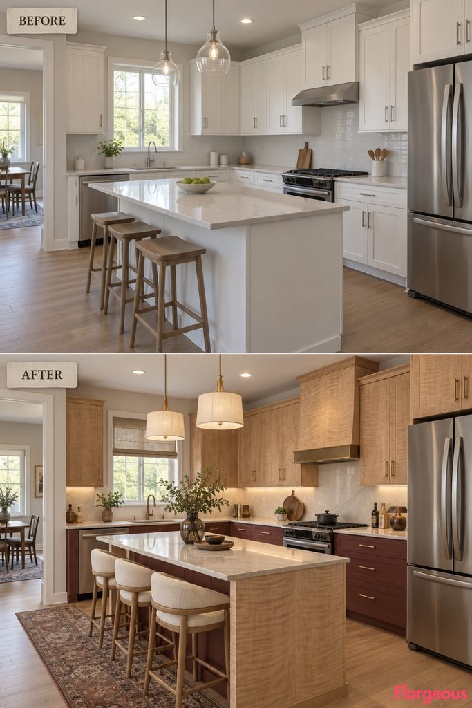
This direction has the richness of a vintage furniture collection.
Before: The kitchen lacks any distinction between storage, work zones, and focal areas.
After: Finish the lower cabinets in muted burgundy, use figured maple on upper fronts and the island, add pale quartzite counters, brushed brass hardware, parchment pendants, cream upholstered stools, and a faded brown-and-red runner.
Small smoke-colored glass vessels keep the palette sophisticated.
14. Make a Moss and Black Granite Night-Garden Kitchen
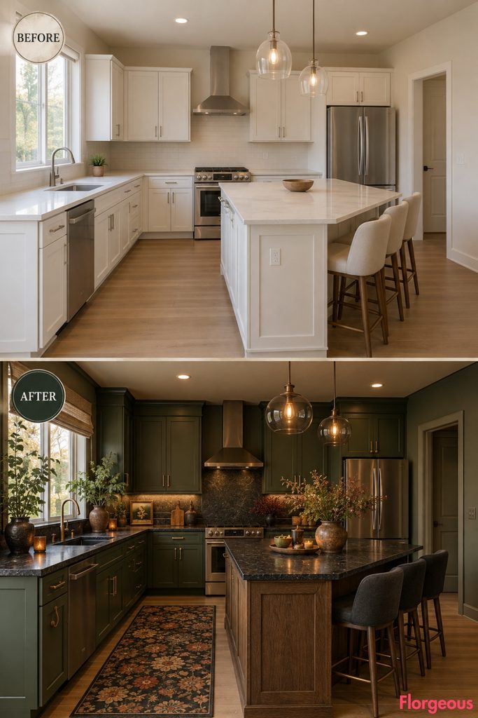
This kitchen is darker, calmer, and more atmospheric.
Before: Soft daylight falls across pale generic surfaces.
After: Introduce deep moss cabinetry, honed black granite counters, a dark oak island, smoked opaline pendant lights, aged bronze hardware, charcoal stools, a muted floral-inspired runner, and several sculptural plants clustered near the existing window.
The plants stay away from food preparation surfaces.
Why it works: The dark palette makes greenery look more architectural and less decorative.
15. Go Sun-Faded With Coral, Ash, and White Terrazzo
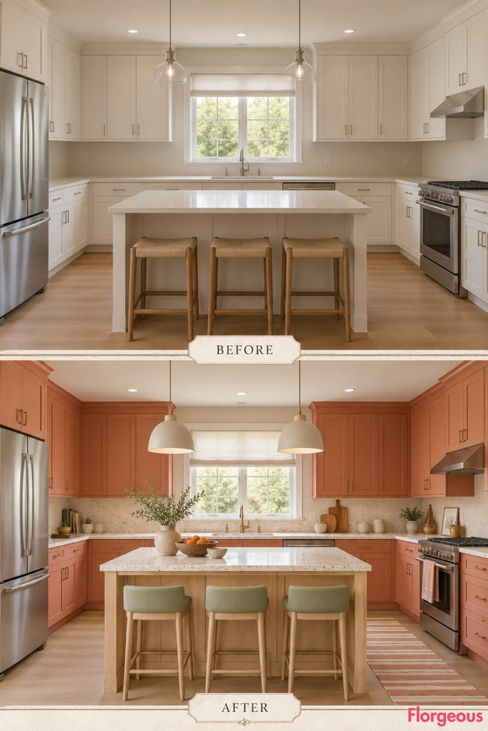
This is the brightest direction in the collection.
Before: The builder-grade kitchen feels pale but not intentionally light.
After: Use sun-faded coral cabinetry, a natural ash island, white terrazzo counters with sparse warm aggregate, pale green stools, matte ceramic lights, a soft striped runner, and off-white linen at the window.
The coral should feel chalky rather than saturated.
Why it works: Ash and white terrazzo give the coral enough neutral structure to feel sophisticated.
16. Create an Ivory and Ink Graphic Bohemian Kitchen
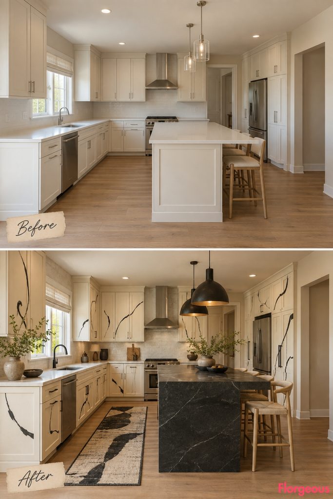
This concept uses drawing-like details instead of saturated color.
Before: Pale cabinetry and neutral surfaces have no graphic identity.
After: Keep the main cabinetry creamy ivory, then introduce broad hand-brushed ink lines on selected flat cabinet panels, a dark soapstone island, pale stone perimeter counters, blackened metal lighting, ash stools, and a loose black-and-cream runner.
The linework stays abstract, irregular, and free of symbols or readable imagery.
Why it works: The kitchen gains personality without becoming dependent on color.
17. Mix Dusty Rose With Espresso Timber
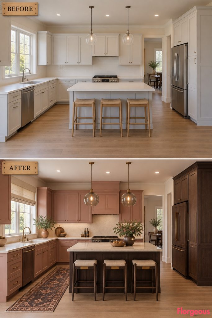
This version feels softer and more romantic without becoming decorative or sweet.
Before: The original room is neutral but visually cold.
After: Finish cabinetry in a dusty mineral rose, use espresso-stained timber for the island and tall storage, creamy stone worktops, softly aged brass hardware, smoke-glass pendants, dark wood stools with oatmeal upholstery, and a deep brown-and-rose runner.
Use a simple flax Roman shade at the rear window.
18. Build a Sea-Fog Blue and Mustard Artisan Kitchen
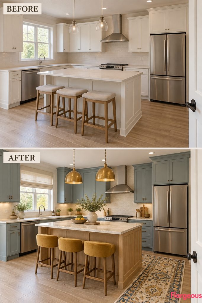
This palette feels relaxed and slightly playful.
Before: Pale builder-grade finishes create no hierarchy.
After: Use muted sea-fog blue cabinetry, a white-oak island, creamy quartzite counters, mustard upholstered stools, hammered brass pendant lights, dark bronze hardware, and a handwoven runner in cream, blue, mustard, and charcoal.
Add a simple warm-white linen curtain at the window.
Why it works: Mustard acts as a small energetic accent instead of covering large surfaces.
19. Create a Caramel Lacquer and Ribbed Limestone Kitchen
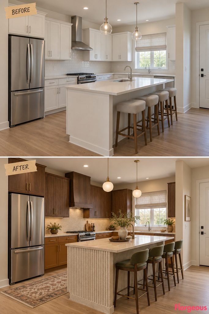
This direction is smoother and more sculptural.
Before: Flat matte surfaces make the builder-grade kitchen feel visually ordinary.
After: Use deep caramel lacquer on lower cabinetry, dark walnut on upper cabinetry, pale limestone worktops, a ribbed limestone treatment around the outward-facing island base, compact globe pendants, olive stools, and a softly faded cream-and-brown runner.
Keep all styling low and sculptural.
Why it works: Glossy lacquer and carved-looking stone create a strong material contrast without adding more colors.
20. Combine Plum Cabinetry With Brushed Stainless Steel
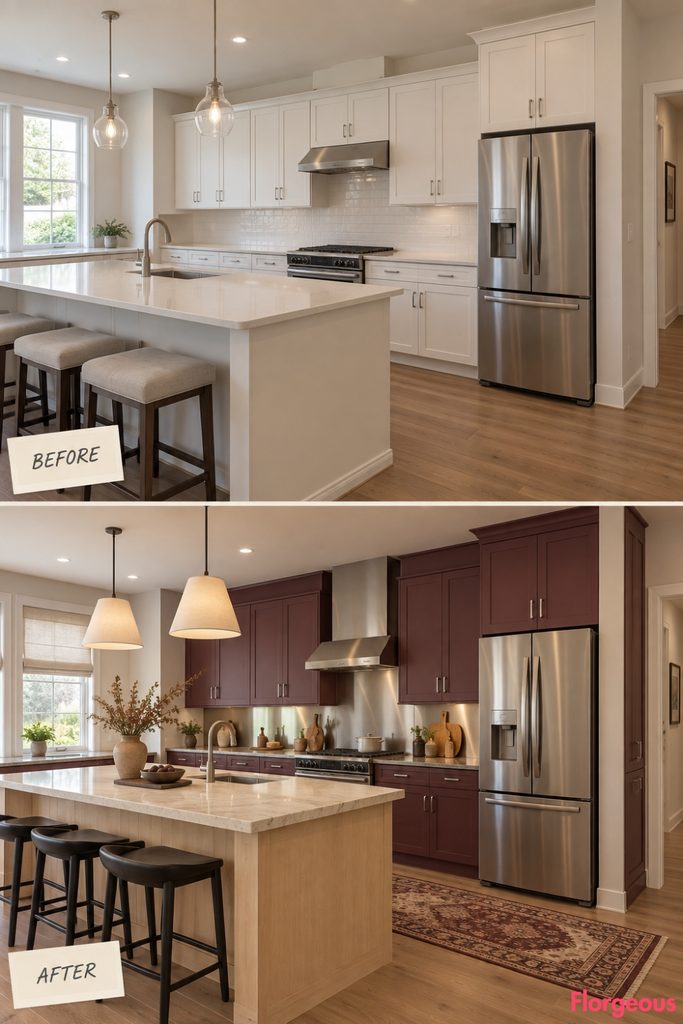
Bohemian style can also feel urban and studio-like.
Before: The kitchen is conventional and visually soft.
After: Use muted plum cabinetry, brushed stainless-steel worktops around the range and main prep area, a pale maple island with a thick cream stone top, parchment pendants, black stools, silver-toned hardware, and a faded burgundy-and-cream runner.
Add a small collection of clay vessels to soften the metal surfaces.
Why it works: The room balances handmade warmth with a utilitarian studio material.
21. Finish With a Tobacco-Oak Grand Bohemian Kitchen
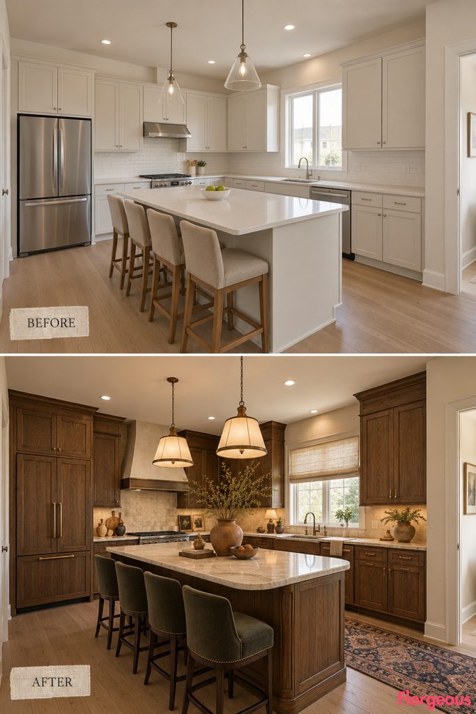
The final direction is the richest and most layered, but everything still has a clear purpose.
Before: The room has pale cabinetry, standard counters, basic lighting, and almost no character.
After: Use tobacco-stained oak cabinetry, creamy ivory stone worktops, a substantial island with softly rounded ends, antique bronze hardware, large parchment-and-bronze pendants, dark upholstered stools, a faded indigo and rust runner, flax window treatment, oversized earthenware, and one sculptural branch arrangement on the dry side of the island.
The room should feel collected, mature, and luxurious rather than crowded.
Why it works: Every surface shares a warm undertone, allowing layered materials to coexist without visual chaos.
How to Choose the Right Bohemian Kitchen Direction
A convincing bohemian kitchen is not created by adding as many decorative objects as possible. Start with a clear atmosphere, then build the cabinets, worktops, lighting, furniture, textiles, hardware, and styling around that same idea.
If your home already has plenty of color, the Chalk-and-Charcoal or Satin-Aluminum directions can provide contrast. If the kitchen needs warmth, look toward Desert Atelier, Dusty Rose and Espresso, Saffron and Indigo, or Tobacco Oak. For a moodier room, Peacock, Moss and Black Granite, or Plum and Stainless Steel create much stronger depth.
Also consider the daylight in the room. Dark walnut, black granite, burgundy, and peacock blue benefit from a well-lit kitchen. Softer palettes such as sea-fog blue, coral, ivory, celadon, and dusty lilac are easier to use where natural light is limited.
Most importantly, a Bohemian Kitchen still has to function beautifully. Keep the center walkway open, maintain practical clearance around the island, avoid fabric near open heat, protect working surfaces from decorative clutter, and keep the original architectural shell believable.