Sage green is getting more than a passing mention in 2026 home decor reports.
According to Zillow’s 2026 Paint Color Analysis, sage green was the only shade to rank in the top tier in every room it evaluated. Houzz’s 2026 U.S. Emerging Summer Trends Report also points to growing interest, with searches for “sage” rising 55%.
That combination makes the sage green home decor trend worth watching, especially for homeowners who want color without making a room feel too loud, dark, or difficult to furnish.
The appeal is not just that sage green looks pretty. It sits in a useful middle ground: softer than forest green, warmer than many cool grays, and more finished-looking than plain white when styled well.
What Zillow and Houzz Say About Sage Green
Zillow’s 2026 Paint Color Analysis gives sage green a rare position among paint colors. The company says sage green was the only shade to rank in the top tier across every room it evaluated.
The same analysis suggests sage green bedrooms may be associated with offers around $1,035 higher than white bedrooms. For living rooms, Zillow says sage green may be associated with offers nearly $500 higher than white living rooms.
That does not mean painting a room sage green guarantees a higher sale price. Paint color is only one part of how buyers respond to a home, and the condition, location, layout, lighting, and overall styling still matter.
The safer takeaway is that sage green appears to be a broadly appealing color in Zillow’s analysis. It gives homeowners a way to introduce color while still keeping the room calm, familiar, and easy to imagine living in.
Houzz adds a second layer to the story. Its 2026 U.S. Emerging Summer Trends Report says searches for “sage” rose 55%, and it groups sage with softer neutrals such as mushroom, taupe, and cream.
That pairing matters visually. Sage is not being treated like a bright novelty color. It is being pulled into the same design family as earthy neutrals, quiet textures, and gentle natural palettes.
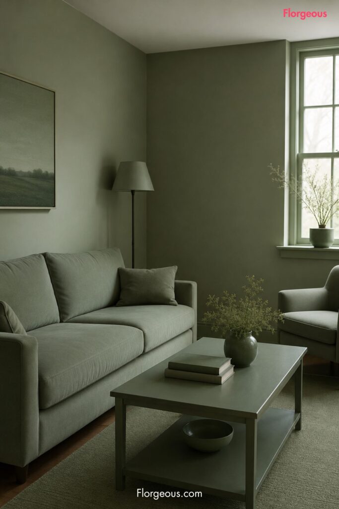
Why Sage Green Feels So Easy to Live With
Sage green works because it behaves more like a tinted neutral than a dramatic color.
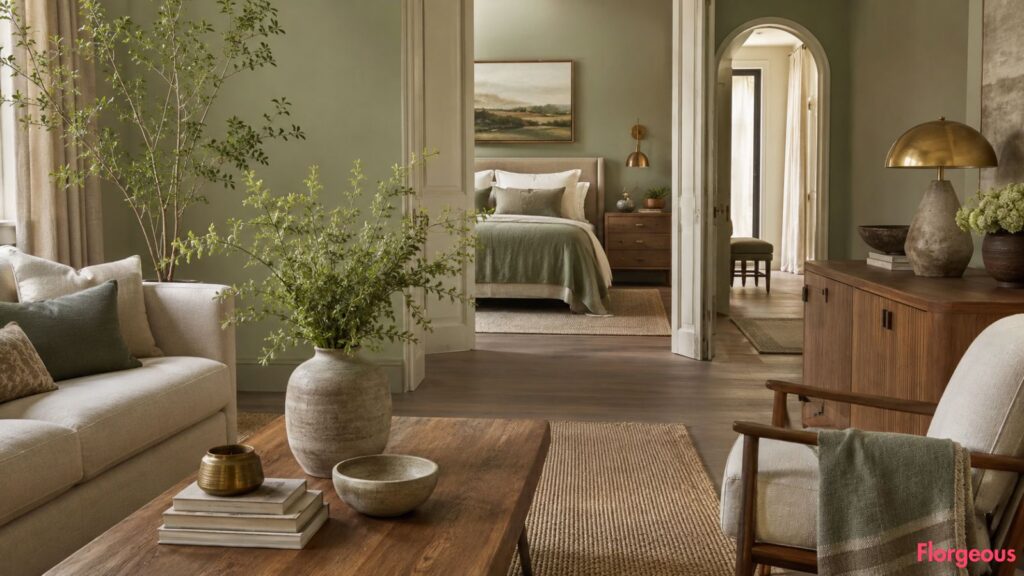
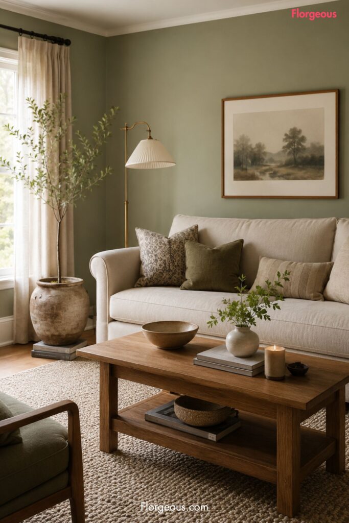
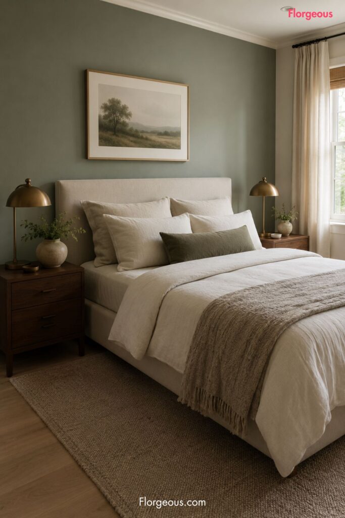
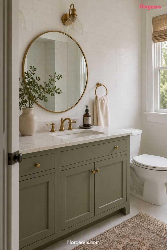
In a bedroom, it can make the walls feel softer behind ivory bedding, linen curtains, and warm wood furniture. In a living room, it can give cream upholstery and oak tables more depth. In a bathroom, it can make white tile, stone counters, and brushed brass hardware feel less clinical.
The color also has a flexible undertone. Some sage greens lean gray and muted, which makes them feel quiet and refined. Others lean slightly yellow or olive, which gives them a warmer, more botanical mood.
That flexibility is why sage can move through a whole home more easily than sharper greens. It can sit beside cream walls, pale oak floors, walnut furniture, woven rugs, stone bowls, ceramic lamps, and aged brass lighting without fighting for attention.
The strongest versions feel natural, layered, and slightly dusty. The weakest versions can look flat, chalky, or dated if the room has no contrast.
See more: Zillow Says This Ochre Yellow Paint Color Could Be Risky for Resale
Where to Use Sage Green Around the Home
Sage green can work beautifully in a whole-home palette, but it does not need to cover every wall.
In a bedroom, use it behind the bed as a soft focal point. Pair it with ivory bedding, a textured neutral rug, walnut or oak nightstands, and warm bedside lamps. This keeps the room restful while giving it more character than a plain white box.
In a living room, sage green walls can make a cream sofa feel more grounded. Add pale wood furniture, woven shades, linen curtains, ceramic decor, and framed art in warm neutral tones. The goal is relaxed and polished, not overly rustic.
In a bathroom, sage works well on a vanity, beadboard, painted trim, or a single wall near a freestanding tub. It looks especially fresh with white tile, pale stone, unlacquered brass-style finishes, and soft towels in cream or taupe.
In a kitchen or dining nook, sage can be used more carefully. Try it on lower cabinets, a built-in bench, open shelving backing, or a small breakfast area instead of committing to every surface. The color needs enough light and texture to stay fresh.
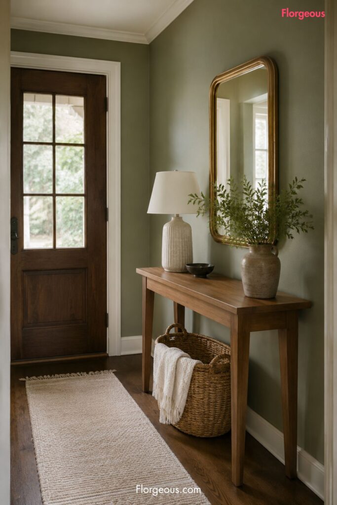
In hallways or entryways, sage green can create a gentle transition between rooms. It is especially useful when the rest of the home uses warm whites, taupes, creams, natural wood, and soft stone.
The Colors and Materials That Make Sage Look Current
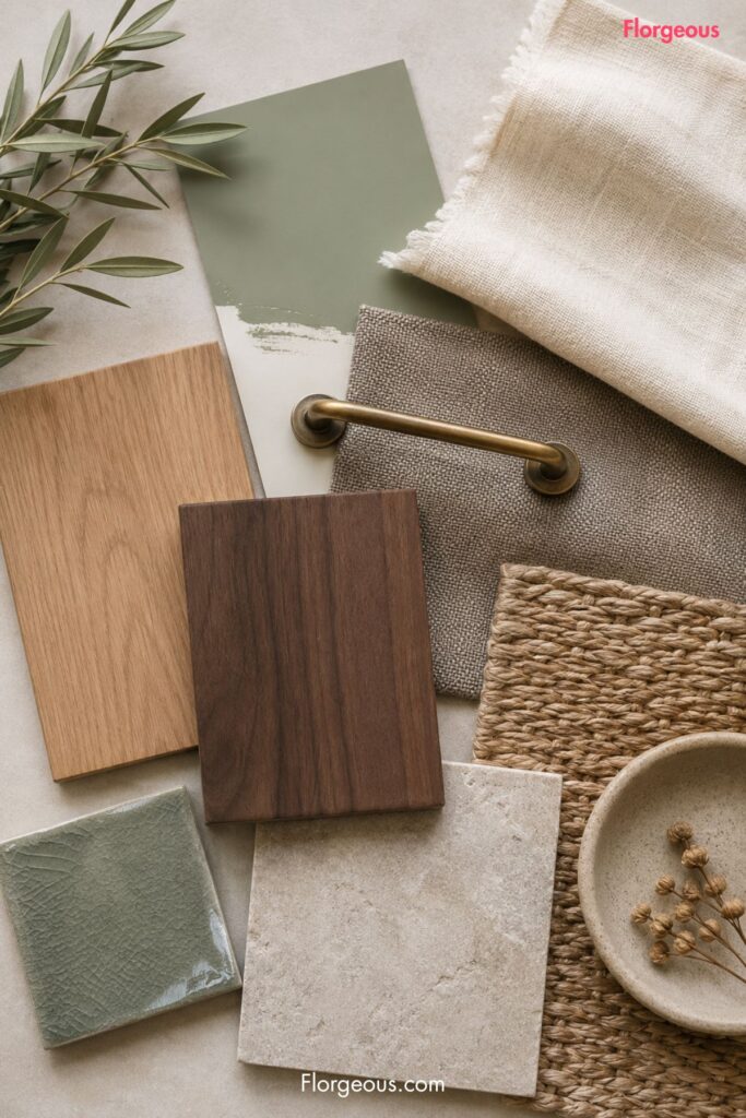
Sage green looks most current when it is treated as part of a layered natural palette.
Cream is the easiest partner. It keeps sage from feeling heavy and gives the room a clean but warm base. Use it on trim, curtains, bedding, lampshades, upholstery, or rugs.
Mushroom and taupe are also strong companions because they sit in the same soft neutral world Houzz connects with sage. These colors make the palette feel quiet and expensive-looking without becoming stark.
Warm wood gives sage more life. Pale oak makes it feel fresh and airy, while walnut makes it feel richer and more grounded.
Aged brass, bronze, and warm metal finishes can stop sage from feeling too cool. Use them through lamps, cabinet pulls, mirror frames, picture lights, or small decorative objects.
Stone, linen, wool, rattan, and ceramic pieces are important because sage needs texture. Without texture, the color can look like a flat paint choice rather than a complete design direction.
What to Avoid With Sage Green
The biggest mistake is choosing sage green only because a report connects it with buyer appeal.
A color still has to work with the room’s light, flooring, furniture, and fixed finishes. A sage that looks soft in a bright bedroom may look dull in a dark hallway or muddy beside cool gray tile.
Avoid pairing sage with too many cold finishes. If the room already has icy gray floors, blue-toned counters, or very stark white lighting, sage can lose its warmth. Balance it with cream textiles, warmer bulbs, wood, and woven texture.
Be careful with overly yellow sage if the room already has orange-toned floors or cabinets. The combination can feel dated unless it is balanced with cleaner cream, stone, or black accents.
Do not make the whole room one note. Sage walls, green pillows, green curtains, green art, and green decor can feel forced. Let the color breathe by adding contrast through ivory, taupe, wood, stone, brass, and natural black details.
Also avoid using sage as a shortcut for “calm.” The room still needs scale, layers, lighting, and good furniture placement. Paint can support the mood, but it cannot fix an empty layout.
The Florgeous Take
The Florgeous take: sage green is strongest when it feels like a quiet backdrop, not the entire personality of the room.
Use it the way you would use a warm neutral. Let it hold the walls, vanity, or built-ins, then bring in cream fabric, wood grain, stone texture, soft rugs, and warm lighting.
For a whole home, sage works best as one chapter in a larger palette. It can connect beautifully with mushroom, taupe, cream, oak, walnut, aged brass, woven textures, and leafy houseplants.
The most stylish version is not overly farmhouse, overly coastal, or overly gray. It is calm, natural, and layered enough to feel intentional.
A Practical Way to Try Sage Green First
Before repainting a full room, test sage green in the exact space where you want to use it.
Paint a large sample board and move it around the room during the day. Look at it near the floor, beside your sofa or bedding, next to your trim, and under your evening lighting.
If you are not ready for paint, start with one larger piece: linen curtains, a bathroom vanity, a headboard, a cabinet, or a textured rug with sage in the pattern.
Small decor pieces can help you test the mood, but sage usually looks better when it has enough surface area to feel intentional.
FAQs
Is sage green a good color for bedrooms?
Yes, sage green can work especially well in bedrooms because it feels soft, calm, and easy to pair with ivory bedding, linen curtains, warm wood, and gentle lighting. Zillow’s analysis also suggests sage green bedrooms may be associated with higher offers than white bedrooms, but that should not be treated as a guarantee.
What colors pair best with sage green?
Sage green pairs beautifully with cream, mushroom, taupe, warm white, pale oak, walnut, stone, linen, rattan, and aged brass. These combinations help it feel current rather than flat.
Can sage green work in bathrooms?
Yes. Try sage green on a vanity, beadboard, painted trim, or a feature wall. It works well with white tile, pale stone, cream towels, warm metal hardware, and natural textures.
Is sage green better than white walls?
Not always. White walls can still look beautiful in the right home. Sage green may be a better choice when a room needs more softness, depth, and visual warmth without becoming bold or dark.
How do I keep sage green from looking dated?
Choose a muted, balanced shade, then style it with current materials such as linen, stone, warm wood, cream upholstery, simple lighting, and clean-lined furniture. Avoid making every accent green.
The Takeaway for Your Home
The sage green home decor trend is gaining attention because it does something many homeowners want right now: it adds color while still feeling calm, natural, and flexible.
Zillow’s analysis points to sage green as a strong performer across rooms, while Houzz’s search data suggests growing interest in softer, earthier neutrals. The best way to use it is not to chase a resale promise, but to build a room that feels finished, balanced, and easy to live in.
Treat sage green as a soft foundation. Add cream, taupe, wood, stone, linen, and warm lighting, and it can move from trend color to timeless backdrop.