
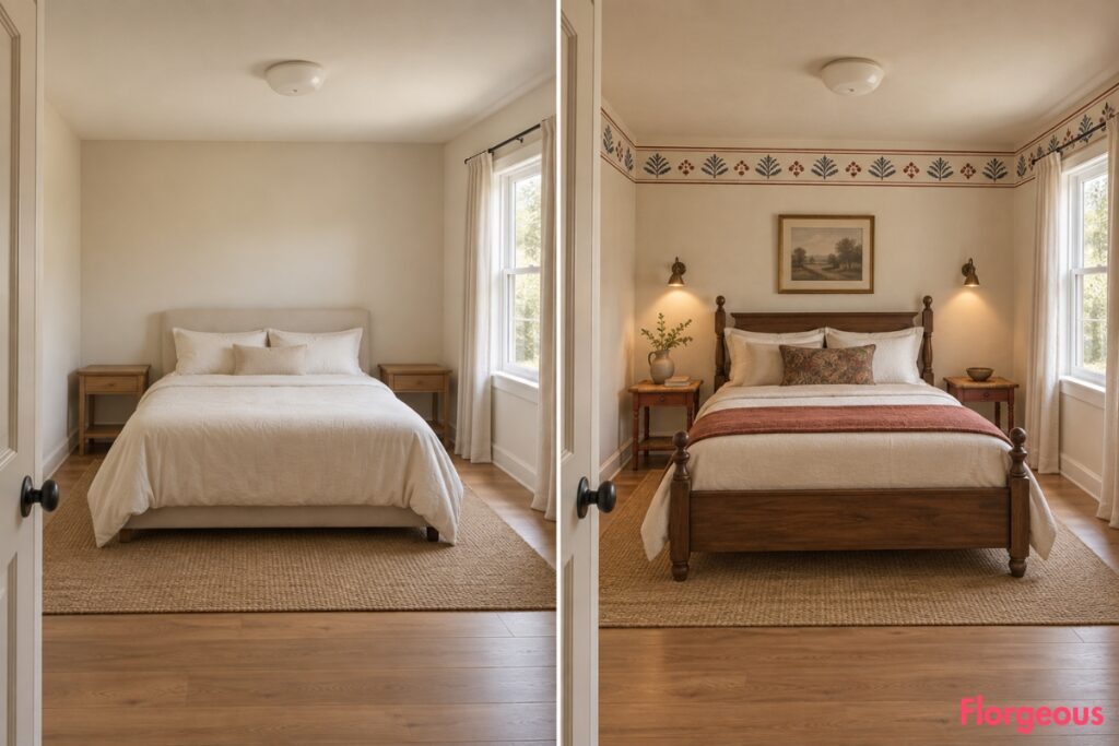
Our starting bedroom is intentionally ordinary: warm off-white walls, a basic centered bed with cream bedding, two bare nightstands, short plain curtains at the right-side window, light timber flooring, a generic ceiling light, and almost no styling.
That makes it a useful blank slate for showing how varied a Colonial Bedroom can become. Instead of repeating dark wood, white linen, four-posters, cane furniture, shutters, or paneling, these thirteen makeovers use overlooked furniture types, hardware, textile techniques, joinery, window details, and practical historic ideas.
The BEFORE stays exactly the same every time. Each AFTER changes its focal point, layout, furniture logic, material emphasis, lighting strategy, and, importantly, its entire color story.
1. Let Blue-Black Door Hardware Set the Tone
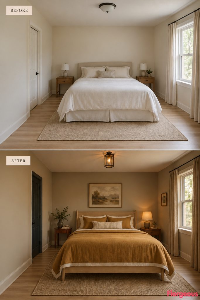
This makeover starts at the entrance instead of the bed.
Before: The same plain bedroom feels neutral, functional, and anonymous.
After: Finish the existing six-panel door in deep blue-black and fit it with visible forged H-L hinges and a simple thumb latch. Paint the walls warm flax, choose a pale maple bed, and bring in rich ochre bedding with a narrow cream edge.
A shallow cherry table stays well clear of the doorway. A compact entry lantern throws amber light across the blackened iron.
Designer Tip: When hardware is the main feature, keep the surrounding trim and furniture quieter.
2. Circle the Room With Indigo and Brick Stenciling
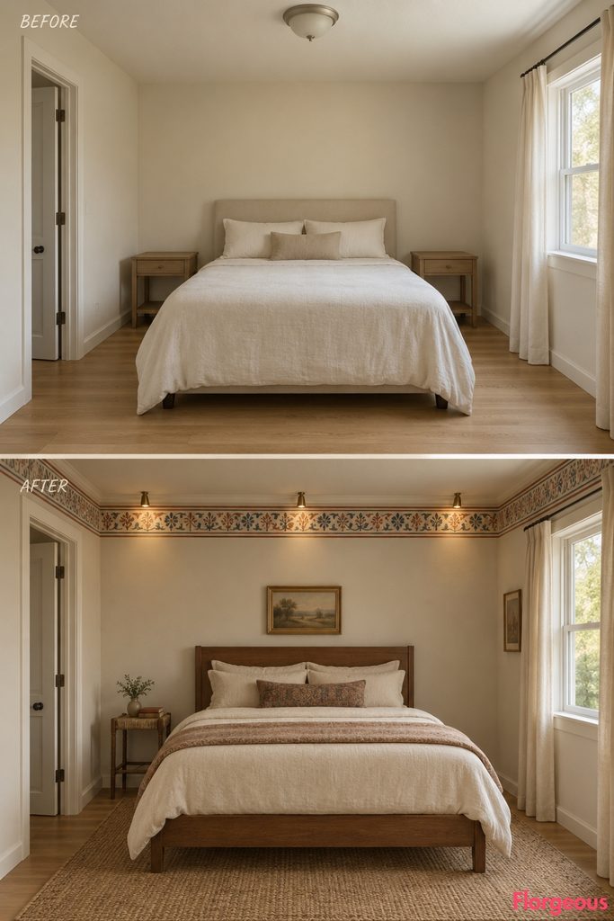
There is no single feature wall here. A narrow painted band ties all four walls together.
Before: The identical bedroom remains undecorated and visually flat.
After: Paint the walls soft bone and add a slim hand-stenciled frieze in faded indigo and earthy brick red. Use a medium walnut bed with dusty ivory bedding, then introduce one narrow rust-red rush-topped stand along the side wall.
Tiny downward wall lights selectively illuminate the stencil, making the blue and brick pigments deepen after sunset.
Budget Version: A reusable stencil gives you the effect without wallpaper or custom molding.
3. Pair Dusty Lilac With a Turned Maple Clothes Tree
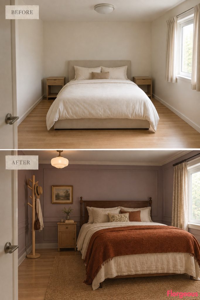
This room introduces useful vertical storage without another wardrobe or dresser bank.
Before: The same bedroom has nowhere convenient for a robe or tomorrow’s clothes.
After: Paint the walls dusty lilac and add a tall freestanding turned-maple clothes tree with staggered pegs. Shift the bed slightly to the opposite side and dress it in warm cream linen with a burnt-orange wool blanket.
A small maple bedside box keeps the furniture palette pale and coherent.
An offset opaline ceiling light creates a gentle shadow behind the turned profile, making the maple silhouette easy to read against the lilac wall.
4. Give the Window a Celadon, Cherry, and Butter-Yellow Rhythm
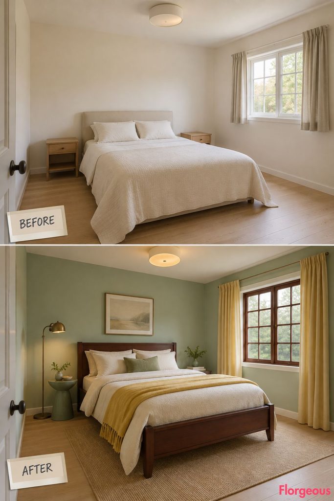
The window becomes the focal point through geometry rather than shutters or heavy drapery.
Before: The plain bedroom has a simple right-side window with short neutral curtains.
After: Add a removable dark-cherry muntin grid that visually divides the same window into twelve panes. Paint the walls celadon green and replace the short curtains with full-length butter-yellow cotton panels pulled clear of the glass.
Use a dark cherry bed with creamy bedding and a small celadon-toned side table.
A slender bronze floor light sits away from the window so nothing interrupts the grid.
5. Put a Cobalt Cannonball Bed Against Cherry-Red Walls
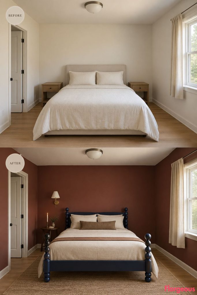
This is the boldest bed-centered makeover in the series, and it avoids the expected tall posts completely.
Before: The same plain room uses a generic rectangular bed.
After: Paint the walls a rich but slightly muted cherry red and introduce a low cannonball bed finished in deep cobalt blue. Keep the rounded finials substantial but low.
Use warm cream bedding with one thin tobacco-colored stripe. A tiny dark-wood candlestand sits on one side, while the opposite bedside remains open except for a small cream wall light.
Color Story: Warm cream is what keeps cobalt and cherry red from competing with each other.
6. Mix Mineral Gray Furniture With Coral Linen
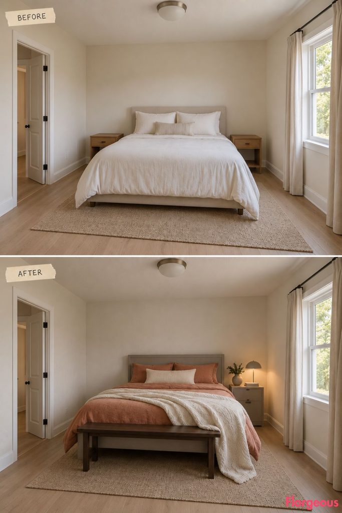
The finish of the furniture, rather than the architecture, provides the tactile interest.
Before: The identical bedroom has smooth generic surfaces and little material contrast.
After: Keep the walls clear ivory and finish a simple pine bed and compact pedestal in mineral-gray sand paint with a visible matte grain. Add coral linen bedding and a soft ivory wool blanket.
A narrow dark timber foot rail prevents the room from feeling overly pastel.
A low side light skims across the textured furniture, making the mineral finish visible through shadow.
Style Note: Sand-painted furniture works best when the forms themselves stay straightforward.
7. Let Pistachio Walls Push a Mahogany Bureau Forward
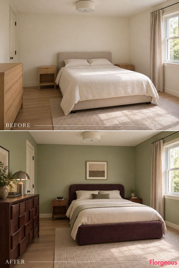
The architecture remains simple. One sculptural case piece gets all the movement.
Before: The plain bedroom has flat walls and generic rectangular furniture.
After: Paint the walls a clear pistachio green and position a dark mahogany block-front bureau opposite the bed. Its projecting and recessed drawer fronts create the visual rhythm.
Use a compact bed upholstered in deep plum, with pale cream bedding to separate it from the green walls.
A small pewter lamp on the bureau pulls the evening focal point away from the bed.
8. Keep the Walls Chalk White and Let Raspberry Meet Moss
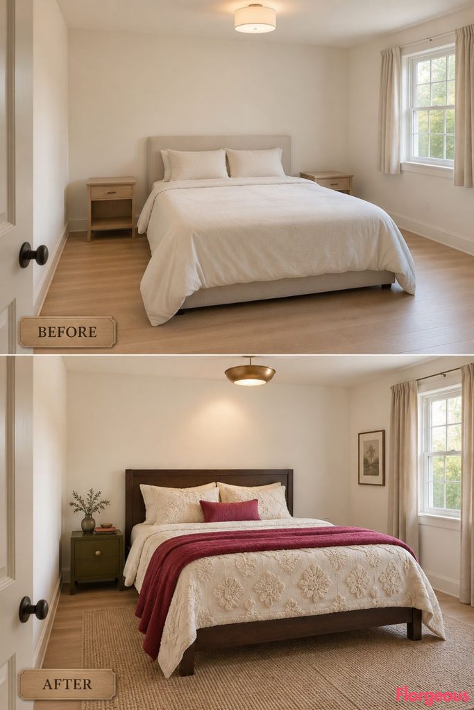
This room gets its pattern from raised texture instead of printed fabric.
Before: The same bedroom has flat cream bedding with almost no tactile detail.
After: Keep the walls crisp chalk white and use a straightforward dark maple bed. Cover it with a thick cream candlewick counterpane with raised tufted motifs.
Fold a saturated raspberry blanket across the lower third of the bed and add one small moss-green bedside box.
A directional ceiling light passes across the counterpane at a shallow angle, creating pattern through shadow.
9. Turn the Shape of a Bed Warming Pan Into a Modern Copper Reflector
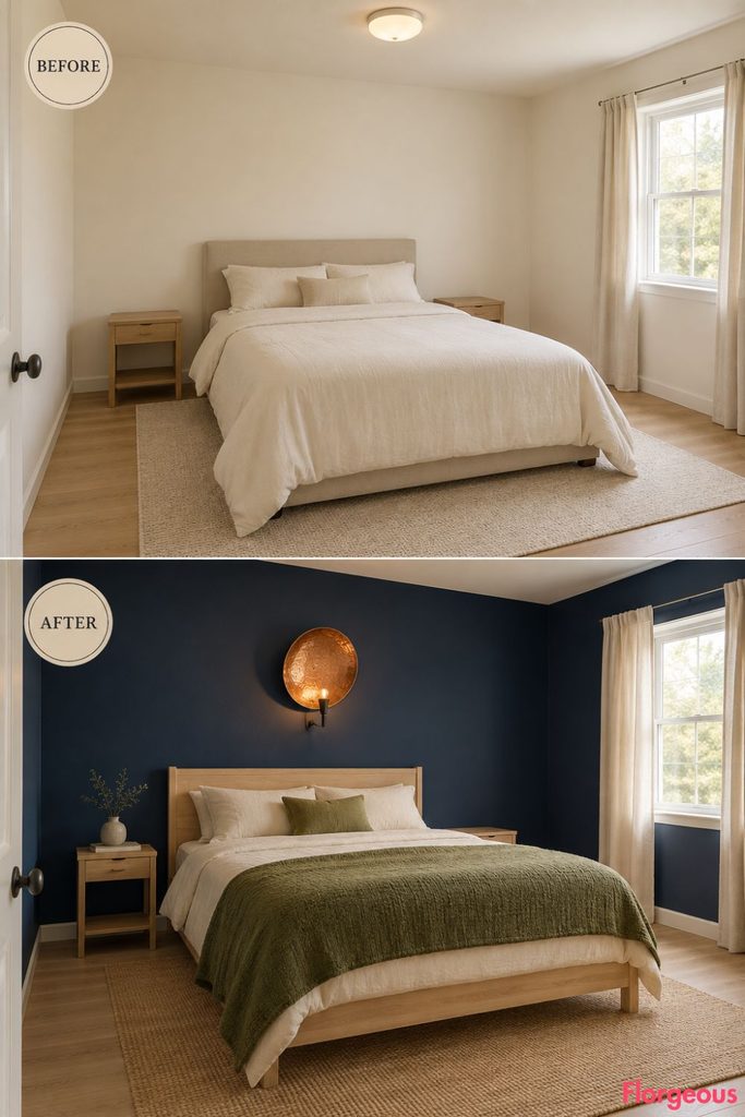
This is the most abstract historical reference of the group. Instead of displaying an antique object, the form becomes part of the lighting design.
Before: The standard plain bedroom stays bright, neutral, and minimally styled.
After: Paint the walls deep ink navy and use a simple pale-wheat timber bed with warm ivory bedding and a moss-green wool blanket. Beside the bed, mount one shallow circular hammered-copper reflector inspired by the broad pan shape of an early bed warmer.
The actual light source stays concealed. Warm light strikes the hammered copper and reflects back toward the bed, creating a subtle amber pool without making the metal appear luminous.
No other decorative metal pieces compete with it.
Why it works: The room references history through reinterpretation rather than literal period decoration.
Common Mistake: Copper should reflect light, not glow like a backlit object.
10. Put Ink Blue Above a Peach Wall With a Glass Transom
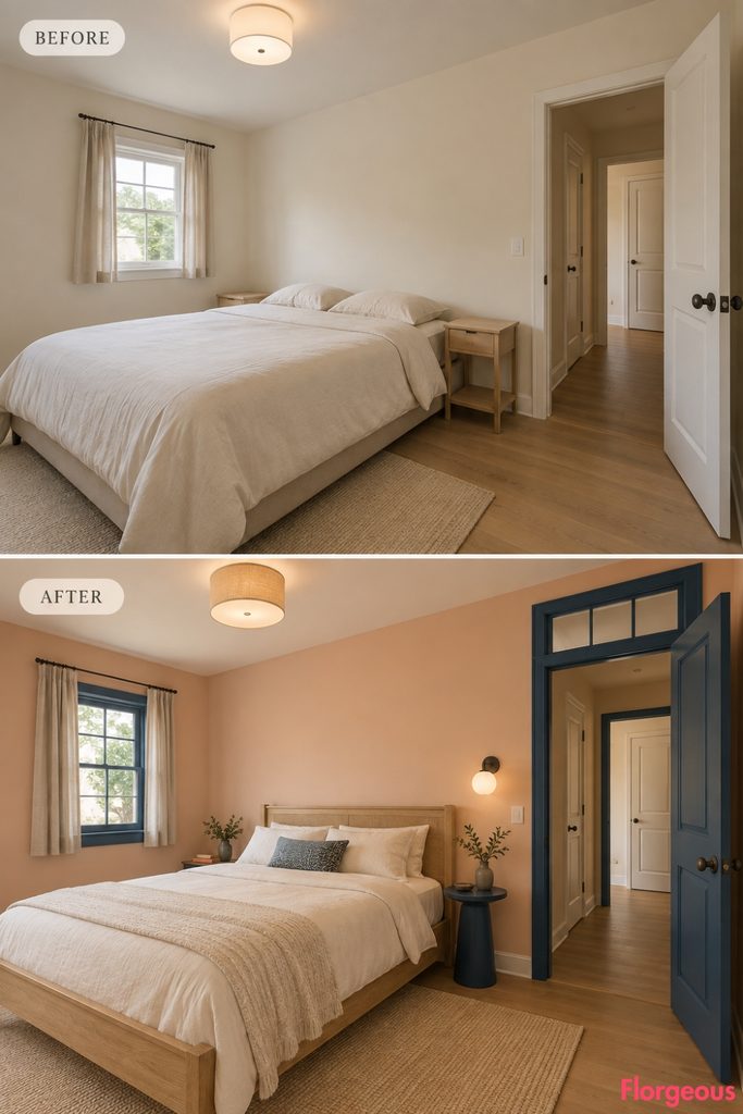
This makeover gets its character from the doorway and a more graphic color contrast.
Before: The same bedroom has a standard doorway with uninterrupted wall above it.
After: Paint the room a soft peach and introduce a shallow clear-glass transom above the existing doorway, divided by ink-blue timber muntins.
Use a pale oak bed with ivory bedding and a compact ink-blue pedestal near the wall.
A frosted light positioned close to the transom produces a quiet evening glow through the upper glass.
11. Make Mustard and Forest Green Work Around One Pembroke Table
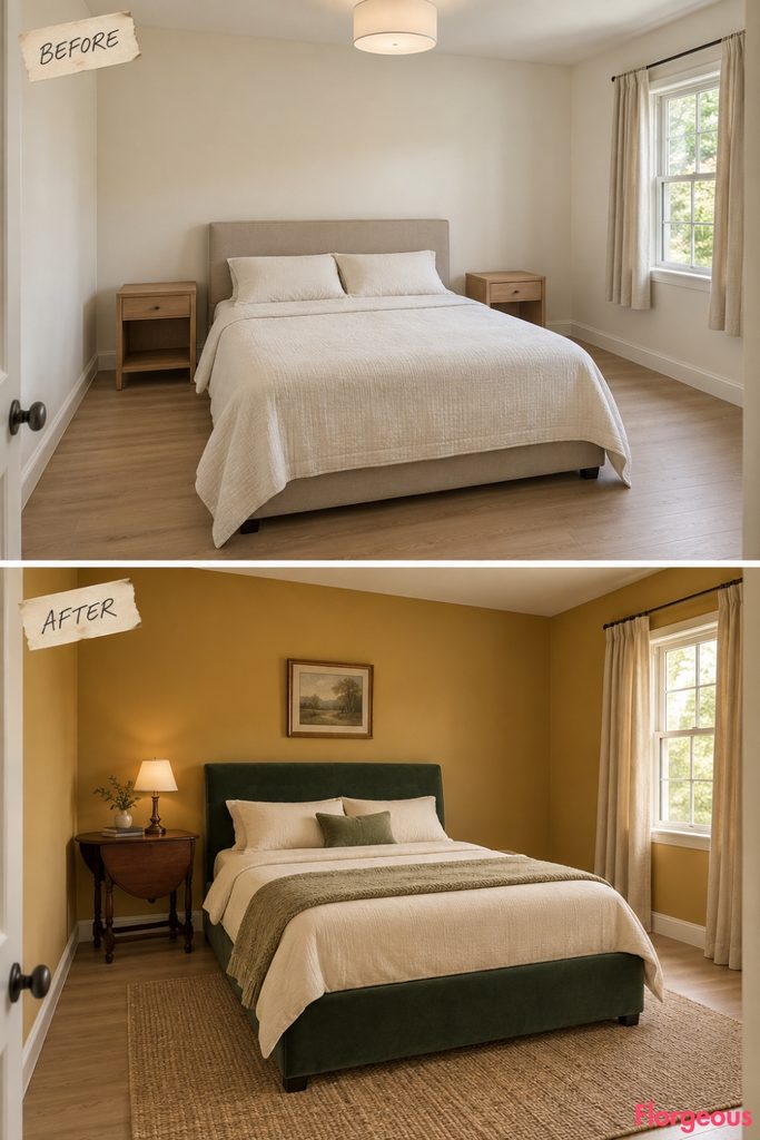
The interest here comes from furniture that physically changes shape.
Before: The standard bedroom has two static bare nightstands.
After: Paint the walls warm mustard and use a deep forest-green bed with muted cream bedding. Remove both nightstands and introduce one mahogany Pembroke table beside the bed.
Leave one hinged leaf open and the other down so its mechanism remains visible. A small cream-shaded lamp stays near the fixed center of the tabletop.
The opposite side remains completely open.
12. Make Dusty Turquoise Glow With Cranberry and Antique Gold
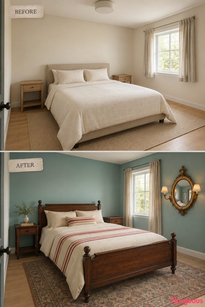
The mirror in this room participates in the lighting rather than acting as a dressing feature.
Before: The identical bedroom has flat lighting and no reflective focal point.
After: Paint the walls dusty turquoise and use a simple dark fruitwood bed with parchment bedding and a cranberry-red stripe.
On the wall opposite the window, place a modest convex girandole-style mirror in an antique-gold frame with two tiny shaded light arms.
The curved glass catches daylight and redistributes warm evening light, while the cranberry accent keeps the turquoise from feeling too cool.
Common Mistake: Leave the wall around a convex mirror mostly empty. It loses impact when surrounded by smaller frames.
13. End With Aubergine, Copper, and Exposed Walnut Joinery
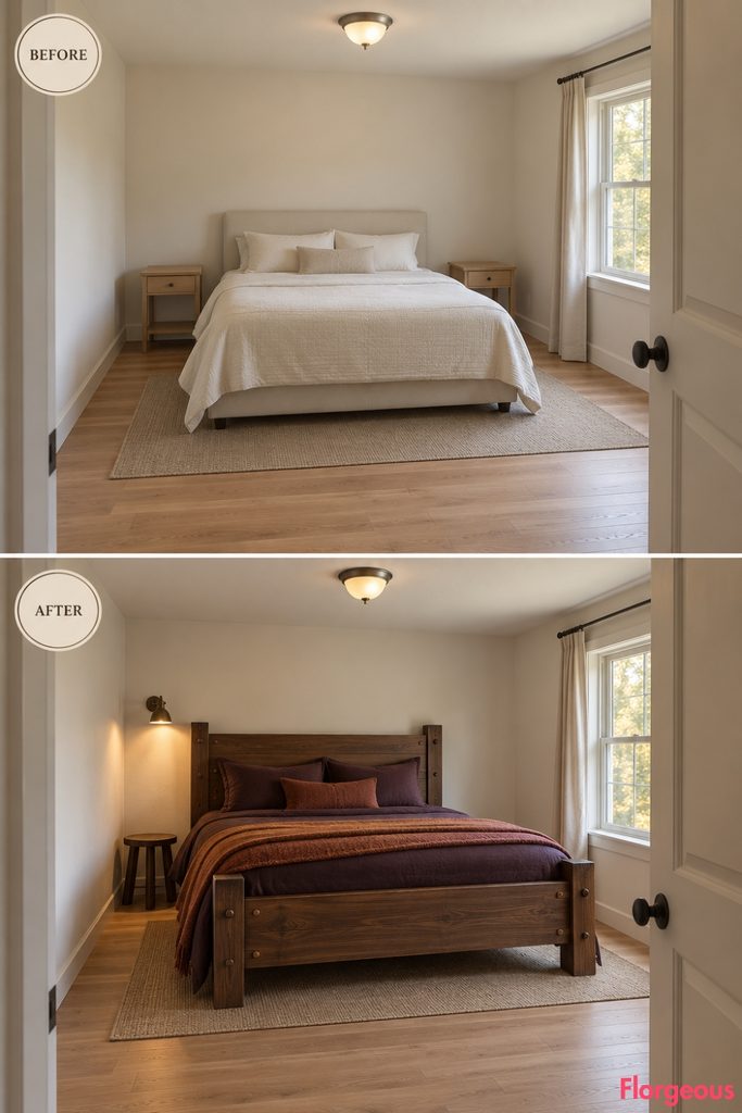
The final room strips the historical reference down to craftsmanship.
Before: The same ordinary bedroom remains unchanged.
After: Keep the walls warm mineral white and replace the generic bed with a dark-walnut knockdown frame assembled with clearly visible dark bed bolts and pegged mortise-and-tenon joints.
Use deep aubergine bedding with a muted copper wool blanket. One small round walnut stool replaces both nightstands.
A localized warm wall light sits slightly above the rail connection so the bolts and pegged joints cast visible shadows.
There is no decorative wall treatment, pattern, or extra storage feature competing with the construction.
How to Keep Colonial Character Fresh
A convincing Colonial Bedroom does not need every recognizable historical cue in one space. These thirteen makeovers work because each room chooses one specific idea and gives it enough visual room to matter.
The same principle applies to color. Colonial-inspired design does not have to stay trapped in beige, brown, cream, and muted green. Cobalt can work with cherry red, dusty turquoise can sit beside cranberry, pistachio can sharpen mahogany, and lilac can make pale maple feel unexpectedly fresh.
Choose your core detail first, then build a deliberate palette around it. Avoid repeating the same timber, bedding, wall tone, and metal finish in every part of the room.
Finally, map the walking route before adding large furniture. Keep the doorway and window clear, check the operating space of trundles and folding tables, and leave empty areas where the composition needs breathing room. That balance is what makes historically informed design feel livable rather than staged.