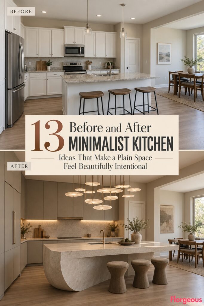
A plain builder-grade kitchen can be perfectly functional and still feel like something is missing. Basic pale cabinetry, neutral counters, visible appliances, bare surfaces, and one ordinary ceiling fixture give you a usable room, but they rarely create a strong visual identity.
The best Minimalist Kitchen designs solve that problem without filling the room with decoration. Instead, they create interest through proportion, negative space, carefully controlled materials, architectural lighting, sculptural forms, hidden storage, and one or two memorable design moves.
Every makeover below begins with the same neutral kitchen. The walls, windows, doorways, ceiling geometry, floor footprint, and overall room proportions stay unchanged. Only the interior design changes. Each AFTER also follows a completely different artistic direction, while the camera viewpoint changes from one section to the next so the whole gallery feels fresh.
1. Turn the Kitchen Into a Warm Oak Gallery With a Suspended Stone Shelf
This first makeover treats the kitchen more like a quiet design gallery than a conventional fitted room.
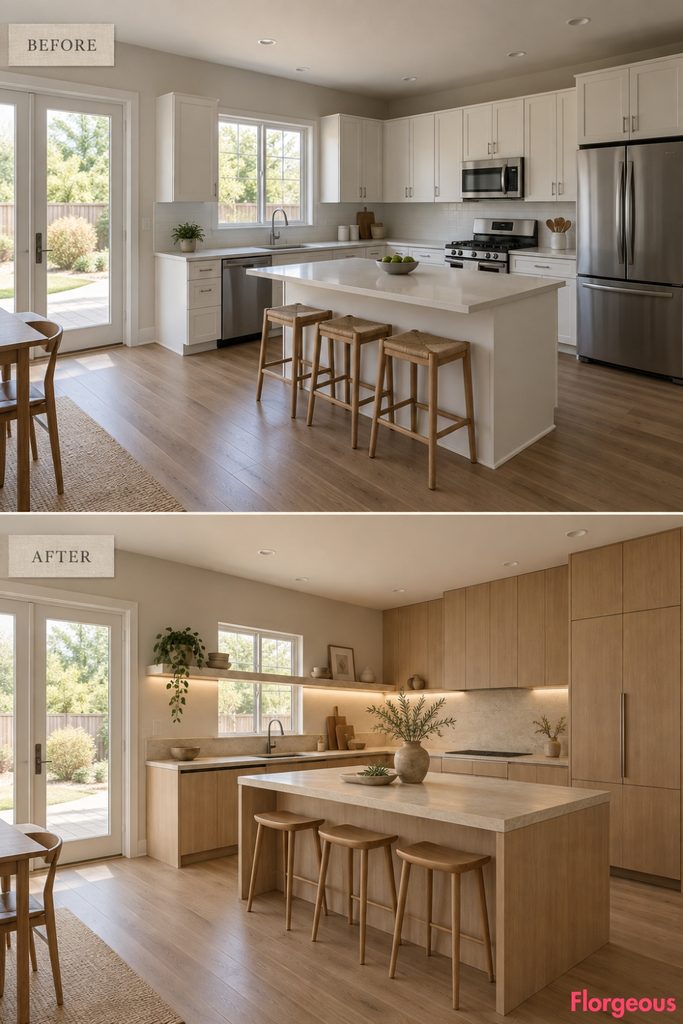
Before: The same builder-grade kitchen has pale basic cabinets, neutral counters, visible everyday appliances, bare surfaces, simple lighting, and no strong focal point.
After: Full-height pale oak cabinetry creates a calm furniture-like backdrop. Instead of standard upper cabinets above the sink wall, one long suspended cream-stone shelf appears to float across the backsplash, supported with nearly invisible metal brackets. A slender rectangular island in matching oak sits parallel to the work zone, while concealed wall washing highlights the timber grain.
The visual drama comes from proportion and negative space, not decoration.
Designer Tip: Leave generous empty wall around one strong shelf or architectural element so it reads as intentional.
2. Create a Japandi Kitchen Around a Handcrafted Shadow Niche
This design uses craft and shadow as its focal point rather than a statement island.
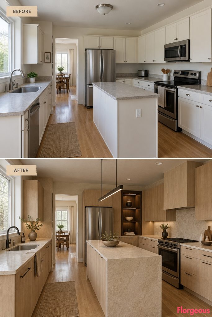
Light ash cabinetry runs quietly around the room, but one section of the back wall contains a recessed-looking dark timber display niche created entirely within the cabinetry depth. The niche holds a few handmade ceramics beneath a slim concealed light.
Warm mineral plaster, honed beige stone, blackened bronze fixtures, and finely detailed timber joints give the room a distinctly handmade quality.
Nothing is symmetrical for the sake of symmetry. The beauty comes from subtle imbalance and craftsmanship.
Style Note: Japandi minimalism feels strongest when details look tactile and handmade instead of perfectly machine-polished.
3. Make the Kitchen Feel Almost Weightless With Nordic Floating Lines
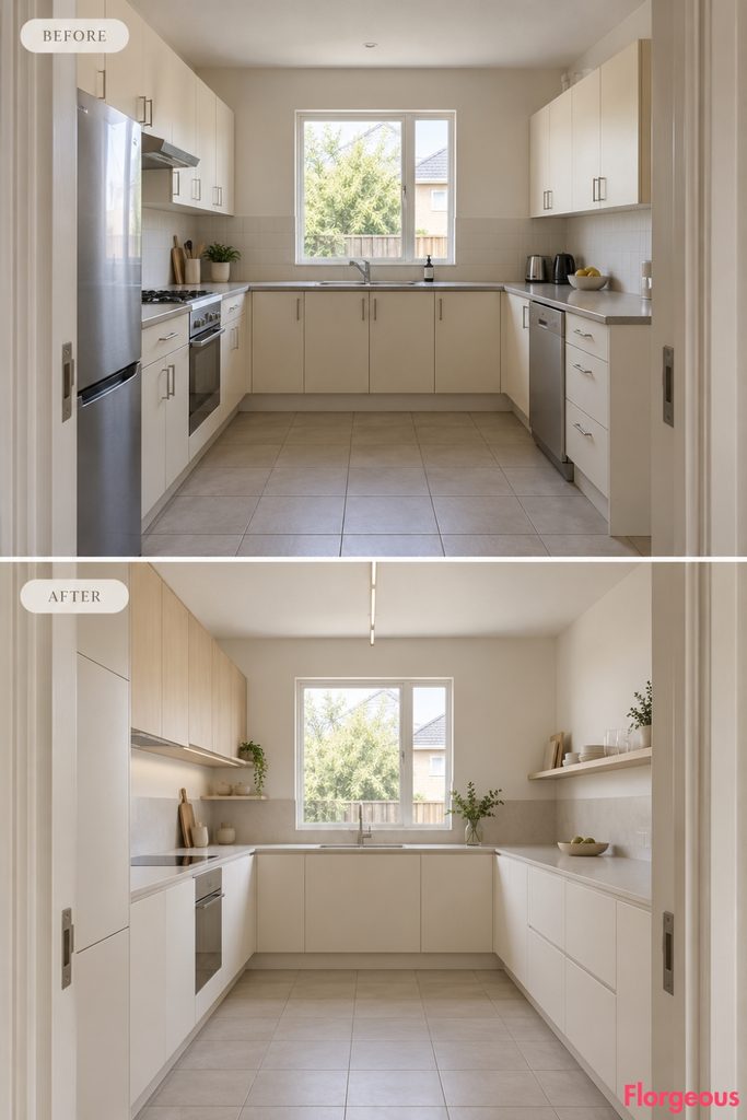
This Scandinavian direction is built around horizontal lines rather than cabinetry mass.
Matte warm-white lower cabinets visually merge with the walls. Upper storage is reduced to one very shallow pale-birch cabinet band and a long open ledge.
A thin light-gray worktop appears almost blade-like, while a slender ceiling-mounted light bar follows the length of the main counter.
The result feels bright and airy without looking empty.
Small Space Tip: Reducing the perceived depth of upper elements can make the room feel substantially wider.
4. Hide the Entire Working Mess Behind Pocket Doors
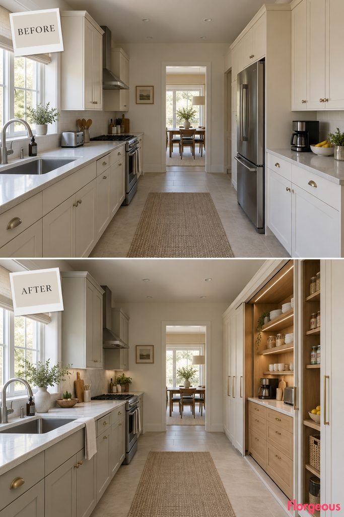
This makeover makes storage choreography the visual idea.
One full-height warm-white utility wall contains a series of large retractable pocket doors. When open, they reveal an oak-lined coffee station, toaster, small appliances, pantry shelves, drawers, outlets, and realistic task lighting.
When closed, the whole wall becomes a calm sequence of nearly uninterrupted panels.
The rest of the kitchen stays extremely simple, with pale stone-gray sink cabinetry and no competing focal point.
Why It Works: Minimalism becomes far more practical when visual clutter can disappear without forcing the homeowner to own fewer useful things.
5. Turn the Kitchen Into a Refined Stainless-Steel Atelier
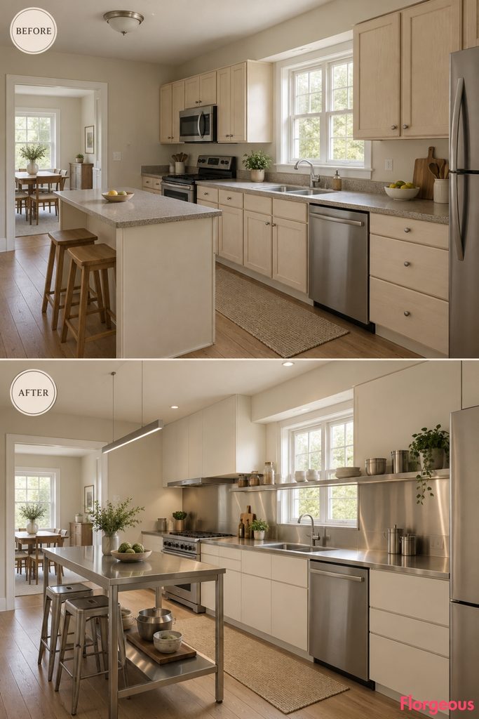
This concept deliberately steps away from warm wood and stone.
Most storage disappears behind matte ivory cabinetry, while the active preparation zone becomes one precise stainless-steel composition. A continuous brushed-metal counter rises into the backsplash and continues into one suspended stainless shelf.
A narrow worktable-style island uses a stainless top over a slim ivory frame.
There are no industrial props, exposed pipes, or factory-style fixtures. The effect is closer to a minimalist culinary atelier.
Common Mistake: Stainless steel already has strong visual presence, so avoid mixing it with several competing metals.
6. Make Translucent Glass the Artistic Feature
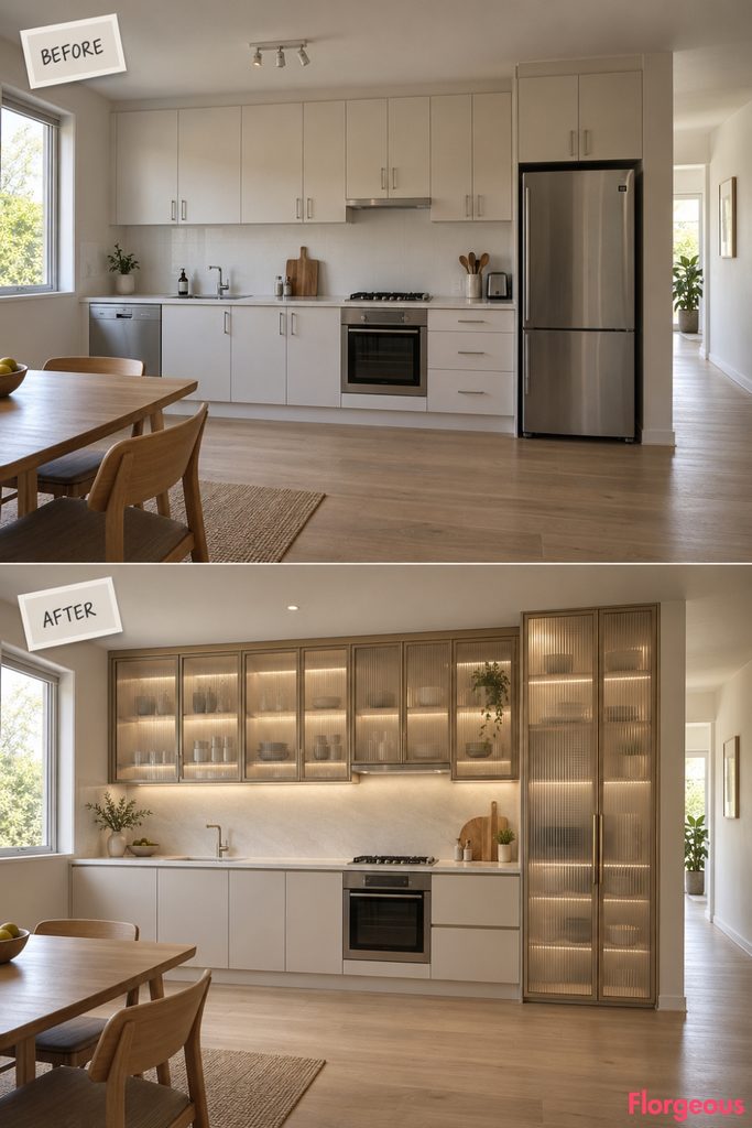
Rather than using transparency everywhere, this concept concentrates it into one luminous-looking but physically believable cabinet composition.
A selected bank of upper and tall cabinets uses ribbed translucent glass framed in slim champagne aluminum. Behind the glass, softly lit shelves create depth and reveal only blurred silhouettes.
The lower cabinets remain matte ivory and completely solid, while seamless pale counters keep the foreground calm.
The room changes through light, reflection, and transparency rather than color.
7. Create a Nocturnal Minimalist Kitchen With Basalt and Smoked Oak
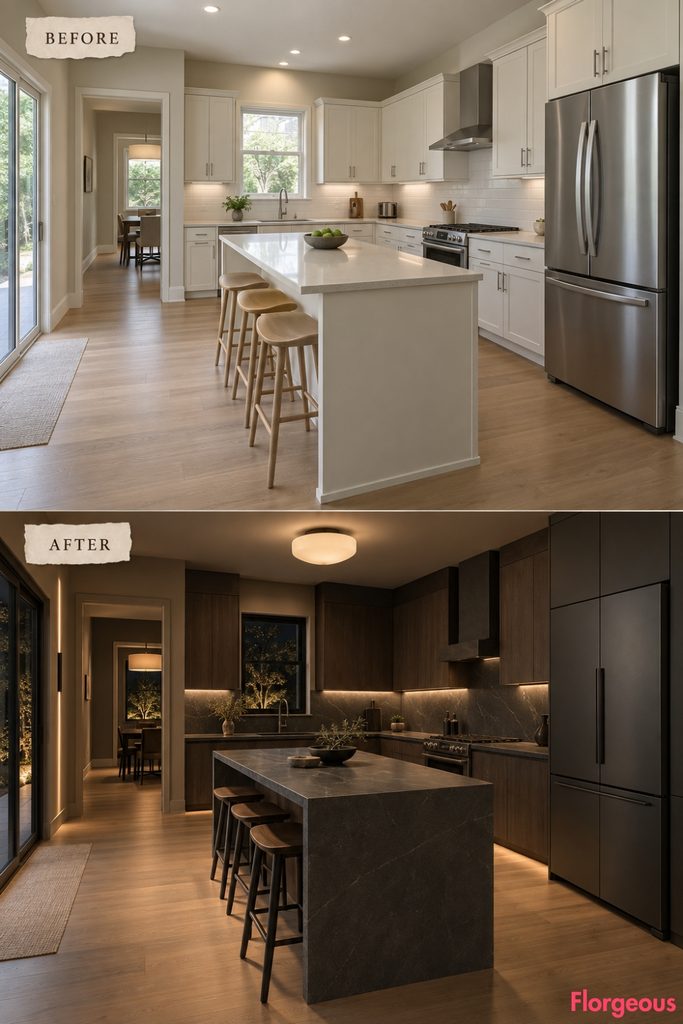
This is the darkest concept in the series, but it avoids simply turning the cabinets black.
Large charcoal basalt slabs create the visual anchor across the backsplash and one compact island face. Smoked-oak cabinetry adds subtle brown warmth, while the remaining tall storage uses muted graphite.
Lighting becomes deliberately low and architectural, with narrow wall grazers revealing the basalt texture and a small opaline ceiling fixture preventing the room from feeling theatrical.
The result feels calm, grounded, and almost cinematic.
Color Story: Natural stone and brown-black timber make a dark palette feel richer than flat black cabinetry alone.
8. Replace Hard Rectangles With a Soft Sculptural Kitchen
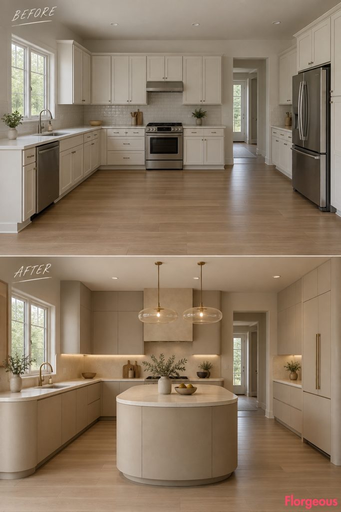
Minimalism can feel artistic without relying on ornament.
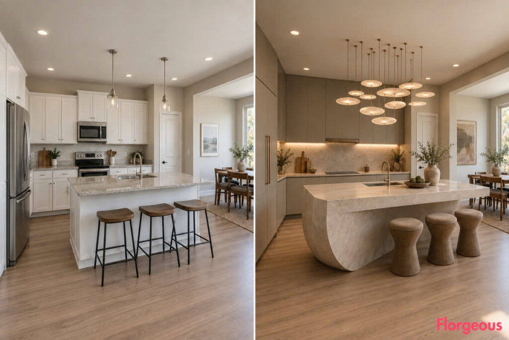
In this AFTER, the perimeter cabinetry remains smooth and understated in warm plaster beige, but every exposed end is gently radiused. The central island becomes a capsule-like form with softly rounded ends and a continuous cream solid-surface top.
Above it, two flattened oval glass pendants repeat the softened geometry.
Even the backsplash transition uses curved corners rather than abrupt edges.
Why It Works: Repeating one controlled curve across several elements creates a strong visual language without adding clutter.
9. Turn the Ceiling Into a Minimalist Light Installation
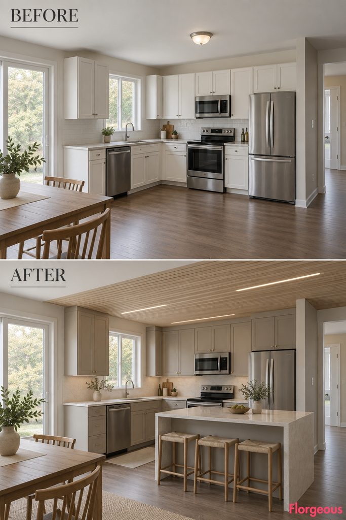
This design deliberately leaves the cabinets quiet and moves the focal point overhead.
Matte greige cabinetry, pale stone counters, and a simple rectangular island form a restrained foundation.
Across the central ceiling area, a shallow pale-oak batten field creates rhythm without changing the ceiling height. Slim recessed lines of illumination sit between selected battens, making the ceiling feel like an integrated installation rather than a decorative fixture.
No pendant is needed.
Designer Tip: A strong ceiling feature works best when the elements below it remain visually simple.
10. Replace the Conventional Island With a Freestanding Design Table
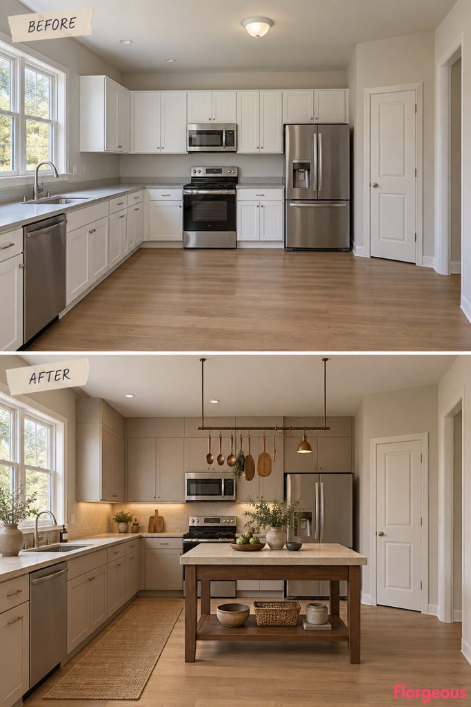
This kitchen feels more like a beautifully furnished room than a built-in workspace.
Muted clay-beige perimeter cabinetry becomes the quiet background. Instead of a fitted island, the center contains a freestanding dark-oak preparation table with tapered legs, a thick pale-stone top, and one low open shelf.
A slim suspended utensil rail and one small ceramic lamp-like task light give the table the feeling of a crafted piece of furniture.
The open space beneath it keeps the room visually light.
Small Space Tip: A freestanding table is especially effective where a solid cabinet island makes circulation feel compressed.
11. Frame the Cooking Zone With a Stone Portal
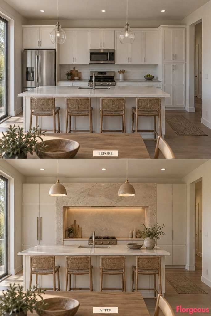
Instead of making the island the star, this makeover creates a strong vertical focal point on the perimeter wall.
Warm-white cabinetry sits quietly around a cooking recess framed with thick-looking slabs of pale veined stone. The material runs up both sides and across the top like a minimalist portal, but it is applied entirely within the existing room and cabinet zone, without altering the wall opening or architecture.
Inside the portal, the backsplash becomes a calm matte mineral surface with discreet integrated lighting.
Why It Works: Framing one functional area can create architectural drama without filling the kitchen with multiple focal points.
12. Create a Seamless Mineral Cocoon With Clay Microcement
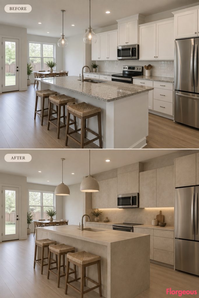
This concept avoids visible joints, wood grain, contrasting hardware, and obvious cabinet detailing.
Soft clay-beige microcement appears across the backsplash, selected cabinet fronts, island exterior, and adjacent wall planes. A matching integrated-look sink and thick counter edge make the working surfaces feel carved from the same mineral material.
Hardware is almost invisible, and one small brushed-nickel faucet is the only crisp metallic accent.
The result feels tactile, monolithic, and almost gallery-like.
Style Note: A mineral-heavy room needs subtle variations in texture so the surfaces feel handmade rather than digitally flat.
13. Finish With an Asymmetric Cantilevered Island and Sculptural Light Composition
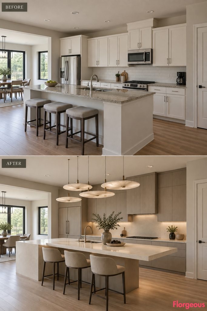
The final makeover is intentionally the most artistic in the series.
The perimeter stays almost silent in soft mineral gray cabinetry and creamy solid-surface counters. In the center, however, the island becomes an asymmetric composition: one end forms a solid rectangular volume while the opposite counter extends outward as a dramatic cantilever supported by a recessed structural base that remains visually hidden.
Above it, several thin opaque glass discs hang at different heights to create one large sculptural lighting composition. The discs reflect and diffuse light realistically rather than appearing self-luminous.
The room still reads as minimalist because there are only two hero gestures, the island and the light.
How to Choose a Minimalist Direction Without Making the Kitchen Feel Generic
These 13 makeovers show that minimalism does not require every kitchen to look alike. A room can feel minimalist through concealed storage, sculptural geometry, carefully framed negative space, translucent materials, handcrafted timber, metal precision, mineral surfaces, architectural lighting, or an intentionally strong focal composition.
Start by choosing the idea that solves the biggest weakness in your existing room. If clutter is the problem, the concealed utility wall may have the most impact. If the kitchen feels visually forgettable, consider a stone portal, sculptural island, artistic ceiling treatment, or translucent-glass composition instead of simply changing cabinet colors.
For a successful Minimalist Kitchen, give the room one primary artistic idea and allow everything around it to become quieter. That hierarchy is what makes a minimalist interior feel designed rather than merely empty.