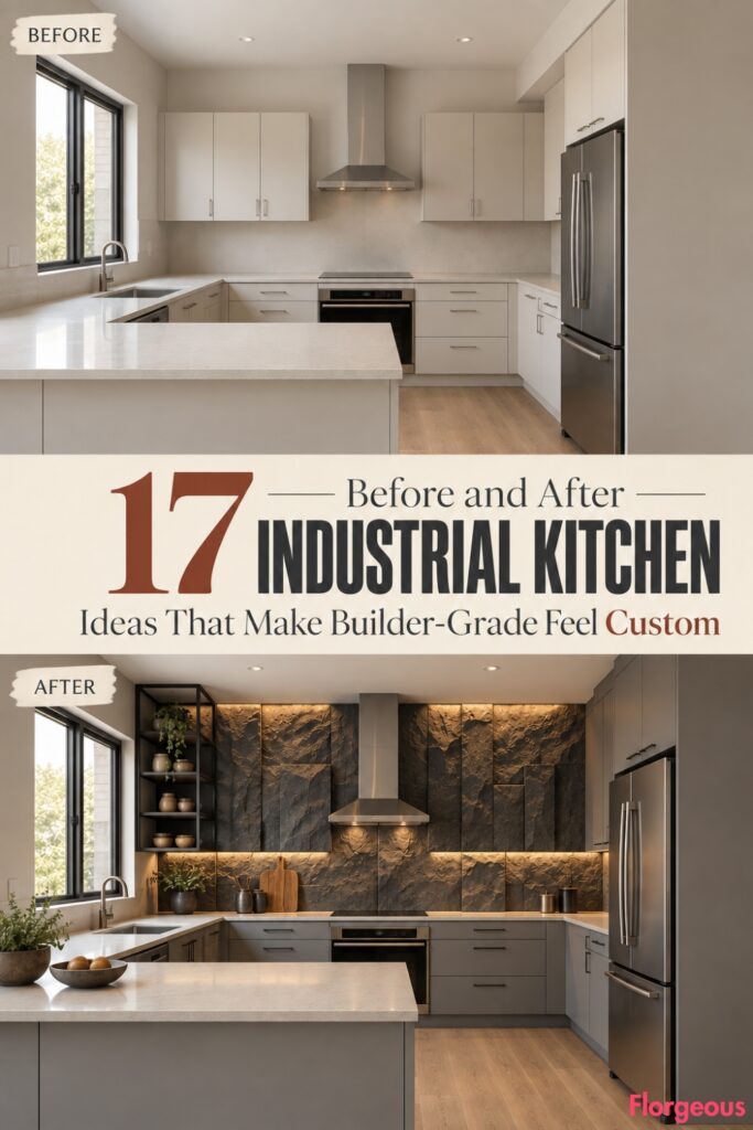
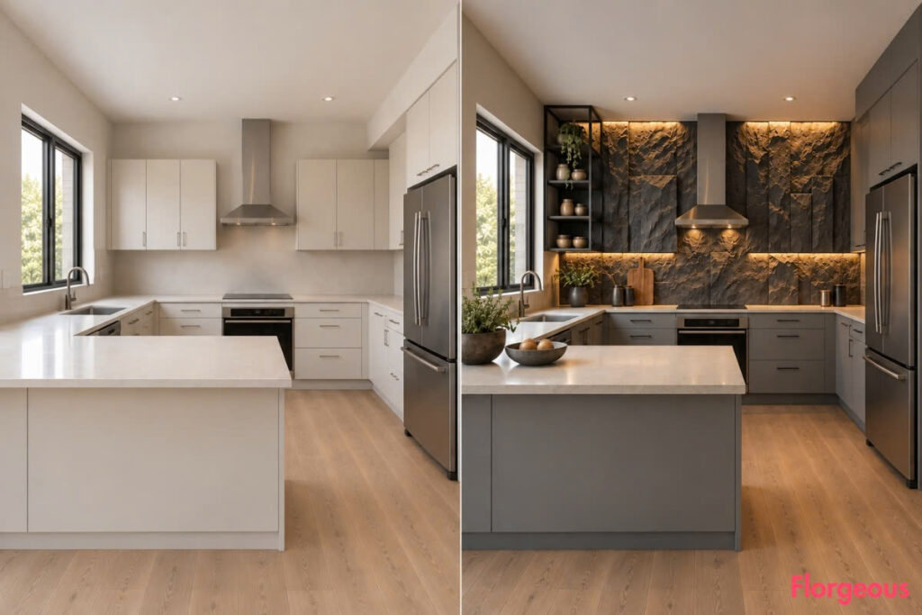
A plain builder-grade kitchen does not need a bigger footprint to become visually memorable. Pale cabinets, neutral counters, ordinary appliances, and basic lighting can act as a blank architectural shell for something much more expressive.
The most interesting Industrial Kitchen ideas go beyond adding black handles or exposing a little brick. They borrow from laboratories, foundries, electrical workshops, ceramic factories, cold-storage rooms, machine halls, and old utility buildings, then translate those references into something believable for a home.
These 17 makeovers begin with the same simple kitchen, but every after image follows a different design language. The goal is not repetition with new colors. Each transformation introduces a separate architectural idea, material rhythm, focal point, and atmosphere.
1. Turn the Utility Wall Into a Salt-Glazed Ceramic Relief
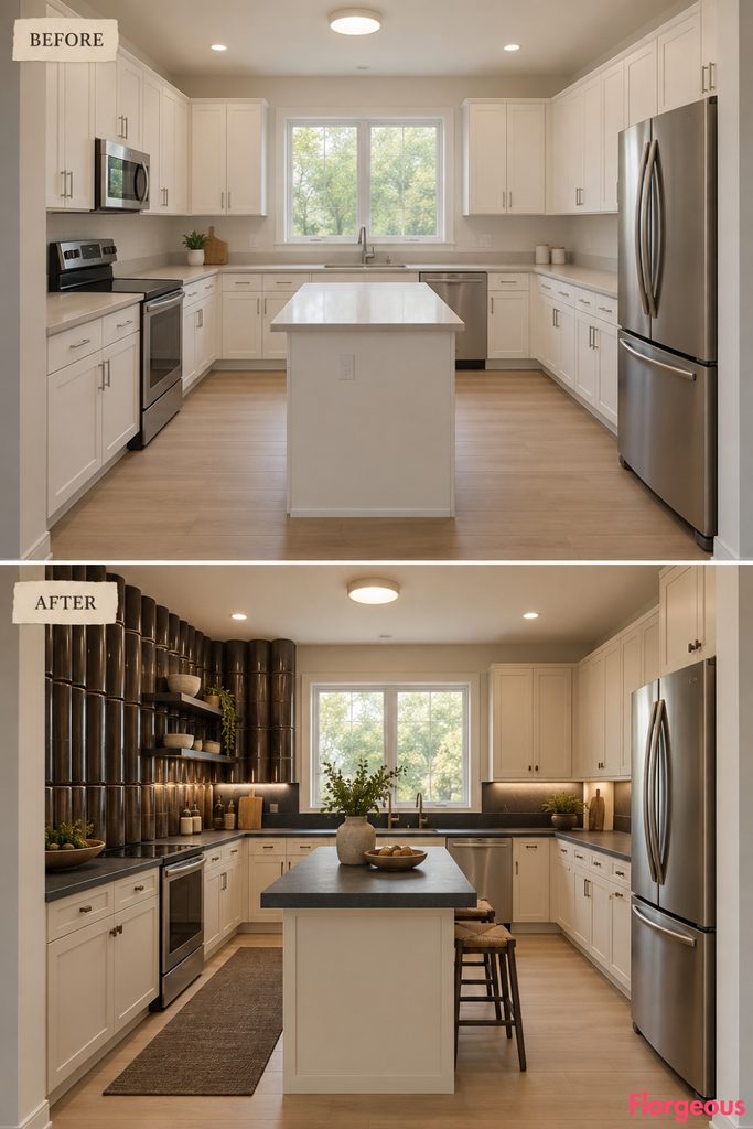
Industrial pipework becomes the inspiration for an unexpectedly sculptural wall.
Before: Pale builder-grade cabinets, neutral counters, standard appliances, plain walls, basic lighting, bare surfaces, and soft natural daylight.
After: Cover one utility wall with half-round salt-glazed ceramic conduit forms arranged in an abstract vertical rhythm. Their brown-black glaze catches light differently across each curved surface. Keep the cabinetry chalky cream with charcoal worktops so the ceramic relief remains dominant.
Why it works: The wall references old industrial drainage and conduit systems without exposing real plumbing.
Try this: Limit the relief to one contained wall instead of surrounding the whole kitchen.
2. Wrap the Sink Zone Like an Old Hygienic Factory Room
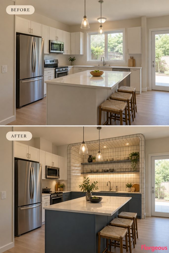
This concept borrows from dairies, food laboratories, and early industrial wash rooms.
Before: The same neutral kitchen has an ordinary backsplash and basic sink area.
After: Wrap the entire sink zone in glossy ivory rectangular tiles, including rounded coved transitions where horizontal and vertical planes meet. Pair the tile envelope with smoky blue-gray cabinetry, dark grout, and a simple wall-mounted metal shelf.
Why it works: The continuous tiled surface makes a functional area feel almost architectural.
Try this: Use specially shaped cove tiles around the counter transition instead of simply ending tile at a sharp corner.
3. Make the Floor Look Like an Old Machine Hall
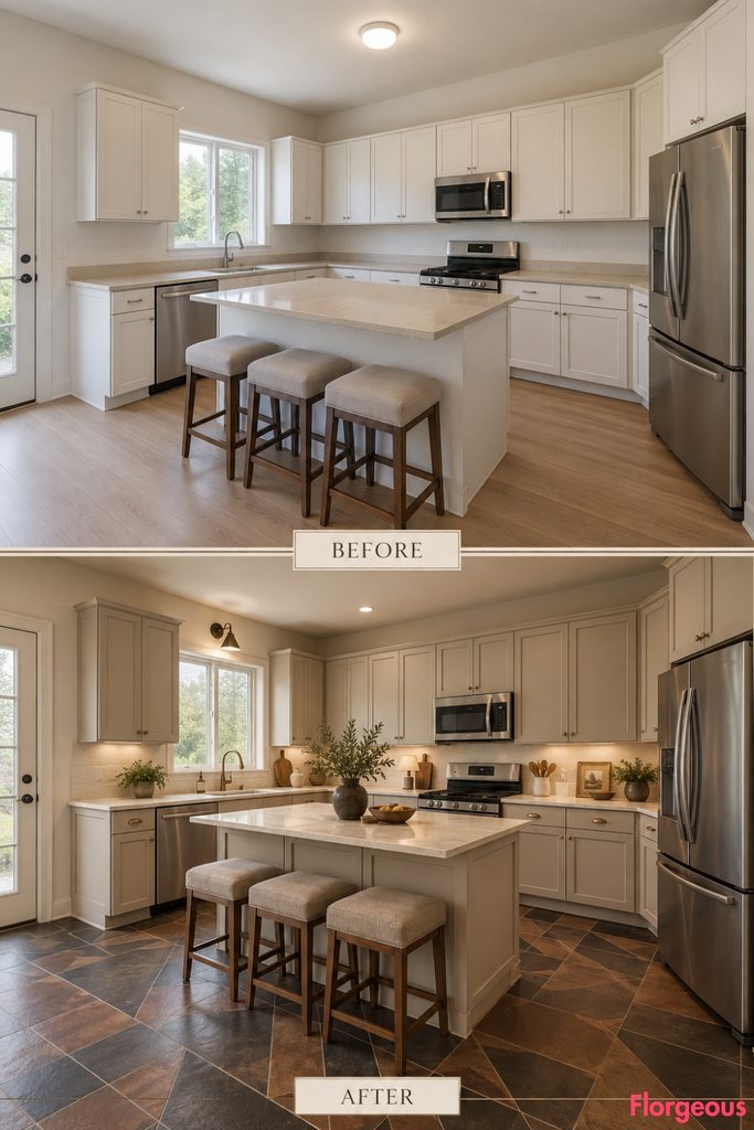
Instead of treating the cabinets as the main event, let the floor establish the industrial character.
Before: Neutral flooring disappears beneath the otherwise generic kitchen.
After: Replace the visual floor finish with dense unglazed quarry tiles in charcoal, umber, and deep brown, arranged in an oversized directional pattern that runs through the kitchen like a factory circulation route. Use pale putty cabinetry and simple cream counters above it.
Why it works: The low visual focus makes the entire room feel grounded and substantial.
Try this: Keep the upper half of the room pale so the dark floor does not become heavy.
Color Story: Warm brown quarry tile looks richer with putty and bone than with stark white.
4. Create a Foundry-Mold Bas-Relief Behind the Work Zone
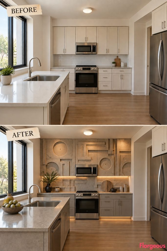
Industrial inspiration can become wall art without adding framed artwork.
Before: The working wall is blank and visually flat.
After: Install large mineral-composite relief panels inspired by antique foundry casting patterns. Use abstract circles, recesses, channels, and raised blocks with no recognizable machinery or text. Pair them with warm gray cabinetry and very simple counters.
Why it works: Light and shadow give the wall depth while the abstract geometry prevents it from becoming themed.
Try this: Use relief on only the wall above the main preparation counter.
5. Turn Surface-Mounted Electrical Services Into Graphic Architecture
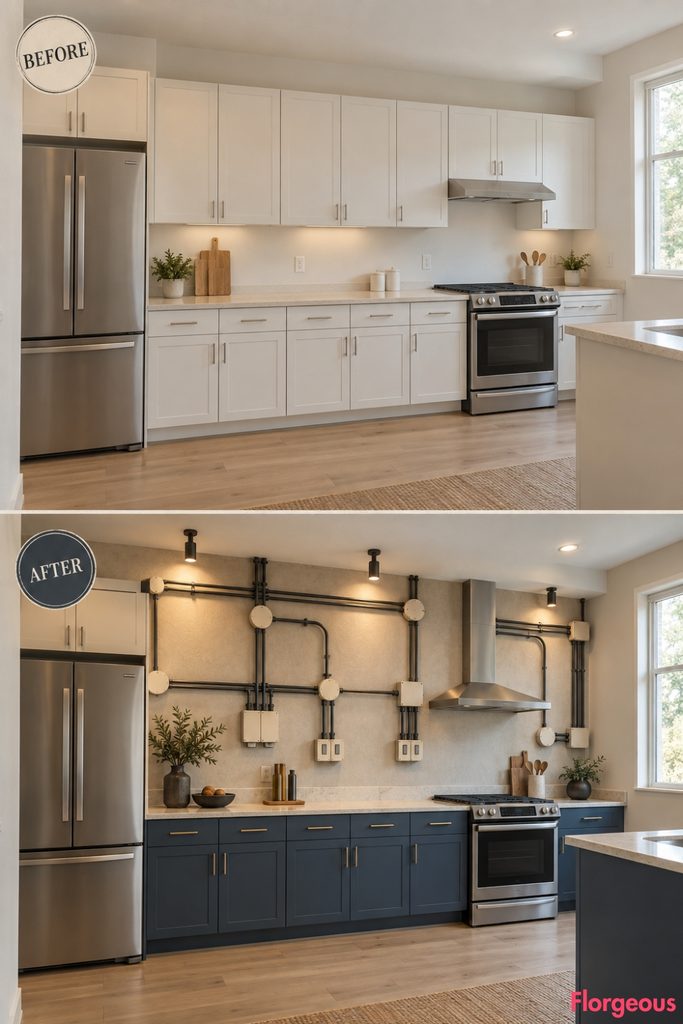
Rather than hiding every technical element, organize them deliberately.
Before: The kitchen walls are plain and all services visually disappear.
After: Create one carefully composed service spine using matte dark conduit, cream porcelain junction forms, ceramic switch plates, and precise right-angle routes above a muted ink-blue cabinet run. Every line should look functional, deliberate, and professionally installed.
Why it works: Repetition and alignment turn ordinary infrastructure into a graphic wall composition.
Try this: Concentrate exposed services on one controlled plane instead of scattering them around the room.
6. Build a Sawtooth Wall From Cleft Slate
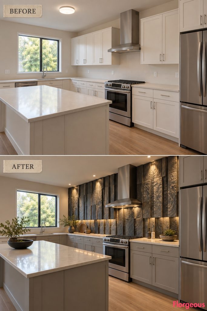
This version takes inspiration from cutting tools and machine teeth rather than familiar warehouse finishes.
Before: A simple cooking wall lacks texture or shadow.
After: Arrange narrow cleft-slate slabs vertically in alternating depths so their edges create a dramatic sawtooth relief around the cooking area. Add fog-gray cabinetry and a quiet pale worktop.
Why it works: The rough edges catch side light, creating a strong architectural rhythm without relying on color.
Try this: Keep the slate away from cabinet doors and high-use corners where sharp textures could be impractical.
Designer Tip: Grazing light should reveal the slate texture, not make the stone appear self-lit.
7. Give the Ceiling a Pressed-Metal Utility Skin
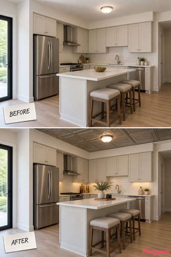
Before: The original flat white ceiling has one basic light fitting.
After: Preserve the exact ceiling height and geometry but finish the central kitchen ceiling plane with shallow pressed-metal panels in a muted pewter tone. Choose an embossed pattern based on simple industrial ribs and squares rather than ornate Victorian florals.
Why it works: The ceiling gains texture while the cabinets can remain extremely simple.
Try this: Use a matte finish so the metal reflects daylight softly instead of becoming shiny.
8. Make Ceramic Heat-Exchanger Fins the Main Texture
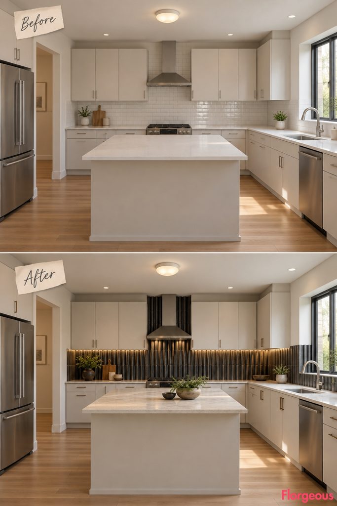
This idea turns the rhythm of industrial machinery into a handcrafted surface.
Before: The room has a conventional flat backsplash.
After: Introduce a field of narrow soot-black refractory ceramic fins running vertically behind the main preparation area. Their deep spacing creates alternating bands of shadow. Pair them with pale ash cabinetry and a light mineral counter.
Why it works: The surface feels mechanical from a distance but tactile and handmade up close.
Try this: Leave the fins unglazed or softly satin rather than glossy.
9. Put the Cabinetry on Cast-Iron Machine Bases
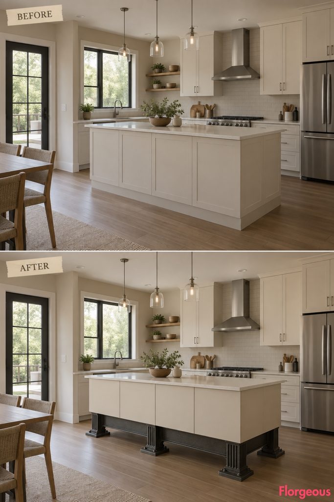
Instead of changing the cabinet fronts dramatically, change the way they meet the floor.
Before: Standard base cabinets sit directly on ordinary plinths.
After: Raise selected base-cabinet runs onto sculptural dark cast-iron supports with broad feet and deep vertical ribs, inspired by old machining equipment. Keep the cabinet fronts warm ivory and the worktop pale so the heavy bases remain visible.
Why it works: The kitchen suddenly looks engineered rather than conventionally fitted.
Try this: Use the machine-base treatment only on one important cabinet run.
10. Carve the Sink and Drainboard From One Granite Block
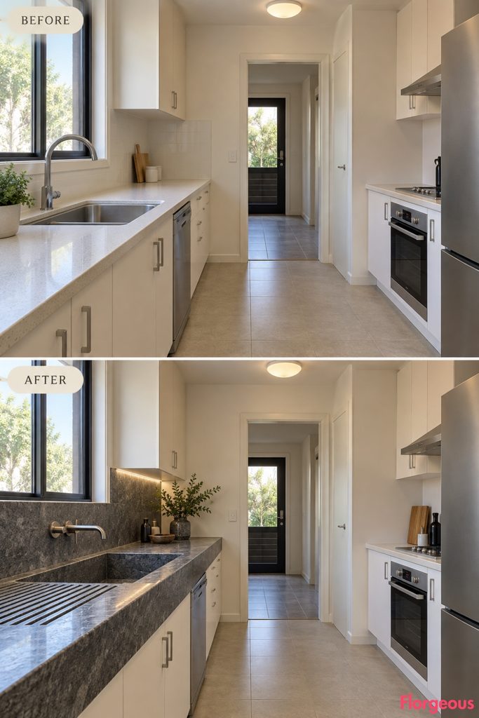
The sink becomes the architectural centerpiece rather than an appliance inserted into a counter.
Before: The standard sink sits conventionally within a neutral worktop.
After: Create one long dark-gray granite bench containing a deeply carved trough sink and integrated ribbed drainboard. Keep the granite thick and slightly honed, paired with quiet chalk cabinetry and an understated wall-mounted faucet.
Why it works: The massive stone form brings the weight of an industrial wash station into a refined kitchen.
Try this: A fabricated stone surround can create the same visual idea without requiring one literal solid block.
Common Mistake: Keep the trough proportional. An oversized commercial sink can dominate a normal residential kitchen.
11. Use Counterweighted Hatch Doors Instead of Normal Uppers

This makeover makes movement part of the design.
Before: Conventional hinged upper cabinets line the wall.
After: Replace the visual language of selected upper doors with large flat panels that rise vertically on precise external cables and compact counterweights, similar to industrial service hatches. Keep the mechanisms exposed but orderly, with soft mushroom cabinets below.
Why it works: The moving panels give the kitchen a mechanical identity without filling it with decorative factory objects.
Try this: Use the system on two or three upper doors rather than every cabinet.
12. Borrow the Hardware Language of a Cold-Storage Room
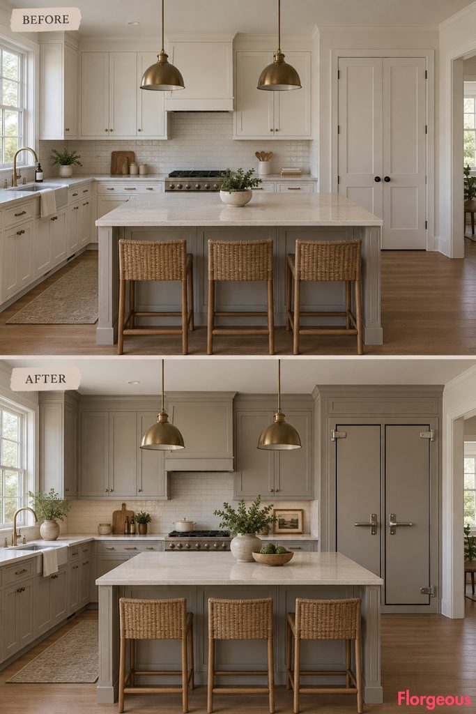
This concept is clean, almost minimal, but still unmistakably utilitarian.
Before: The pantry doors disappear into ordinary pale cabinetry.
After: Create two substantial pale insulated-looking pantry doors with thick slab faces, dark gasket lines, rounded metal corner guards, and oversized lever latches. Surround them with smooth warm-gray cabinetry and pale counters.
Why it works: A few exaggerated functional details create an industrial character without making the whole kitchen dark.
Try this: Use one cold-room-inspired pantry door as the focal point in a smaller kitchen.
13. Create a Ceramic Kiln-Shelf Work Zone
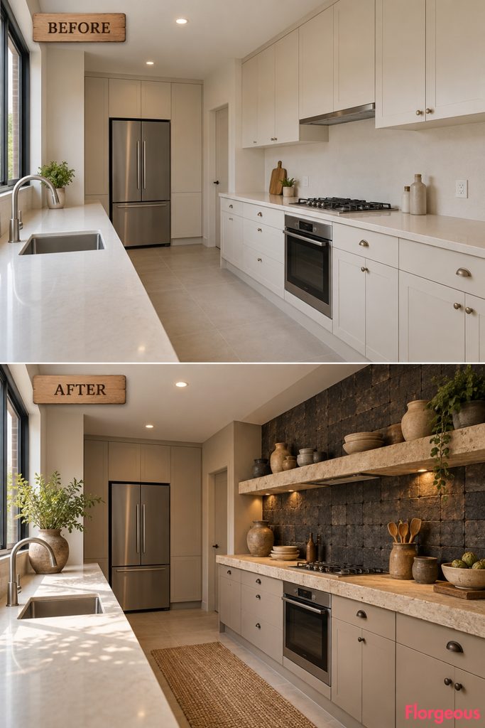
This makeover looks more like a working ceramics studio than a warehouse.
Before: The preparation wall is simple and characterless.
After: Install thick buff-colored refractory ceramic shelves on compact dark brackets, combined with charcoal grogged-clay splash tiles and soft clay-beige cabinetry. Add only a few handmade vessels so the materials remain the focal point.
Why it works: Refractory surfaces have the weight and utility of industrial materials but feel warmer than metal.
Try this: Use two substantial shelves instead of many thin open shelves.
14. Turn Loading-Bay Markings Into an Abstract Room Composition
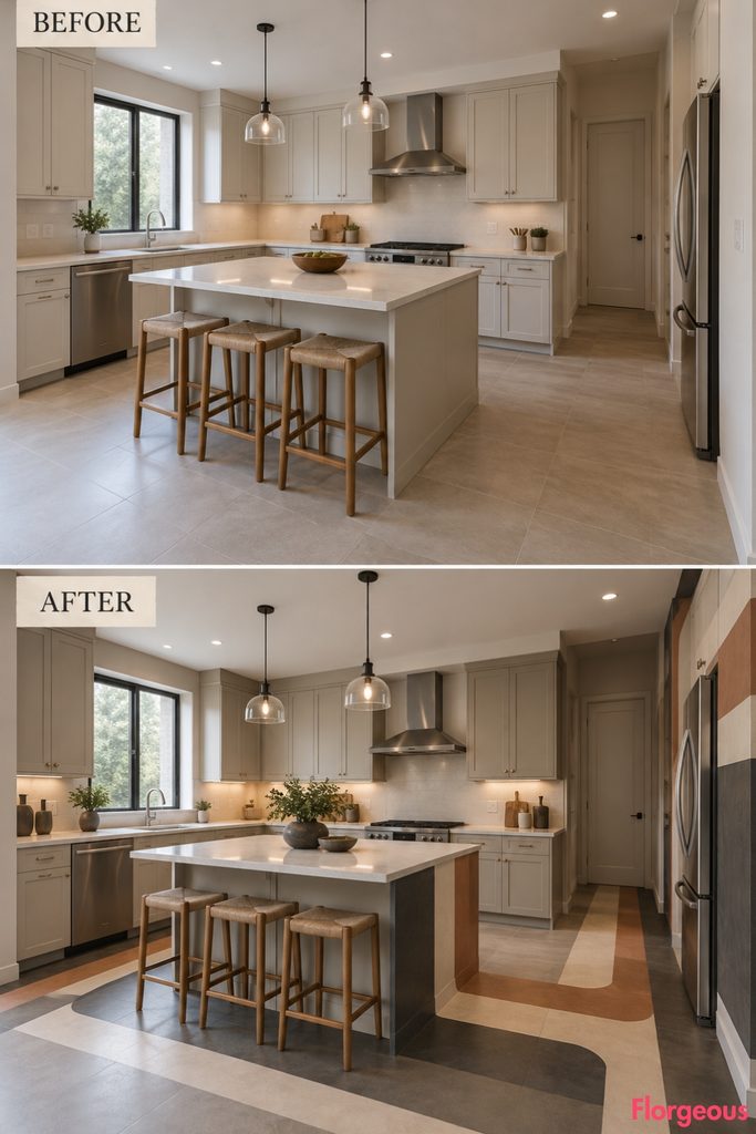
Graphic industrial markings can become art when stripped of text and warning symbols.
Before: Floors, lower walls, and cabinet ends are visually disconnected.
After: Introduce broad matte mineral-painted bands that travel across a short section of floor, turn upward onto one cabinet end, and continue onto a low wall plane. Use charcoal, dirty cream, and muted clay rather than bright safety yellow.
Why it works: The graphic path visually connects separate planes and gives movement to an otherwise static room.
Try this: Keep the geometry oversized and simple.
Small Space Tip: One strong diagonal can create more energy than covering several surfaces with small patterns.
15. Make the Worktop Look Like a Vintage Laboratory Bench
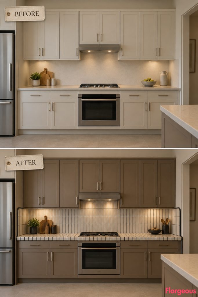
Small-format tile can become surprisingly architectural when it wraps the entire work surface.
Before: The counter and backsplash are separate generic finishes.
After: Wrap one long preparation counter, its exposed vertical edge, and the backsplash in matte rectangular porcelain tiles with deep graphite grout and rounded dark corner trims. Pair the tiled bench with muted tobacco-colored cabinets.
Why it works: The continuous tiled surface feels hard-working, graphic, and deliberately old-school.
Try this: Choose matte porcelain rather than glossy subway tile so the result feels more technical than café-inspired.
16. Replace Flat Tall Doors With Ventilation Louvers
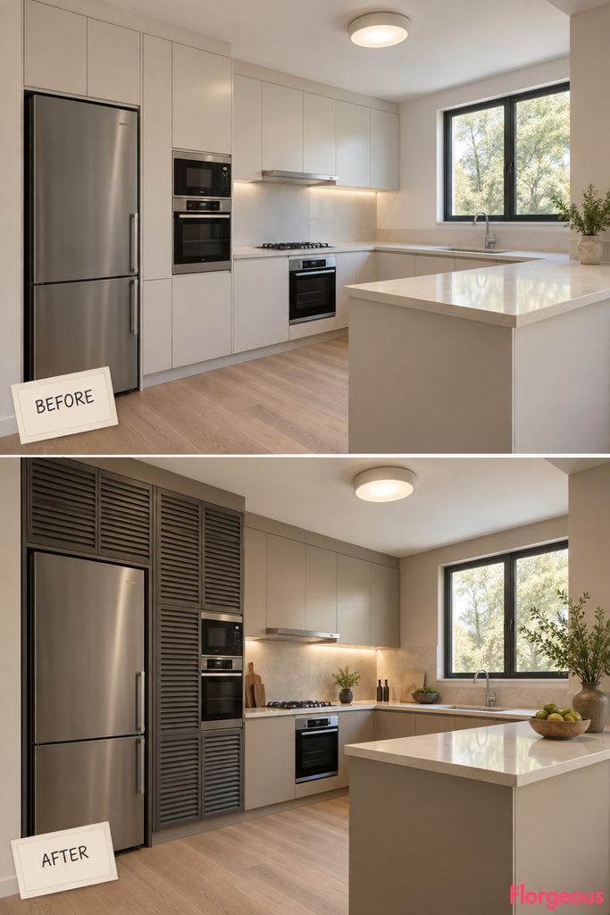
This design takes a familiar industrial component and turns it into cabinetry architecture.
Before: The tall cabinet fronts are smooth and visually heavy.
After: Give selected tall doors deep horizontal ventilation louvers with carefully angled blades, finished in dusty graphite. Place them beside flat warm-bone cabinetry and a pale work surface so the repeating shadows remain the focus.
Why it works: The louver depth makes the cabinet wall change throughout the day as light moves across it.
Try this: Keep the louvers confined to the tall cabinet zone so cleaning remains manageable.
17. Finish With a Diamond-Plate Utility Wall
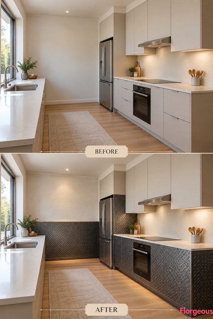
The final design uses a familiar industrial surface in an unexpectedly controlled way.
Before: One side wall is blank, while the cabinetry remains basic and pale.
After: Wrap the lower portion of the utility wall and the adjacent cabinet end in matte dark checker plate with a fine raised lozenge texture. Stop it at one clean horizontal datum, then use chalky plaster above and warm stone-colored cabinetry beside it.
Why it works: The repetitive embossed surface catches tiny highlights without requiring a bold color or decorative pattern.
Try this: Choose a fine-scale plate pattern instead of oversized tread texture.
How to Choose an Industrial Direction Without Making the Kitchen Feel Themed
A strong Industrial Kitchen does not need every familiar industrial material at once. In fact, these concepts work because each room has one clear idea: a quarry-tile floor, a carved trough sink, a ceramic machine-like wall, counterweighted cabinetry, unusual utility hardware, or a precisely organized technical surface.
Start by deciding which architectural plane you want to emphasize. A dramatic floor works well when the cabinetry is already simple. A relief wall can turn a plain kitchen into something far more artistic without changing the layout. If you want a subtler result, focus on cabinet mechanisms, unusual pantry hardware, or the way cabinetry meets the floor.
Material samples matter more here than perfect color matching. Slate should have real edge variation, quarry tile should look dense and matte, ceramic fins should cast genuine shadows, and industrial metal should reflect its surroundings rather than glow.
Most importantly, preserve practical circulation and working clearances. The most compelling makeover is one where the industrial idea feels as though it genuinely belongs to the architecture, rather than something added simply to make the room look different.