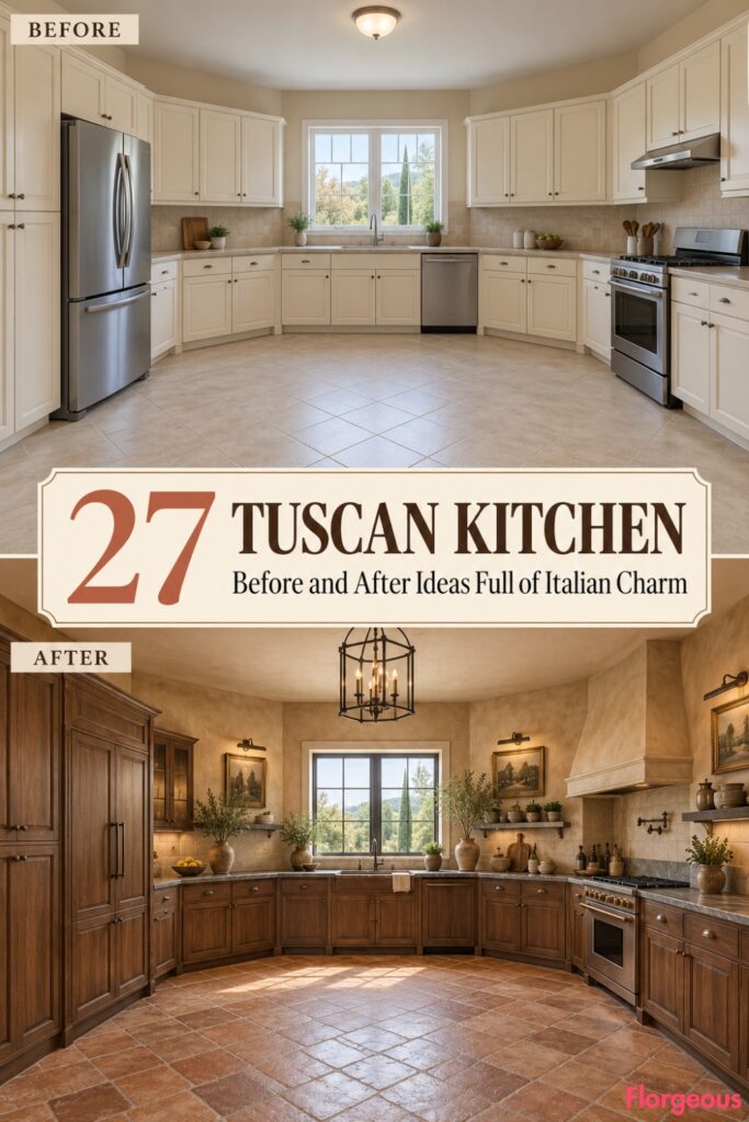
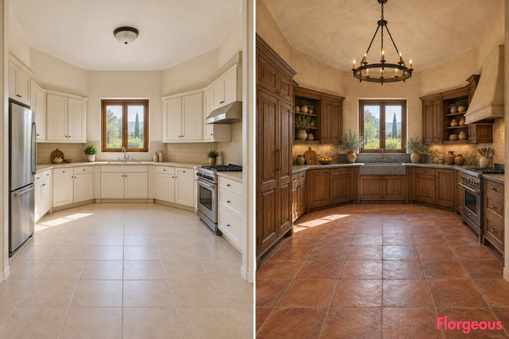
Some kitchens are perfectly functional but have almost no personality. Plain cupboards, inexpensive countertops, generic flooring, and basic ceiling lights can make even an interesting room feel ordinary.
Now imagine 27 completely different kitchens, each with its own architectural character, transformed through the beauty of Tuscany. One begins inside a tapering country-house room, another beneath an old masonry vault, while others occupy a former hayloft, a polygonal corner room, an unusually narrow passage kitchen, or a space shaped around original stone piers.
The appeal of a Tuscan Kitchen goes far beyond terracotta floors and rustic wooden tables. Beautiful Italian-country interiors can draw from regional stonework, traditional woodworking, pottery, mineral pigments, artisanal furniture, and intelligent adaptations of old buildings.
These conceptual before-and-after designs explore 27 different rooms, rather than repeatedly redesigning one rectangular or five-sided kitchen. Each BEFORE remains simple and builder-grade, while its corresponding AFTER preserves exactly the same walls, windows, doors, ceiling, floor footprint, camera position, and working services.
The architecture changes between ideas. Within each pair, it never changes. That distinction creates a gallery of genuinely different transformations without sacrificing architectural realism.
1. Turn a Tapered Farmhouse Kitchen Into an Impruneta Terracotta Gallery
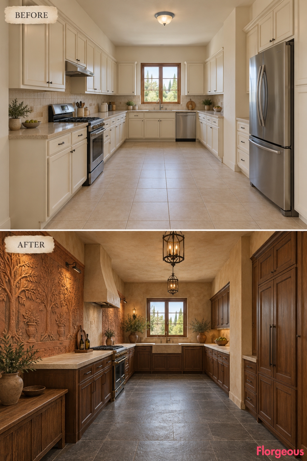
A long trapezoidal room offers an unexpected opportunity for an artistic kitchen, particularly when its walls gradually narrow toward the rear.
Before: Basic cream cabinets follow the tapered walls, with beige counters, pale tile flooring, and an ordinary window at the narrow end.
After: The longer left wall becomes a spectacular display of hand-finished Impruneta-inspired terracotta relief, while dark chestnut preparation cupboards and a staggered limestone counter follow its geometry. A separate low storage bench anchors the wider front portion, leaving the center open.
Why it works: The sculptural clay wall emphasizes the room’s unusual proportions instead of disguising them.
Try this: Use dimensional terracotta on one dry wall and keep the remaining cabinetry restrained.
Designer Tip: Reserve deeply textured clay for places away from direct splashing. Choose an appropriate protective treatment and plan how each module will be cleaned.
2. Give a Polygonal Bay Kitchen the Artistry of Florentine Scagliola
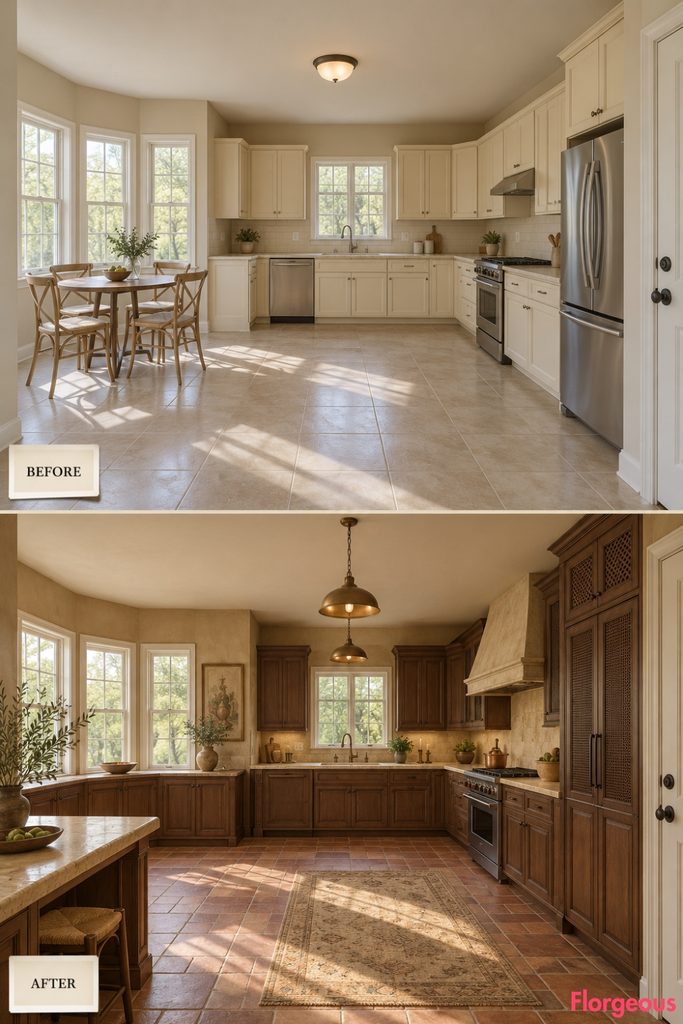
This room features a five-sided window bay projecting from one corner, giving the kitchen a beautiful architectural feature before any decoration is introduced.
Before: Plain cabinetry runs around the square main room, while the projecting bay feels disconnected from the working kitchen.
After: A low walnut serving cabinet follows the bay’s geometry, topped with pale stone and backed by a carefully framed scagliola-inspired decorative panel. The main kitchen receives plum-brown cabinetry, light limestone counters, and muted cotto flooring.
Why it works: The makeover gives the unusual bay a clear purpose and visual identity.
Try this: Use custom low cabinetry to follow an existing bay without blocking its windows.
3. Give a Barrel-Vaulted Kitchen the Character of a Chianti Vintner’s Workshop
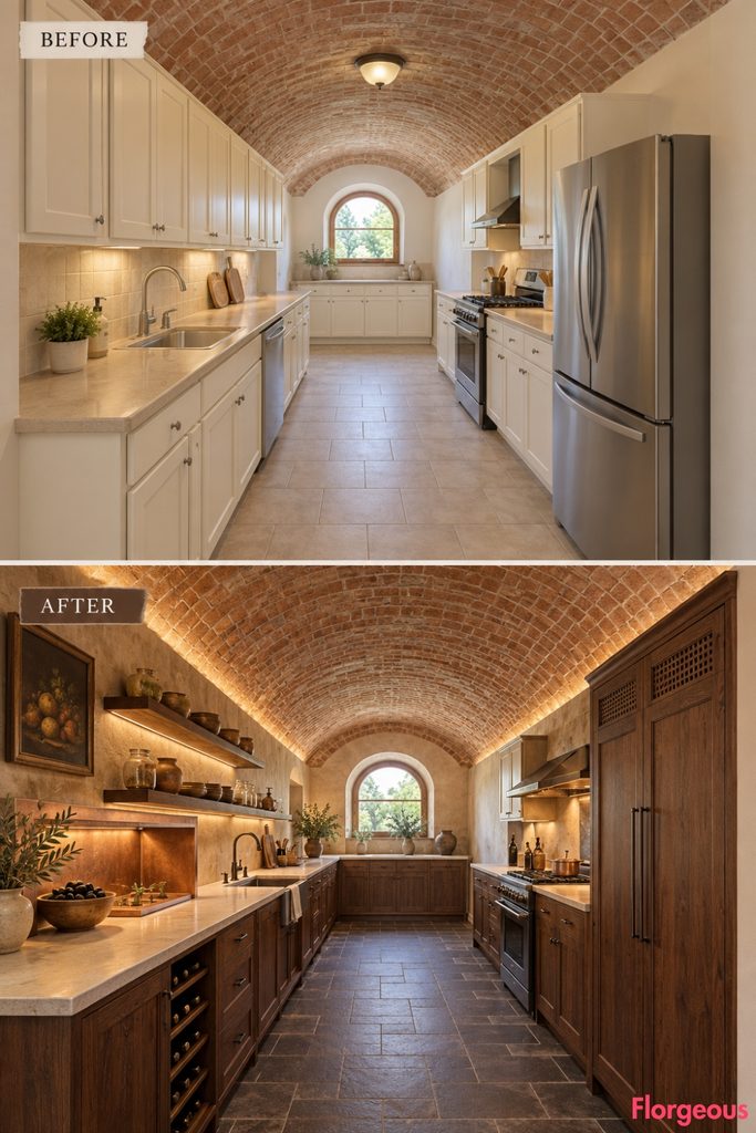
An elongated masonry barrel vault immediately distinguishes this room from a conventional residential kitchen.
Before: Generic cream cupboards and laminate countertops sit awkwardly beneath the existing curved ceiling, with little relationship to the architecture.
After: Low dark-oak storage hugs the side walls, leaving the vault completely visible. A sculptural copper-lined dry-preparation station and a narrow array of chestnut bottle drawers create a beautifully organized vintner-inspired kitchen. Discreet lighting grazes the original masonry overhead.
Why it works: The low furniture composition celebrates the ceiling instead of competing with it.
Try this: Keep tall storage concentrated near the entrance in vaulted rooms.
4. Reorganize an L-Shaped Country Kitchen Into a Val d’Orcia Preparation Suite
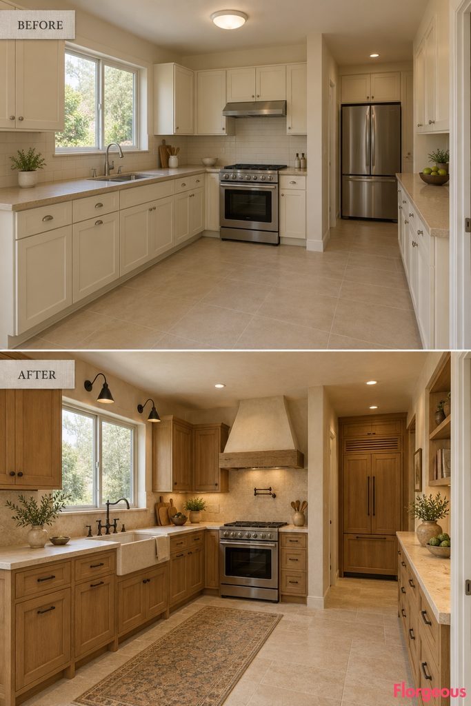
An L-shaped floor plan with a narrow side wing calls for a more thoughtful solution than a conventional central island.
Before: Cream cupboards occupy both wings, but the side portion feels like leftover space.
After: The shorter wing becomes a dedicated pale-travertine preparation station with an integrated chopping counter and enclosed dry storage. The larger main room features warm honey-oak cupboards and a generous uninterrupted circulation area.
Why it works: Separating preparation from cooking gives each part of the L-shaped room its own purpose.
Try this: Use a narrow existing wing for a specialized task instead of overcrowding the main floor.
5. Give a Former Tuscan Hayloft a Beautiful Porcelain Working Wall
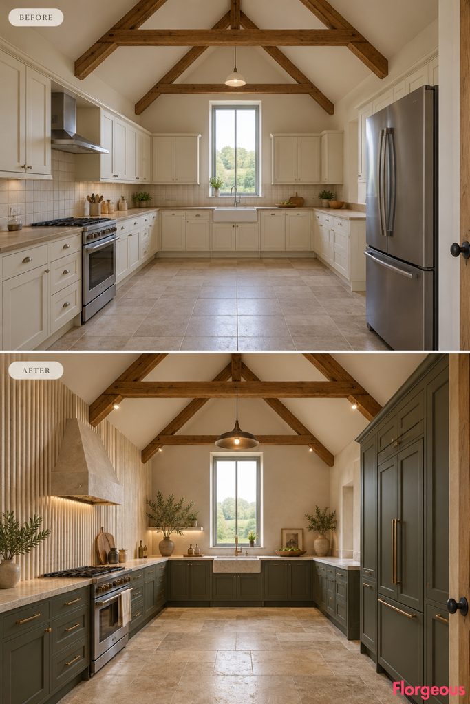
A high pitched roof with visible timber trusses gives this kitchen a dramatic vertical character.
Before: Plain white cabinetry and beige worktops sit beneath the tall gable, making the original timber roof look unrelated to the kitchen.
After: A full-length relief of softly fluted ivory porcelain transforms the solid working wall. Deep olive-blue cabinets, warm limestone floors, and carefully positioned task lighting create a sophisticated contrast beneath the existing roof structure.
Why it works: The delicate porcelain texture balances the bold scale of the gabled ceiling.
Try this: Use dimensional ceramic tiles on a single solid working elevation and preserve the roof structure as the room’s upper focal point.
6. Turn a Triangular Kitchen Into a Garfagnana Cabinetmaking Statement
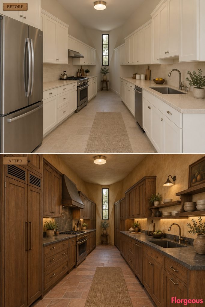
A genuine wedge-shaped kitchen is challenging, but its narrowing floor plan can inspire extraordinarily distinctive joinery.
Before: Standard cabinets stop awkwardly before the triangular corners, leaving unusable gaps.
After: Custom chestnut cabinetry gradually changes depth along the two angled walls, with wide dry-food drawers near the entrance and narrow fitted cupboards toward the far end. The broad entry-side working surface keeps the narrow tip free of furniture.
Why it works: The cabinetry follows the architectural geometry instead of forcing rectangular furniture into an unsuitable shape.
Try this: Use angled fillers and purpose-built pull-outs to recover storage in irregular kitchens.
7. Transform a Two-Pier Farmhouse Hall Into an Arezzo Ironwork Kitchen
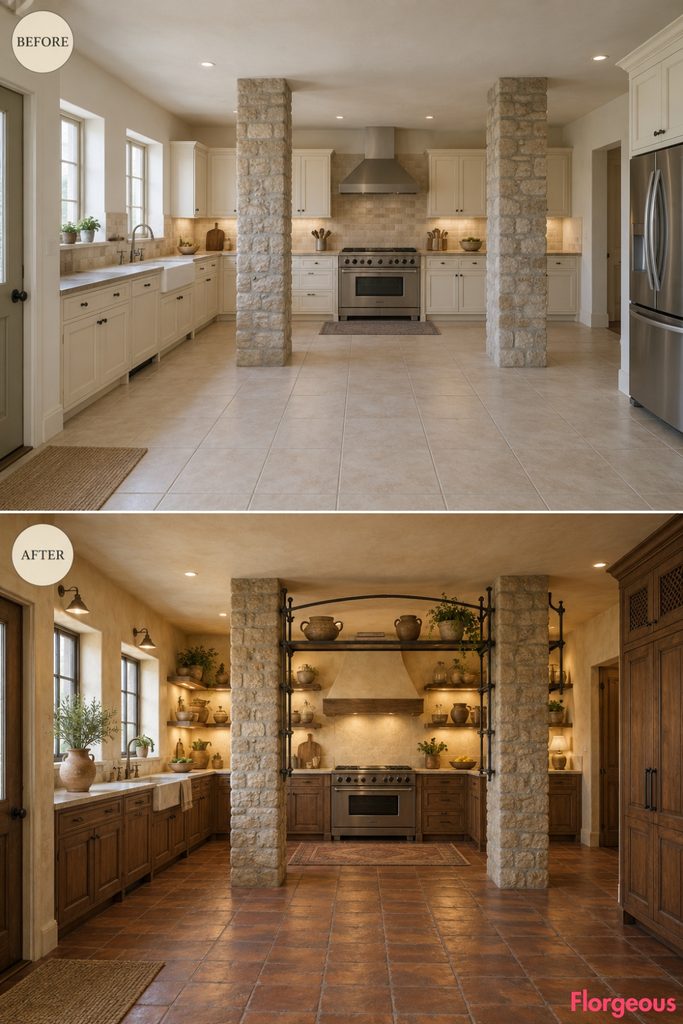
Two original masonry piers define this broad kitchen and provide the opportunity for an unusual working arrangement.
Before: Generic cabinets sit against the surrounding walls, while the two existing piers interrupt the room without serving a visual purpose.
After: A coordinated forged-iron framework connects visually between the piers, holding carefully supported dry-storage shelves and hanging cookware away from heat. Stone-topped working cabinets occupy the perimeter, while the space between the piers remains walkable.
Why it works: Existing structural elements become central to the design without being moved or hidden.
Try this: Use independent, professionally supported iron shelving near existing masonry piers.
8. Make an Off-Center Stone Pier the Heart of a Volterra Kitchen
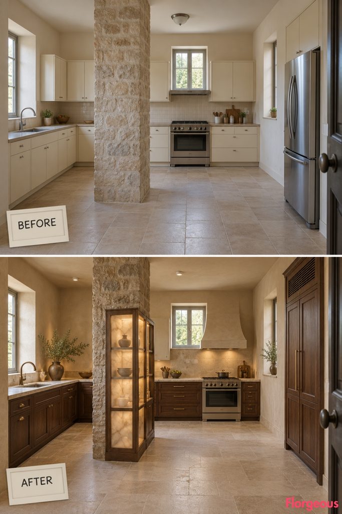
This old-room conversion has a single structural pier standing away from the center, creating an asymmetrical interior.
Before: Cream cabinets surround the edges, while the pier makes the open floor feel awkward.
After: A translucent alabaster display cabinet is arranged against one side of the existing pier, paired with low timber storage and protected internal lighting. The rest of the kitchen remains quietly composed in dark chestnut and pale limestone.
Why it works: The design gives the fixed architectural obstruction a beautiful, practical purpose.
Try this: Treat existing columns as opportunities for shallow storage rather than hiding them behind walls.
9. Reimagine an Under-Stair Kitchen as a Pienza Storage Atelier
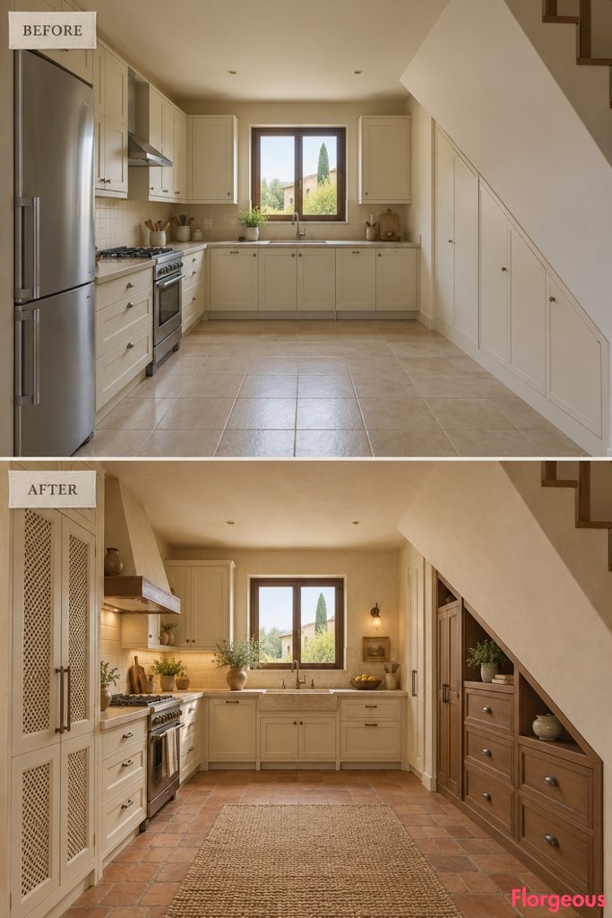
An existing stair soffit slopes across one side of this room, producing an unusual ceiling line.
Before: Ordinary cupboards stop before the slope, leaving awkward empty space beneath the staircase.
After: A beautifully stepped system of traditional cream-and-chestnut cupboards fills the usable under-stair area without blocking access panels. Deep drawers occupy the low portion, while taller pantry storage rises toward the full-height end. Pale limestone and honey plaster unify the room.
Why it works: The storage composition turns an awkward architectural constraint into the kitchen’s distinguishing feature.
Try this: Design under-stair storage around the available headroom and required stair access.
10. Create a Montelupo Ceramic Kitchen Around Three Windows
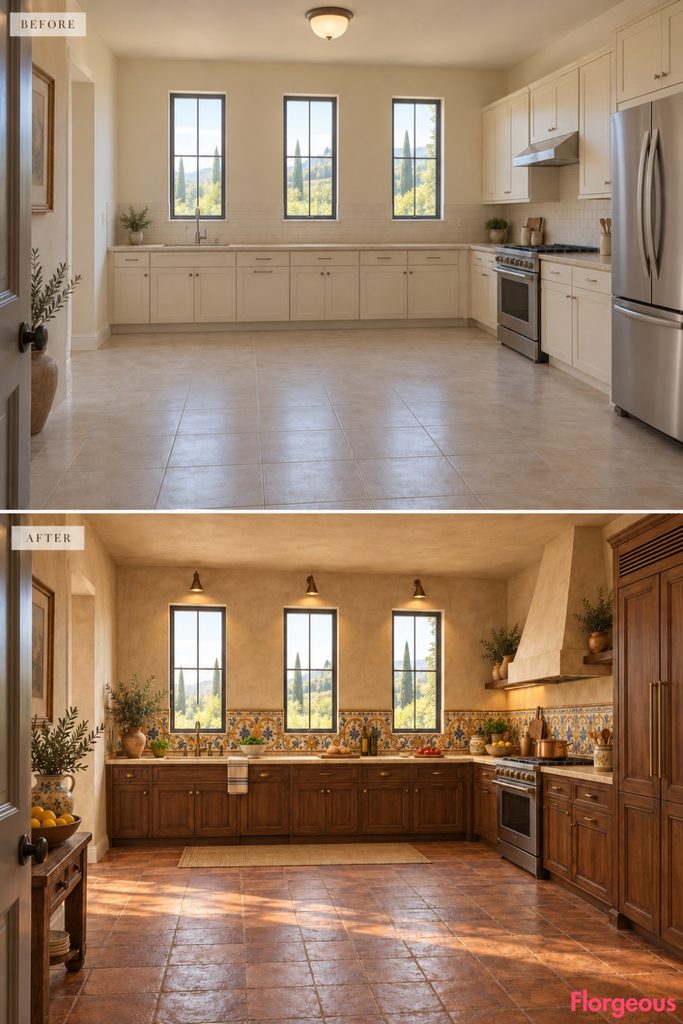
This wide, shallow room has three evenly spaced rear windows, creating a completely different architectural rhythm.
Before: A line of basic cream cabinetry runs beneath the windows, with generic counters and little decoration.
After: Carefully arranged Montelupo-inspired ceramic panels form a continuous frieze beneath the glazing. Walnut lower cupboards, deep cream stone worktops, and dark russet flooring emphasize the long horizontal composition.
Why it works: The tilework connects the three separate windows into one visually coherent kitchen elevation.
Try this: Limit expressive ceramics to the backsplash and use simple cabinetry underneath.
11. Make an Octagonal Kitchen Feel Like a Tuscan Stone Pavilion
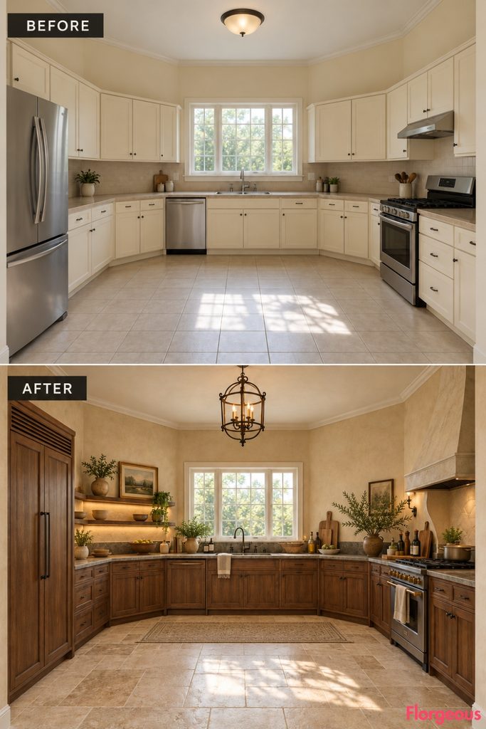
An old eight-sided room presents a rare opportunity for carefully segmented cabinetry.
Before: Standard straight cabinets leave awkward gaps at the angled corners, and the room feels unfinished.
After: Precisely fitted low limestone and walnut units follow selected octagonal wall segments, creating an elegant continuous working perimeter. One segment holds the range, another the washing station, while a pair of walls remain free of cabinetry to preserve generous movement.
Why it works: The kitchen works with the geometry rather than imposing a rectangular island inside it.
Try this: Use fitted corner carcasses and preserve open wall sections to avoid overwhelming polygonal rooms.
12. Give a Clerestory Kitchen a Beautiful Cortona Washing Wall

This long room receives its daylight from a narrow high window strip rather than a conventional sink window.
Before: Basic lower cabinets and laminate surfaces sit beneath the high glazing, leaving a large blank wall.
After: An extended Cortona-inspired limestone washing station occupies the lower wall, with a carved apron-front sink, grooved draining counter, chestnut drawers, and a refined timber drying frame. Indirect light from the clerestory emphasizes the stone craftsmanship.
Why it works: The substantial low washing composition balances the high glazing.
Try this: Pair a stone-look apron sink with one carefully detailed draining counter.
13. Use an Irregular Stepped Wall to Create a Lucca Shutter Gallery
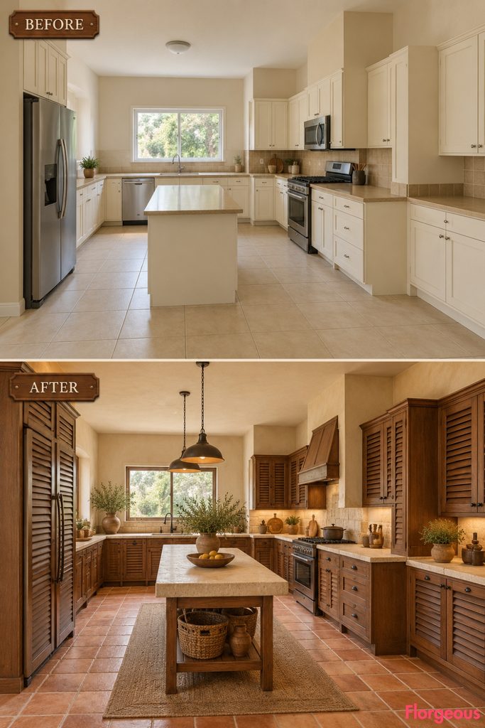
This kitchen has two existing wall offsets, creating a sequence of shallow recesses and projections along one side.
Before: Ordinary cabinets fill the wall inconsistently, making the offsets look accidental.
After: A rhythm of chestnut shutter-front cupboards and stone-topped low storage follows each existing step. The staggered cabinetry creates a beautifully layered elevation, while pale plaster and warm floor tiles keep the irregular geometry clear.
Why it works: Repeating a disciplined joinery detail gives the stepped wall a cohesive design.
Try this: Carry the same timber finish across cabinetry of different depths.
14. Turn a Narrow Side Alcove Into a Tuscan Granary Kitchen
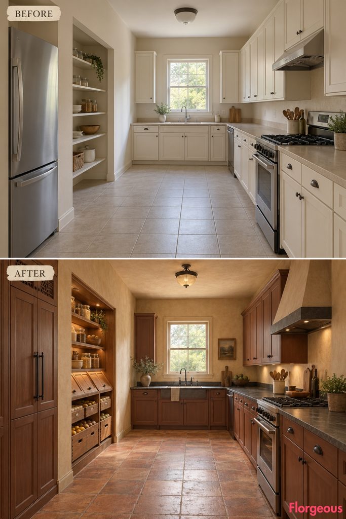
Unlike a standard fitted kitchen, this long room has a single deep side alcove that can become a distinct storage destination.
Before: The alcove holds basic shelves while the kitchen’s main working wall remains plain.
After: The original recess becomes a beautiful chestnut dry-food granary with large drawers, sloped-lid bins, and carefully arranged smaller compartments. The main room receives dark honed stone worktops, warm wheat plaster, and restrained cabinetry.
Why it works: The storage zone is visually and functionally separate from the working kitchen without constructing additional walls.
Try this: Use an existing alcove for deep pantry drawers rather than filling the main floor with storage furniture.
15. Give a Skewed Parallelogram Kitchen an Etruscan Black-Clay Identity
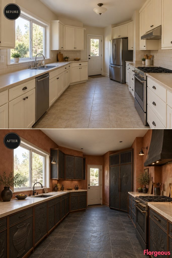
Two long walls run parallel but at an oblique angle to the end walls, creating a distinctive sheared floor plan.
Before: Standard cabinets meet the diagonal corners awkwardly, and pale finishes make the room feel generic.
After: A carefully fitted band of matte black bucchero-inspired ceramic cabinet fronts follows the angled perimeter. Warm red-earth plaster, pale limestone counters, and deep charcoal flooring reinforce the dramatic geometry.
Why it works: Strong horizontal cabinetry gives visual order to the skewed plan, while dark clay adds unmistakable character.
Try this: Keep countertop junctions simple and commission precisely measured angled cabinet fillers.
16. Turn a Split-Level Maremma Kitchen Into a Sculptural Stone Retreat
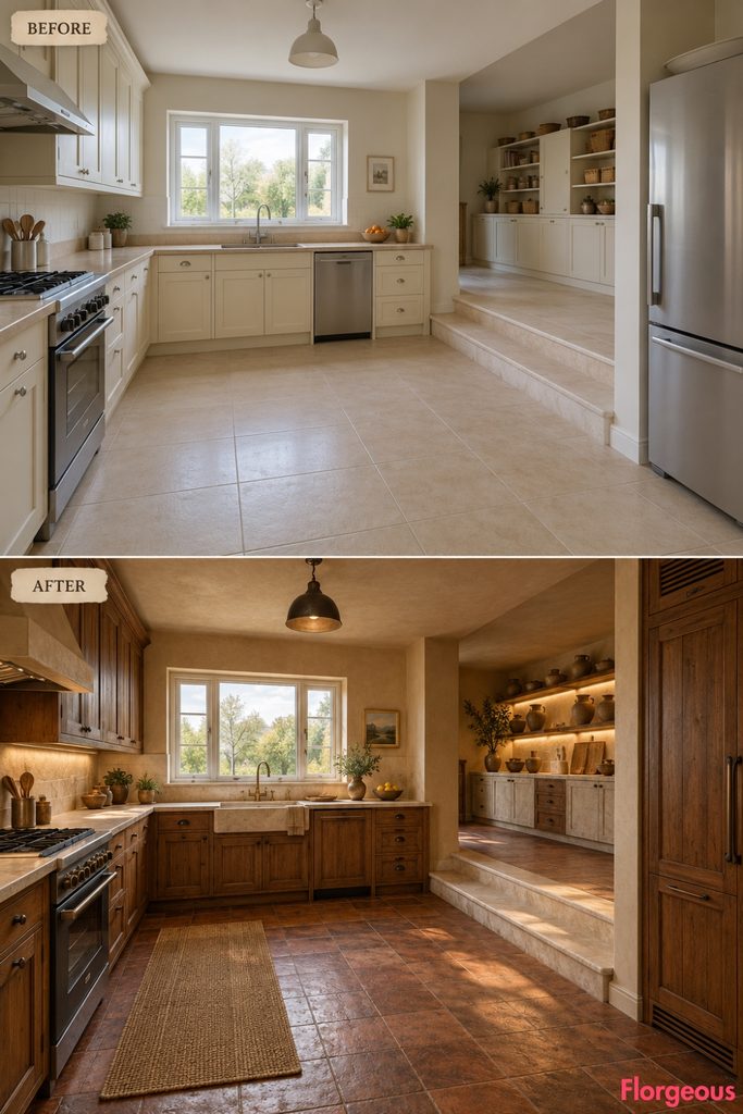
A genuine split-level kitchen offers a wonderful opportunity to create a Tuscan interior that feels deliberately organized rather than simply decorated.
The original room has two distinct floor heights, with a broad limestone step separating the main working kitchen from a shallow raised storage platform.
Before: Ordinary cream cupboards, beige laminate worktops, and pale floor tiles make the two levels feel disconnected. The raised portion holds basic storage, while the lower area contains the everyday cooking and washing zones.
After: The main working level becomes a beautiful composition of deep chestnut cabinets, broad honed limestone counters, and warm mineral plaster. The original raised platform transforms into a dramatic dry-storage gallery with low stone-fronted cupboards and carefully displayed Tuscan earthenware. The existing step receives a refined stone finish, emphasizing the change in level rather than concealing it.
Why it works: The two floor heights establish separate functional zones without requiring any new walls or partitions.
Try this: Use consistent stone detailing across existing level changes, while contrasting the cabinetry to distinguish preparation from storage.
17. Create a Florentine Pietra Dura Kitchen Across Two Connected Chambers
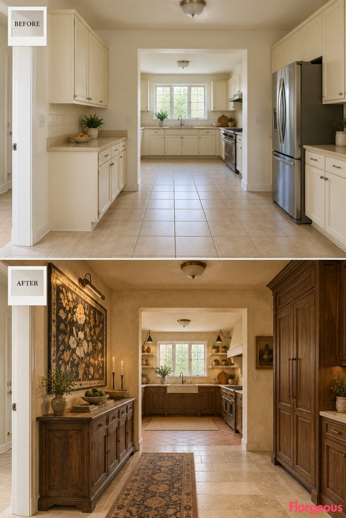
Instead of one continuous room, this design begins with two existing chambers connected by a generous rectangular opening.
The front chamber serves as an entrance and preparation area, while the rear chamber accommodates the fixed cooking and washing functions.
Before: Generic cream cabinets occupy both rooms, with matching beige counters and basic lighting. The connecting opening is visually unremarkable, and the two spaces lack a coherent identity.
After: The front room becomes a sophisticated Florentine serving gallery centered on a walnut console with a carefully framed pietra dura decorative inlay. The rear kitchen receives deep walnut lower cabinetry, warm limestone working surfaces, soft ivory plaster, and beautifully proportioned stone shelving. Contrasting cotto flooring subtly defines the two functions while maintaining visual continuity through the existing passage.
Why it works: Two connected rooms allow decorative serving furniture and practical kitchen activity to occupy separate architectural zones.
Try this: Use matching stone and timber materials in adjoining rooms while allowing each space to have its own furniture composition.
18. Transform a Courtyard-Ring Kitchen Into a Cortona Villa Retreat
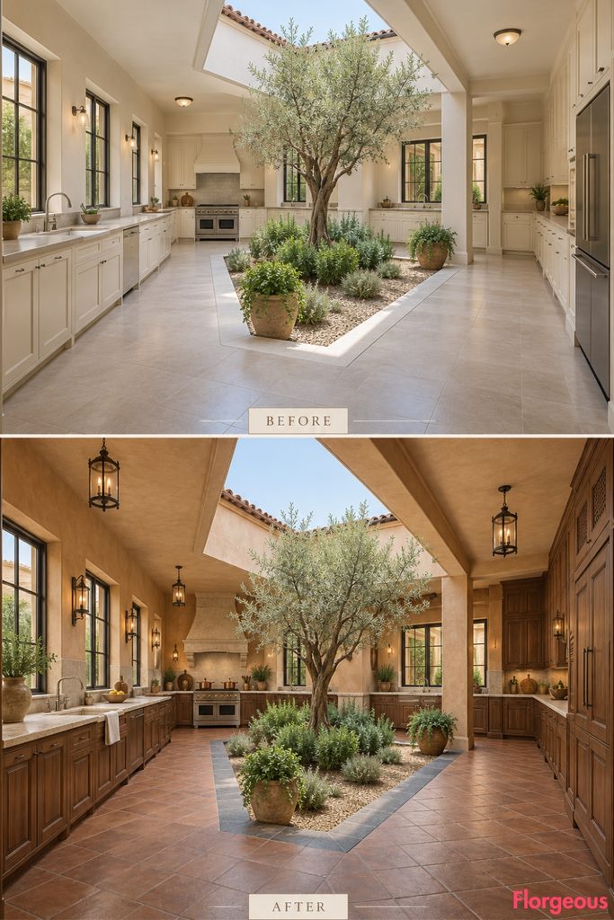
An original open-air courtyard creates a striking architectural centerpiece, with four connected kitchen galleries surrounding the central lightwell.
Before: Plain cream cabinetry, beige laminate counters, pale floor tiles, and basic lighting make the unusual ring-shaped kitchen feel fragmented.
After: Rich chestnut cabinetry, honed limestone countertops, and warm sienna plaster transform the surrounding galleries. Handmade cotto flooring with a dark pietra serena border highlights the courtyard, while refined iron lighting and dedicated cooking, washing, and storage zones create an elegant Cortona villa atmosphere.
Why it works: The central courtyard organizes the kitchen naturally, while contrasting materials emphasize its distinctive architecture.
Try this: Highlight an existing courtyard perimeter with contrasting flooring while preserving clear circulation.
19. Reimagine a Double-Dogleg Kitchen as a Tuscan Frantoio
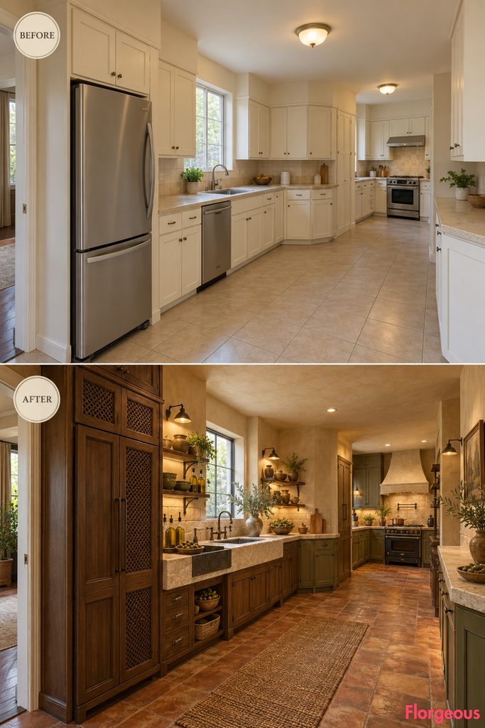
A kitchen with two directional changes can feel awkward when fitted with standard cabinetry. Here, those bends become the central design feature.
The room forms an elongated Z-like plan with three connected stretches, each offset from the previous one.
Before: Cream cupboards and beige countertops occupy disconnected wall sections, while the two bends make the space visually fragmented.
After: The first stretch becomes a beautiful dry-storage area with deep chestnut drawers. The middle stretch introduces a carefully composed limestone preparation station with black-stone trays and organized olive-oil compartments. The rear stretch contains the original cooking and washing zones, redesigned with pale stone surfaces and warm olive-toned cabinetry.
Why it works: Each bend separates a functional activity naturally, creating a kitchen that feels organized rather than inconvenient.
Try this: Use continuous materials and consistent counter heights to connect working areas across existing changes in direction.
Style Note: In a dogleg kitchen, keep the inside corners visually open. Tall cabinets positioned directly at the bends can reduce visibility and make circulation uncomfortable.
20. Turn a Double Cross-Vaulted Workshop Into a Prato Textile Kitchen
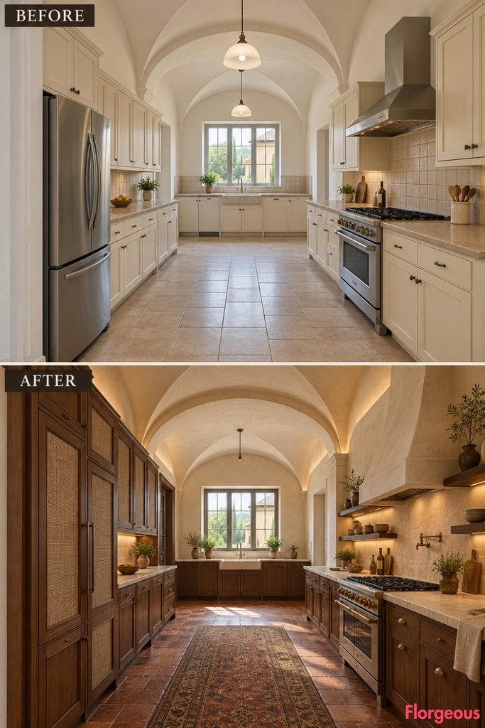
Two original groin-vaulted ceiling bays give this kitchen an architectural rhythm completely different from a flat-ceiling or barrel-vaulted room.
The intersecting masonry curves create distinctive overhead geometry, while the floor remains a simple working space.
Before: Generic cream cabinetry and beige worktops sit beneath the old cross-vaulted ceiling, with little connection between the roof structure and the modern kitchen furniture.
After: A long cabinet composition of dark chestnut frames and protected woven-flax panels runs beneath one vault bay, while the other contains pale limestone preparation counters and traditional working cupboards. Soft mineral plaster, muted dark cotto flooring, and discreet uplighting bring out the original vault intersections.
Why it works: The textile panels introduce softness and detail without competing with the strong vaulted ceiling.
Try this: Use protected textile inserts only in dry-storage doors and keep food-preparation surfaces durable and easy to clean.
21. Create a Pienza Breakfast Kitchen Around an Original Half-Height Wall
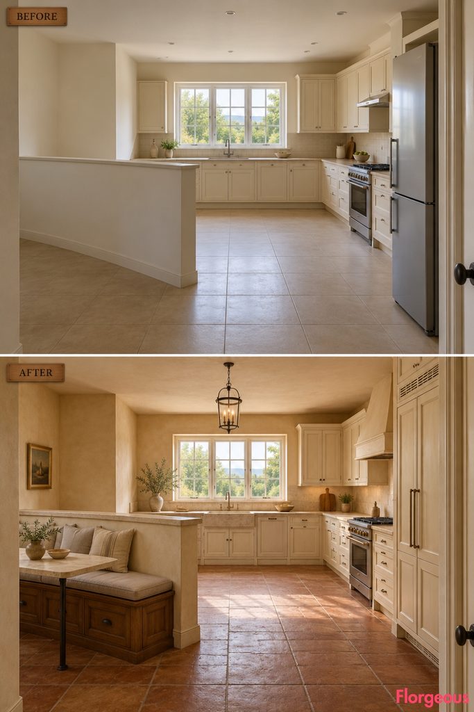
A broad original masonry half-wall projects from one side of this room, dividing the floor into two visually connected areas.
Rather than hiding the divider, this design turns it into an important furniture and spatial feature.
Before: Basic cream cabinets surround the working area, while the low wall feels disconnected from the rest of the kitchen.
After: The original masonry divider receives a carefully fitted limestone cap and a low chestnut breakfast bench along its sheltered side. Behind it, traditional cream cabinetry, warm limestone counters, honey-toned plaster, and handmade cotto floors define the working kitchen. A small iron lantern provides focused light without cluttering the ceiling.
Why it works: The existing half-wall naturally separates casual seating from active preparation while keeping sightlines open.
Try this: Use low built-in furniture beside existing masonry dividers rather than creating additional partition walls.
22. Build a Lunigiana Peninsula Kitchen Inside a U-Shaped Plan
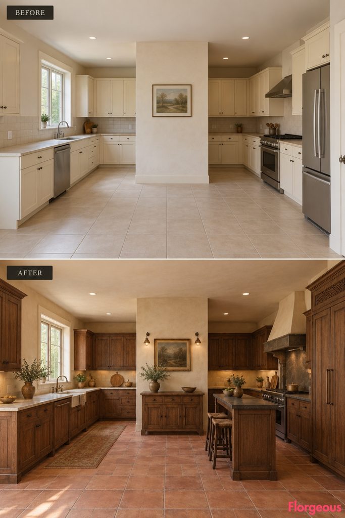
This unusual kitchen has three connected architectural wings arranged around an existing inward-facing masonry projection.
Rather than filling the center with an island, the design uses a side-connected working peninsula to organize the flow.
Before: Cream cabinetry occupies the separate wings, with beige countertops and pale flooring making the room feel fragmented.
After: The left wing becomes a beautifully organized washing area, the right wing a substantial cooking elevation, and the broad connecting front portion houses storage and preparation. A narrow dark-stone peninsula extends from the right-hand working cabinets toward the open connecting area, stopping well before the main circulation route.
Why it works: The peninsula gives the three-wing plan a practical working connection without erasing its distinct shape.
Try this: Use a short peninsula to connect work zones rather than installing a large freestanding island.
23. Reimagine an Original Coffered Ceiling as a Siena Painted Masterpiece
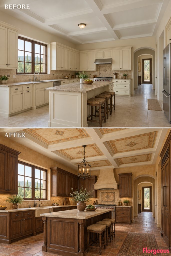
Here the defining architecture is a shallow original coffered ceiling, divided into six broad rectangular panels by existing plastered structural bands.
The floor remains spacious and simple, allowing the ceiling composition to become the dominant feature.
Before: The ceiling coffers are uniformly painted white, while cream cabinets, beige counters, and basic lighting contribute little character.
After: Mineral ochre and warm ivory decorative painting fills the existing coffer fields, using carefully measured borders and restrained geometric motifs. Deep walnut lower cabinetry, pale limestone counters, terracotta-toned plaster, and muted stone flooring repeat the ceiling’s proportions.
Why it works: The makeover turns existing ceiling geometry into the room’s strongest decorative feature without adding beams or lowering the ceiling.
Try this: Highlight original ceiling panels with a restrained two-color scheme instead of introducing new moldings.
Common Mistake: Adding decorative beams to an already articulated ceiling can make a room feel overcrowded. Work with the existing ceiling structure first.
24. Turn an Apsidal Villa Kitchen Into a Florentine Palazzo Statement
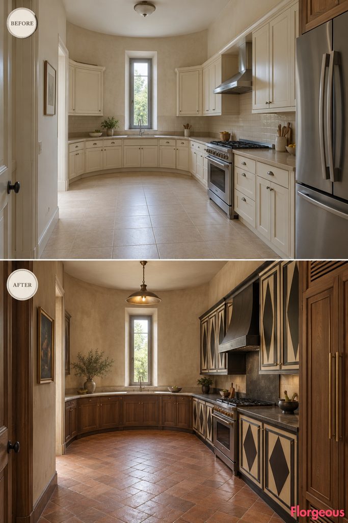
This room has a rectangular front portion terminating in a genuine semicircular masonry apse.
The curved rear wall creates a completely different visual composition from ordinary rectangular and polygonal kitchens.
Before: Plain cream cabinets stop awkwardly near the curve, with beige counters and basic flooring failing to make use of the unusual architecture.
After: Carefully faceted walnut lower cabinets follow the existing semicircular wall, creating a beautifully continuous storage composition beneath an original narrow window. The straight side walls receive cream cabinetry, dark pietra serena worktops, and carefully painted geometric door panels. Warm mineral plaster and elegant cotto flooring complete the Palazzo-inspired identity.
Why it works: The cabinet layout follows the existing curve while contrasting its organic shape with strong, controlled cabinetry geometry.
Try this: Use several precisely fitted cabinet modules rather than attempting to force one long straight cabinet against a curved wall.
25. Create a Val d’Orcia Limestone Gallery Across an H-Shaped Floor Plan
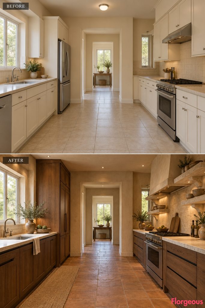
This former agricultural building has two parallel rectangular wings connected by one short central internal passage, creating a distinctive H-shaped layout.
The geometry naturally separates different working functions.
Before: Generic cream cabinets appear in both wings, while the connecting passage feels disconnected and poorly organized.
After: The left wing becomes a quiet washing and dry-storage area with traditional walnut cabinetry. The right wing becomes a beautifully composed limestone gallery, with strong horizontal stone shelves, deep shadow gaps, and low storage drawers. Coordinated plaster and floor materials visually connect the two sides through the existing short passage.
Why it works: The room’s two wings can support different tasks without crowding the narrow central connection.
Try this: Keep the connecting passage free of cabinetry and use matching floor and wall finishes to visually unify separated working zones.
26. Transform a Triple-Arch Stable Kitchen Into a Montepulciano Stone Arcade
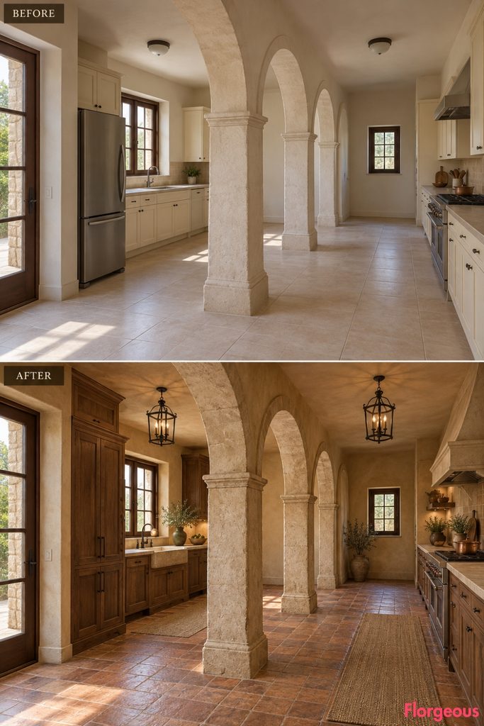
A former Tuscan stable with three original masonry arches creates a distinctive kitchen layout, dividing the interior into two parallel working aisles without closing off the space.
Before: Plain cream cabinets, beige laminate counters, pale floor tiles, and basic lighting make the original stone arcade feel disconnected from the kitchen.
After: The three arches become the architectural centerpiece, highlighted by warm limestone surrounds and softly textured plaster. One aisle features substantial chestnut pantry cabinetry, while the opposite aisle becomes an elegant cooking and washing gallery with honed stone counters. Rich cotto flooring, dark iron details, and restrained lighting create a dramatic Montepulciano villa atmosphere.
Why it works: The original arcade naturally separates storage and cooking while maintaining visual connections between both aisles.
Try this: Highlight existing masonry arches with contrasting finishes and keep their openings clear.
27. Finish With a Golden-Stone Siena Palazzo Kitchen in a Cruciform Room
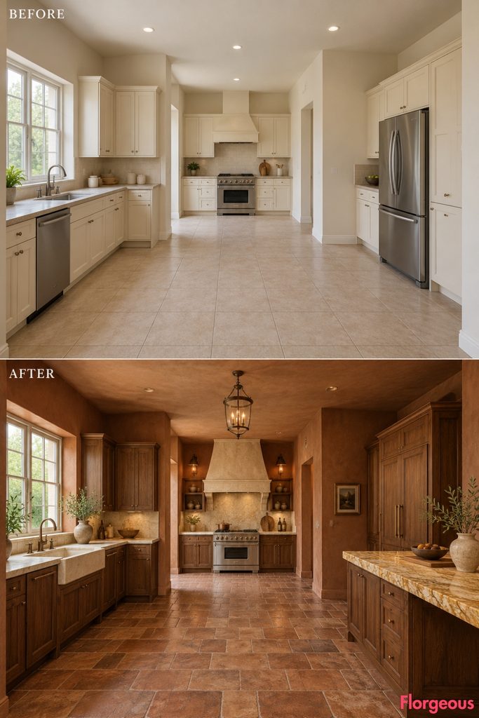
The final design takes place in a genuinely cross-shaped former estate room, with four shallow architectural arms meeting around a broad central space.
Rather than placing an oversized island in the middle, the kitchen uses the separate arms to create a clearly organized set of working areas.
Before: Basic cream cabinets occupy different arms without a consistent design direction. Beige counters, neutral flooring, and simple lighting make the unusual cruciform architecture feel underused.
After: The rear arm becomes a refined cooking elevation, the left arm a beautifully detailed washing zone, and the right arm a sophisticated pantry with cream and walnut cabinetry. A richly veined golden-stone preparation counter sits within the wider portion of the right-hand working arm, leaving the central intersection open. Deep sienna plaster, rich cotto flooring, and restrained bronze lighting unify the whole room.
Why it works: Each arm has a specific purpose, while the central crossing remains clear and visually powerful.
Try this: In an irregular room with multiple branches, establish the circulation route first, then position a statement preparation surface away from the central junction.
Finding the Right Tuscan Kitchen Design for Your Home
These 27 before-and-after transformations show that Tuscan-inspired interiors can be as varied as the buildings themselves. A vaulted kitchen benefits from low furniture and carefully controlled lighting. An irregular polygonal room calls for custom-fitted cabinets, while a gabled former hayloft can accommodate taller working-wall compositions.
The most memorable results come from connecting each design to the room’s existing architecture. Stonework, terracotta, chestnut joinery, decorative plaster, and handcrafted ceramics become more compelling when they respond to actual wall shapes, windows, structural piers, and circulation routes.
When planning a Tuscan Kitchen makeover, begin with the floor plan before selecting colors. Identify the strongest existing architectural feature, decide how the working zones should relate to it, then choose one artistic material or furniture composition to define the redesign.
Careful measurements, practical appliance access, and consistent natural lighting matter just as much as beautiful finishes. A successful kitchen should feel thoughtfully transformed without appearing architecturally impossible.