A kitchen can have perfectly functional cabinets, plenty of counter space, and reliable appliances yet still feel completely uninspiring. Basic finishes, awkward storage, and generic lighting often leave city kitchens looking more like temporary installations than thoughtfully designed interiors.
What makes an Urban Modern Kitchen transformation exciting is the opportunity to rethink the entire visual composition. The strongest makeovers don’t simply replace white cabinets with darker ones. They introduce a new relationship between built-in furniture, architectural surfaces, functional zones, lighting, and the room’s existing proportions.
These 13 before-and-after concepts explore dramatically different approaches to contemporary city living. Every transformation begins with an ordinary builder-grade kitchen, but the finished designs range from boldly geometric apartment interiors to sculptural loft kitchens and sophisticated architectural showpieces.
The most surprising changes happen without moving a single structural wall, window, or doorway. Each design works within its original room shell, proving that a genuinely dramatic makeover comes from creative decisions rather than imaginary extra space.
1. Turn a Basic Studio Kitchen Into a Bold Color-Blocked Living Wall
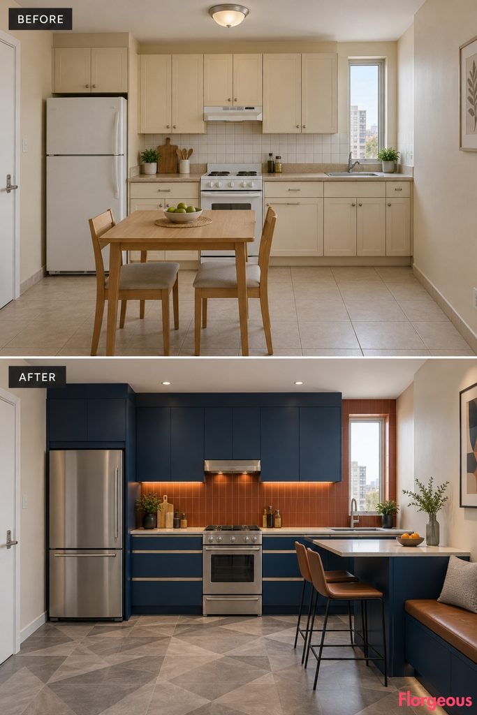
A compact studio kitchen is often visible from nearly every part of the apartment. Instead of making it look like a collection of ordinary cupboards, this concept turns the entire kitchen wall into one striking architectural composition.
Before: A narrow single-wall kitchenette has cream base cabinets, beige laminate countertops, white backsplash tiles, and a freestanding dining table occupying valuable floor space. The refrigerator stands at one end, with little visual connection to the remaining cabinetry.
After: The entire kitchen elevation is reimagined as a layered composition of deep cobalt-blue cabinetry, glossy burnt-coral ceramic surfaces, and pale satin-aluminum detailing.
A full-height cobalt storage volume incorporates the existing refrigerator, while a continuous horizontal cooking counter cuts across the composition. Above it, contrasting coral ceramic panels create a dramatic backsplash that extends across the available solid wall.
The separate dining table disappears. In its place, a compact two-seat breakfast counter extends from a properly supported cabinet end, accompanied by a slim upholstered bench along the adjacent solid wall. A geometric mineral-look floor finish visually defines the kitchen without adding partitions.
Integrated task lighting, concealed storage, and carefully organized countertop accessories complete the transformation.
Why it works: The kitchen changes from scattered pieces of furniture into a cohesive architectural feature that also improves everyday floor-space efficiency.
Try this: Keep the strongest color on the largest cabinetry volume, then use one contrasting material for the cooking zone. Too many competing surfaces can overwhelm a small studio.
Small Space Tip: Check seating clearance and appliance door swings before replacing a freestanding table with attached dining furniture.
2. Give a Narrow Galley a Dramatic Dual-Material Architectural Identity
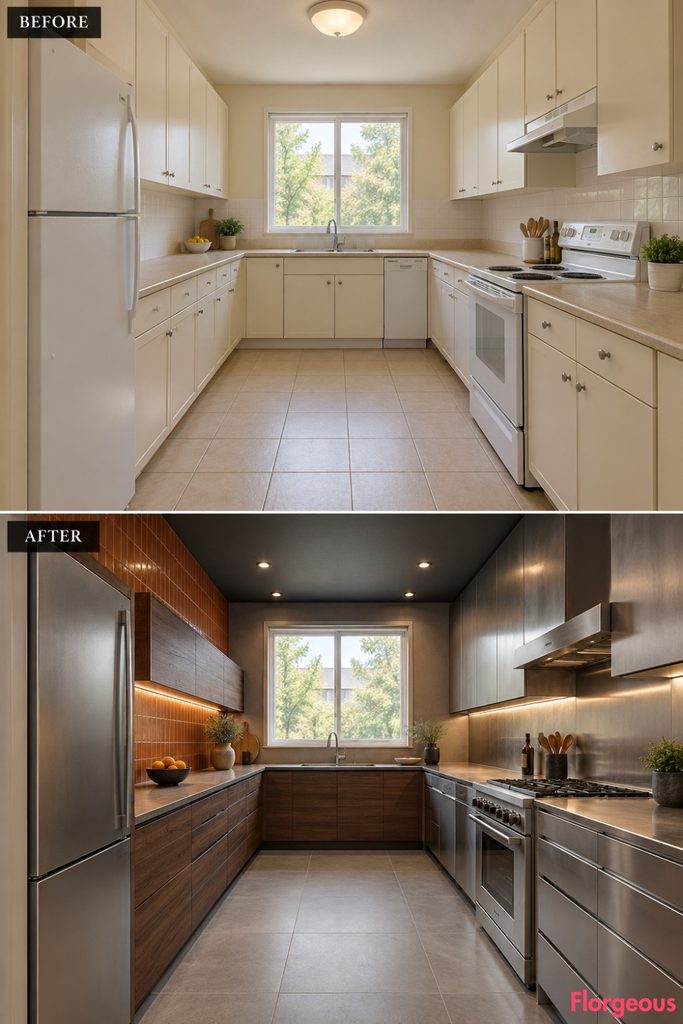
A narrow galley kitchen doesn’t need to feel like two ordinary cabinet runs facing each other. A more ambitious approach is to give each wall a distinct architectural role.
Before: Two parallel rows of cream cabinets create a conventional working corridor. Beige countertops, ordinary upper cupboards, and a single overhead light make the space feel repetitive and enclosed.
After: One wall becomes a dramatic brushed-stainless workstation, combining precisely aligned drawers, a continuous preparation counter, and a compact professional-looking utensil organization system.
The opposite wall transforms into a rich terracotta-glazed ceramic composition, with dark walnut lower cabinetry and integrated pantry storage. Rather than repeating upper cabinets on both sides, a continuous shallow cabinet band runs along only one wall.
The original flat ceiling receives a deep charcoal finish with carefully spaced recessed lighting, while large-format warm-gray flooring creates a calm continuous base.
These changes give the narrow room a bold gallery-like quality without compromising working clearances.
Why it works: Opposing materials create a memorable visual contrast while a carefully controlled cabinet layout prevents the galley from feeling overloaded.
Try this: Keep stainless steel concentrated around the busiest working surfaces and use warmer materials where visual softness matters.
3. Make an Awkward L-Shaped Kitchen Feel Like a Contemporary Art Installation
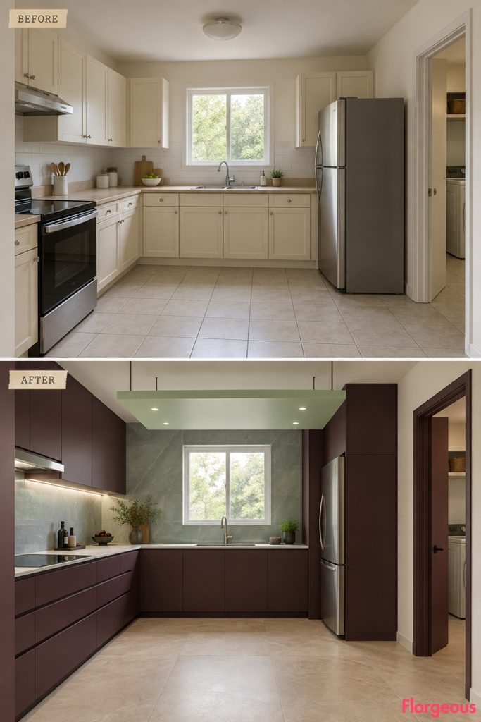
An L-shaped kitchen with a doorway interrupting one wall often looks unfinished. Instead of adding a decorative frame, this transformation uses a bold sequence of cabinetry volumes and surfaces to create visual order.
Before: Basic cream cabinets meet awkwardly at the corner, while an existing utility-room doorway breaks up the opposite wall. The beige countertops and simple backsplash provide little design identity.
After: The main cooking wall becomes a powerful composition of deep plum cabinetry and pale blue-green porcelain panels.
A large, carefully proportioned matte-plum storage block occupies the solid wall beside the utility doorway, while a low continuous drawer composition stretches along the adjacent working zone.
The original doorway remains completely intact and operational, but its existing door leaf receives a matching architectural finish that visually relates to the new cabinetry.
A distinctive mint-green ceiling-mounted lighting plane, built as a shallow nonstructural fixture rather than a lowered ceiling, visually connects the separate kitchen zones.
The floor changes to large warm limestone-look tiles, creating a clean, generous base for the dramatic cabinetry.
Why it works: Strong contrasts between tall and low cabinet volumes create a much more architectural composition without surrounding the doorway with unnecessary decorative construction.
Try this: Use a matching finish on an existing door leaf only if the original door swing, ventilation, and hardware remain fully functional.
4. Turn an Ordinary U-Shaped Kitchen Into a Sculptural Terrazzo Workspace
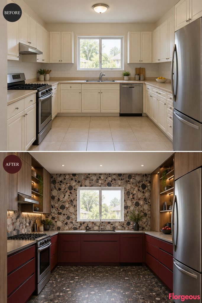
U-shaped kitchens can offer excellent functionality, but their continuous run of ordinary cupboards often feels visually heavy.
This concept reimagines the three working walls as a coordinated composition of strong material blocks.
Before: Cream stock cabinets wrap around a rear window. Beige countertops meet at conventional corners, upper cupboards crowd the walls, and a plain tile floor adds little character.
After: Large terrazzo-look porcelain slabs clad the central sink wall, forming a dramatic visual backdrop that extends from the countertop toward the ceiling.
Deep oxblood-red lower cabinetry creates a continuous U-shaped base, while the side walls receive selective full-height ash-wood storage volumes, each precisely fitted around existing appliance positions.
Instead of bulky upper cabinets across every wall, several sections become recessed open display panels with carefully integrated lighting. The former plain floor is replaced with a richly textured charcoal terrazzo-look surface.
The room now feels like a compact contemporary design studio, with the entire kitchen organized around one commanding material composition.
Why it works: Concentrating the strongest material on the sink wall creates a focal point, while carefully balanced storage prevents the U-shaped layout from becoming visually overwhelming.
Try this: Large porcelain panels can provide dramatic stone-like character with relatively predictable maintenance.
5. Turn a Dogleg Apartment Kitchen Into Two Distinct Architectural Zones
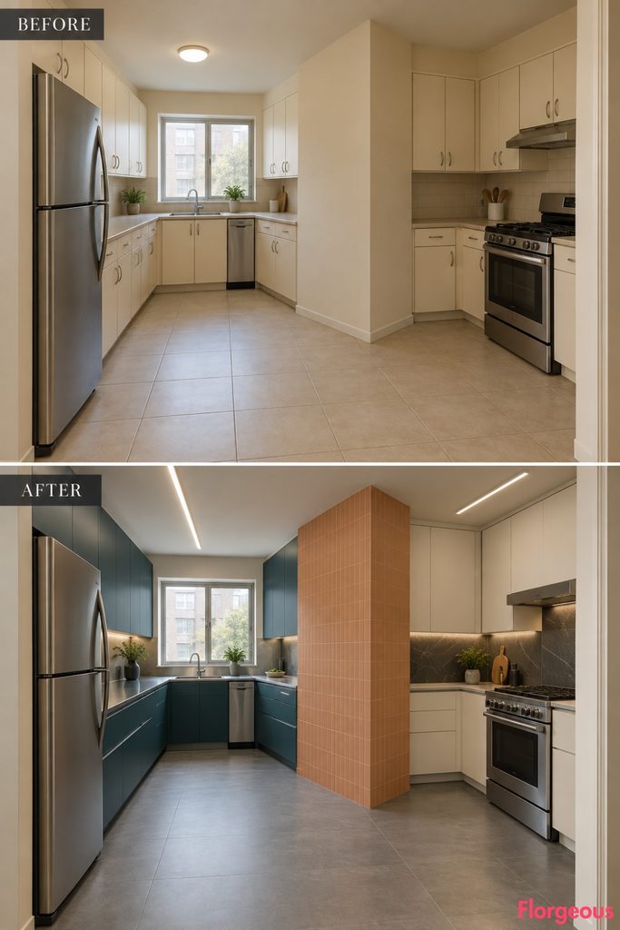
An irregular kitchen layout doesn’t have to feel like a compromise. An existing change in direction can create an opportunity for a dramatic transition between different working zones.
Before: A long kitchen bends around an interior corner, with basic cabinetry continuing awkwardly into a shorter return. The room lacks visual organization, and the transition between its two sections feels accidental.
After: The long preparation wing becomes a sophisticated dark teal cabinet composition with continuous aluminum countertops and slim integrated storage.
Around the existing bend, a contrasting soft apricot ceramic-clad wall marks the transition into the compact cooking wing. Here, matte cream cabinetry and a darker mineral backsplash create an entirely different working atmosphere.
A continuous ceiling lighting track follows the two existing straight room axes, turning the awkward bend into a deliberate visual sequence.
Rather than repeating the same cabinets around every corner, the two zones feel connected through proportion and precise details.
Why it works: The existing floor plan becomes part of the design concept instead of something to conceal.
Try this: Maintain a consistent countertop working height across both zones, even when cabinet finishes and wall treatments change.
6. Give an Under-Stair Kitchen a Dramatic Translucent Storage Wall
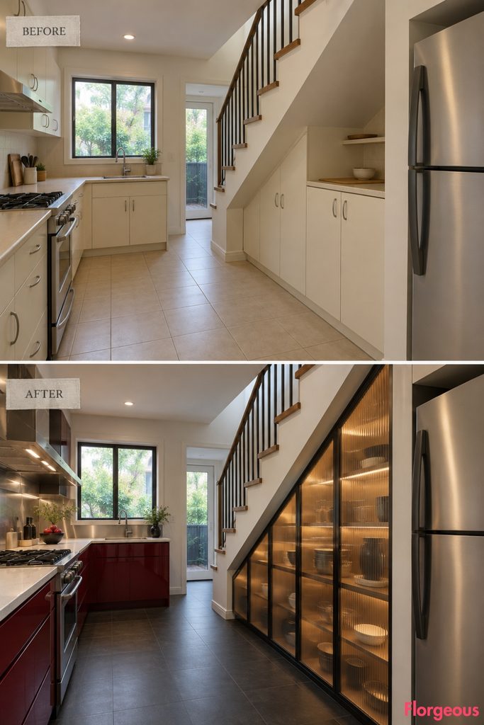
A kitchen beneath a staircase already has a memorable architectural shape. The trick is to make its unusual proportions work for the design rather than fight against them.
Before: Cream cupboards sit beneath a sloping stair structure with awkward gaps above them. Basic countertops and ordinary wall finishes make the entire space feel improvised.
After: A fitted storage wall follows the original stair slope using amber-tinted polycarbonate panels set within precise dark metal frames.
Behind the translucent panels, neatly organized shelving and internal storage create subtle depth. The panels reflect ambient light without turning the storage into an unrealistic glowing object.
Opposite the staircase, a bold wine-red cooking wall combines glossy cabinetry, a pale ceramic countertop, and a slim stainless backsplash.
A dark charcoal floor gives the compact kitchen a stronger sense of visual grounding.
Why it works: The combination of translucent storage and saturated cabinetry turns difficult geometry into the room’s defining architectural feature.
Try this: Specify heat-resistant, kitchen-appropriate materials and ensure translucent storage remains accessible for cleaning.
7. Give a Split-Level City Kitchen a Bold Gallery-Like Identity
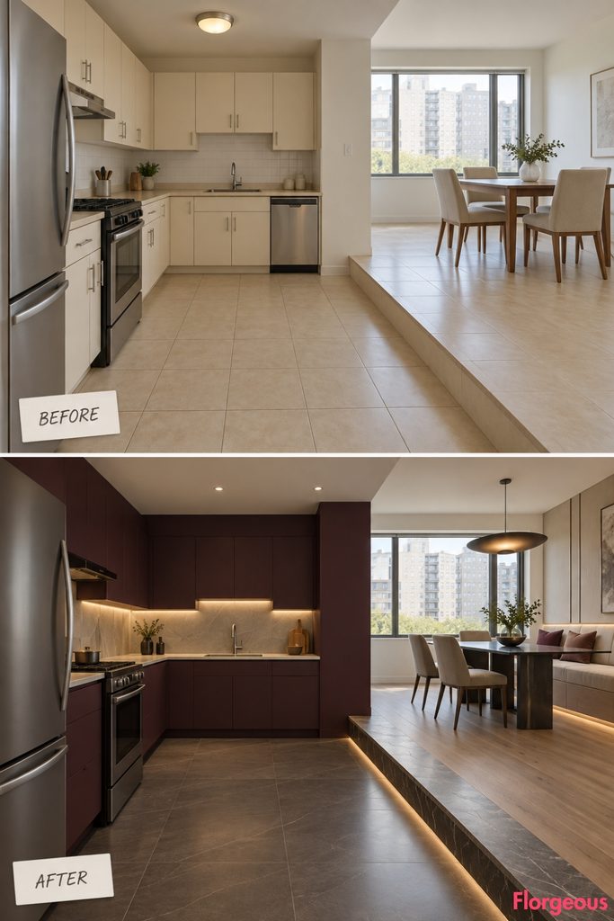
A split-level apartment already has an architectural feature many kitchens lack: a natural separation between the cooking area and the adjacent living or dining space.
This transformation makes that level difference feel intentional.
Before: A plain kitchen occupies the lower level, with a broad step leading to a slightly raised dining platform. Cream cabinets, beige counters, and nearly identical flooring across both levels make the change in height look accidental.
After: The lower kitchen becomes a rich aubergine-colored working zone, featuring deep drawers, a continuous pale stone countertop, and a dramatic vertical ceramic panel behind the cooking range.
The raised dining platform is redesigned with a custom, furniture-like pale oak banquette along its solid wall and a carefully proportioned dark glass-topped dining table.
A contrasting polished mineral finish marks the original step riser without changing its height or location. Above the dining area, a sculptural horizontal light defines the seating zone.
The result is two visually distinct spaces that work together rather than competing for attention.
Why it works: The original architectural difference becomes a clear functional and visual boundary.
Try this: Use a contrasting, slip-resistant treatment at an existing step edge to make the transition easier to recognize.
Designer Tip: Treat each level as part of one coordinated palette. Contrast is useful, but the proportions of colors and materials should still feel deliberate.
8. Turn a Glass-Block Kitchen Into a Graphic Contemporary Color Chamber
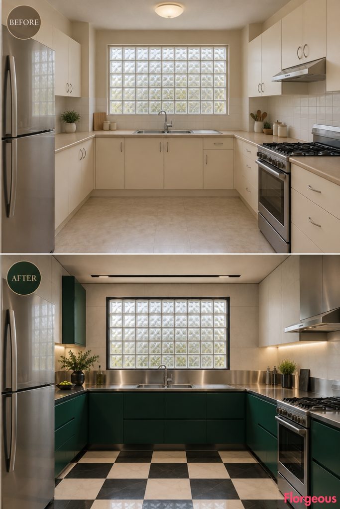
A glass-block window already provides interesting texture and filtered daylight. Instead of treating it as an outdated detail, this makeover builds a whole contemporary design around its grid.
Before: A medium-sized kitchen has a large glass-block window over the sink, ordinary cream cabinets, beige worktops, and a featureless neutral floor.
After: Deep emerald-green cabinet fronts establish a striking horizontal base, while a dramatic black-and-cream checkerboard porcelain floor introduces bold geometric contrast.
Around the original glass blocks, dark metallic framing and precision-laid pale ceramic panels create a graphic wall composition. The sink area becomes a highly organized workstation with a continuous brushed-stainless countertop and integrated draining grooves.
A slim suspended lighting element reinforces the window’s strong rectangular grid without covering the glazing.
The room feels energetic, expressive, and unmistakably contemporary.
Why it works: The makeover repeats the existing window’s geometry through large coordinated surfaces rather than adding unrelated decorative details.
Try this: If a full checkerboard floor feels too strong, use larger tiles in a slightly softened two-tone palette.
9. Transform a Sawtooth-Roof Loft Into an Urban Material Gallery
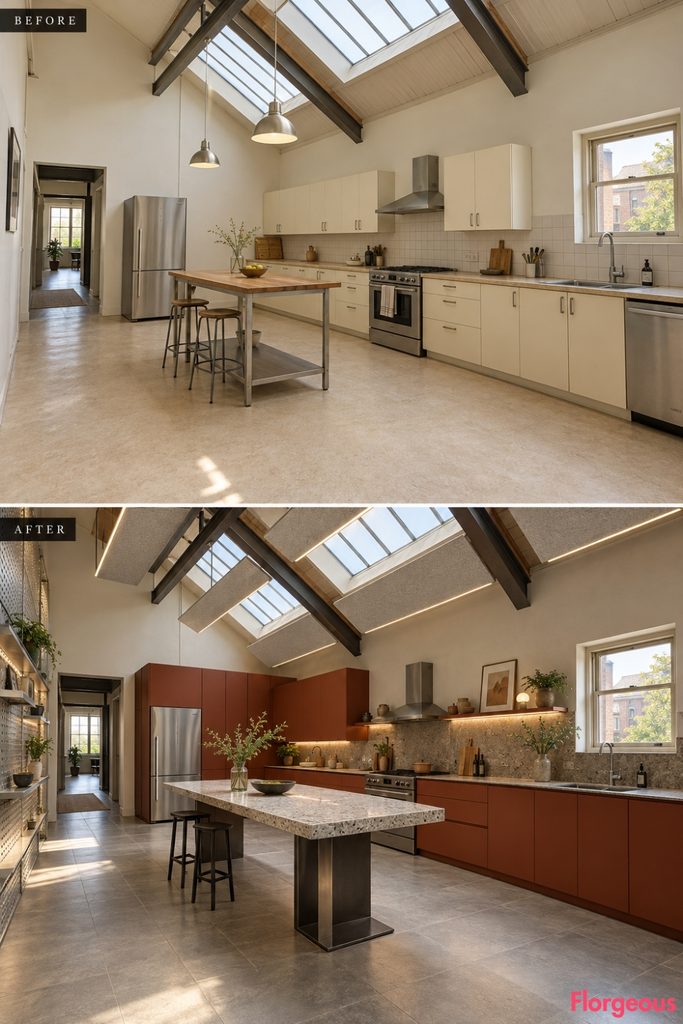
A converted commercial loft can have extraordinary overhead architecture, yet a conventional kitchen may fail to take advantage of it.
This concept treats the room as a contemporary material gallery, using bold but carefully organized cabinet volumes beneath the existing roof.
Before: Ordinary cream cabinets sit below three sawtooth roof sections. Beige countertops, basic hanging lights, and a generic preparation table do little to connect the kitchen with its architecture.
After: A continuous deep rust-red storage composition stretches along the main solid working wall. Its precise geometric cabinet divisions establish a strong rhythm beneath the angular roof.
A large low preparation table in pale polished terrazzo occupies the center, supported by two correctly engineered dark metal legs. Along the opposite solid wall, a shallow perforated-aluminum display and utility system provides organized storage without blocking natural light.
Instead of filling the upper loft with tall cabinetry, the design uses suspended acoustic baffles placed between existing structural beams, with carefully integrated lighting.
The roof remains untouched, but the entire space gains an expressive modern identity.
Why it works: The strong horizontal kitchen elements balance the roof’s dynamic geometry while preserving its visual prominence.
Try this: In a loft, keep the highest storage limited to accessible areas. A dramatic ceiling is more impressive when it remains visible.
10. Reimagine a Walk-Through Kitchen as a Precision-Organized Storage Gallery
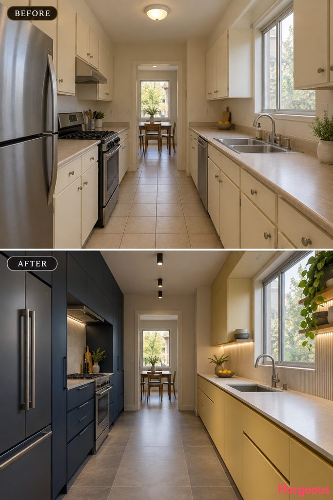
A walk-through kitchen connects different areas of a home, so its layout must support movement as well as cooking.
This transformation removes the visual disorder of ordinary cabinetry and replaces it with two completely different but coordinated working walls.
Before: A long room has an opening at either end, standard cream cabinets along both sides, and a basic tiled floor. The numerous cabinet doors and exposed appliances make the corridor feel busy.
After: One entire side becomes a matte midnight-blue storage composition with integrated appliances, full-depth drawer systems, and a long continuous horizontal opening for countertop work.
The opposite side uses pale yellow powder-coated metal fronts below the sink window, with a thin pale stone counter and minimal overhead storage.
A graphic floor made from large gray tiles with a subtle central band emphasizes the straight circulation route. Slim directional ceiling fixtures create alternating pools of practical light rather than one uniform ceiling glow.
The finished kitchen feels like a precisely organized architectural corridor.
Why it works: Concentrating tall storage on one side and keeping the other wall lighter creates a stronger spatial hierarchy and more comfortable working environment.
Try this: Before selecting cabinet systems, check that opposing doors and drawers can open without blocking access through the kitchen.
11. Turn an Under-Mezzanine Kitchen Into a Warm, Layered Architectural Retreat
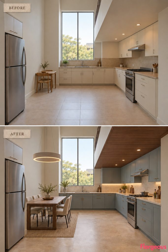
A mezzanine can create two dramatically different ceiling heights within the same room. This makeover uses that contrast to give an ordinary kitchen a layered contemporary character.
Before: A simple kitchen sits partly below an existing mezzanine. Basic cabinets and weak lighting leave the lower zone feeling compressed, while the taller adjacent area has little visual purpose.
After: The underside of the mezzanine receives a rich smoked-walnut veneer finish, carefully fitted without changing its height or structural shape.
Below it, pale blue-gray cabinetry and warm stone counters form a crisp working composition. The lower zone becomes a focused cooking area, with lighting concealed neatly within the cabinet system.
In the taller adjoining section, a slim architectural dining table and suspended circular acoustic light provide a visual counterpoint to the mezzanine’s low horizontal form.
The two ceiling levels now feel like intentionally different spaces within one coherent kitchen.
Why it works: Distinct finishes and lighting strategies clarify the relationship between the low working zone and the open-height dining area.
Try this: Use warm materials under low ceilings, but avoid bulky suspended fixtures where headroom is limited.
12. Give a Sloping Attic Kitchen a Dramatic Contemporary Envelope
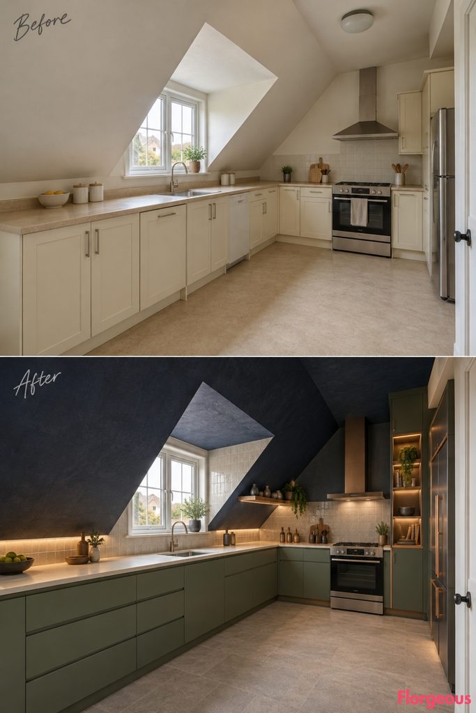
An attic kitchen can become one of the most visually distinctive spaces in a city home, especially when its original sloping ceiling becomes a feature rather than a limitation.
Before: Cream cabinetry sits awkwardly beneath the eaves, while the existing dormer window and roof slope feel visually disconnected from the working surfaces.
After: The sloping ceiling receives a rich midnight-indigo mineral finish, emphasizing its existing geometry without altering the roof.
Below, low pistachio-green cabinetry follows the roofline with precisely fitted drawer fronts and a continuous pale stone countertop. At the taller gable end, a compact full-height storage system introduces contrasting brushed copper details.
The original dormer window becomes the focal point of the sink area, framed by pale ceramic wall panels and a slim floating shelf attached to the solid surrounding wall, not the glazing.
Warm concealed lighting highlights the sloping roof surface, giving the kitchen a highly composed contemporary atmosphere.
Why it works: The contrast between a dark sloping ceiling and lighter low cabinetry makes the unusual architectural shape feel purposeful.
Try this: Avoid filling low eaves with oversized storage. The most comfortable solution often uses deep lower drawers and concentrates taller cabinets where headroom allows.
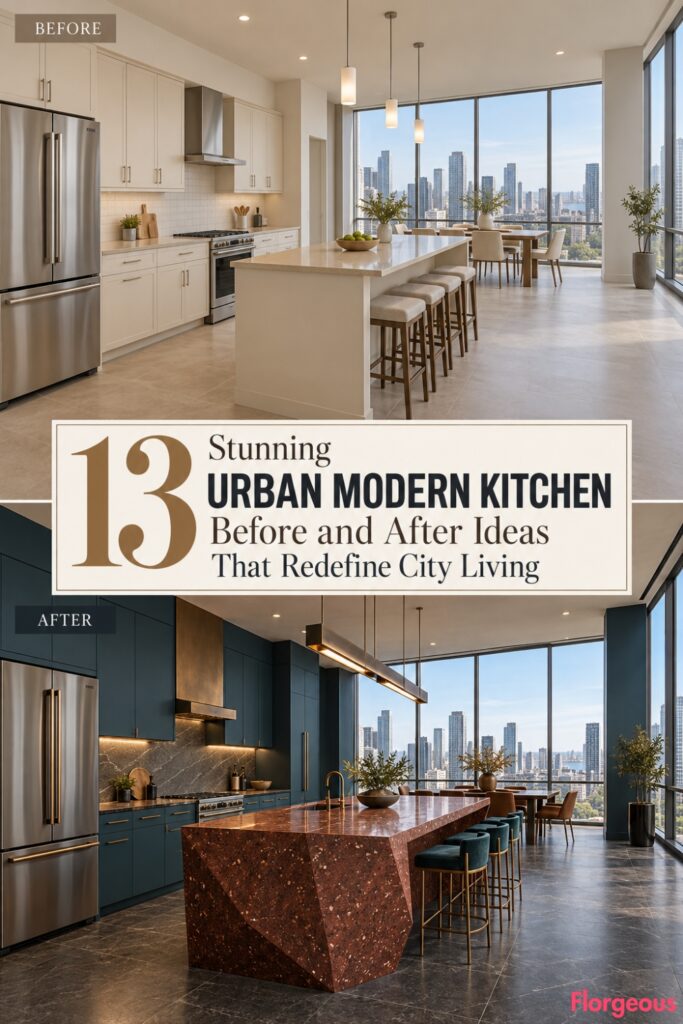
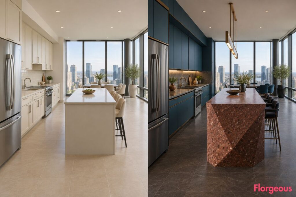
13. Turn a Panoramic Penthouse Kitchen Into a Sculptural Modern Showpiece
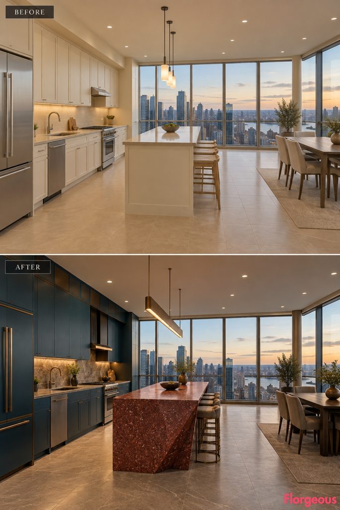
The final makeover takes advantage of a spacious high-rise kitchen with beautiful city views, but the design doesn’t depend on changing its architecture.
Instead, the transformation comes from one bold architectural gesture supported by carefully controlled surrounding materials.
Before: A broad penthouse kitchen has ordinary perimeter cabinets, beige countertops, a generic preparation island, and large corner glazing. The room is spacious, but its furnishings have little relationship to the impressive architecture.
After: The existing working walls become a composition of dark peacock-blue cabinetry, warm gray stone surfaces, and subtle bronze-metal details.
At the center, the ordinary island is replaced with a remarkable faceted preparation monolith clad in deep clay-red terrazzo. Its angular sides create a strong sculptural silhouette, while the upper surface provides a practical, level working area.
A suspended linear lighting sculpture follows the island’s main axis without competing with the expansive glazing.
The surrounding cabinetry includes large uninterrupted panels, carefully placed recessed storage, and discreet appliance integration. The original panoramic windows remain completely unobstructed.
The result feels like an architectural installation designed for a sophisticated metropolitan residence.
Why it works: One dominant sculptural volume establishes the kitchen’s identity, while the surrounding surfaces provide restraint and practical functionality.
Try this: Use a visually dramatic island only where the room provides enough circulation. In smaller kitchens, apply the same material idea to a compact peninsula or a single cabinet volume instead.
How to Make Your Kitchen Makeover Feel Like a Real Transformation
A successful Urban Modern Kitchen makeover should change how a room looks, functions, and feels, not simply introduce a more fashionable cabinet color.
The strongest transformations in this collection have one thing in common: every major design decision contributes to a clear visual concept. Cabinetry is organized into deliberate architectural volumes, surfaces support a cohesive material story, lighting reinforces the spatial layout, and furniture is selected according to the room’s actual dimensions.
For smaller apartments, practical changes to storage and furniture placement can create an enormous difference. In larger spaces, stronger architectural elements, sculptural preparation counters, and more expressive materials become possible.
Before choosing a makeover direction, photograph your existing kitchen, measure the fixed architectural features, and identify the three elements that contribute most to its unfinished appearance.
Then build a cohesive redesign around those priorities, rather than simply replacing individual finishes one at a time.