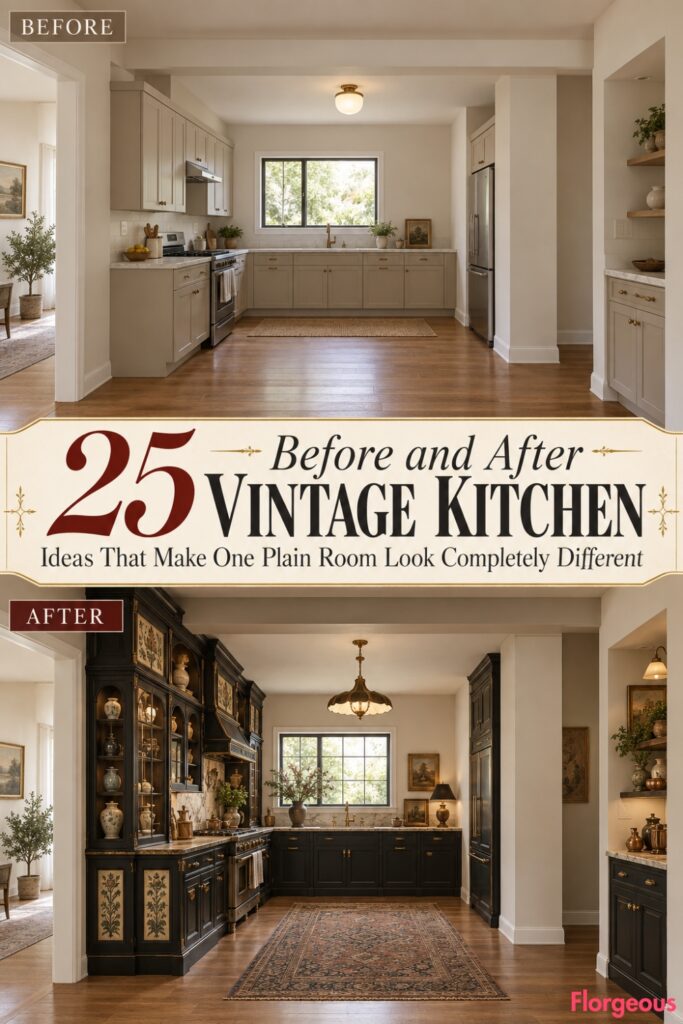
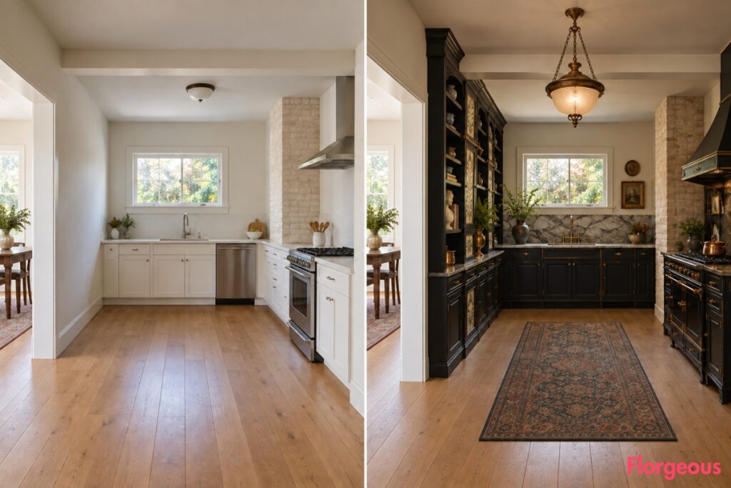
A plain builder-grade kitchen does not need new walls to become almost unrecognizable.
For these Vintage Kitchen ideas, every makeover begins with exactly the same unusual base room: an asymmetrical five-sided kitchen with a wide front-left cased opening, one horizontal rear window positioned off-center to the left, a fixed masonry column near the rear-right corner, a shallow service alcove behind it, one transverse ceiling beam, warm timber flooring, and generous central circulation.
The BEFORE always stays deliberately simple. Neutral cabinetry occupies only the rear-left zone and a short right return, leaving much of the room visually unfinished.
The architecture never changes. Instead, each AFTER completely rethinks how cabinetry, furniture, work surfaces, lighting, storage, materials, and focal elements occupy that shell. The goal is not 25 color schemes. It is 25 visibly different rooms inside the same architecture.
1. Turn the Left Wall Into an Aesthetic Movement Cabinet Room
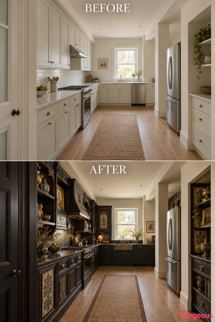
Before: The same plain five-sided kitchen with sparse neutral cabinets and an unused solid left wall.
After: The long left wall becomes a dramatic furniture-like composition of ebonized timber cabinets with asymmetrical shelves, inset ceramic relief panels, small brass details, and elevated display niches. The rear cabinetry stays low so the new cabinet wall dominates.
Why it works: One previously empty architectural plane becomes the entire visual identity of the room.
2. Build a Beaux-Arts Scagliola Service Kitchen Around the Column
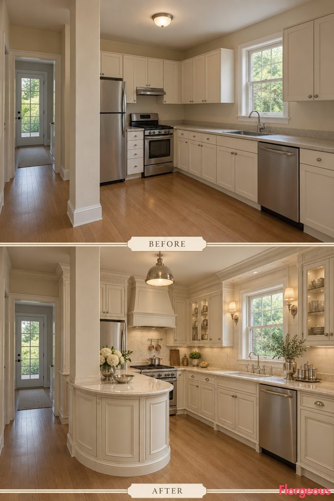
This makeover makes the fixed structural column feel intentional.
The column becomes the visual center of a formal service composition, surrounded by scagliola-clad work surfaces, paneled ivory cabinetry, nickel-silver rails, and a curved serving counter that stops well before the circulation route.
Try this: Treat an awkward structural element as the anchor rather than trying to hide it.
3. Stretch the Room Vertically With Glasgow School Joinery
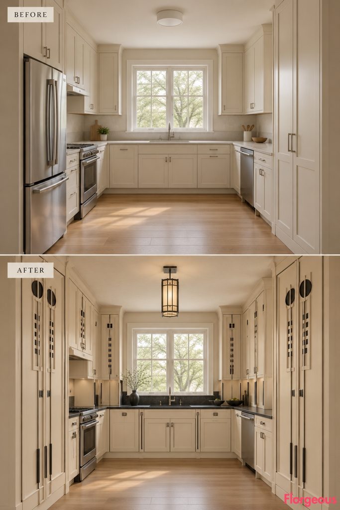
Tall, narrow proportions make this version instantly different.
Slim cream-and-black cabinet towers rise along the left wall with elongated door panels and tiny square pewter inlays. The rear window remains exposed beneath a restrained low counter.
Why it works: The eye moves upward instead of across conventional cabinet runs.
4. Make a Prairie School Horizon Run Beneath the Window
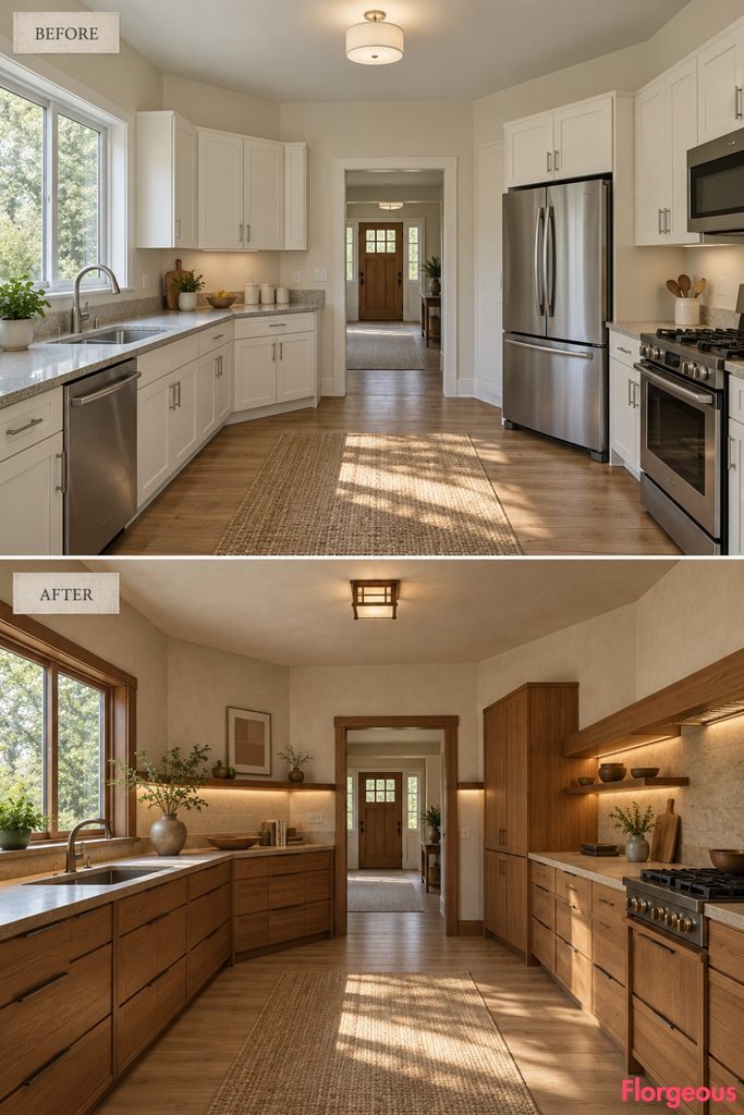
This section does the opposite.
A continuous low timber datum wraps from the rear window toward the short right wall, connecting counters, drawers, ledges, and lighting into one strong horizontal line.
Upper storage is almost completely removed.
5. Frame the Service Alcove Like an Egyptian Revival Pylon
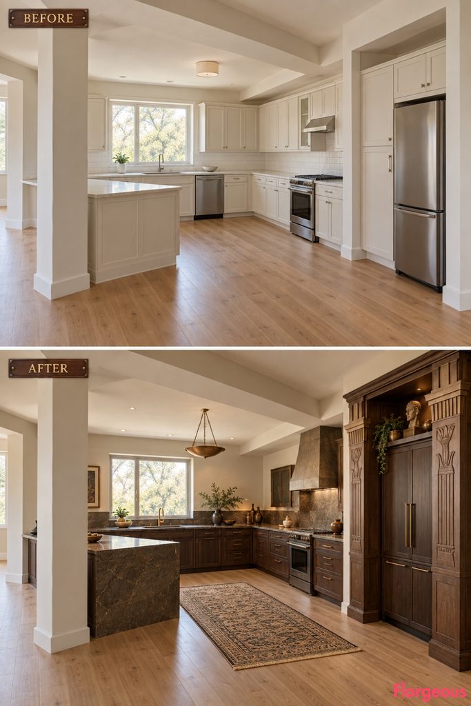
Instead of hiding the shallow alcove, this makeover turns it into the focal point.
Two tall cabinet masses frame its opening like simplified pylons, with stepped pale-stone edges, dark timber faces, and restrained papyrus-inspired relief.
The rest of the kitchen remains visually quiet.
6. Recompose the Left Wall as a De Stijl Spatial Artwork
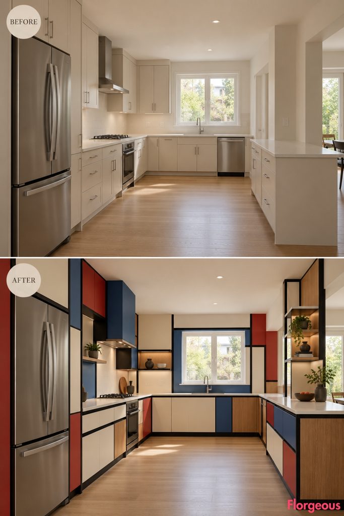
The long solid wall becomes an arrangement of interlocking planes rather than a cabinet run.
Cream, muted red, dusty blue, warm timber, and black lines create projecting and recessed volumes with carefully controlled voids.
Designer Tip: Empty space is part of the composition, so avoid filling every gap with storage.
7. Turn the Alcove Into a 1930s Bakelite Machine Station
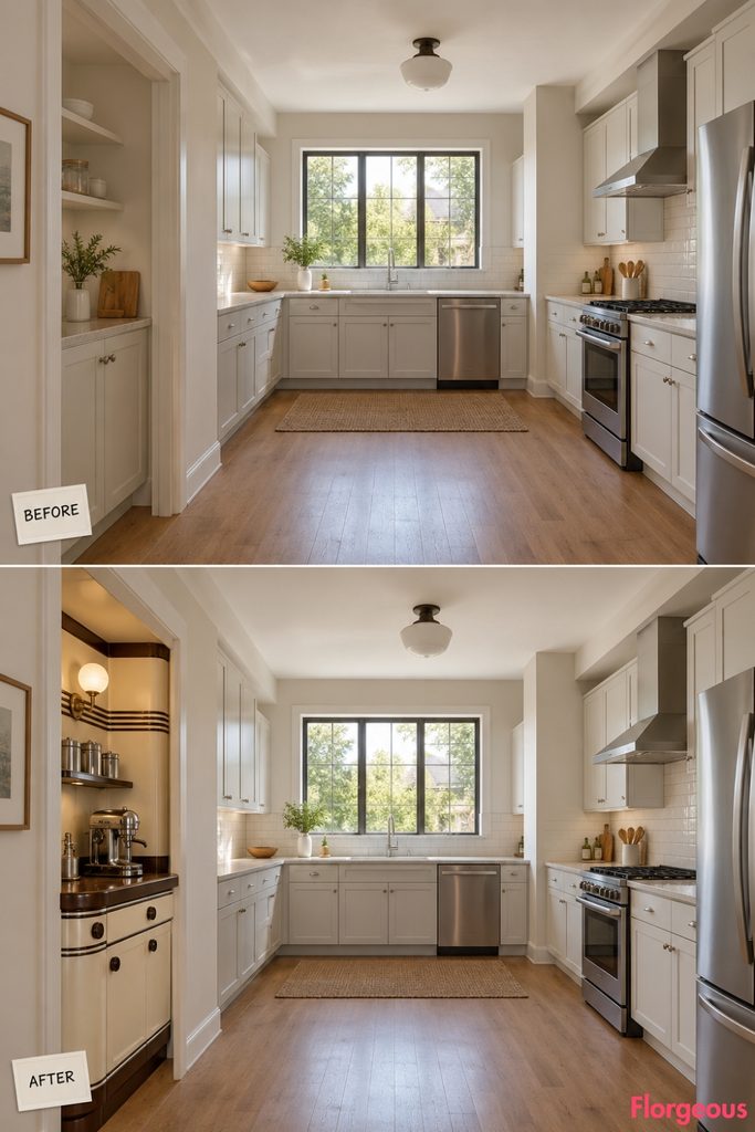
Here, the shallow service alcove becomes a compact machine-like preparation center.
Cream cabinetry surrounds brown Bakelite-inspired molded details, rounded dial-like handles, a dark work surface, and precise repeating drawer proportions. The opposite walls remain sparse.
8. Wrap the Rear Corner in Vitrolite Structural Glass
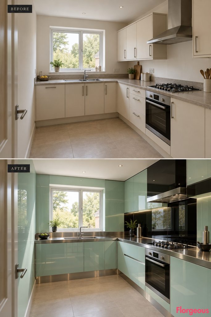
Large opaque glass planes replace the visual fragmentation of normal cabinets.
Black and pale jade structural-glass surfaces wrap the rear-left working corner, meeting in crisp lines around the fixed window. Stainless trim traces the edges without introducing glass-front cabinet doors.
9. Create a Grand Hotel Silver Pantry
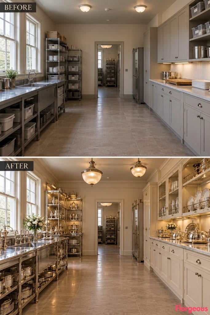
This AFTER feels formal, bright, and almost ceremonial.
A polished nickel-silver preparation zone occupies the short right return, while tall cream cupboards are limited to one compact block behind the column. Gallery rails, shallow warming cupboards, and substantial ceiling lights reinforce the service-room mood.
10. Build the Kitchen Around a 1910s Central European Tiled Range
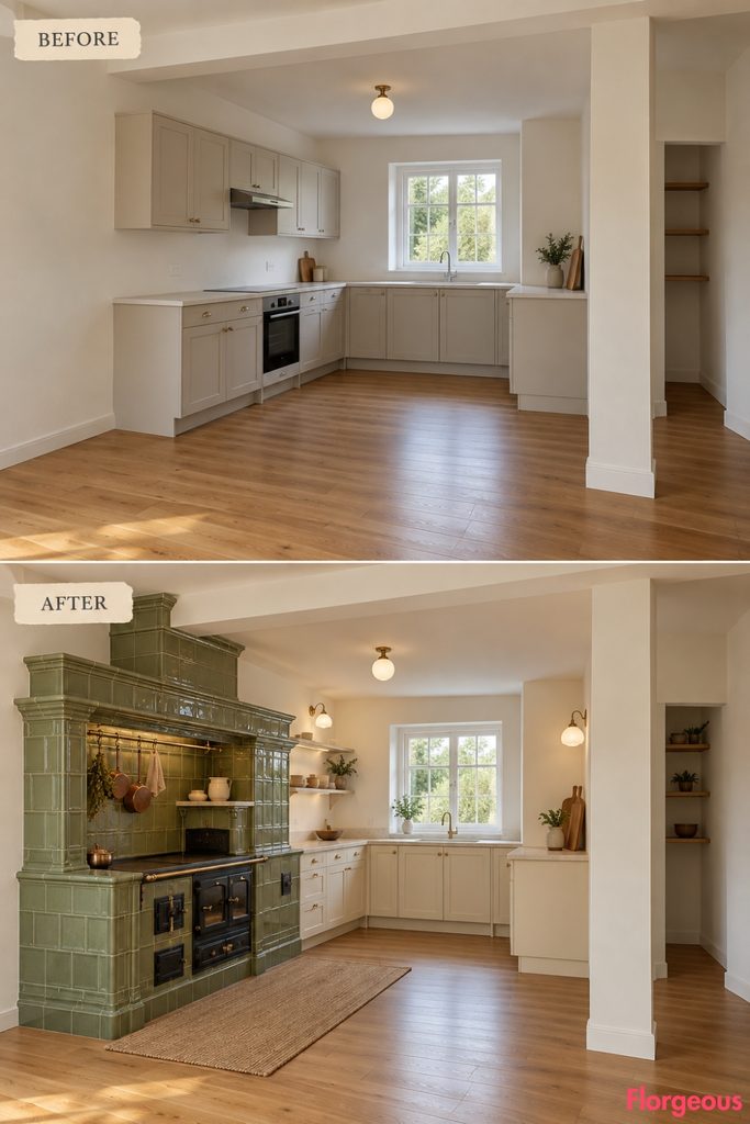
This makeover gives the room one monumental vintage focal point instead of another conventional cabinet composition.
Before: The same plain five-sided builder-grade kitchen with neutral cabinetry, ordinary counters, basic lighting, and open central circulation.
After: A sculptural sage-green glazed-tile cooking range becomes the dominant feature along the solid left wall, with stepped ceramic profiles, dark metal cooking details, a shallow warming shelf, and compact cream cabinetry around it. Pale stone counters and simple opaline lighting keep the rest of the kitchen restrained.
Why it works: One large architectural cooking element completely changes the room’s silhouette and visual hierarchy without altering the original shell.
Try this: Keep surrounding cabinetry simple so the tiled range remains the unmistakable focal point.
11. Build a Dedicated Preserving Kitchen Under the Rear Window
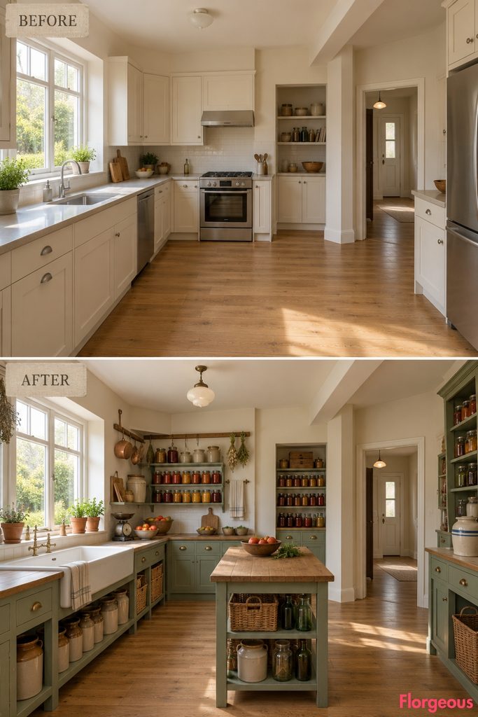
The fixed rear window defines this entire design.
A deep white porcelain preparation bench runs beneath it, flanked by cooling shelves, bottle storage, shallow drawers, and a wall-mounted utensil rail. Tall cabinetry moves away from the window entirely.
12. Give the Short Right Wall an Olivetti-Inspired Control Console
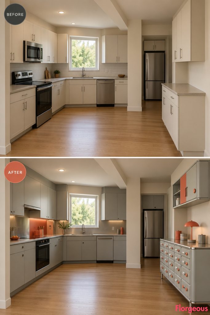
A single precise object defines this makeover.
The right return becomes a compact pale-gray and coral preparation console with typewriter-like key rhythms, small colored control details, carefully repeated drawers, and a thin working surface.
Other cabinetry becomes quiet cream background storage.
13. Float a Festival of Britain Display Structure Beside the Column
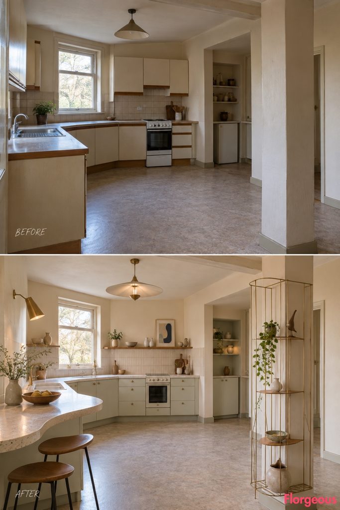
This concept creates a light sculptural centerpiece without blocking movement.
A fine wire-frame display structure wraps only one side of the fixed column, paired with a biomorphic preparation ledge and pale cabinetry pushed to the rear walls.
Why it works: The room gains a central event without becoming a conventional island kitchen.
14. Turn the Counter Into a Swiss Werkbund Precision Instrument
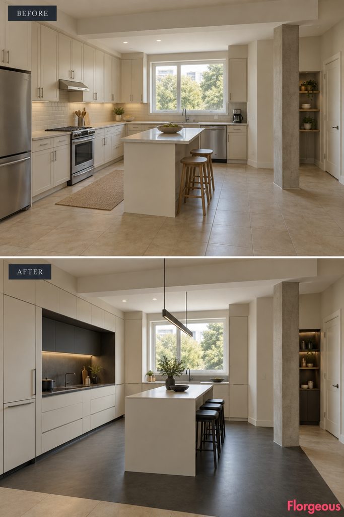
This layout is almost entirely about one work surface.
A long pale-lacquer cabinet run hugs the left wall, but a dark inset preparation zone interrupts it with machine-like precision. Hard rubber flooring within the working area visually marks the kitchen zone without changing the floor footprint.
15. Make One Corner an Optical Illusion
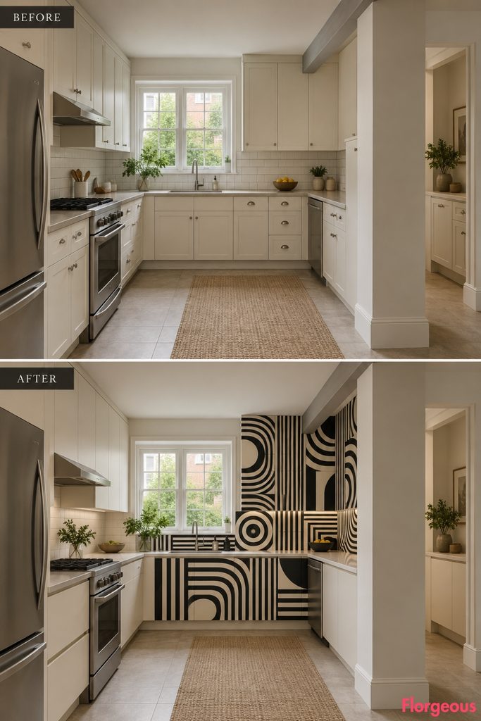
Black-and-cream geometry creates the transformation rather than color variety.
One rear corner becomes a continuous Op Art field that crosses cabinet fronts, backsplash, and the short adjacent wall. The remaining surfaces are almost completely plain.
16. Install a Seamless Monocoque Preparation Object
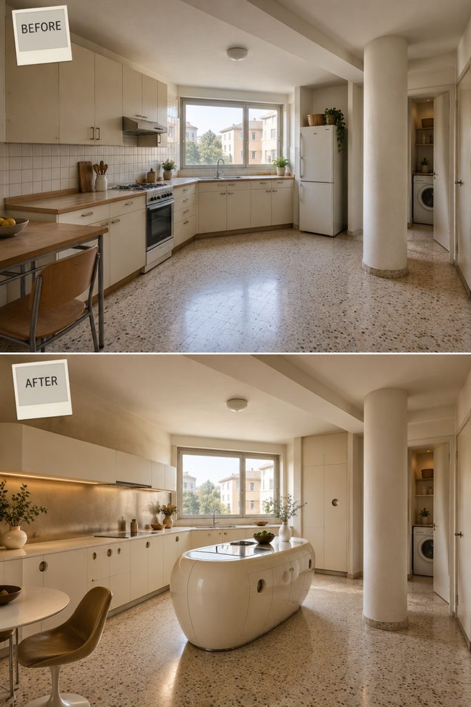
The kitchen’s centerpiece now reads as one molded object rather than an island.
A smooth off-white monocoque preparation form sits several feet inside the room with recessed circular handholds and an integrated work surface. It stays narrow enough to maintain generous circulation around both sides.
17. Turn the Alcove Into a French Ceramic Laboratory
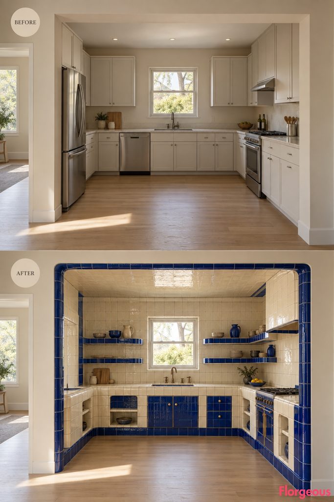
Small-format ceramic becomes architecture.
The entire shallow alcove is lined with glossy cream and cobalt ceramic units, continuing over the counter, plinth, side returns, and built-in work niche. Surrounding cabinetry stays matte and minimal.
18. Cover the Room With a Superstudio Grid
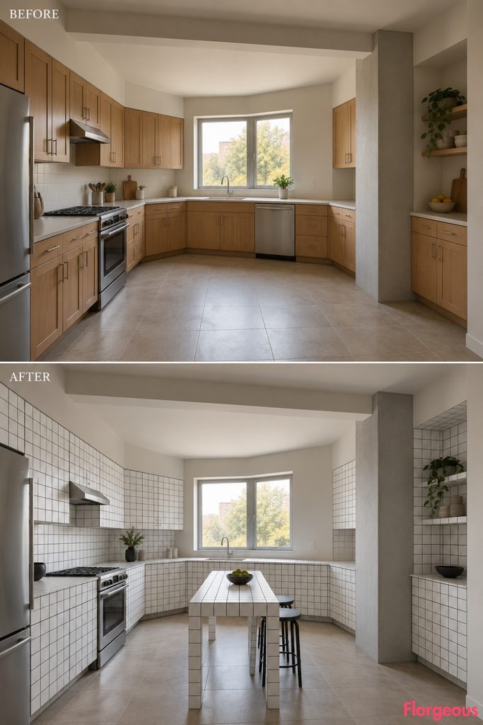
A fine continuous grid visually connects previously separate elements.
The grid moves across selected cabinet fronts, worktops, and a central preparation table, while untouched walls remain visible around it.
The fixed column stays raw so the viewer can still clearly read the original architecture.
19. Turn the Column Zone Into a 1910s Viennese Coffeehouse Service Kitchen
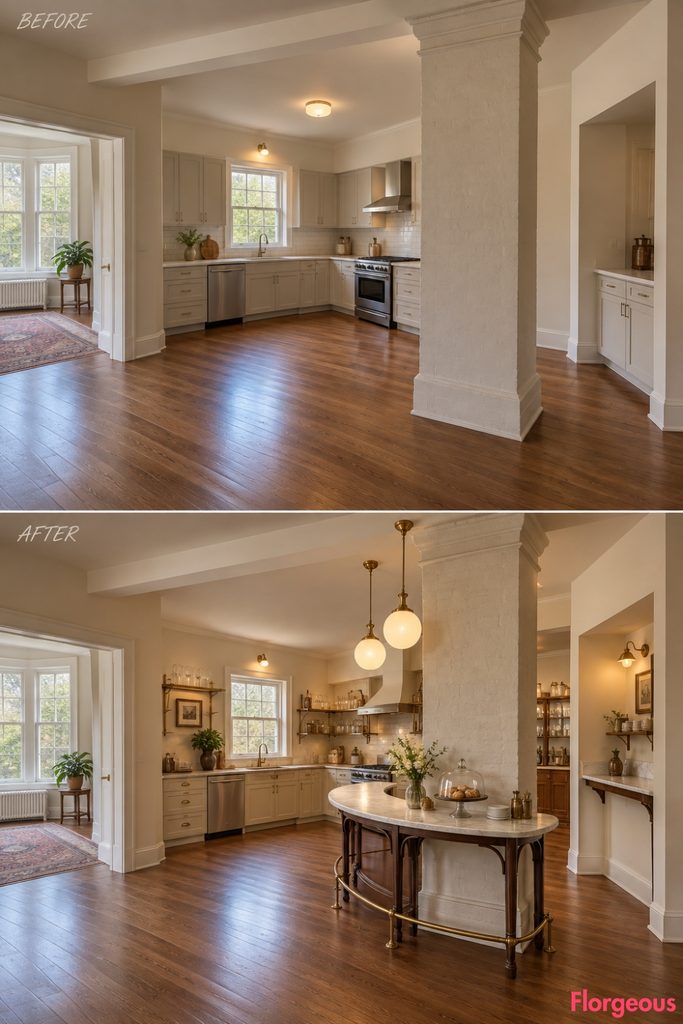
This makeover turns the fixed column into a graceful vintage service focal point.
Before: The same plain five-sided builder-grade kitchen with neutral cabinetry, basic finishes, fixed column, shallow alcove, and open circulation.
After: A slim crescent-shaped marble counter wraps one side of the column, supported by dark bentwood-inspired legs with a polished-brass foot rail. Low cream cabinetry, small marble landing shelves, a narrow tray ledge, and two opaline globe lights complete the Viennese coffeehouse mood.
Why it works: The curved service zone creates a completely new layout and focal point without changing the architecture.
Try this: Keep the counter visually light underneath so circulation stays open.
20. Turn Cabinet Faces Into Graphic Laminate Inlay
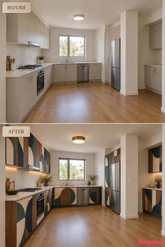
This section keeps the volumes simple but makes the surfaces highly crafted.
Large cabinet doors use precise geometric laminate inlays in tobacco, cream, muted teal, and black. The pattern is constructed as panel composition rather than painted across the room.
21. Make the Entire Kitchen a Memphis Composition
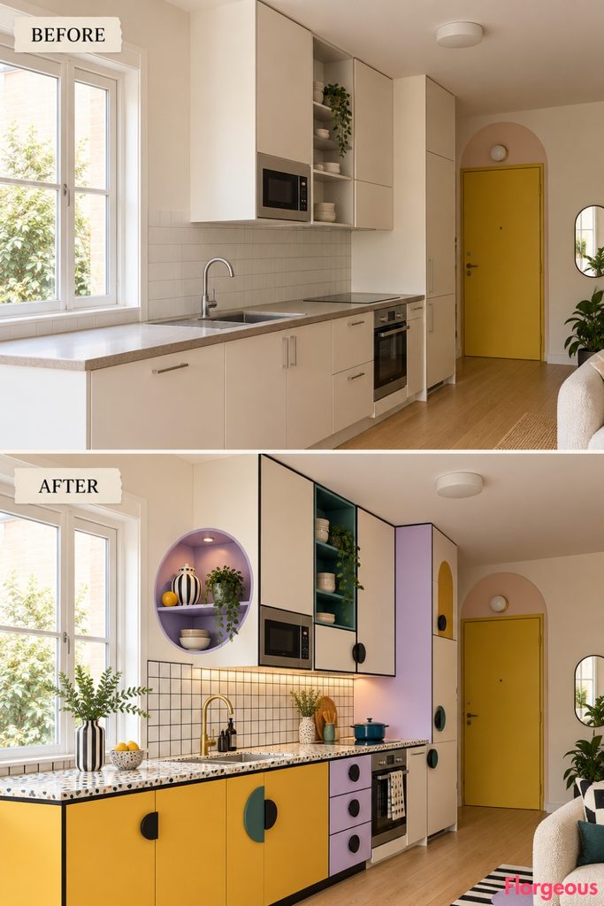
Now the room becomes intentionally playful.
Stepped cabinet blocks, circular niches, small arches, oversized handles, speckled surfaces, and controlled ochre, lavender, cream, and teal create a composition with almost no conventional symmetry.
The pentagonal shell remains clearly visible around the new objects.
22. Give the Left Wall a Neo-Baroque Lacquer Salon
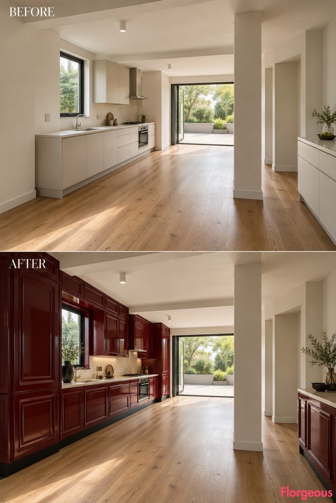
Vintage becomes dramatic without repeating traditional carved cabinetry.
A deep oxblood lacquer composition covers the solid left wall, framed by oversized flattened classical profiles. Cream work surfaces and black plinths make the wall read almost like theatrical paneling.
23. Build a Symmetrical French Neo-Deco Composition Around the Window
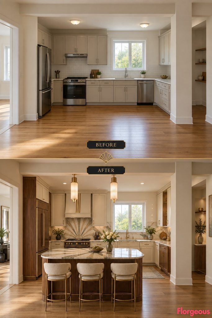
For once, symmetry becomes the main design device.
The offset rear window remains exactly where it is, but cabinetry creates a deliberately balanced composition around the entire rear elevation using fan-like stone wedges, polished timber, ivory lacquer, and strong vertical light fixtures.
The asymmetry of the architecture makes the controlled cabinetry even more striking.
24. Turn the Column Zone Into a Glass-Block Cabinet Object
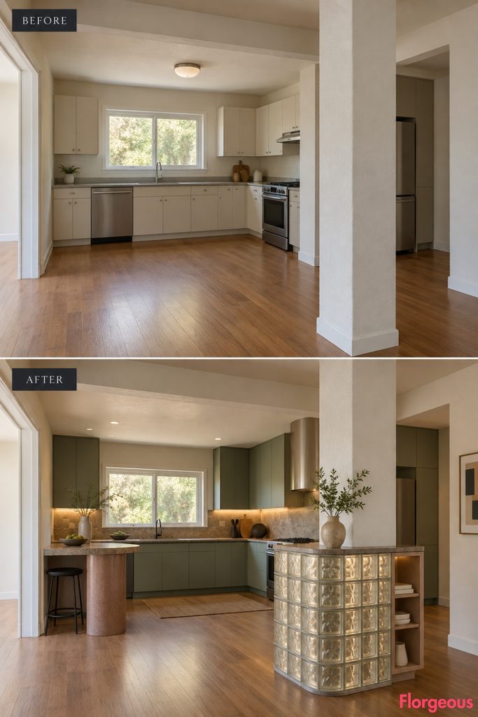
This makeover uses glass block as a volumetric material rather than glazing.
A low glass-block storage and display object sits beside the fixed masonry column, with solid matte cabinetry behind it. Soft internal cabinet lighting stays hidden inside actual fixtures so the blocks reflect and diffuse light rather than glow by themselves.
25. Finish With a Museum Archive Kitchen
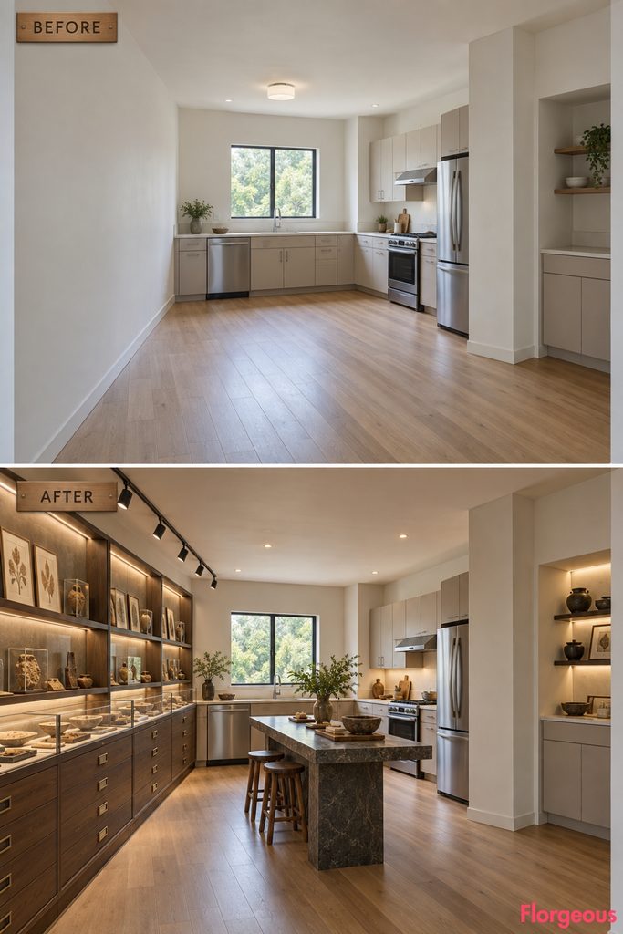
The final makeover uses an entirely different storage hierarchy from a conventional kitchen.
One long wall becomes a sequence of oversized horizontal archival cases with broad shallow drawers and glazed specimen-style display tops. A slim stone workbench sits independently opposite them, while the rear window and column remain fully visible.
The room feels part kitchen, part private design archive.
How to Make a Vintage Kitchen Makeover Feel Truly Different
A convincing makeover begins with composition, not decoration.
Before choosing paint, decide what should become visually dominant. It might be one monumental cabinet wall, a long horizontal datum, an alcove transformed into a specialized workstation, a sculptural preparation object, or several freestanding furniture pieces.
Then change the scale of the materials. A small decorative backsplash rarely changes the whole room, but an entire ceramic work alcove, structural-glass corner, monumental lacquer wall, or oversized stone preparation surface can.
Lighting should also belong to the concept. A precision modernist kitchen needs very different lighting from a hotel pantry, Glasgow-inspired interior, or Memphis composition.
Most importantly, keep the architecture honest. These makeovers never require moving the rear window, changing the column, inventing new recesses, widening the room, or altering the ceiling beam. The same distinctive shell remains visible throughout.
That contrast is what makes a Vintage Kitchen before-and-after satisfying. The viewer can immediately recognize the same physical room while seeing a genuinely different design world inside it.