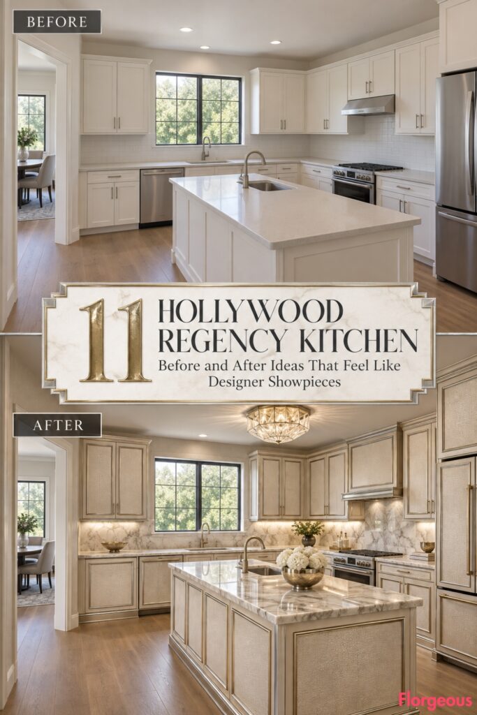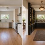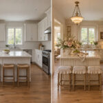
A plain builder-grade kitchen can be practical yet almost completely anonymous. Pale stock cabinets, neutral counters, standard appliances, flat lighting, and empty surfaces provide function, but they offer very little visual identity.
That blank starting point makes a Hollywood Regency Kitchen especially exciting to reimagine. The best makeovers are not created by painting the same cabinets different colors or adding a glamorous pendant. They change how the entire interior composition is perceived through custom-looking cabinetry, decorative craftsmanship, unusual luxury materials, architectural framing, lighting, and carefully controlled ornament.
Every makeover below begins with the same ordinary kitchen. The walls, corners, ceiling geometry, floor footprint, window and doorway positions, plumbing, appliance locations, and primary work zones remain fixed. Nothing structural moves.
The AFTER, however, should feel like a complete designer renovation. Each of these 11 concepts has a different visual language, dominant material, cabinet form, focal feature, lighting strategy, and camera viewpoint.
1. Turn the Main Cabinet Wall Into a Theatrical Regency Proscenium
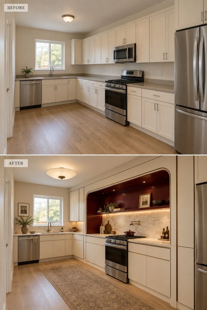
Make the entire cabinet elevation feel like an Old Hollywood stage set, with bold architectural framing rather than relying on decorative surface alone.
Before: A plain builder-grade kitchen with pale cabinets, neutral counters, standard appliances, bare worktops, and basic lighting.
After: Rebuild the main cabinet elevation as a dramatic proscenium composition with deep warm-ivory side frames, an oversized curved upper surround, and a recessed oxblood-red central working zone. Add thin dark-bronze inlay lines, dense cream stone, concealed task lighting, and one shallow opaline ceiling bowl.
Why it works: The AFTER completely changes the perceived architecture of the cabinet wall, creating a strong cinematic focal point while keeping the original kitchen shell intact.
Try this: Concentrate the proscenium treatment on one full elevation and keep the other cabinet runs visually quiet.
2. Build a Book-Matched Malachite Cooking Portal
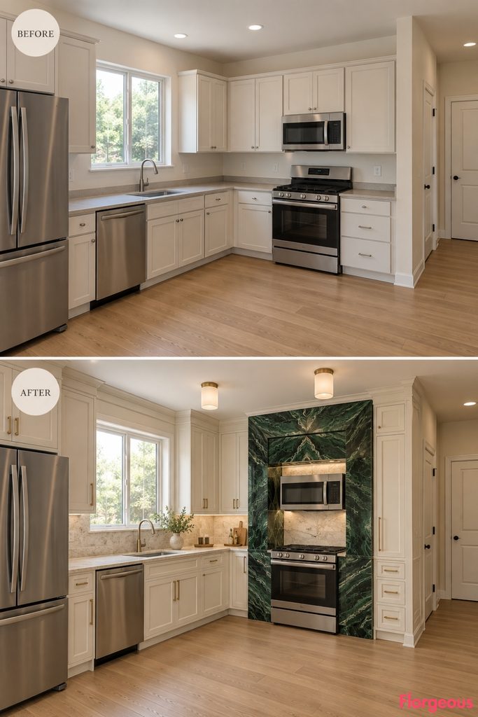
This kitchen is organized around one extraordinary mineral-inspired focal composition rather than an all-over cabinet color.
Before: The same neutral builder-grade kitchen with generic pale cabinetry, standard appliances, thin neutral counters, and flat lighting.
After: Keep the cooking appliance exactly where it is, then visually frame the entire existing cooking bay as a tall architectural portal using book-matched malachite-inspired panels with deep green, black, and mineral veining.
Surround the portal with calm bone-white cabinetry featuring thick slab-like frames and almost invisible hardware. Use quiet warm-white stone elsewhere so the malachite remains the only expressive pattern.
A pair of compact frosted-glass ceiling cylinders provides soft illumination without competing with the mineral feature.
Why it works: One concentrated decorative gesture gives the kitchen a strong identity without repeating jewel-colored lacquer already used elsewhere.
Designer Tip: A porcelain slab with convincing malachite patterning is far more practical around a working kitchen than real decorative stone.
3. Transform the Tall Storage Into a Grisaille Architectural Gallery
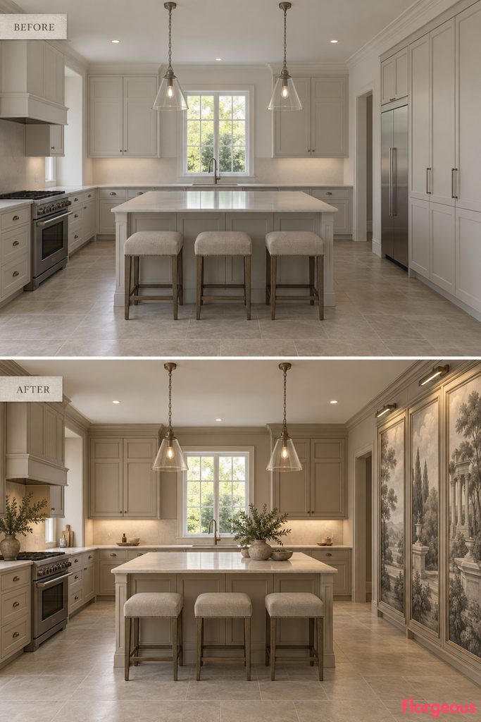
Here the cabinet elevation becomes artwork, but without turning the kitchen into a wallpaper-led design.
Before: The same plain kitchen with pale tall cupboards, neutral counters, exposed everyday functionality, and no memorable storage wall.
After: Conceal the existing tall storage behind a continuous sequence of deeply framed grisaille panels painted with tonal imaginary gardens, colonnades, urns, terraces, and theatrical architectural perspectives.
The artwork spans multiple cabinet doors so the storage elevation reads as one large composition. Warm limestone-colored framing and antique-silver inner lines create depth without introducing a second pattern.
Keep the working counters almost monolithic and add discreet picture-style illumination integrated above the art panels.
Why it works: Functional cabinetry becomes a built-in decorative gallery without moving the storage itself.
4. Create an Iridescent Mother-of-Pearl Cabinet Pavilion
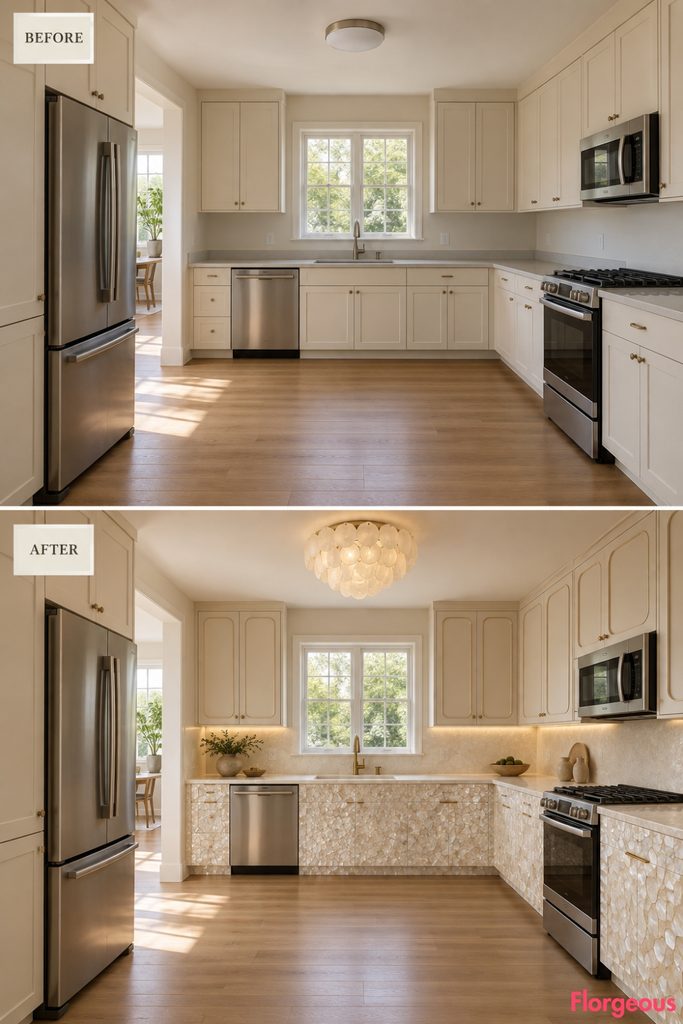
This concept uses natural shimmer as an architectural surface rather than as a small decorative accent.
Before: The same ordinary kitchen with pale rectangular cabinet fronts, neutral worktops, standard appliances, and basic lighting.
After: Convert one complete existing lower cabinet run into a nearly seamless plane of irregular ivory mother-of-pearl mosaic. Drawer and door breaks remain functional but become visually quiet.
Above it, oversized ecru cabinet faces receive gently bowed corners and deep recessed framing, giving the elevation a softer silhouette without changing the cabinet footprint.
A continuous pale ceramic slab connects countertop and backsplash. Overhead, one sculptural opal-glass fixture composed of overlapping shell-like discs becomes the room’s luminous focal point.
Why it works: The makeover changes surface, silhouette, depth, and lighting at the same time.
5. Frame the Fixed Window With Regency Obelisk Piers
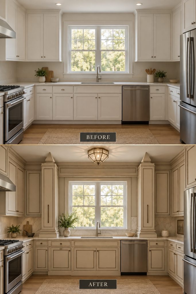
Instead of redesigning a cabinet material, this makeover changes the architectural reading of the sink elevation.
Before: The same generic sink beneath a fixed window, surrounded by ordinary cabinets and an unremarkable backsplash.
After: Keep the sink and window exactly where they are. Build two visually tapered obelisk-inspired storage piers into the outer edges of the existing cabinet run, using applied panel geometry rather than changing the wall footprint.
A deep horizontal frame bridges the composition above the window without covering the glazing. Parchment-beige surfaces, dark pewter linework, inset lower panels, and a substantial continuous stone sill make the whole wall read as one formal Regency composition.
A shallow faceted lantern aligns with the center of the fixed window.
Why it works: The window changes from an incidental opening into the organizing focal point of the room.
6. Replace Straight Cabinetry With a Serpentine Regency Furniture Run
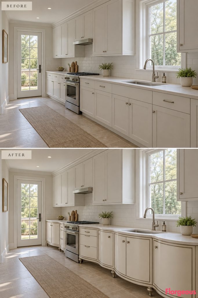
This concept creates its drama through silhouette rather than an unusual applied pattern.
Before: The same repetitive straight-front builder-grade cabinets, neutral counters, standard appliances, and generic hardware.
After: Keep the cabinet boxes and work zone in exactly the same locations, but rebuild the visible lower fronts as a shallow serpentine furniture composition. Gentle convex and concave sections move across the elevation while staying within realistic kitchen depth.
Use pale shell-colored lacquer with antique pewter edge trim and substantial sculpted feet at only the outer termination points. Above, keep the storage deliberately rectilinear and quiet so the curved base run remains dominant.
A seamless warm-white stone worktop follows the subtle curve, creating a bespoke furniture effect without compromising the walkway.
Why it works: The AFTER has a completely new silhouette, not simply a new color.
7. Create a Lacquered Harlequin Cabinet Gallery
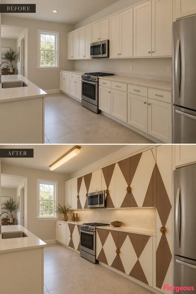
Turn the main cabinet run into one oversized graphic composition using large-scale harlequin geometry and jewelry-like hardware.
Before: The same plain builder-grade kitchen with pale cabinets, neutral counters, standard appliances, and generic lighting.
After: Redesign the main cabinet fronts with oversized chalky-cream and muted tobacco harlequin fields divided by fine bronze lines. Add a few cloudy-amber cabochon pulls, plain warm-ivory secondary cabinetry, creamy mineral surfaces, and one long opaque-glass ceiling fixture.
Why it works: The oversized geometry completely changes the visual rhythm of the kitchen without altering the original layout.
Try this: Limit the harlequin pattern to one cabinet run so it remains bold and refined.
8. Turn the Pantry Wall Into Repoussé Pewter Artwork

This makeover treats metal as handcrafted decorative art rather than industrial cabinetry.
Before: The same plain tall pantry doors, pale perimeter cabinets, neutral counters, and ordinary lighting.
After: Cover the existing tall storage elevation in hand-hammered pewter-effect panels with shallow repoussé abstract ribbon forms. The pattern should be large-scale and irregular, reading as crafted metalwork rather than repetitive embossing.
Keep surrounding cabinetry chalky cream with almost no visible hardware. A charcoal soapstone-look worktop grounds the cool metallic feature, while narrow warm wall washers reveal the hammered texture at night.
The pantry remains completely functional behind the decorative panels.
Why it works: It uses metal in an artisanal, sculptural way rather than repeating stainless-steel, chrome, or blackened industrial kitchen ideas.
9. Make Pietra Dura the Kitchen’s Single Piece of Permanent Artwork
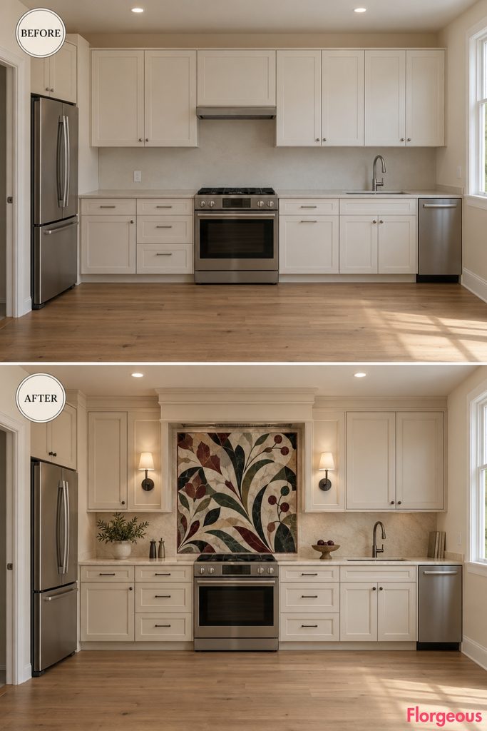
This concept moves decorative stone away from the usual full-slab backsplash treatment.
Before: The same neutral kitchen with a plain backsplash, pale cabinets, ordinary counters, and no crafted focal artwork.
After: Keep the cabinetry quietly warm ivory, but turn the fixed wall section behind the primary preparation zone into one large pietra-dura-inspired stone inlay panel.
Use abstract botanical curves composed from deep burgundy, cream, moss, smoky gray, and black stone pieces, but avoid readable symbols or overly literal floral imagery. Frame the panel inside a deep ivory surround integrated with the existing cabinetry.
The remaining backsplash stays plain. Dark nickel hardware and low-profile shaded sconces direct attention toward the stone artwork.
Why it works: The focal point is created through craftsmanship and composition, not another statement cabinet color.
10. Create a Macassar Ebony Ribbon Cabinet Wall
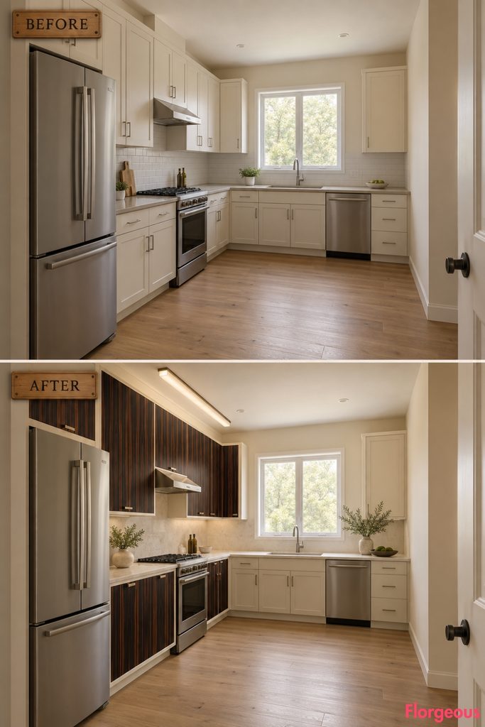
The glamour here comes from extraordinary wood grain and disciplined repetition rather than reflective glass or ornate applied decoration.
Before: The same flat pale cabinet elevation with ordinary doors, neutral counters, standard appliances, and little depth.
After: Wrap one uninterrupted existing storage wall in vertically book-matched Macassar-ebony veneer, carefully aligning the dark and caramel grain so it flows continuously across cabinet breaks.
Set the doors inside thick warm-ivory outer frames, creating the effect of dark timber ribbons held inside a pale architectural grid. Use small satin-nickel tab pulls and an almost white limestone worktop to keep the wood visually dominant.
A long, low frosted-glass ceiling fixture follows the cabinet wall rather than hanging centrally.
Why it works: The wood grain becomes a graphic architectural device rather than simply another warm timber finish.
11. Finish With a Periwinkle Eggshell-Lacquer Collector’s Kitchen
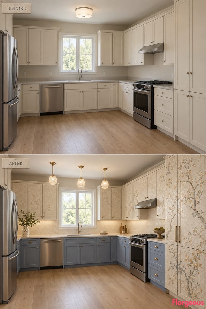
The final concept uses painstaking decorative craft on one controlled feature rather than repeating any previous project material system.
Before: The same neutral builder-grade kitchen with pale stock cabinetry, neutral counters, standard appliances, simple lighting, and no memorable detailing.
After: Rebuild the lower cabinet faces in muted periwinkle enamel with deep recessed framing and substantial furniture-like bases.
Transform one complete existing tall-storage elevation into an ivory eggshell-lacquer artwork made from thousands of finely cracked shell fragments. Carry the crackled tonal field continuously across several doors so the cabinet wall reads as one large handcrafted surface rather than individual panels.
Cream glass-ceramic connects the counter and backsplash, while three compact frosted crystal drops align tightly over the existing central work zone.
How to Keep a Hollywood Regency Kitchen Original
The strongest Hollywood Regency Kitchen makeover begins with a single memorable design idea rather than a checklist of glamorous materials.
These eleven rooms deliberately take different routes. One depends on shagreen texture and silver shadow lines. Another turns mineral pattern into an architectural portal. Grisaille turns storage into art, mother-of-pearl creates an iridescent cabinet plane, and obelisk piers completely reframe an existing window.
Elsewhere, the transformation comes from serpentine cabinet geometry, hand-burnished parchment, repoussé metalwork, pietra dura, continuous Macassar grain, or handcrafted eggshell lacquer. None depends on simply repeating the same cabinet layout in another fashionable color.
When planning your own makeover, decide first what the room’s hero will be. Then allow the counter, hardware, lighting, and supporting cabinetry to become quieter. Strong visual hierarchy is especially important in Hollywood Regency because too many competing glamorous details can quickly make the room feel theatrical.
The architecture should remain believable too. Keep windows and doors unobstructed, maintain practical appliance access, preserve comfortable cabinet depths, and protect the main circulation path. A successful AFTER should look radically more designed than the BEFORE while still being unmistakably the same physical kitchen.