A builder-grade kitchen can be perfectly functional yet still feel visually restless. Standard cabinetry, ordinary counters, visible appliances, flat lighting, and a lack of hierarchy often leave the room feeling more practical than peaceful.
A Zen Kitchen should change more than the color palette. The strongest versions use proportion, natural materials, negative space, Japanese craft traditions, soft light, connection to nature, and carefully controlled focal points to make the whole room feel calmer.
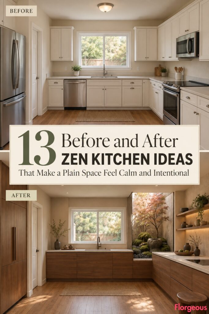
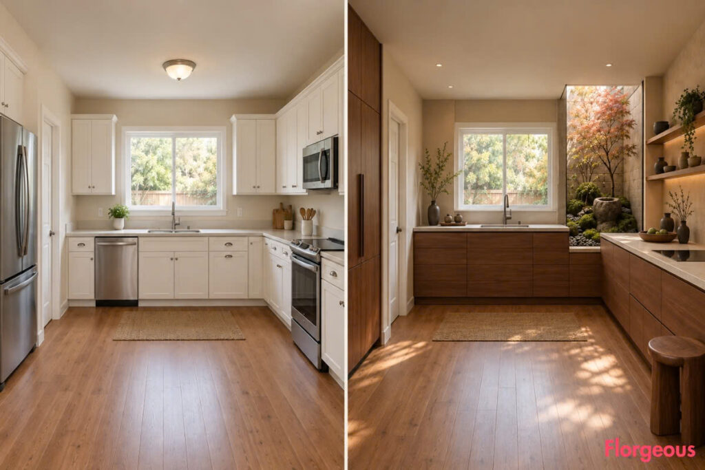
Each of these 13 ideas begins with the same plain kitchen: neutral builder-grade cabinetry along the rear and right walls, ordinary pale counters, standard visible appliances, a fixed rectangular window above the rear sink, warm timber flooring, warm off-white walls, a flat ceiling with one basic fixture, minimal styling, and a wide entry opening. Within each pair, every wall, opening, window, ceiling line, floor boundary, plumbing zone, camera position, lens, perspective, and daylight direction stays exactly the same.
1. Turn the Plain Kitchen Into a Tsuboniwa Garden Retreat
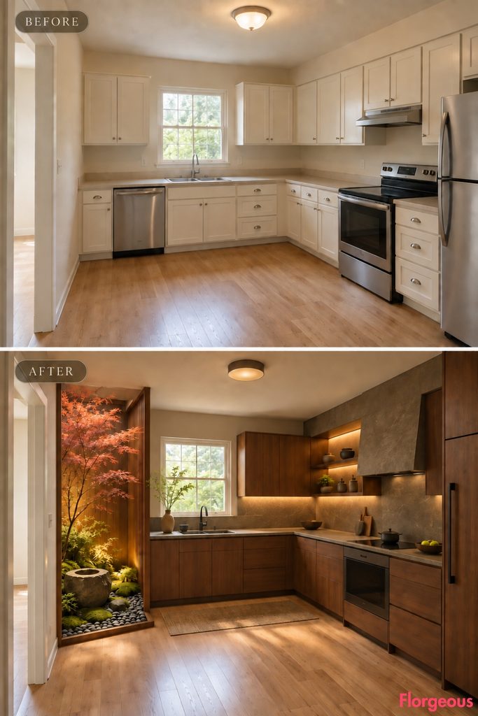
A tsuboniwa is a tiny Japanese courtyard designed to create a concentrated connection with nature. Here, that idea becomes the visual heart of the kitchen.
Before: The same builder-grade kitchen has neutral cabinets, ordinary counters, visible appliances, flat lighting, bare surfaces, and no strong focal point.
After: One underused corner becomes a narrow indoor garden court framed by low cabinetry. Moss, one sculptural Japanese maple, dark river stone, and a shallow weathered-stone base create a quiet green focal point. The surrounding cabinets become low, warm chestnut forms so the garden remains visually dominant.
Why it works: Nature is treated as part of the spatial composition rather than as decorative houseplants.
Try this: Keep the planting extremely restrained. One memorable specimen is calmer than a collection of small pots.
2. Build an Ensō Kitchen Around One Powerful Circle
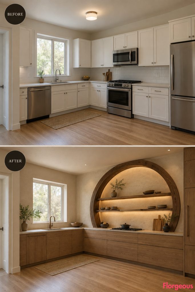
The ensō circle represents simplicity, presence, and intentional imperfection. In this kitchen, it becomes the organizing architectural gesture.
Before: The ordinary cabinet grid gives every part of the kitchen equal visual importance.
After: The cooking wall is rebuilt around one enormous circular timber frame set within smooth chalk plaster. The unchanged cooking zone sits inside the lower part of the circle, while shallow storage follows its outer geometry. All other cabinetry becomes deliberately quiet and rectilinear.
Why it works: One memorable form replaces dozens of competing visual details.
Try this: Avoid repeating circles elsewhere. The single ensō should remain the undisputed focal point.
3. Recompose the Room With a Tansu Stair Cabinet Wall
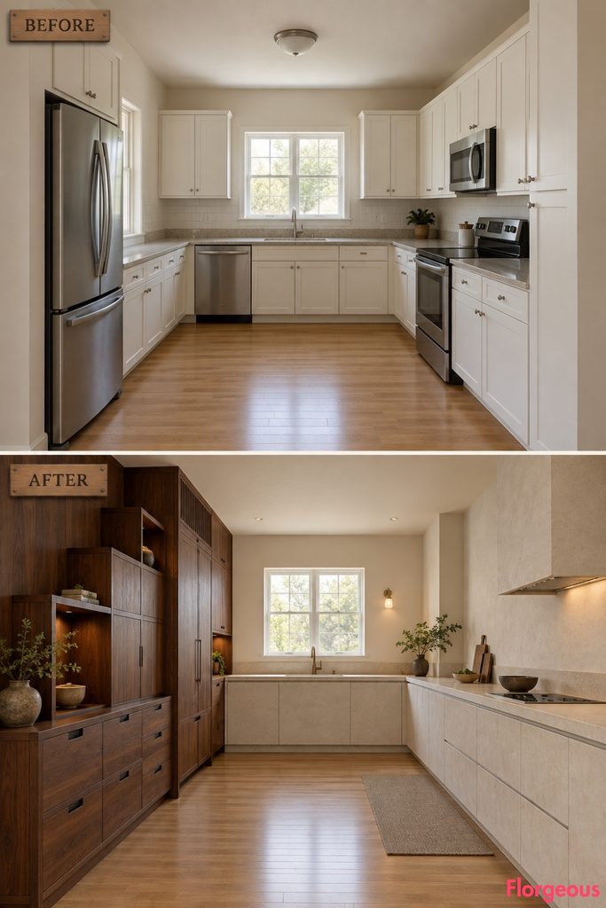
Traditional Japanese tansu chests inspire a completely different cabinetry silhouette.
Before: Standard upper and lower cabinets create predictable straight horizontal lines.
After: One side of the room becomes an asymmetrical staircase of chestnut storage blocks, gradually rising from counter height to full height. Some sections conceal pantry storage, while others form deep open pauses displaying only a few handmade ceramics.
The opposite work zone stays low and pale to balance the stronger composition.
Why it works: The stepped massing makes storage feel like crafted furniture rather than fitted cabinetry.
Try this: Limit open compartments to the widest steps so the arrangement stays calm.
4. Give the Kitchen the Solidity of a Japanese Kura Storehouse
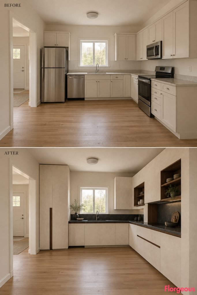
Kura storehouses are known for thick plastered volumes and strong visual weight. That character creates a grounded version of Zen.
Before: Thin cabinet fronts and exposed appliances make the room feel visually fragmented.
After: Storage is consolidated into several substantial warm-white plaster-faced blocks with deep recessed openings and dark timber edge details. Appliances disappear inside the thick volumes.
A low black stone work surface cuts through the composition, creating a strong contrast between solid mass and precise working areas.
Why it works: Large volumes reduce the number of visible elements and make the kitchen feel unusually composed.
Try this: Use recessed pulls instead of decorative hardware.
5. Create a Mizuya-Inspired Water Preparation Kitchen
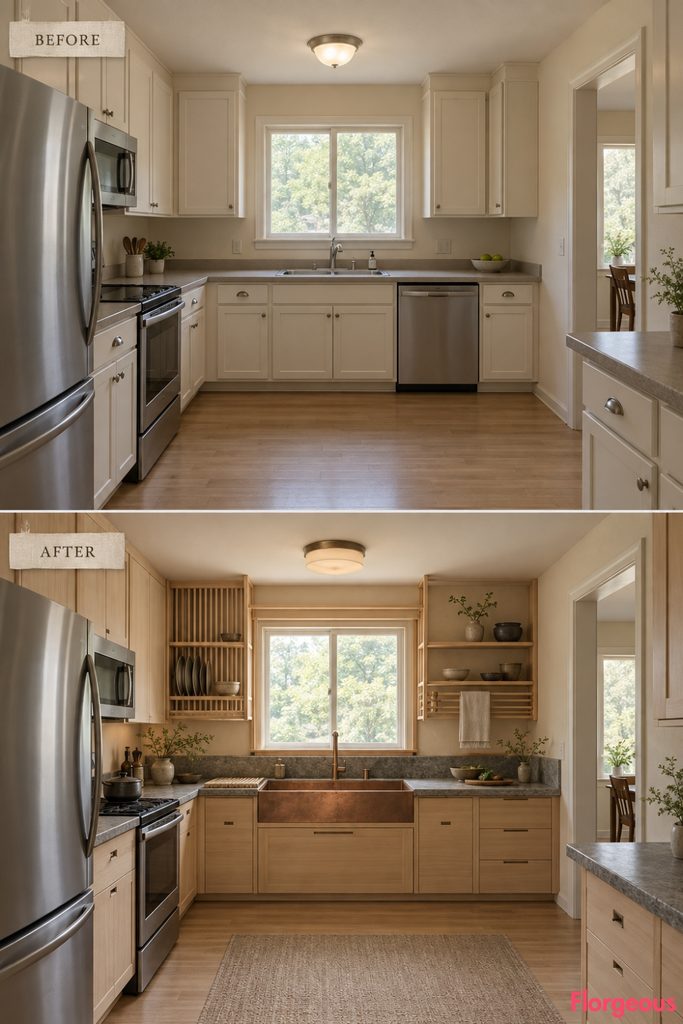
Traditional tea rooms use a mizuya as a practical preparation space for washing and arranging utensils. This kitchen expands that ritual into an entire wet zone.
Before: The sink is simply another appliance set into an ordinary counter.
After: The unchanged sink wall becomes a beautifully ordered washing and preparation composition with a long copper-toned work basin, pale cypress drying rails, stone draining surfaces, ceramic storage vessels, and low drawer units.
Tall cabinetry moves visually away from the wet zone so water, timber, and stone become the focal materials.
Why it works: An everyday kitchen task becomes an intentional ritual without sacrificing practicality.
Try this: Keep frequently used tools visible only inside the dedicated washing zone.
6. Make a Zen Kitchen From Deep Urushi Lacquer and Pale Ash
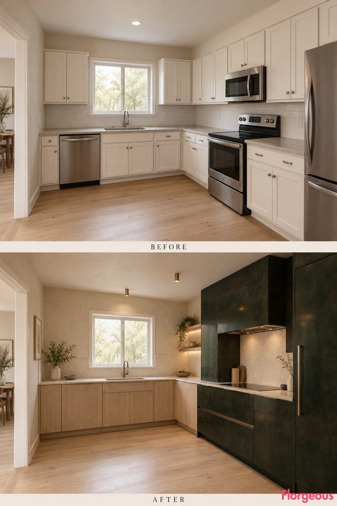
Zen does not have to mean pale beige. Japanese lacquer can create a richer, more contemplative atmosphere.
Before: Neutral builder-grade finishes make the room visually flat.
After: A deep black-green urushi-inspired lacquer volume wraps the cooking side, while pale ash cabinetry forms a lighter opposing preparation zone. A thin ivory stone counter bridges the two finishes.
The glossy lacquer is used selectively, surrounded by matte plaster and natural timber so it feels precious rather than flashy.
Why it works: The contrast between luminous lacquer and quiet natural materials creates depth while keeping the palette disciplined.
Try this: Keep decorative objects off the lacquered surfaces so their reflective depth remains the feature.
7. Turn the Main Wall Into a Sumi-E Landscape
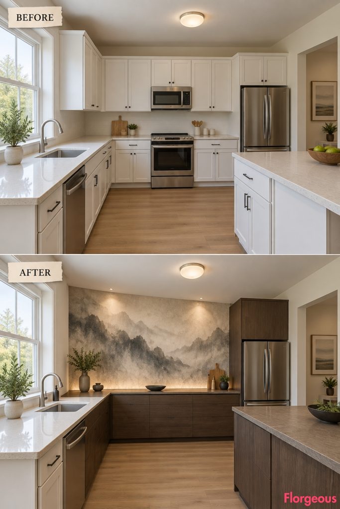
Instead of adding framed artwork, this makeover makes the architecture itself feel painted.
Before: Standard upper cabinets and a plain backsplash dominate the principal wall.
After: Upper cabinetry disappears from the main sightline. A full-height hand-finished wall carries an abstract sumi-e-inspired wash of charcoal, smoke gray, and warm ivory, resembling distant misty mountains without becoming a literal mural.
A single low dark timber work run stretches beneath it.
Why it works: The kitchen becomes more like a quiet gallery, yet the visual language remains unmistakably Japanese and Zen.
Try this: Keep the ink effect soft and abstract. Hard outlines would make it feel decorative rather than atmospheric.
8. Organize the Kitchen With Tatami-Inspired Proportions
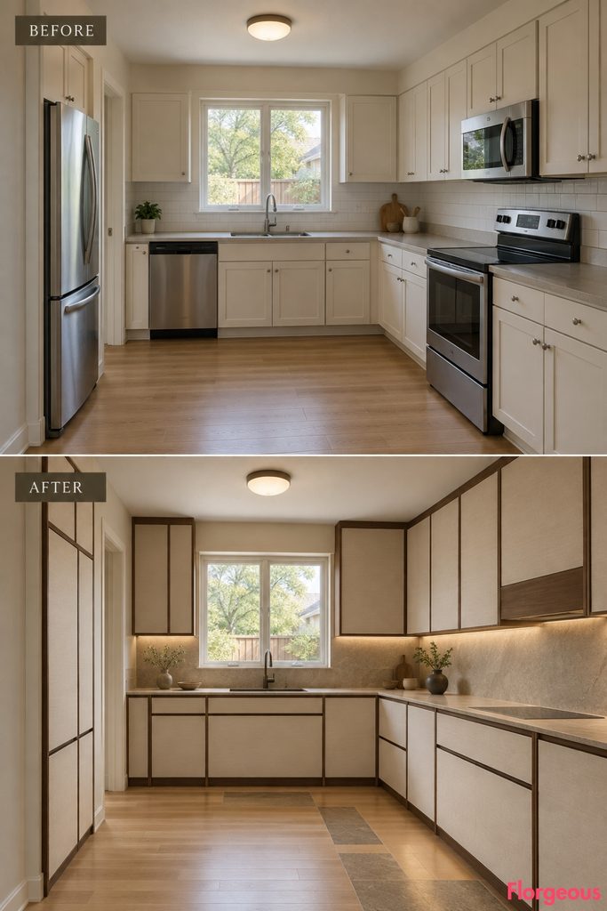
This concept borrows the quiet proportional discipline of tatami rooms rather than using literal mats.
Before: Cabinet doors, counters, and floor lines follow unrelated dimensions.
After: A precise 1:2 proportional grid controls the new cabinetry faces, stone floor insets, work surfaces, and open spaces. Broad rectangular modules repeat with different orientations, creating visual order without obvious symmetry.
Warm rice-toned cabinetry and dark chestnut edges make the geometry easy to read.
Why it works: Repetition of proportion creates calm even when individual elements are asymmetrical.
Try this: Repeat the proportion, not the exact object. That keeps the room structured without becoming rigid.
9. Create a Kitchen Lit Like Japanese Andon Lanterns
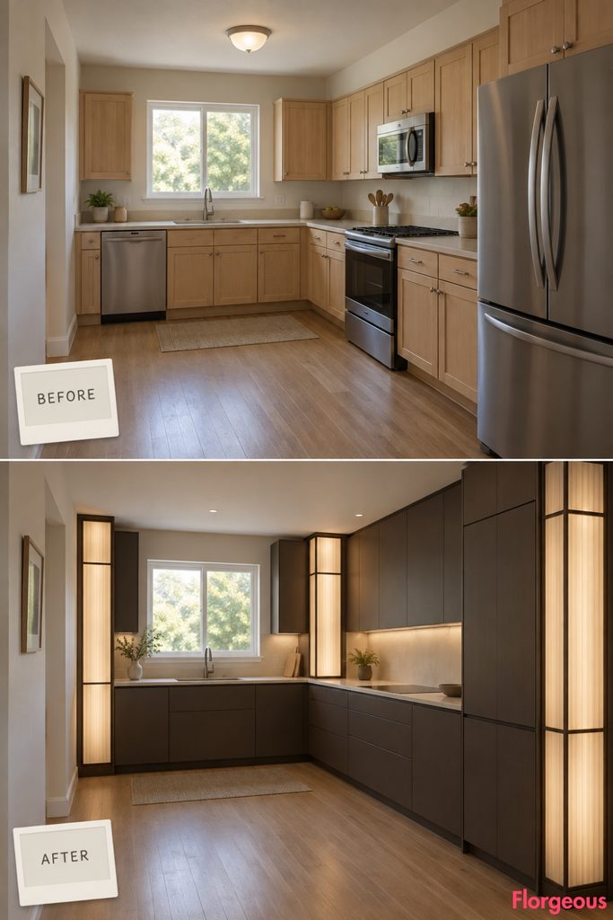
Instead of decorating the room with pendant lights, illumination becomes part of the cabinetry.
Before: One ceiling fixture creates flat, generic light.
After: Three tall, slender translucent light volumes are integrated at strategic ends of the cabinet composition. Their softly diffused surfaces recall andon lanterns, while dark matte cabinetry remains deliberately low around them.
Hidden task lights handle practical cooking needs, allowing the glowing vertical elements to shape the atmosphere.
Why it works: The room gains a strong evening identity without filling the ceiling with fixtures.
Try this: Use warm diffused light and keep the translucent surfaces neutral rather than yellow.
10. Reimagine the Space as a Quiet Ryokan Kitchen
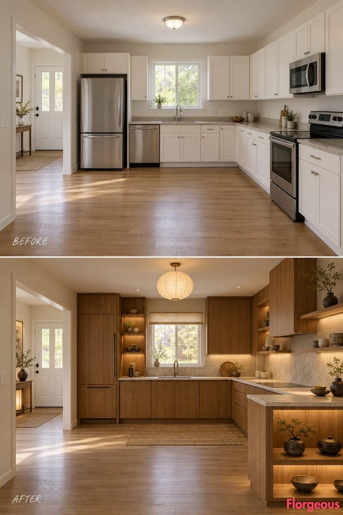
A refined ryokan often feels calm because built-in furniture, storage, and lighting are treated as one composition.
Before: Standard cabinet modules and visible appliances make the kitchen feel conventional.
After: The room becomes warmer and more residential, with mid-tone cedar cabinetry shaped like built-in furniture, a recessed serving counter, a low ceramic display shelf, and soft paper-shaded lighting.
Cabinet heights deliberately vary so the room feels collected rather than factory-fitted.
Why it works: The atmosphere becomes intimate and hospitable while staying restrained.
Try this: Choose only a few ceramics for the display shelf and leave generous empty space between them.
11. Let a Roji Garden Path Shape the Circulation
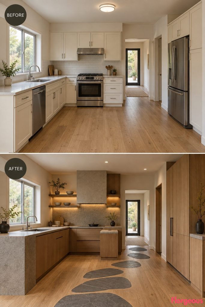
A roji is the garden path leading toward a Japanese tea house. Here, its sense of procession organizes how the kitchen is experienced.
Before: The floor is visually continuous and the route through the room feels incidental.
After: Large irregular charcoal-gray stone inserts create a restrained stepping path through the existing timber floor, beginning at the entry and leading toward the main preparation zone.
Cabinet masses pull back slightly along that route, forming a deliberate sequence of compressed and open spaces.
Why it works: Circulation becomes part of the visual composition instead of being leftover space between cabinets.
Try this: Keep the stone insert pattern sparse and directional, not decorative.
12. Build a Shojin Cooking Kitchen Around Seasonal Ingredients
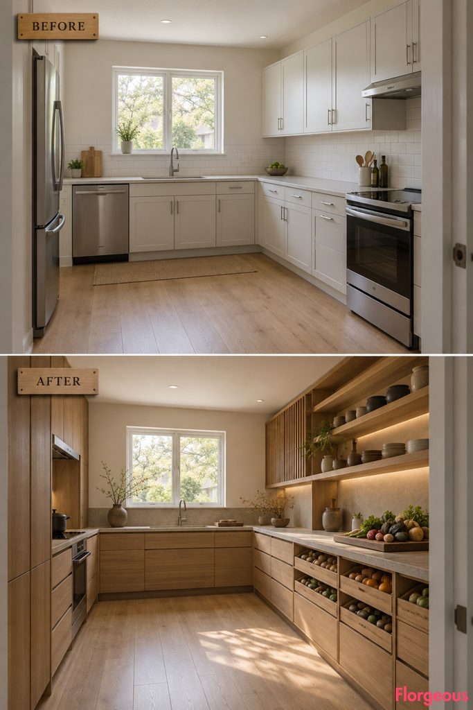
Shojin ryori, the cooking tradition associated with Japanese Buddhist cuisine, values simplicity, seasonality, and careful preparation.
Before: Packaged food, appliances, and storage are scattered across conventional cabinetry.
After: One wall becomes a beautifully ordered ingredient zone with shallow timber drawers, ceramic jars, ventilated vegetable compartments, and one broad preparation surface. Cooking equipment is visually minimized and integrated into the opposite side.
The emphasis shifts from appliances to ingredients and process.
Why it works: The kitchen feels calmer because the design celebrates preparation rather than equipment.
Try this: Use matching ceramic or timber containers for only the ingredients that genuinely stay visible.
13. Create a Yūgen Kitchen With Layered Shadow and Soft Reflected Light
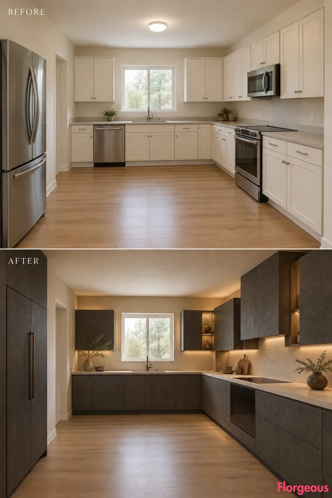
The final idea explores yūgen, a Japanese aesthetic associated with subtle depth and mystery.
Before: Flat overhead light makes every cabinet and wall equally visible.
After: Deep graphite mineral cabinetry is arranged in staggered layers, with warm ivory plaster visible between the darker masses. Light sources remain hidden inside deep recesses, washing softly onto adjacent walls instead of shining directly into the room.
One pale stone preparation plane catches that reflected light and becomes the quiet focal point.
Why it works: The room feels calm because light reveals the space gradually rather than illuminating everything at once.
Try this: Use concealed reflected light for atmosphere, but retain bright dedicated task lighting where knives and heat are used.
How to Choose the Right Zen Direction for Your Kitchen
A successful Zen Kitchen is not simply a minimalist kitchen with pale cabinets. The real goal is to decide what deserves attention and remove visual competition around it.
If nature makes you feel calm, a tsuboniwa-style garden can become the central idea. If you prefer strong geometry, an ensō wall or tatami-inspired proportion system creates order without clutter. For a warmer atmosphere, ryokan cabinetry or deep urushi lacquer gives the room more depth while remaining disciplined.
Think about daily habits before choosing a concept. A Mizuya-inspired washing zone suits someone who spends time preparing tea, produce, and ceramics. A Shojin-inspired ingredient kitchen works best for a cook who values fresh food and clear preparation space. A Yūgen scheme needs carefully planned task lighting so its atmospheric shadows never reduce functionality.
Most importantly, choose one dominant idea.
Zen rooms feel peaceful because visual decisions have hierarchy. One strong focal feature, a restrained material palette, adequate closed storage, and generous circulation will usually create a calmer result than combining several Japanese motifs in the same kitchen.