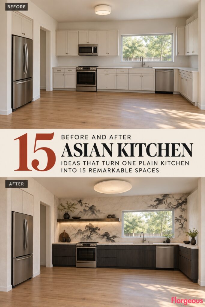
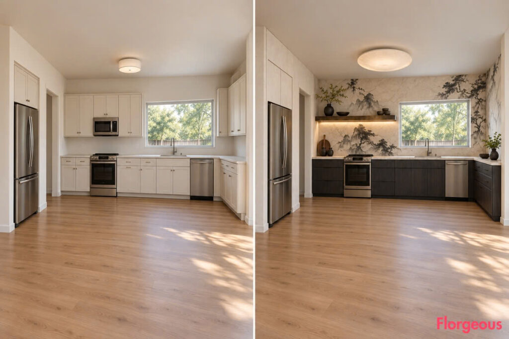
A builder-grade kitchen does not need a conventional rectangular or L-shaped layout to feel generic. This makeover series begins with the same slightly unusual but completely believable base room: an asymmetric broken-plan kitchen with an open entry at the front-left, a shallow recessed tall-storage alcove on the left wall, a long rear preparation wall, a wide horizontal window offset to the right above the sink, and a short service return created by a subtle inward kink in the right wall.
There is no island. The center remains open, giving the room a generous circulation route while the cabinetry follows the irregular perimeter.
Every Asian Kitchen idea below keeps that architecture completely unchanged. What changes is the cabinetry language, surface composition, lighting, material hierarchy, and artistic focal point.
The result is 15 makeovers that feel visually unrelated even though they all begin with the same room.
1. Turn the Rear Wall Into a Japanese Sumi-E Porcelain Installation
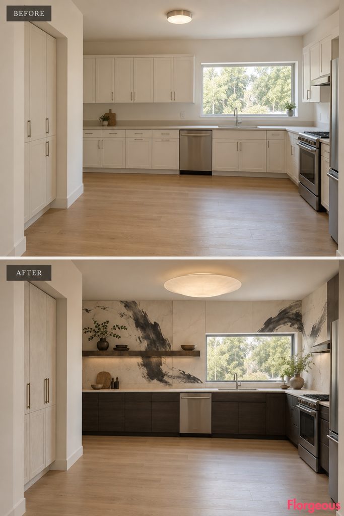
A monumental art wall gives the irregular room a clear visual anchor.
Before: Pale stock cabinetry, thin neutral counters, generic hardware, and blank surfaces.
After: Charcoal lower cabinetry anchors oversized ivory porcelain panels with sweeping sumi-e-inspired brush fields, balanced by mineral-white storage and oxidized metal.
Why it works: The long rear elevation becomes one continuous artistic composition.
2. Rebuild the Left Alcove as a Korean Buncheong Ceramic Composition
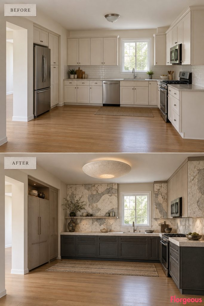
This concept uses the recessed side of the room instead of the main rear wall as its visual focus.
Before: The shallow left alcove contains ordinary pale tall storage.
After: Hand-formed buncheong ceramic relief wraps the alcove interior, framed by charcoal-gray furniture-like cabinetry and soft mushroom storage.
Try this: Let the irregular ceramic surface provide the detail while surrounding cabinetry remains quiet.
3. Turn the Rear Upper Cabinet Band Into Monumental Chinese Cloisonné
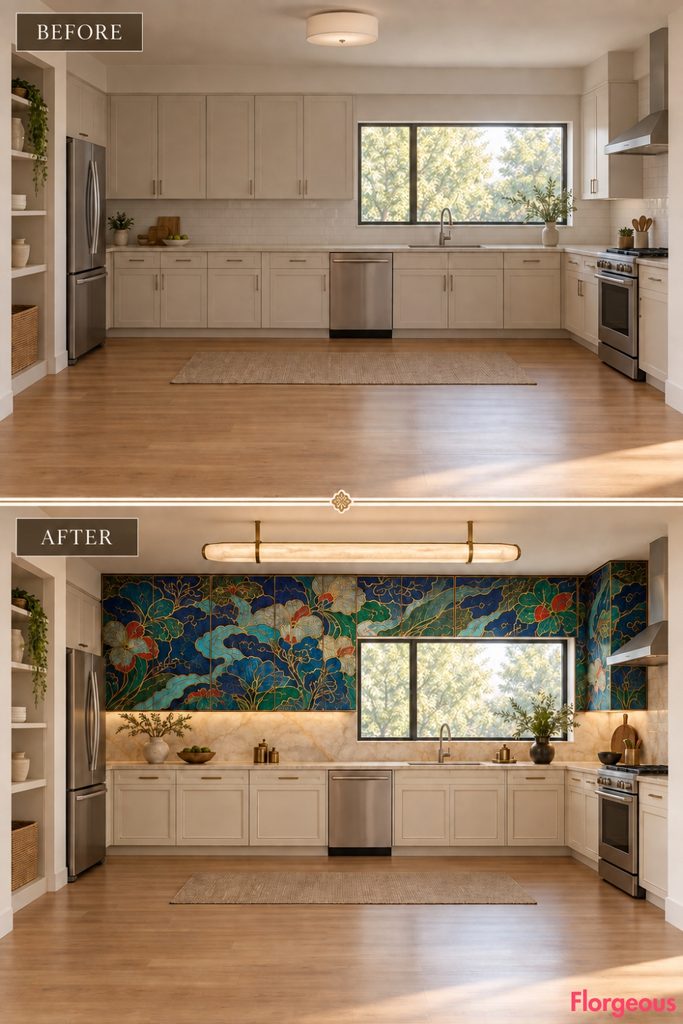
The long rear wall becomes a continuous jewel-like horizontal feature.
Before: Repetitive pale upper doors follow the back wall.
After: Deep ink-blue enamel spans the complete upper run, with fine brass lines flowing continuously across multiple doors.
Why it works: The elongated room geometry gives the enamel artwork enough space to read at architectural scale.
4. Make the Right Service Return Feel Carved From Saigon Modernism
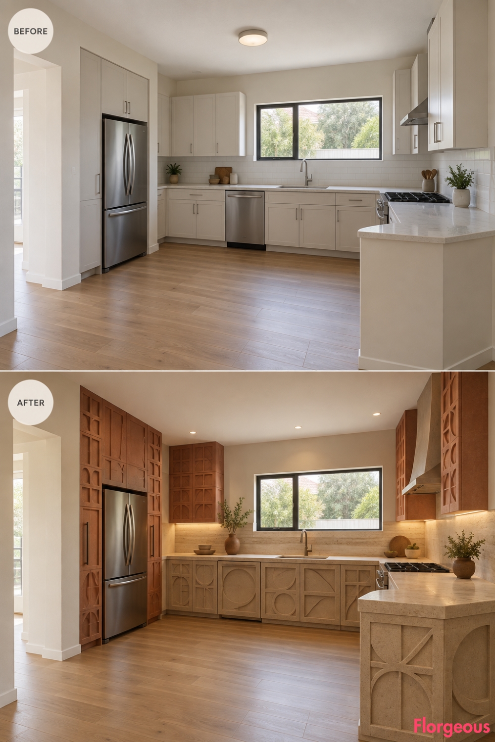
Instead of decorating the longest wall, this design makes the short kinked return the strongest architectural moment.
Before: The right return is an ordinary continuation of stock cabinetry.
After: Thick cast-mineral fronts with deep geometric recesses turn the compact return into a sculptural sand-and-terracotta volume.
Why it works: An awkward architectural kink becomes the room’s defining feature.
5. Create a Thai Benjarong Jewel Wall Beside the Entry Axis
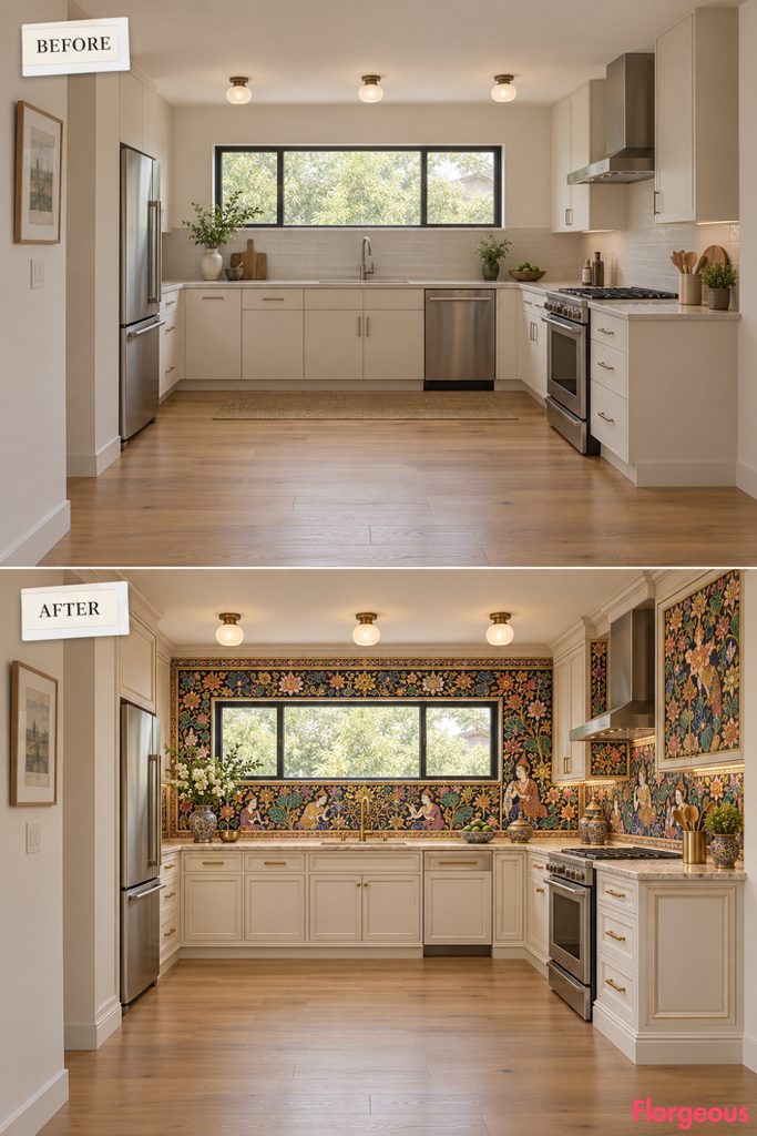
Rich porcelain appears in one concentrated sightline rather than around the whole kitchen.
Before: The first view from the entry is pale and visually flat.
After: A large Benjarong-inspired porcelain composition sits within thick bone-white cabinetry, creating an immediate jewel-like focal point.
Try this: Keep the other elevations visually quiet so the detailed wall feels intentional.
6. Turn the Offset Window Into a Balinese Carved-Stone Pavilion Wall
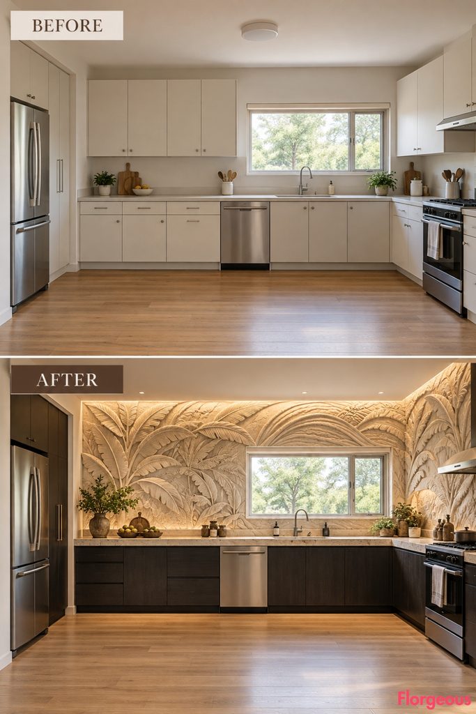
The unusual position of the window becomes an advantage.
Before: The wide horizontal sink window sits plainly toward the right side of the rear wall.
After: Pale carved paras stone extends around the opening and visually rebalances the asymmetric elevation.
Why it works: The transformation celebrates the off-center architecture instead of trying to disguise it.
7. Make the Long Lower Run a Continuous Indonesian Batik Metal Artwork
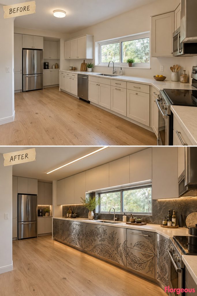
Here, the length of the rear cabinetry creates the drama.
Before: Repetitive pale lower doors emphasize the utilitarian layout.
After: Brushed aluminum cabinetry becomes one continuous etched composition flowing beneath the rear wall.
Why it works: The long run turns multiple functional doors into one visual object.
8. Wrap the Corner Transition in Malaysian Songket Stone
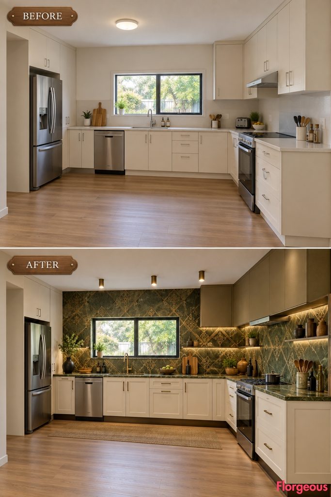
This concept uses the change in wall direction as part of the artwork.
Before: The transition between rear cabinetry and the short return feels unresolved.
After: Deep olive serpentine stone and brass inlay travel continuously around the architectural bend.
Why it works: The existing kink becomes a deliberate three-dimensional composition.
9. Turn the Left Storage Bay Into a Filipino Banig Furniture Wall
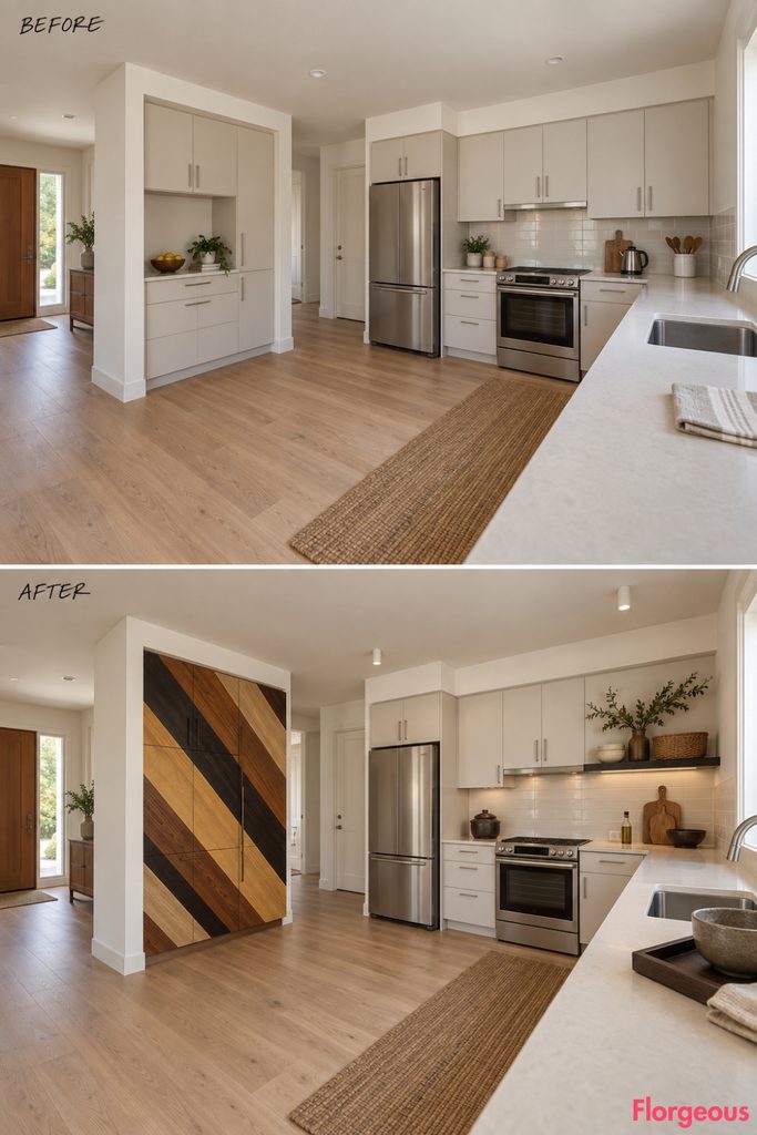
Instead of another long backsplash composition, this concept concentrates craft within the recessed volume.
Before: The left storage alcove feels like ordinary pantry cabinetry.
After: Oversized dyed-maple veneer geometry turns the entire alcove into one crafted furniture installation.
Try this: Let the surrounding rear wall remain calm so the patterned recess gains more depth.
10. Create a Black Bidriware Monolith at the End of the Room
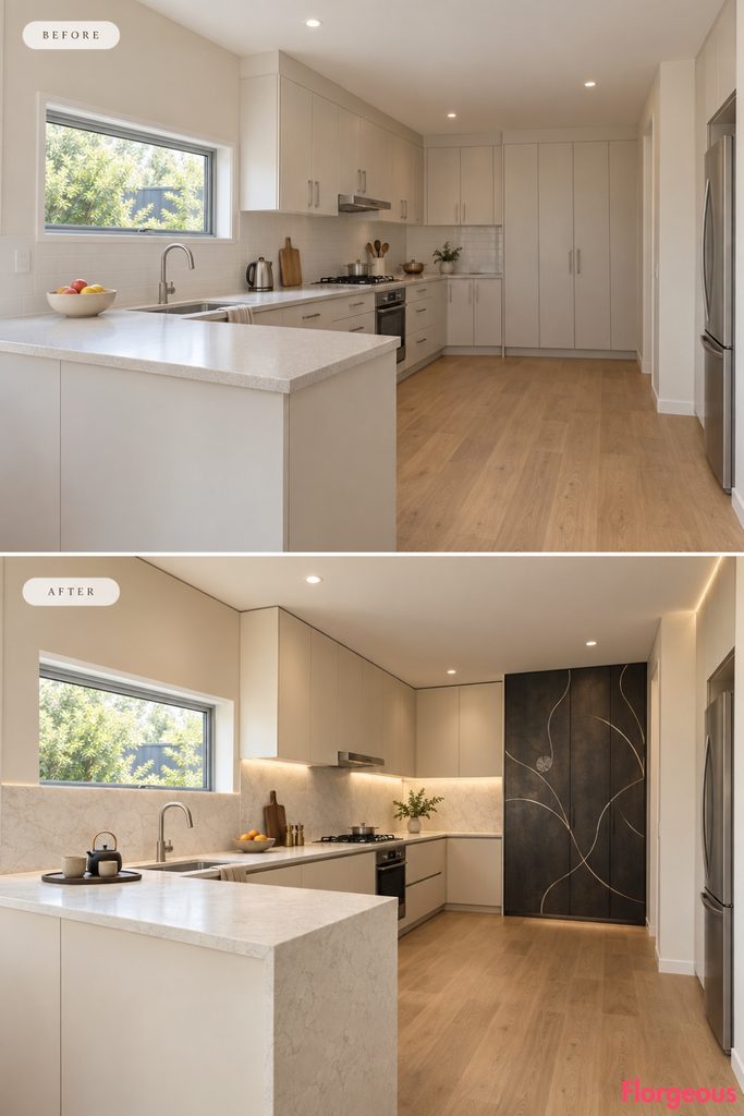
A dark vertical volume changes how the irregular space is perceived.
Before: The end storage feels visually equal to every other cabinet.
After: A floor-to-ceiling blackened-metal monolith becomes the room’s strongest point of contrast.
Why it works: The deep black mass gives the broken-plan shell a strong destination.
11. Rebuild the Cooking Zone as Multan Blue Ceramic Architecture
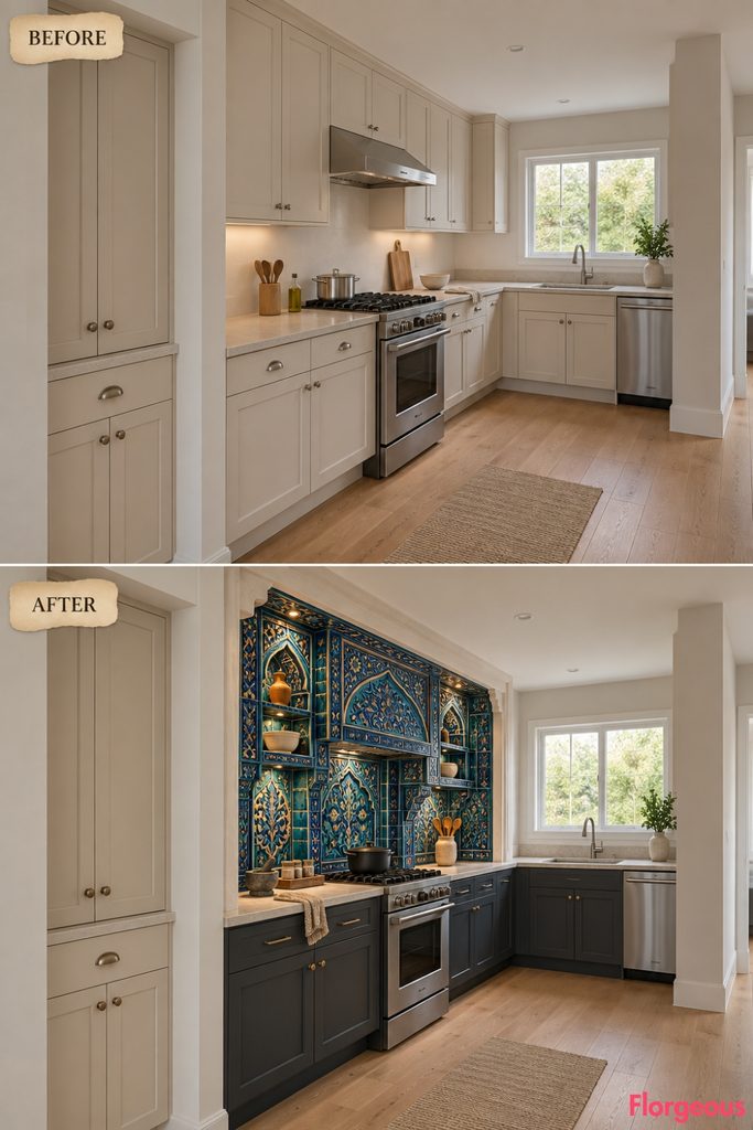
The cooking area is deliberately placed away from the sink focal point, giving this section a different spatial hierarchy.
Before: A standard cooking zone occupies part of the rear-left run.
After: Cobalt and turquoise molded ceramic relief turns it into a deep architectural niche.
Why it works: The kitchen gains a strong secondary focal zone without changing appliance placement.
12. Make the Ceiling the Main Event With Uzbek Ganch
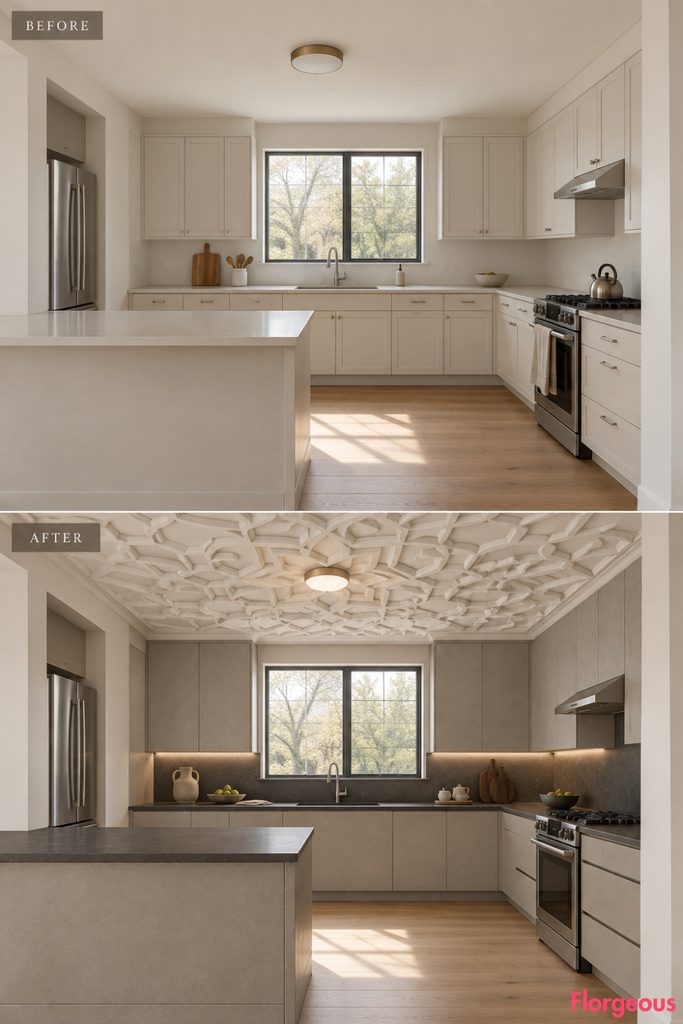
The irregular footprint is unified overhead rather than along the walls.
Before: A flat ceiling does little to connect the different wall directions.
After: A shallow carved plaster field creates one visual canopy across the broken-plan kitchen.
Why it works: This is the only makeover where the strongest design gesture sits overhead.
13. Make the Right-Hand Kink a Nepalese Slate Monolith
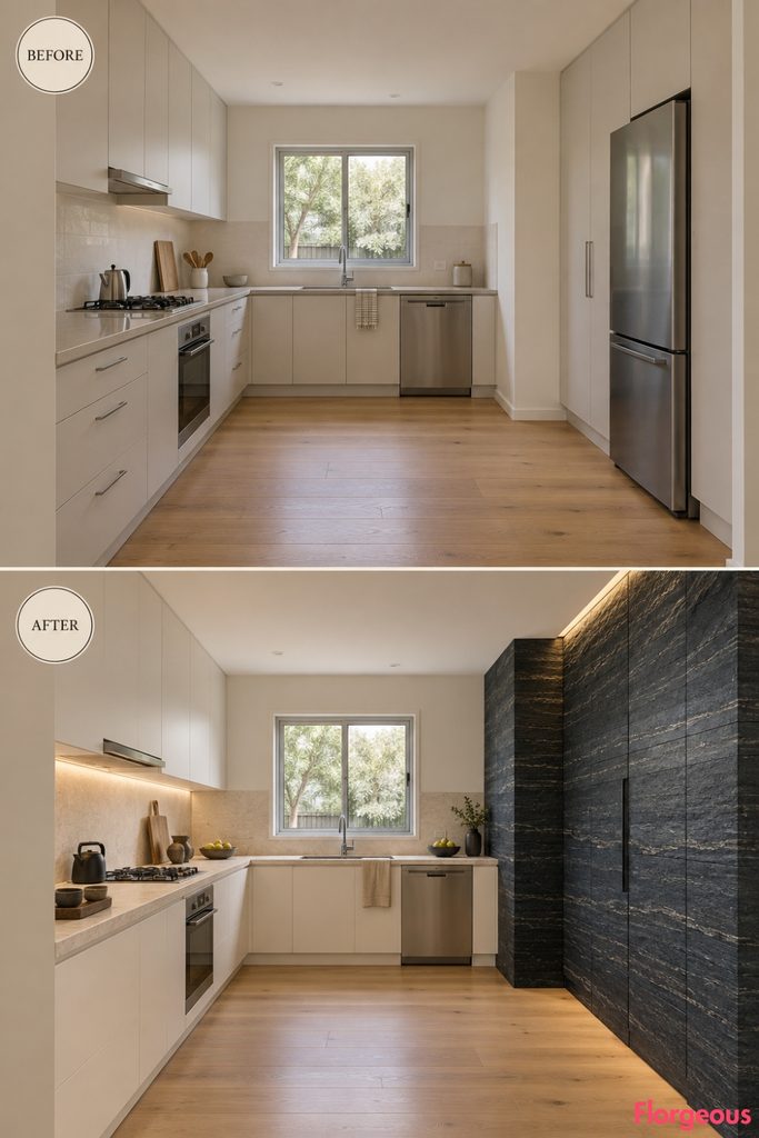
Instead of hiding the angled wall condition, this design exaggerates it.
Before: The kink reads as a small awkward transition.
After: Blue-black slate turns the full-height end condition into a geological architectural marker.
Why it works: The unusual shell becomes more memorable after the makeover, not less.
14. Rebuild the Rear Base as Layered Bhutanese Mineral Architecture
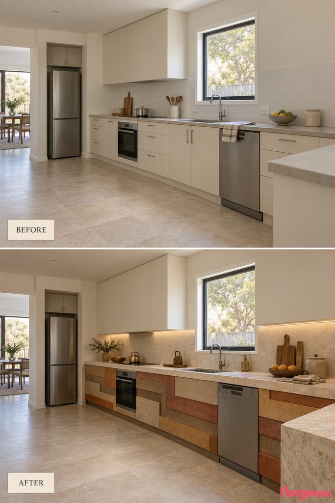
The irregular room gets a strong low horizontal datum.
Before: Individual stock cabinet boxes visually fragment the perimeter.
After: Stepped mineral volumes unify the lower kitchen while quiet cream storage floats above.
Try this: Keep all projections inside the original cabinet footprint so the open center remains generous.
15. Turn the Rear-Left Cooking Zone Into a Sculptural Mongolian Hearth
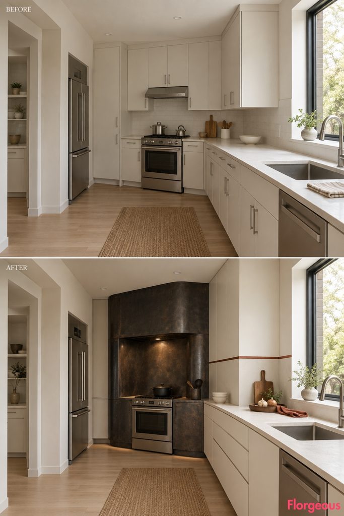
The final concept reorganizes the room visually around cooking rather than storage or the window.
Before: The standard appliance disappears within the pale rear cabinetry.
After: Folded blackened steel creates a dominant hearth-like object against bone-white surrounding surfaces.
Why it works: The same appliance position suddenly becomes the visual center of the kitchen.
How to Choose the Right Asian Kitchen Direction
A strong Asian Kitchen makeover should work with the architecture rather than simply cover it with a new finish.
In an irregular room, first identify what is already visually distinctive. It may be an offset window, a recessed storage bay, an unusual wall return, a long uninterrupted cabinet run, or even the ceiling.
Then decide which single feature deserves to become the hero.
Keeping the same shell does not mean every makeover needs to look spatially identical. A successful redesign can completely change where the eye travels through the room while leaving every wall, opening, plumbing point, and circulation path untouched.