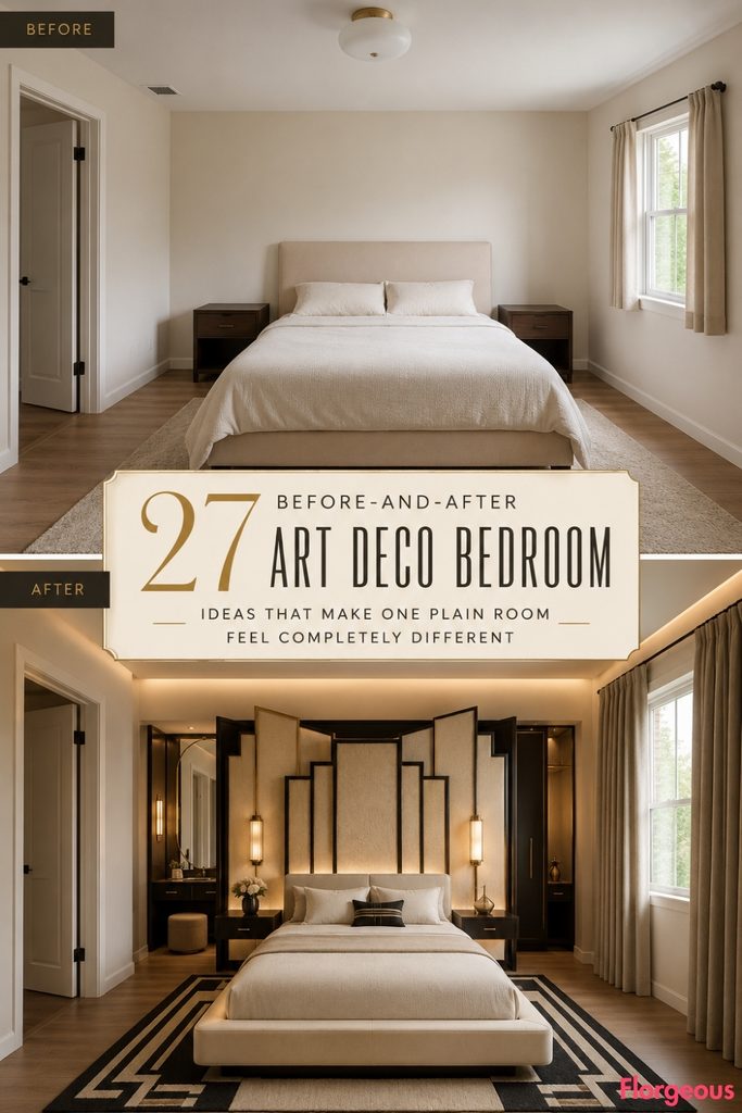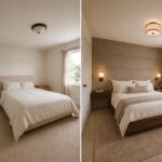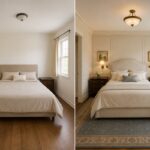
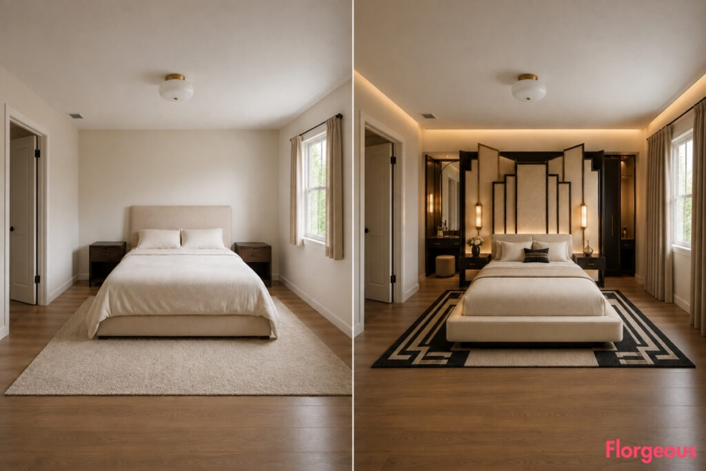
The starting bedroom is always the same: warm off-white walls, a basic neutral bed against the main wall, cream bedding, two bare nightstands, short plain curtains, one generic ceiling light, minimal styling, and soft natural daylight.
The doorway, window, flooring footprint, ceiling height, camera, lens, and circulation remain locked throughout.
What changes is the actual design idea. These Art Deco Bedroom makeovers explore different layouts, functions, furniture silhouettes, lighting identities, materials, and authentic Deco directions rather than repeating one bed-wall formula.
1. Emerald Jewel-Box Deco With One Monumental Fan
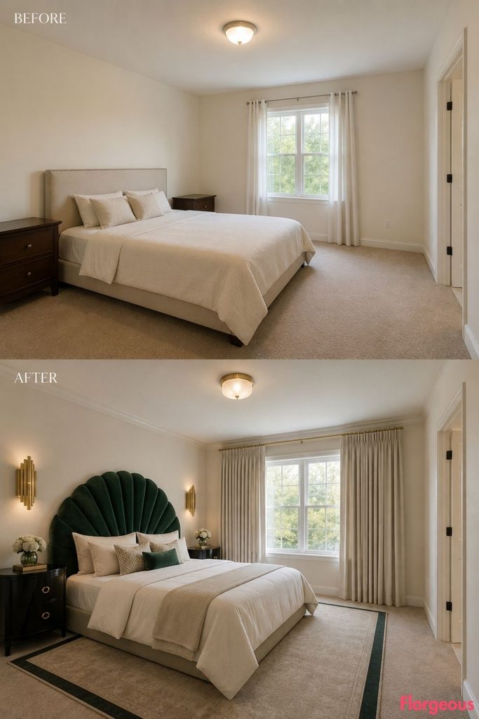
Before: The plain builder-grade bedroom feels flat and generic, with no focal point beyond the basic centered bed.
After: An oversized emerald channel-velvet fan becomes the architectural centerpiece. Tiny black lacquer pedestals and stepped brass fin sconces sharpen the glamorous 1920s composition.
Why it works: One dominant Deco motif gives the room identity without overdecorating it.
Try this: Avoid repeating fan shapes elsewhere.
2. Parisian Deco With the Bed Turned 90 Degrees
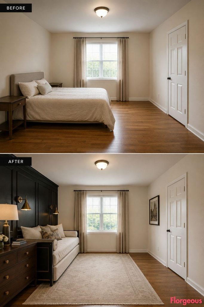
Before: The centered bed creates two narrow, unremarkable bedside strips and leaves the room feeling predictable.
After: The bed rotates 90 degrees along a side wall and becomes a tailored Parisian sleeping couch with black lacquer backing, ivory piping, and integrated bronze cone readers.
Why it works: The new axis creates one generous central walkway and a much stronger silhouette.
Try this: Use a shallow dresser on the far wall rather than adding bedside furniture.
3. Dark Walnut Deco on a Raised Sleeping Dais
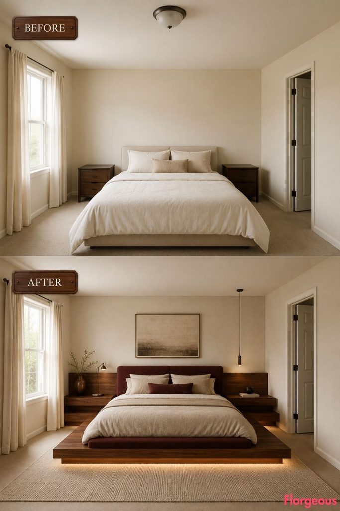
Before: The basic bed and loose nightstands feel disconnected from the room.
After: A shallow stepped walnut dais defines the sleeping zone, carrying a low oxblood mohair bed and integrated bedside ledges. Concealed light glows beneath the platform.
Why it works: Floor architecture replaces several small furniture pieces with one strong Deco gesture.
Try this: Keep the raised edge outside the entrance route.
4. Champagne Deco as a Freestanding Boudoir Island
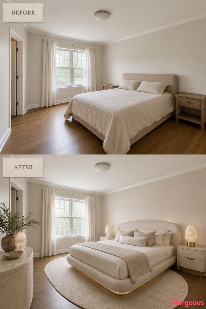
Before: The ordinary bed is pressed against the wall with furniture arranged mechanically around it.
After: A rounded champagne bed floats on an oval rug, while a crescent ivory console partially wraps its foot. One faceted alabaster table lamp supplies the sculptural glow.
Why it works: Curves and negative space make pale Deco feel luxurious without relying on dark color.
Designer Tip: Tape the footprint of curved furniture before buying.
5. Sapphire Deco Inside a Stepped Sleeping Alcove
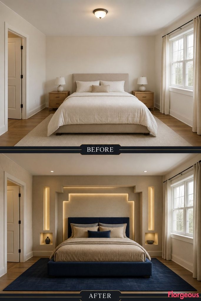
Before: The bed wall has no architectural depth and the bare nightstands feel temporary.
After: A compact sapphire bed sits inside a stepped parchment alcove with recessed bedside ledges and vertical luminous slots.
Why it works: The sleeping zone becomes an architectural jewel box without needing freestanding tables.
Try this: Use shallow applied panels if a real recess is not possible.
6. Streamline Moderne on Two Parallel Axes
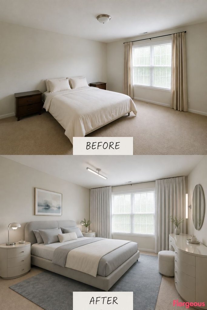
Before: The room is organized only around the bed, leaving the side wall underused.
After: A pearl-gray bed and sweeping ivory lacquer vanity run parallel through the room. One continuous chrome tube light reinforces the 1930s Machine Age direction.
Why it works: Long horizontal lines immediately create a Streamline Moderne identity.
Try this: Stick to chrome and glass rather than mixing in brass.
7. Smoky Rose Deco as a Corner Sleeping Salon
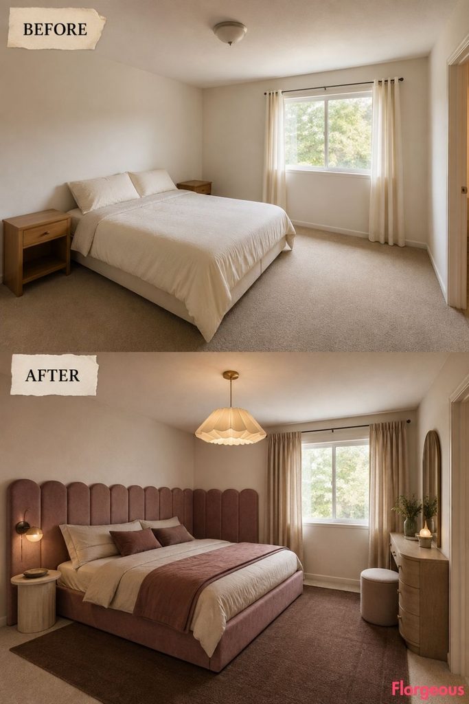
Before: The centered bed wastes the room corners and leaves the opposite side without purpose.
After: A compact smoky rose bed moves into one corner, with scalloped upholstery wrapping both adjoining surfaces. A folded parchment pendant lights only that intimate sleeping zone.
Why it works: The asymmetric corner arrangement creates a second open zone for dressing.
Budget Version: Use removable upholstered wall panels.
8. Black-and-Cream Deco Starts With the Floor
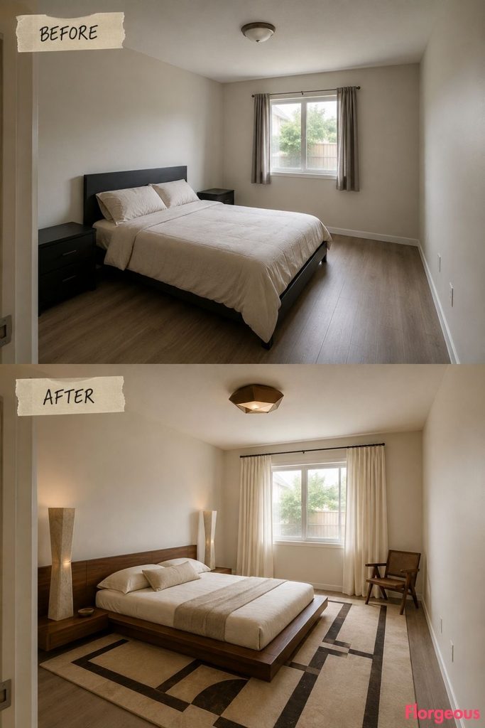
Before: The plain flooring and simple rug do nothing to organize the room visually.
After: An oversized black, cream, tobacco, and rust geometric rug behaves like an Art Deco floor inlay. Low walnut furniture exposes the pattern, while faceted stone torchères illuminate upward.
Why it works: The focal point moves completely away from the bed wall.
Try this: Keep furniture low when the floor is the hero.
9. Fluted-Glass Deco Storage Forms a Bed Portal
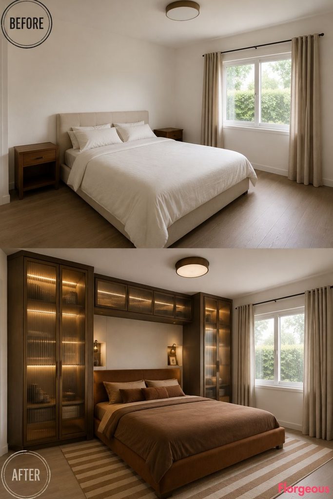
Before: Two bare nightstands provide almost no useful storage.
After: Bronze-framed fluted-glass wardrobe towers flank the sleeping zone and connect across the top. Recessed niches replace the nightstands, while warm internal light glows through the glass.
Why it works: Storage becomes the architecture rather than a separate practical addition.
Try this: Use ribbed glazing to visually lighten full-height cabinetry.
10. A Tailored Deco Hotel Suite With Twin Beds
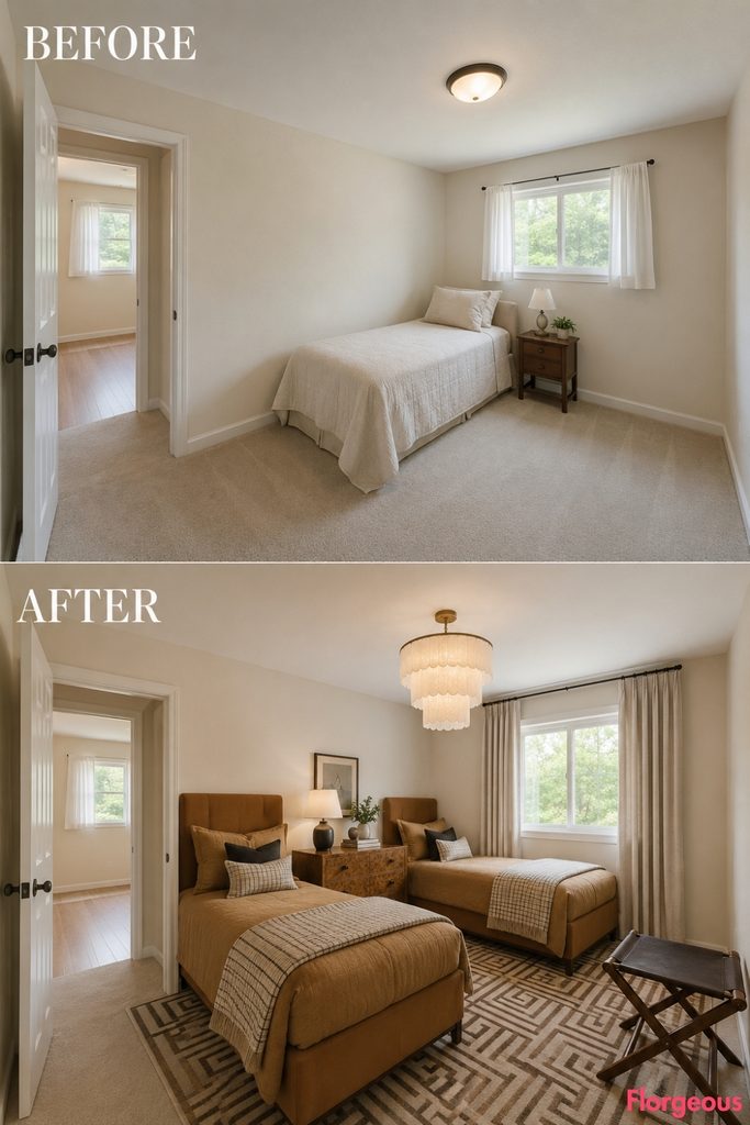
Before: One generic double bed makes the guest room feel basic and inflexible.
After: Two caramel upholstered twin beds share a substantial burl chest and a structured luggage bench. A three-tier milk-glass chandelier centers the composition.
Why it works: The makeover changes both the function and visual rhythm of the room.
Try this: Use one central chest instead of two pairs of tables.
11. Renter-Friendly Deco as a Wall-to-Wall Daybed Lounge
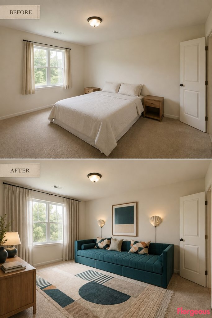
Before: The standard bed dominates the room even when nobody is sleeping there.
After: A wall-to-wall muted-teal modular daybed creates a lounge-like guest room with plug-in ceramic shell sconces, tall ready-made curtains, and an oversized Deco rug.
Why it works: The room gains usable daytime space without permanent construction.
Small Space Tip: This is ideal for a spare bedroom that doubles as a lounge.
12. Miami Deco With a Curved Dressing Corner
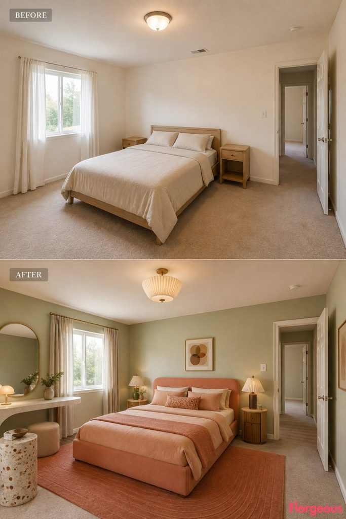
Before: The empty side corner has no function.
After: A peach bed shifts toward one side, freeing the corner for a continuous plaster ledge that widens into a dressing desk. Pistachio walls, terrazzo, and a ribbed ceramic ceiling fixture complete the Miami Deco palette.
Why it works: One continuous curve connects sleeping and dressing functions.
Try this: Keep the palette soft so the room stays residential.
13. Celadon Ocean-Liner Deco Facing the Window
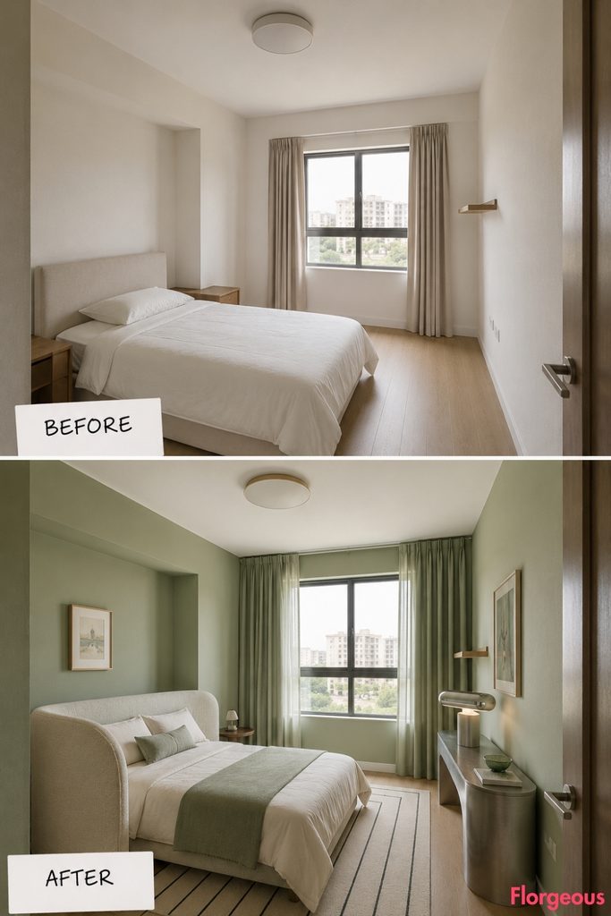
Before: The bed follows the room walls automatically and ignores the window.
After: The bed changes axis to face the window, backed by a curved freestanding gray headboard. A brushed-aluminum console and chrome torpedo lamp create an ocean-liner mood.
Why it works: The new orientation makes the room feel completely re-planned.
Try this: Keep enough clearance so window access remains open.
14. A Walnut Deco Library Becomes the Side-Wall Spine
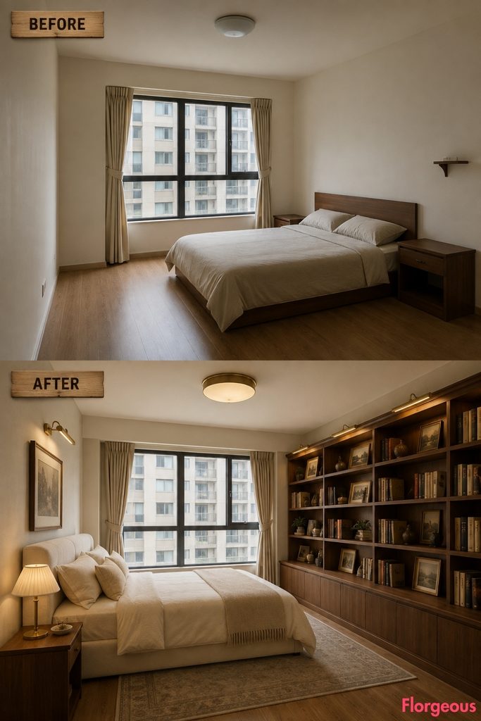
Before: The long side wall is empty and contributes nothing to the bedroom.
After: A stepped walnut library runs along that wall while the cream bed sits perpendicular to it. Rectangular brass picture lights illuminate selected shelves.
Why it works: The room develops a reading axis instead of another decorative bed wall.
Try this: Keep shelving shallow enough to protect circulation.
15. Sculptural Stone Deco Pulls the Bed Off-Center
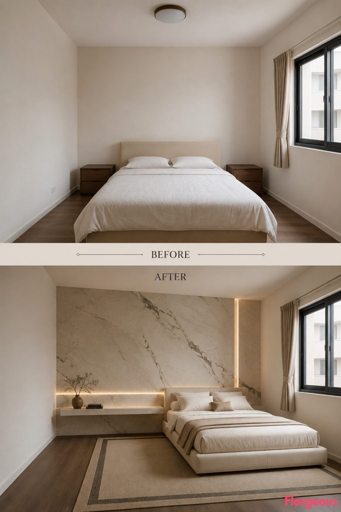
Before: Everything is conventionally centered and visually balanced in an uninteresting way.
After: The ivory bed shifts off-center beside one monumental veined-stone slab. A tiny integrated shelf and luminous slot turn the stone into furniture and lighting.
Why it works: Strong asymmetry makes the room feel architectural rather than decorated.
Try this: Leave the opposite side empty.
16. A Deco Railway-Compartment Sleeping Pod
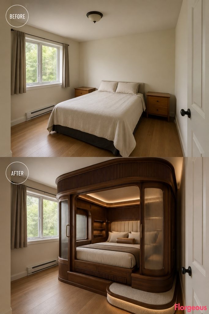
Before: The open bedroom has little sense of enclosure or intimacy.
After: A freestanding walnut and parchment sleeping pod surrounds the bed like an interwar luxury railway compartment. Ribbed-glass inserts, stepped roof geometry, concealed reading slots, and internal light complete the effect.
Why it works: The room gains micro-architecture without altering the permanent shell.
Try this: Leave visible space around the pod.
17. The Window Becomes a Private Deco Salon
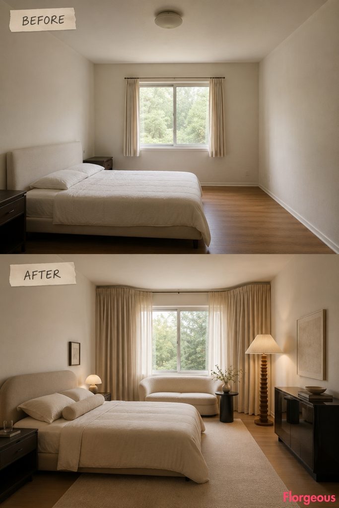
Before: The window zone is underused except for short curtains.
After: A curved mohair settee, black pedestal, lacquer cabinet, and tall stepped timber floor lamp create a private salon beside the glazing.
Why it works: The bedroom gains a true daytime function.
Try this: Position seating beside the window, never directly in front of it.
18. Aubergine Deco Adds a Crescent Conversation Zone
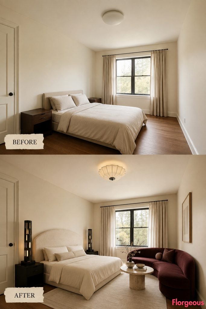
Before: The foot of the bed is empty and the room has only one functional axis.
After: A crescent aubergine banquette and small stone table create a second conversation zone. A black lacquer skyscraper lamp adds a vertical Deco accent.
Why it works: Seating changes how the bedroom is used without altering the shell.
Try this: Maintain a comfortable walking gap around the banquette.
19. A 1930s Deco Murphy Suite Hides the Bed
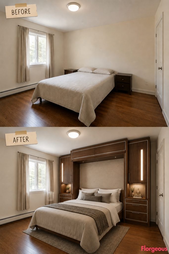
Before: The conventional bed permanently occupies most of the usable floor.
After: A fold-down bed disappears into stepped walnut cabinetry with nickel trim, parchment-lined niches, and vertical frosted light blades.
Why it works: The room becomes multifunctional while still looking authentically period-inspired.
Try this: Best for a guest room that also serves as an office.
20. Bronze Canopy, Almost Empty Walls
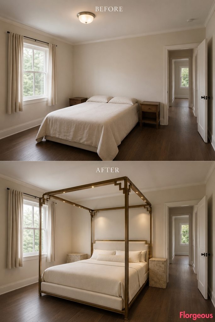
Before: The room depends entirely on the bed wall for visual interest.
After: A slender dark-bronze canopy defines the sleeping volume in three dimensions. Stone plinths sit inside its footprint, while tiny directional pin lights are integrated into the frame.
Why it works: Furniture creates the architecture without needing wall decoration.
Common Mistake: Do not add another statement wall behind it.
21. The Ceiling Becomes a Sculptural Sunburst
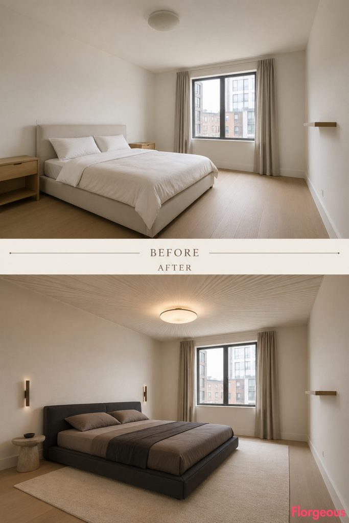
Before: The generic ceiling light makes the entire upper half of the room feel forgotten.
After: Large plaster ribs radiate across the ceiling toward a shallow luminous disc. Furniture below stays deliberately quiet.
Why it works: The room gains a dramatic Art Deco focal point without using floor space.
Try this: Keep wall decoration minimal.
22. Smoky Blue Deco as a Freestanding Textile Divider
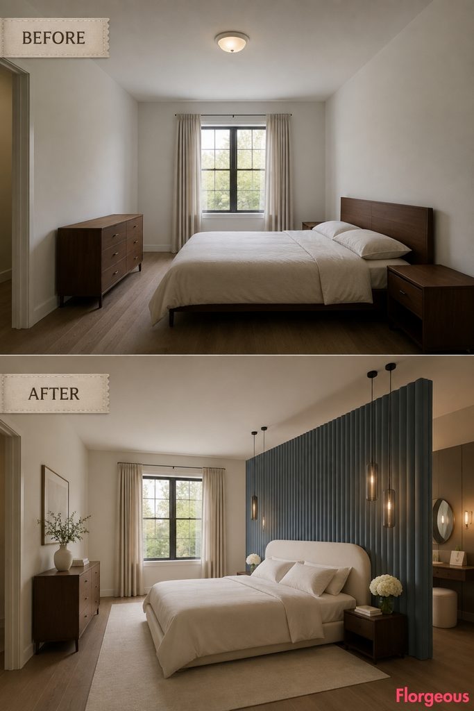
Before: The room is one undivided sleeping zone.
After: A broad pleated smoky-blue velvet divider stands perpendicular to the side wall, separating sleeping from a compact dressing strip. Two slender smoked-glass rod pendants hang at different heights along it.
Why it works: Textile becomes spatial architecture rather than wall decoration.
Try this: Use structured velvet that holds disciplined folds.
23. A Parisian Dressing Pavilion Creates a Second Room
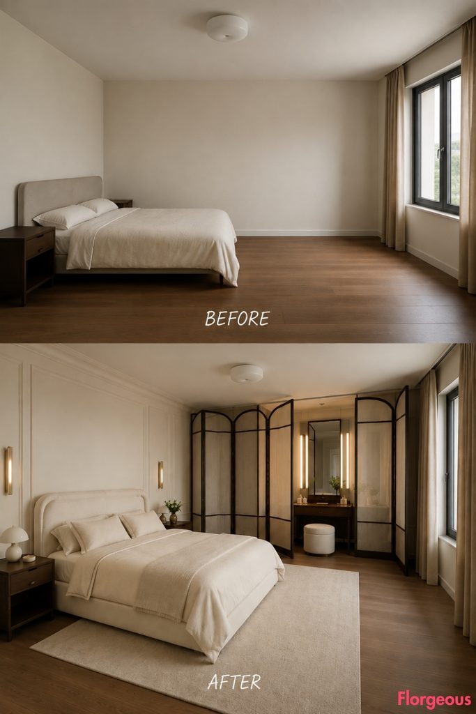
Before: Dressing happens around the bed with no dedicated zone.
After: Black lacquer and parchment screens partially enclose a walnut vanity and stool. Thin illuminated glass blades flank the mirror.
Why it works: The bedroom becomes two distinct but connected Deco environments.
Try this: Stop the screens short of the main circulation route.
24. An Ocean-Liner Wardrobe Island Divides the Room
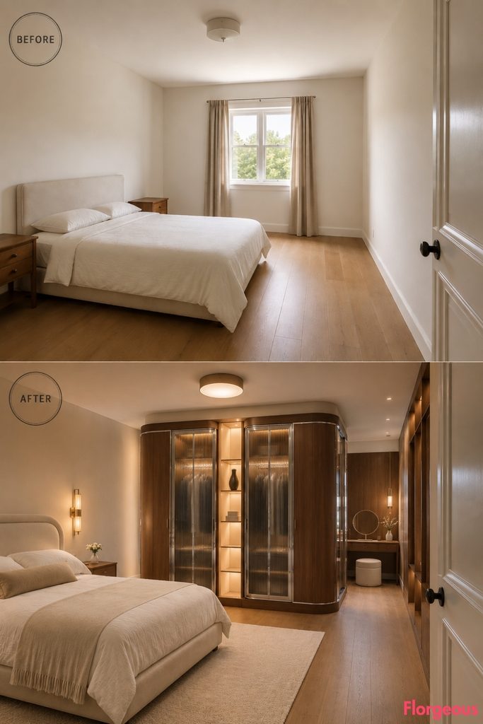
Before: All furniture sits around the perimeter, leaving the center visually empty.
After: A rounded ribbed-walnut wardrobe island moves into the room and separates sleeping from dressing. Chrome trim, fluted glass, and a vertical luminous spine give it Streamline character.
Why it works: Storage becomes a room divider and a sculptural focal point.
Try this: Maintain clear passage on both sides.
25. Sculptural White Deco as a Freestanding Relief Gallery
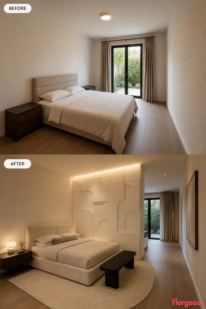
Before: The plain walls provide no depth or architectural rhythm.
After: A tall stepped plaster relief panel stands away from the wall, creating a narrow gallery passage behind it. A bone bed sits to one side, while concealed uplighting throws dramatic shadows across the relief.
Why it works: Geometry and shadow communicate Deco without dark color or metallic excess.
Style Note: Art Deco does not require gold.
26. A Long Narrow Deco Room Uses One Strong Corridor
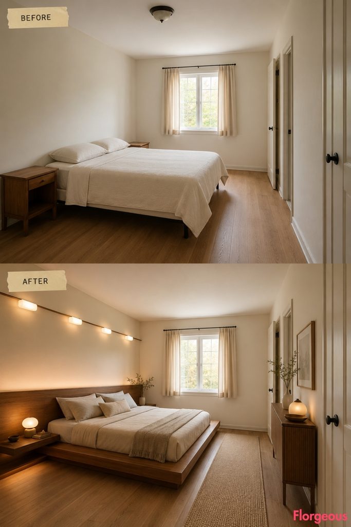
Before: The centered bed creates two uncomfortable narrow strips and awkward circulation.
After: A teak sleeping platform runs lengthwise along one wall, leaving the opposite side as one uninterrupted corridor. A shallow dresser sits at the far end.
A slim opal rail with rectangular modules follows the timber back panel.
Why it works: One proper walkway is more useful than two compromised ones.
27. Angular Parisian Deco on a Deliberate Diagonal
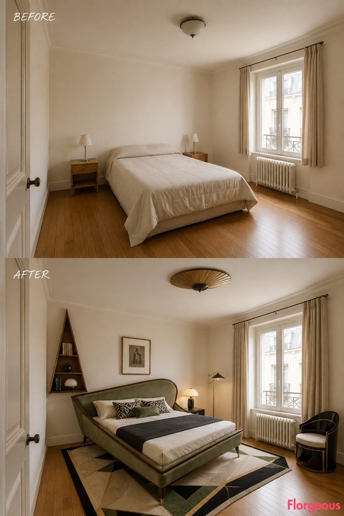
Before: Every element follows the room walls, creating a safe but predictable layout.
After: A compact cream bed turns onto a controlled diagonal, supported by an angular geometric carpet. A triangular walnut shelf uses the leftover corner, while a flattened fan ceiling fixture follows the same axis.
Why it works: The diagonal changes the entire perspective while the lacquer, walnut, and geometry keep it unmistakably Deco.
Try this: Tape the full bed footprint before moving furniture.
Choosing the Right Art Deco Direction
A convincing Art Deco Bedroom starts with one clear design thesis.
Traditional glamour works beautifully with emerald velvet, walnut, burl, oxblood, parchment, and stepped geometry. Restrained Parisian Deco favors lacquer, controlled asymmetry, tailored upholstery, and precise proportions. Streamline Moderne leans toward chrome, curved cabinetry, glass, and horizontal movement, while Miami Deco brings pistachio, peach, terrazzo, and softer curves.
The layout should support the style. A Murphy bed should resemble period cabinetry. A sleeping pod should recall luxurious railway compartments. A wardrobe island should feel like streamlined ocean-liner furniture rather than generic contemporary storage.
Lighting should be designed specifically for each spatial concept. Cabinetry can glow internally, a canopy can carry integrated pin lights, a library can use picture lights, plaster can rely on concealed washing, and table or pendant lamps should have their own distinct silhouettes rather than being repeated throughout the gallery.
Before purchasing larger pieces, map them with painter’s tape. Check doorway clearance, access to the window, curtain movement, storage depth, bed circulation, and lighting height.
The strongest Deco rooms are not the ones with the most motifs. They are the ones where layout, furniture, geometry, materials, and lighting tell one coherent story.