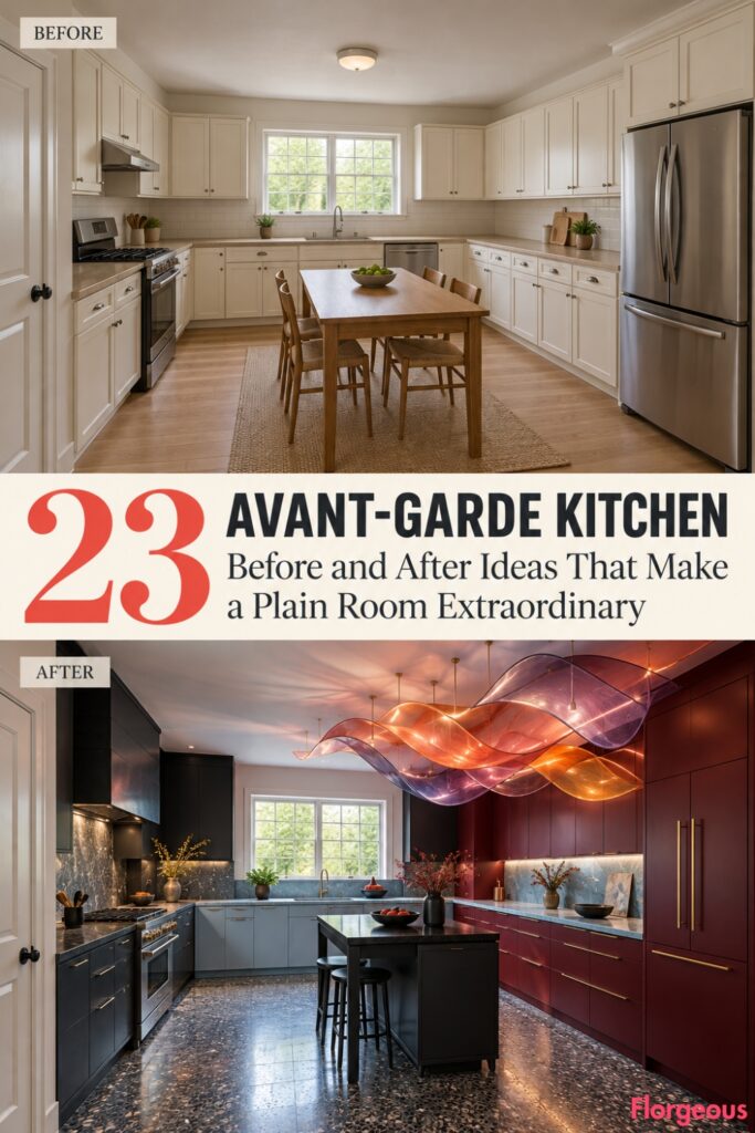
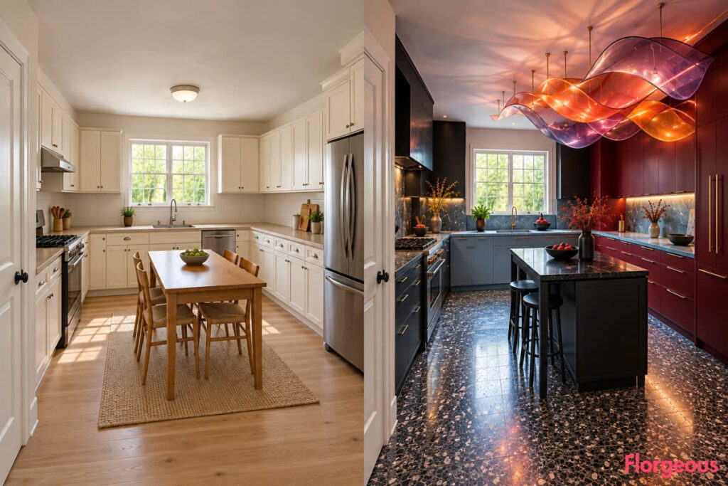
A plain kitchen can have all the essentials and still feel surprisingly forgettable. Cream cabinets, beige countertops, predictable lighting, and an ordinary utility table rarely give a spacious room a memorable personality.
An Avant-Garde Kitchen offers a more imaginative approach. Rather than treating a makeover as a simple finish upgrade, these designs experiment with spatial relationships, unexpected furniture geometry, architectural sculpture, and unconventional materials.
For these 23 imagined transformations, we’re keeping one identical starting point: a rectangular kitchen measuring approximately 7.2m by 5.0m, with a front-left entrance, centered rear window above the sink, left-wall cooking range, right-wall refrigerator, flat ceiling, and ordinary builder-grade furnishings.
Every AFTER retains that architecture while dramatically changing the interior design. Each concept introduces a distinctive layout, visual focal point, material composition, and photographic perspective, allowing the transformation to reveal a different side of the same original room.
1. Create a Monumental Black-Metal Anvil Kitchen
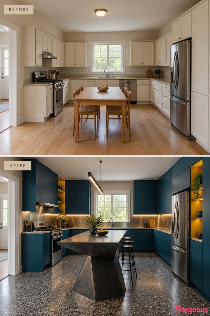
A dramatic anvil-inspired sculpture transforms an ordinary kitchen into an experimental architectural gallery.
Before: Plain cream cabinets, beige countertops, pale oak flooring, and a basic rectangular utility table.
After: A massive blackened-metal preparation sculpture dominates the center-left, featuring a tapered body and projecting stone worktop. Deep petrol-blue cabinetry, electric-citron storage accents, brushed-steel counters, and charcoal terrazzo flooring create a powerful artistic composition.
Why it works: The sculptural centerpiece and bold material contrasts create a cohesive architectural identity.
Try this: Use lightweight black-metal cladding over an engineered cabinet frame.
2. Build an Offset Eclipse-Shaped Preparation Station
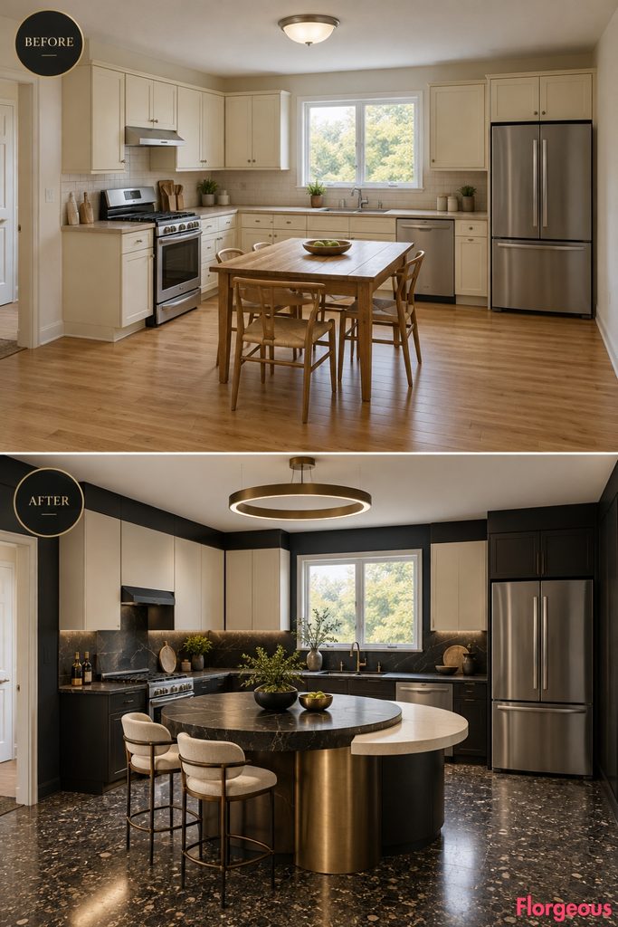
An oversized circular workstation creates a dramatic visual contrast against the original rectangular architecture.
Before: Conventional cabinets and a simple rectangular table emphasize straight lines and predictable proportions.
After: A monumental dark circular preparation disk sits off-center, supported by an eccentric bronze-toned cylindrical base. An ivory crescent cuts through the tabletop, producing an eclipse-like composition. Black-and-cream cabinetry, mineral flooring, and carefully controlled lighting reinforce the sculptural centerpiece.
Why it works: The off-center circular form changes the perceived balance of the room without altering its boundaries.
Try this: Install a circular stone-look worktop on a reinforced pedestal, leaving practical appliance access.
3. Turn the Kitchen Into an Island-Free Architectural Gallery
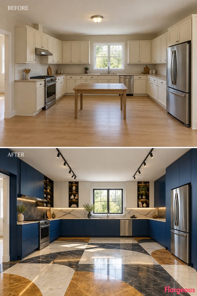
This design proves that an empty center can become the room’s most powerful feature.
Before: The ordinary utility table occupies the middle of the kitchen without creating a deliberate spatial composition.
After: The table disappears, allowing a large uninterrupted floor area to become an architectural gallery. Monumental cobalt-blue cabinet masses, white mineral forms, and deep black storage recesses occupy the perimeter, while ochre-and-charcoal floor inlays create a striking graphic composition.
Why it works: The open center places greater emphasis on sculptural cabinetry, material relationships, and circulation.
Try this: Concentrate the design budget on expressive perimeter storage and a carefully planned floor pattern.
4. Replace the Standard Island With a Broken Circular Working Ring
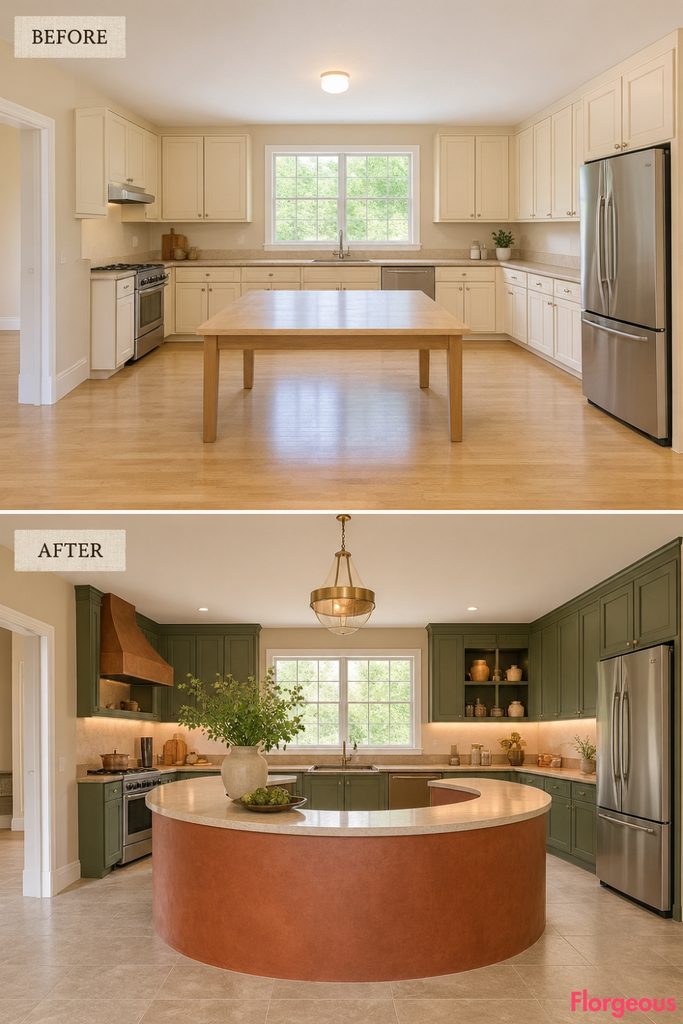
An incomplete circular workstation introduces an unexpected architectural layout.
Before: The central rectangular utility table sits independently from the original cream cabinetry.
After: A thick curved preparation ring forms an open circular working area, with its entrance facing the front-left side. Terracotta cabinetry, cream-stone counters, dark-green storage, and warm-gray flooring give the entire kitchen a strong experimental identity.
Why it works: The open ring creates different working edges while introducing a distinct circulation pattern.
Try this: Build a smaller curved workstation from connected cabinet modules, keeping the opening wide and accessible.
5. Divide Preparation Into Two Staggered Architectural Benches
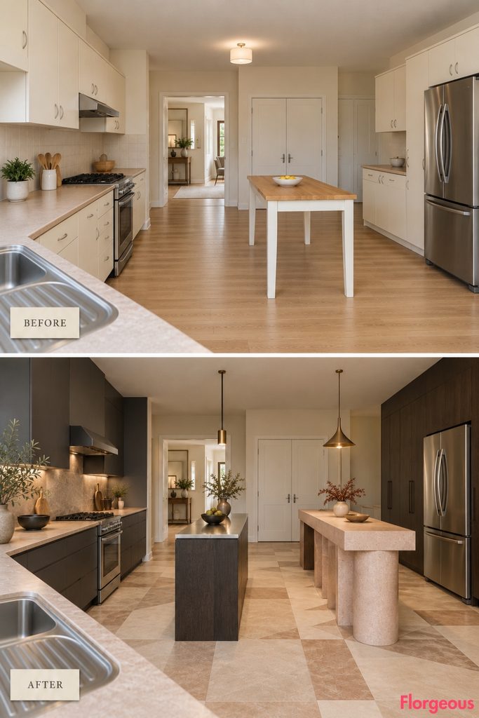
Two independent workstations give the kitchen a more flexible and deliberately layered composition.
Before: One generic utility table occupies the center.
After: Two long preparation benches sit parallel to each other but at different front-to-back positions. One uses blackened oak and brushed steel, while the other combines pale-rose mineral composite with dramatic sculpted end supports. The surrounding kitchen is rebuilt in graphite and warm stone.
Why it works: The staggered arrangement creates distinct work zones without the mass of one oversized island.
Try this: Use two narrow commercial-style preparation tables with safe working clearances.
6. Create a Sawtooth Cooking Wall With Projecting Work Fingers
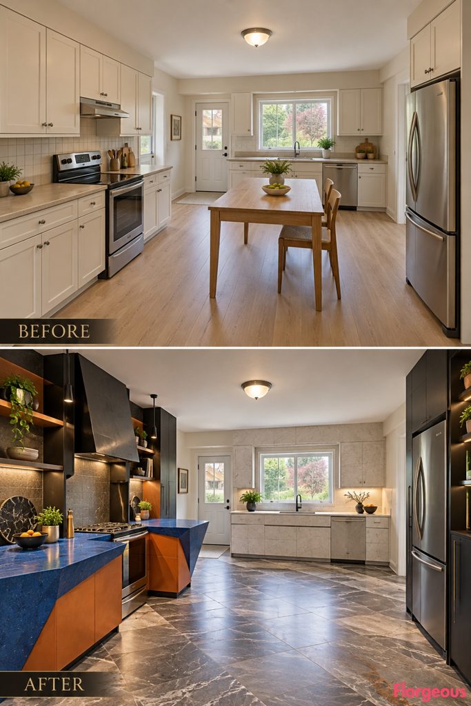
The cooking wall becomes an arrangement of angled working projections rather than a single straight elevation.
Before: Basic cabinetry surrounds the original left-wall range, and a rectangular table fills the center.
After: Two cobalt preparation fingers extend inward at carefully controlled angles from different sections of the left wall. Bright-orange storage blocks and black structural seams emphasize the sawtooth composition. Pale mineral sink cabinetry and directional porcelain flooring support the bold geometry.
Why it works: The projected workstations create distinctive preparation zones while giving the left wall architectural depth.
Try this: Add one short angled counter to a suitable wall cabinet run.
7. Build a Dramatic Inward-Facing Storage Alcove
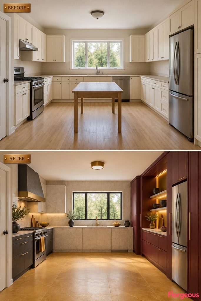
A furniture-built alcove creates the feeling of a second spatial layer within the same rectangular room.
Before: Plain right-wall cupboards and a standard refrigerator create a flat storage elevation.
After: Two tall burgundy pantry wings project from the right cabinetry, framing a sheltered pale-stone preparation niche. Golden interior panels and dramatic geometric cabinet details contrast with the deeper storage volumes. An open central court preserves comfortable movement.
Why it works: The alcove changes how the storage wall is perceived without modifying the original structure.
Try this: Frame a recessed counter between two full-height pantry units, allowing for proper appliance access.
8. Sculpt a Giant Oxidized-Copper Helix Kitchen
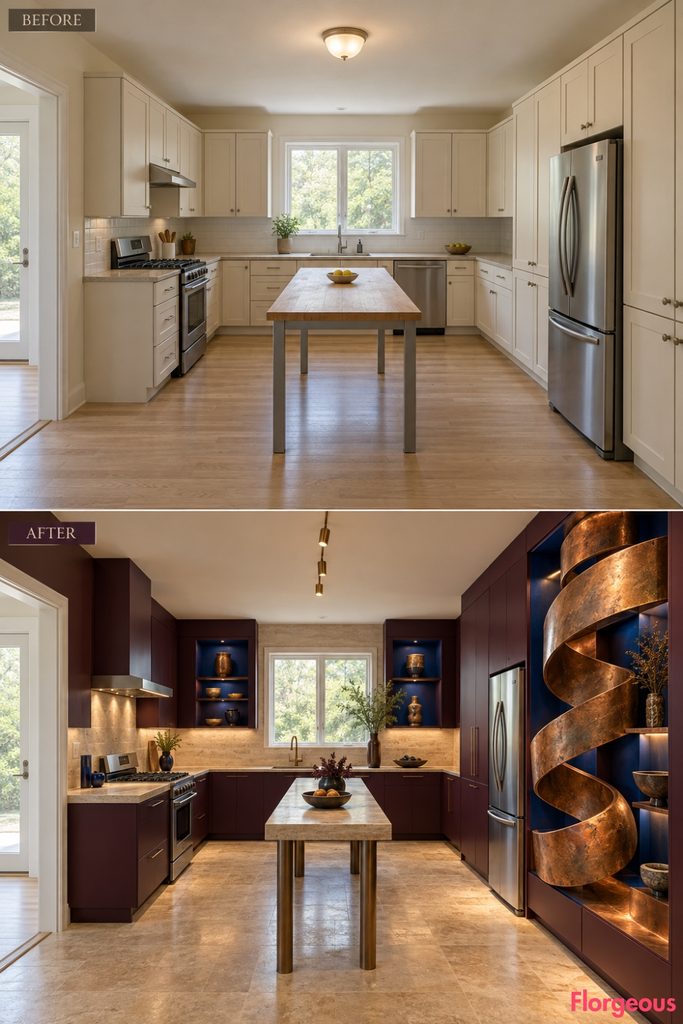
A monumental copper spiral transforms the storage wall into an extraordinary architectural installation.
Before: Standard cream cupboards, beige counters, pale oak floors, and a plain utility table create a predictable interior.
After: Broad oxidized-copper bands twist across the right storage elevation, revealing deep-plum cabinetry and cobalt-blue recesses. A slender travertine preparation bench, warm limestone flooring, and gallery lighting emphasize the sculpture’s dramatic three-dimensional form.
Why it works: The continuous helix creates architectural movement, while restrained furniture keeps the composition balanced.
Try this: Use curved aluminum panels with a copper-effect finish over conventional cabinetry.
9. Turn the Entire Kitchen Into a Radical Infinite-Grid Installation
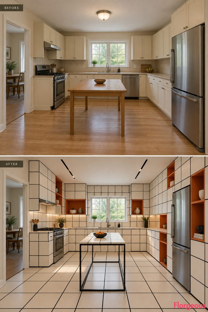
What if the boundaries between cabinets, countertops, and flooring almost disappeared beneath one enormous architectural drawing?
Before: The cream cupboards, beige worktops, pale oak flooring, and ordinary rectangular utility table have no consistent visual language.
After: An uncompromising black-on-ivory grid wraps across the rear cabinetry, left cooking elevation, and floor, creating the impression of one continuous constructed surface. Oversized gridded storage blocks project from the right wall, while a narrow black-framed preparation table sits slightly off-axis near the center. Deep shadows and selective burnt-orange interior compartments disrupt the otherwise precise composition.
Why it works: The repeated grid turns separate furniture pieces into one unified architectural artwork, while the off-axis worktable creates a deliberate interruption.
Try this: Use gridded large-format porcelain, custom laminate fronts, and one black-framed workstation to recreate the effect without replacing every cabinet.
10. Sculpt an Extraordinary Oyster-Shell Washing Gallery
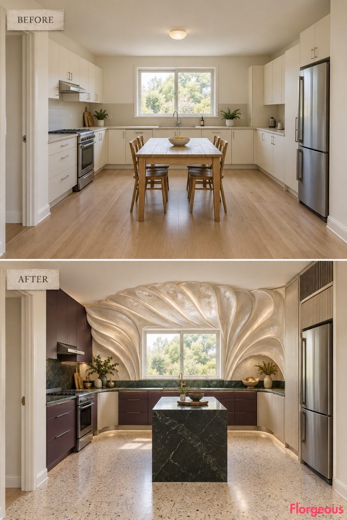
This kitchen takes inspiration from the intricate interior of an opened oyster shell, turning the everyday sink area into a monumental sculptural environment.
Before: A standard sink sits beneath the rear window, surrounded by flat cream cabinets and beige counters.
After: Enormous pearlescent ceramic-composite ribs radiate across the rear working elevation, creating a shell-like structure that frames the original window without covering it. Below, a dramatic sea-green mineral countertop contains the sink, while deep aubergine storage drawers occupy the base. A small, deliberately offset black-stone preparation block balances the sculptural rear wall, with sandy terrazzo flooring softening the composition.
Why it works: The expressive rear installation gives the kitchen an unexpected artistic identity while keeping the washing and preparation functions logically connected.
Try this: Use lightweight molded shell-like backsplash relief panels around an existing sink, with smooth, waterproof surfaces at splash level.
11. Create a Giant Moiré-Art Cabinet Wall That Changes With Perspective
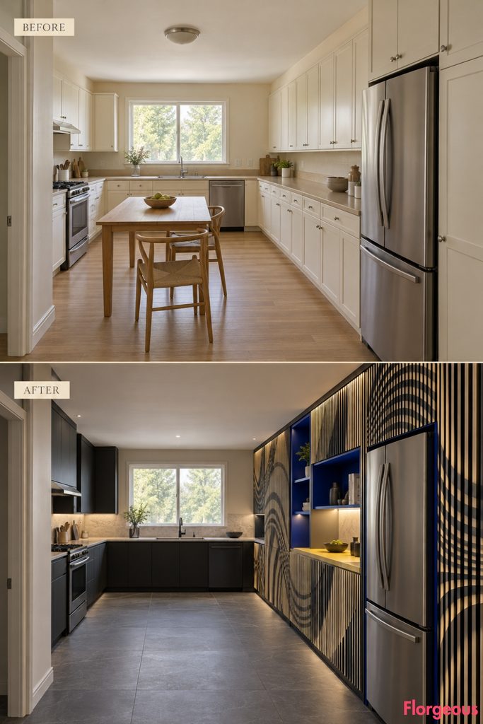
This design explores visual interference, movement, and depth through overlapping architectural surfaces.
Before: The right storage elevation consists of standard cream cupboards and a plain refrigerator.
After: A monumental installation of black and warm-white linear panels covers the right cabinetry, with two offset layers producing a dramatic moiré effect when viewed diagonally. Deep cobalt storage recesses interrupt the pattern, while a compact pale-yellow side preparation counter extends from the cabinet run. Dark-gray flooring and focused grazing lights reinforce the optical composition.
Why it works: The changing appearance of the layered lines gives the kitchen movement without requiring actual moving parts.
Try this: Install one removable, shallow linear overlay over conventional cabinetry, ensuring the doors and drawers can still operate.
12. Reimagine the Kitchen as a Japanese Metabolist Plug-In System
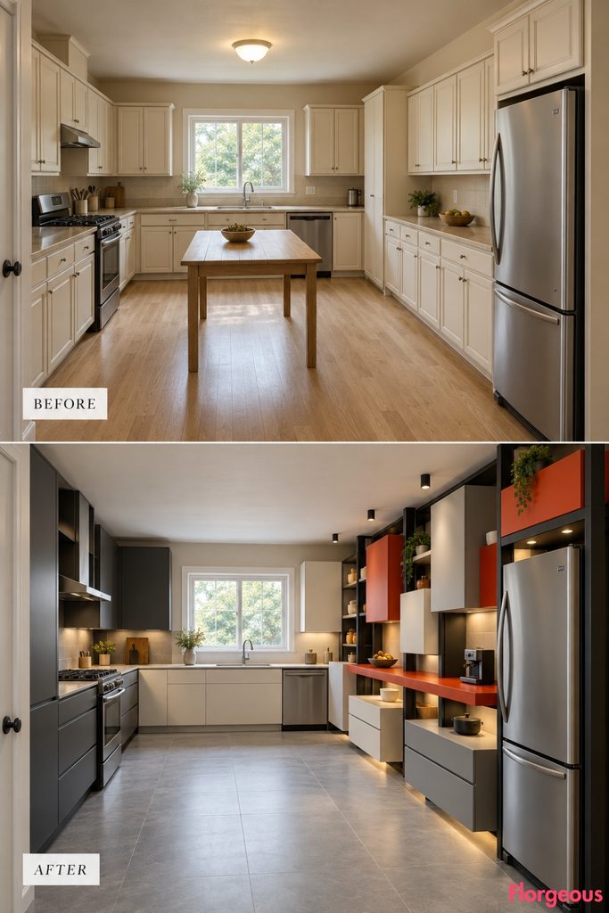
Inspired by experimental modular architecture, this makeover treats cabinetry as a series of independent units connected to a disciplined structural framework.
Before: Standard cabinet rows form a conventional built-in kitchen with no expressive hierarchy.
After: Large square and rectangular plug-in cabinet capsules project from a graphite structural frame on the right storage wall. Each capsule has a distinct function, including dry storage, small-appliance storage, and deep drawers. A bright vermilion serving shelf connects selected modules, while crisp ivory working counters and industrial pale-gray flooring make the composition feel purposeful rather than chaotic.
Why it works: The modular structure gives every storage element its own visual identity while making the kitchen’s organization immediately understandable.
Try this: Recreate the appearance using standard cabinet boxes with contrasting surrounds and a carefully arranged framework.
13. Turn the Cooking Elevation Into a Scarlet Structural Exoskeleton
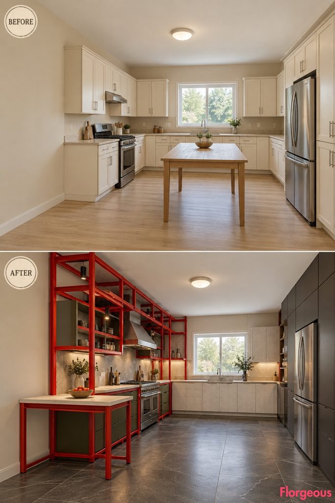
This design exposes an expressive supporting framework as the main architectural feature.
Before: The range sits within ordinary cream cabinetry, with a standard backsplash and no relationship to the open floor.
After: A massive red tubular-metal exoskeleton frames the left cooking elevation, wrapping around black mineral cabinetry and extending forward into a short, carefully supported preparation station. Dark olive metal storage drawers sit within the frame, while a pale stone working counter provides relief from the intense red. Large charcoal tiles emphasize the industrial-art composition.
Why it works: The deliberately visible structural system organizes cooking, preparation, and storage into one coherent sculptural assembly.
Try this: Use powder-coated tubular-steel framing around a standard cabinet system, ensuring heat clearances and accessible ventilation.
14. Wrap the Rear Kitchen in Monumental Hand-Formed Clay Coils
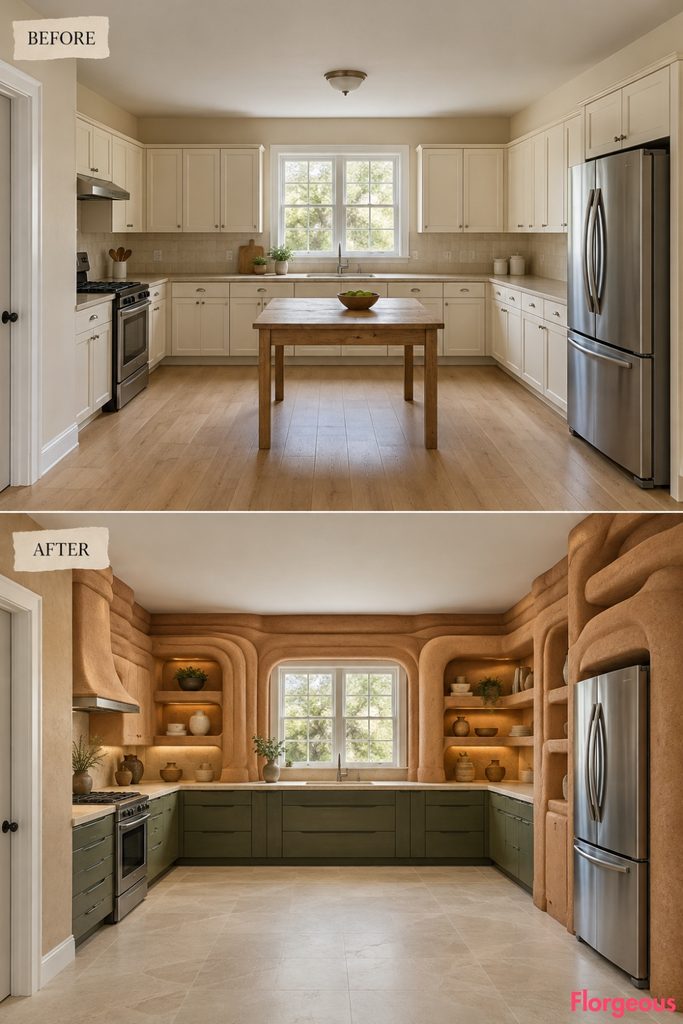
This makeover transforms a familiar pottery technique into an unexpectedly large architectural expression.
Before: The rear wall has a simple cream cabinet run, beige laminate, and a standard sink window.
After: Enormous overlapping clay-like coils frame the rear storage cabinetry, flowing around the existing window without covering it. Their warm ochre surfaces contrast with dark moss-green drawers and thick limestone countertops. Small sculptural shelving pockets are integrated between the coils, while a pale mineral floor and restrained walnut accents keep the room grounded.
Why it works: The oversized handmade-looking construction introduces texture and artistic character on a scale rarely seen in domestic kitchens.
Try this: Use lightweight ceramic-composite relief sections over conventional cabinet frames instead of heavy solid clay.
15. Create a Kitchen of Monumental Chromatic Storage Silos
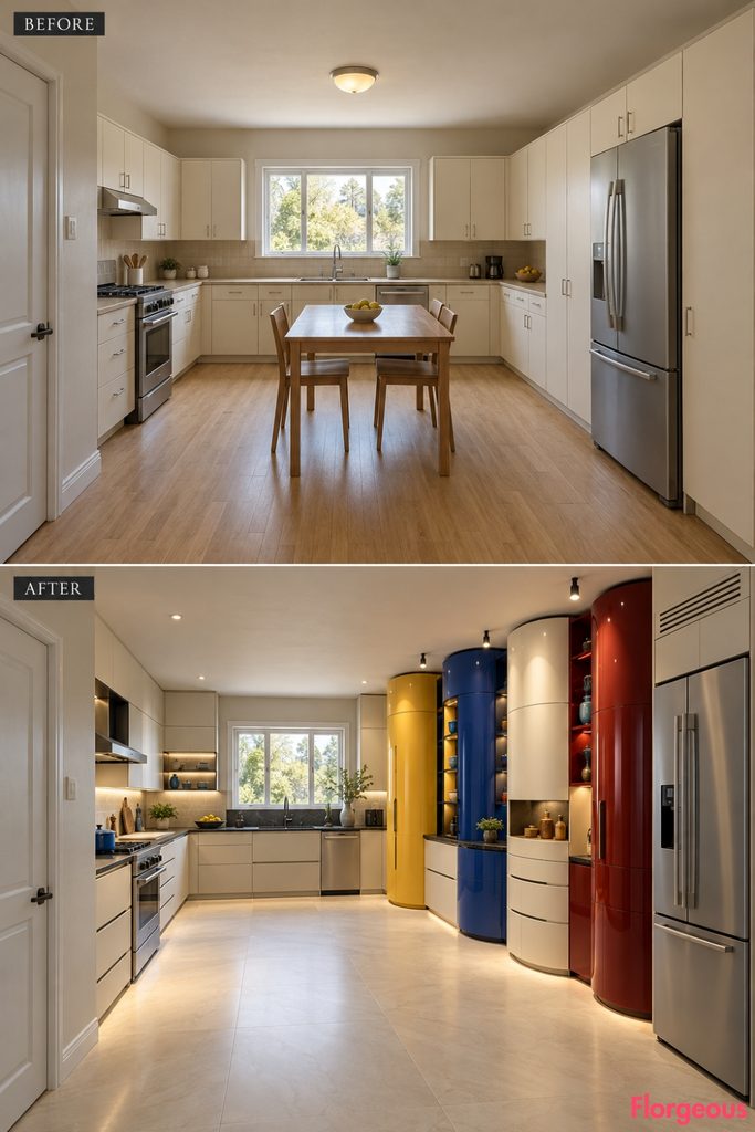
Instead of rows of ordinary cupboards, this design treats tall storage as a collection of bold architectural objects.
Before: Standard rectangular right-wall cabinets and an ordinary refrigerator provide purely functional storage.
After: Several oversized vertical elliptical storage silos occupy the right working elevation, finished in saffron yellow, cobalt, chalk white, and deep oxblood. Each silo contains concealed pantry shelves or drawers and opens through carefully integrated curved doors. A low black-stone preparation counter runs beneath the composition, while pale mineral flooring and restrained rear cabinetry provide visual balance.
Why it works: The exaggerated vertical storage forms create an extraordinary rhythm while preserving familiar kitchen functions.
Try this: Apply curved decorative shells to conventional tall cabinet carcasses, using proper full-extension storage and appliance ventilation.
16. Give the Kitchen a Surreal Upside-Down Cabinet Illusion
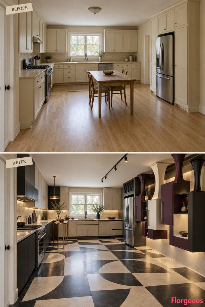
This design questions gravity and traditional furniture construction, making everyday storage appear inverted.
Before: Cabinets stand normally on the floor, upper storage hangs conventionally on the walls, and the room has no visual surprise.
After: An entire section of the right cabinetry appears upside down, with tapered cabinet-leg forms rising toward the ceiling and storage boxes seemingly suspended beneath them. In reality, the installation is securely attached to a concealed structural frame. The lower working zone is finished in dark plum lacquer and white stone, while stark black-and-cream flooring heightens the surreal effect.
Why it works: Familiar furniture is presented in an unexpected orientation, creating a playful but architecturally controlled illusion.
Try this: Use false inverted legs as decorative cabinet surrounds, while keeping storage boxes and worktops conventionally engineered.
17. Suspend a Constellation of Oversized Porcelain Light Discs
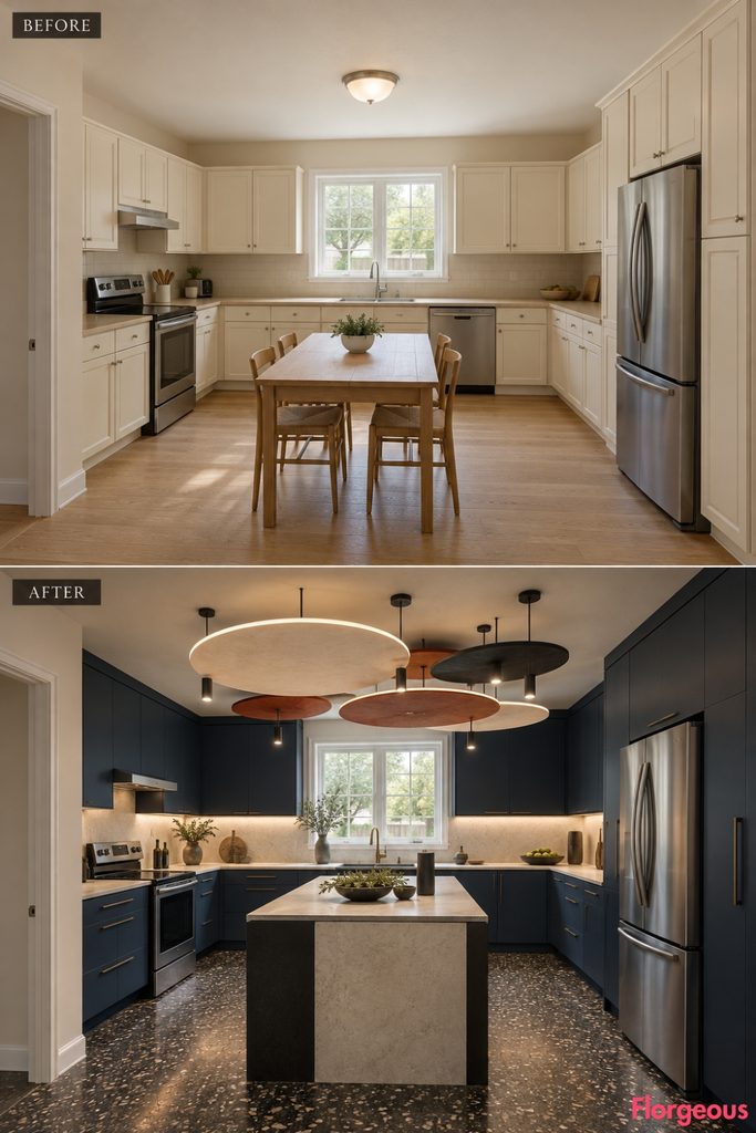
This makeover brings the artistic focal point into the upper volume of the room without modifying its ceiling architecture.
Before: One inexpensive ceiling fixture illuminates a conventional kitchen with no meaningful overhead composition.
After: An extraordinary installation of oversized ivory, rust-red, and charcoal porcelain-look discs floats above the central preparation area, each suspended from discreet supports at carefully controlled heights. Beneath them, a compact black-and-cream preparation block anchors the composition. The perimeter is completely renovated with matte-indigo cabinetry, pale stone worktops, and dark terrazzo flooring.
Why it works: The layered discs create a dramatic spatial installation while keeping the working floor efficiently arranged.
Try this: Choose one lightweight oversized disc pendant or small cluster rather than a full custom installation.
18. Rebuild the Storage Elevation as a Prismatic Glass-Fin Reef
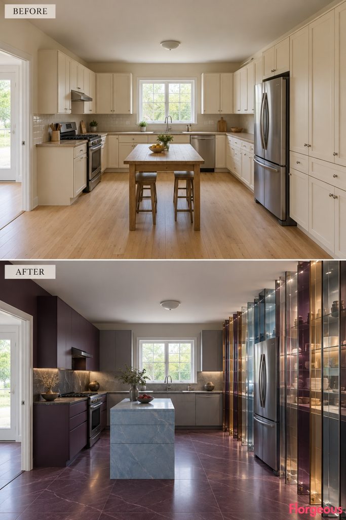
This design creates a layered architectural environment using long vertical planes of textured glass.
Before: The original storage wall consists of opaque cream cupboards and standard appliance fronts.
After: A series of tall smoky-lilac and bronze-tinted glass fins projects a short distance in front of the right storage elevation, creating a shimmering reef-like composition. Functional graphite cabinets sit behind the fins, while a pale-blue preparation plinth occupies the adjacent open working zone. Deep plum flooring and warm task lighting emphasize the extraordinary optical depth.
Why it works: The layered glass planes create transparency, reflection, and movement without turning the kitchen into an impractical glass showroom.
Try this: Use a small number of tempered laminated decorative glass panels in front of accessible storage, with cleanable gaps and protected edges.
19. Turn Everyday Drawers Into a Monumental Typewriter-Key Installation
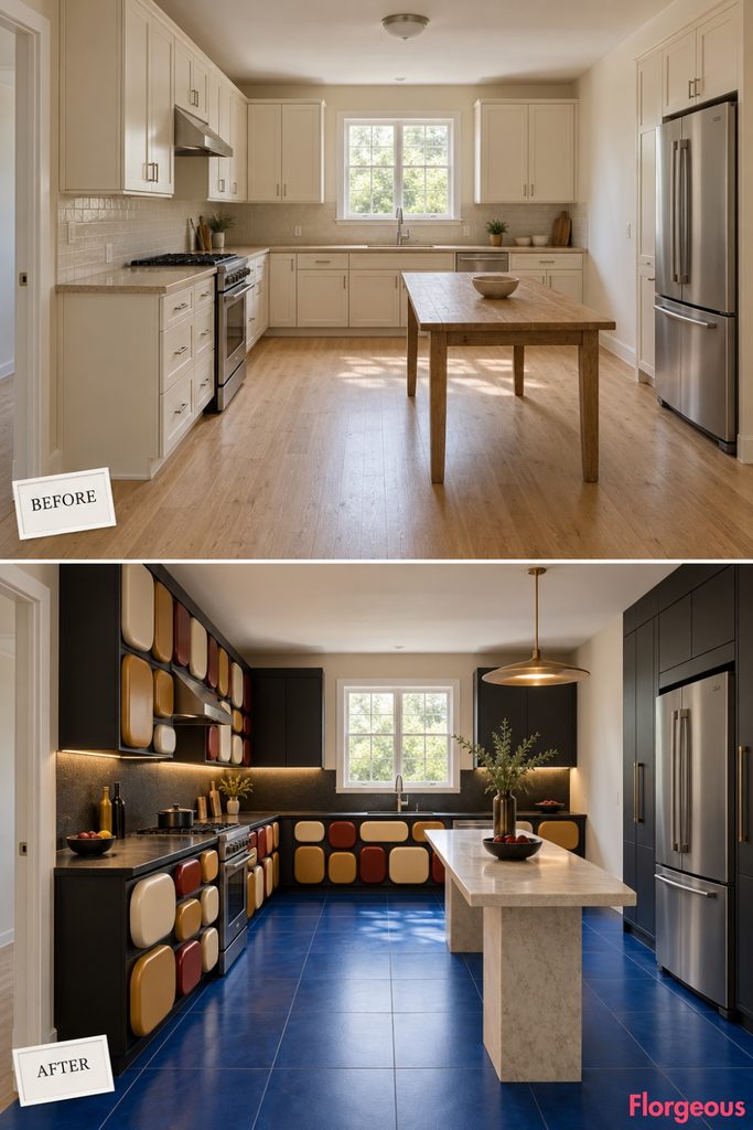
This kitchen borrows the tactile character of an old mechanical keyboard and exaggerates it into a fully functional storage system.
Before: Standard rectangular cabinet doors and drawers form uniform working elevations.
After: Oversized round and softly squared cabinet fronts project from a rigorous matte-black storage frame, resembling giant unlabeled mechanical keys. Cream, ochre, and dark-red modules are arranged in a deliberate staggered rhythm, with practical drawers hidden behind them. A slim pale-stone preparation table stands parallel to the left cooking wall, while cobalt flooring adds a powerful chromatic contrast.
Why it works: The repeated sculptural modules create a strong rhythm while the cabinet grid preserves functional organization.
Try this: Use oversized shaped drawer-front overlays and deep pulls on conventional storage rather than fabricating an entirely new mechanical cabinet system.
20. Split the Kitchen Into Two Worlds With a Giant Sculptural Zipper
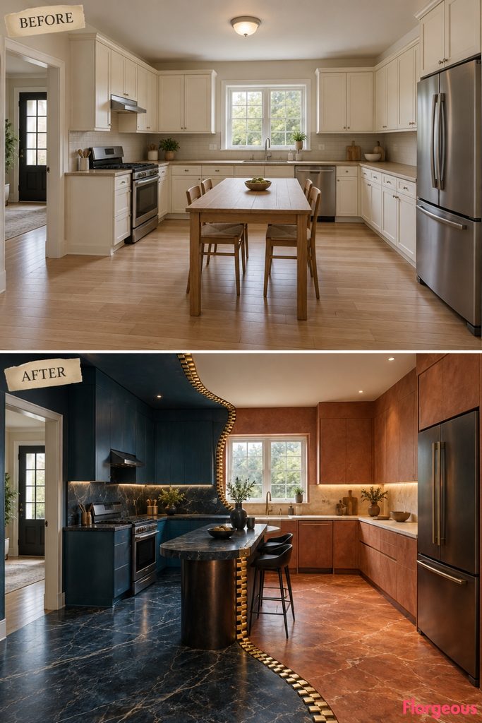
A dramatic oversized zipper becomes an artistic representation of two contrasting design territories coming together.
Before: Cream cabinets, beige counters, and pale oak floors blend into one undifferentiated neutral room.
After: One half of the kitchen is finished in deep petrol-blue lacquer and dark mineral surfaces, while the opposite working area uses warm terracotta plaster and pale stone. Along their boundary, an enormous sculptural brass zipper-like relief runs across cabinet fronts and continues visually into flush floor inlays. A compact black serving counter sits beside the transition without obstructing circulation.
Why it works: The exaggerated joining mechanism provides a memorable conceptual focal point while clearly organizing two material identities.
Try this: Use applied metal relief pieces and contrasting finishes over ordinary cabinetry, with all floor elements completely flush.
21. Reconstruct the Working Walls as a Monumental Kintsugi Stone Artwork
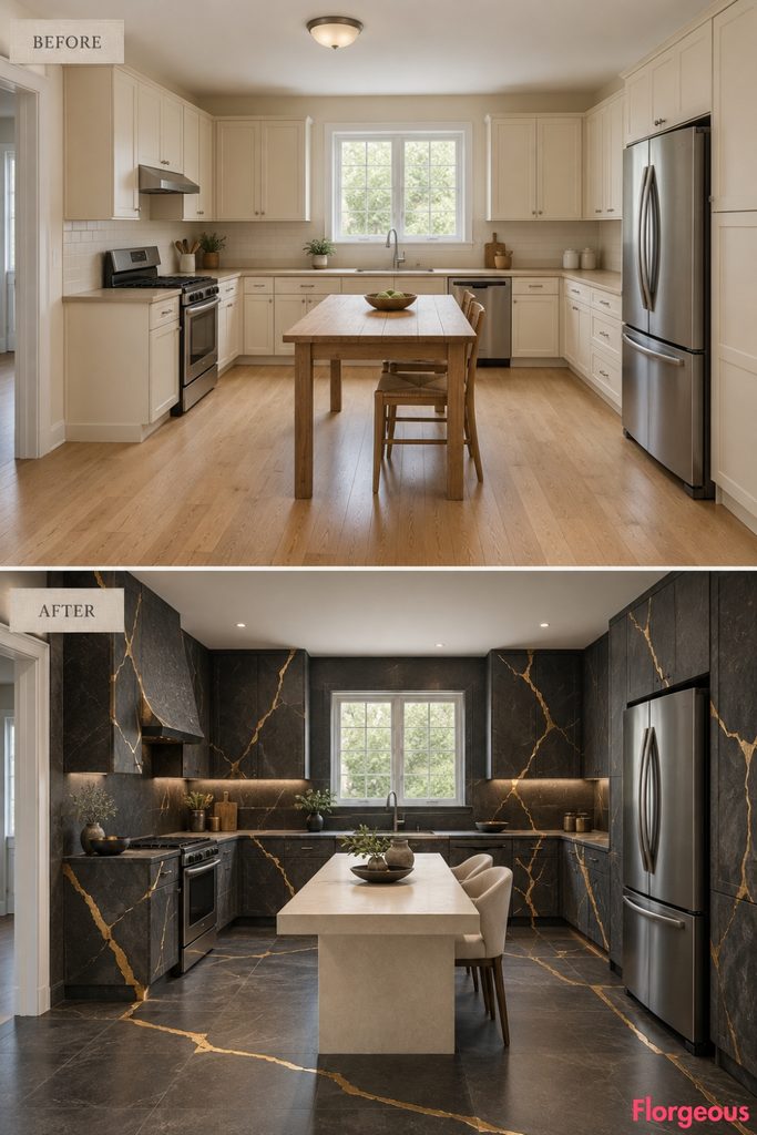
This design uses the visual philosophy of repairing broken ceramics with metal, enlarged to an architectural scale.
Before: The room has generic cream cabinets, beige worktops, and an ordinary pale floor.
After: Enormous dark charcoal stone-look cabinet planes appear fractured into carefully engineered segments, joined by bold irregular bronze channels. The dramatic repair pattern continues from the left cooking wall across selected rear cabinetry and into the flooring. A narrow warm-ivory worktable provides a deliberately calm preparation zone, while dark recessed storage preserves everyday practicality.
Why it works: The fracture lines turn otherwise massive cabinet volumes into one powerful piece of sculptural art.
Try this: Use large-format porcelain cabinet cladding with inset bronze-finish trim rather than attempting to join heavy broken natural-stone slabs.
22. Turn Cabinetry Into an Immense Lapis-Blue Stone Lace Installation
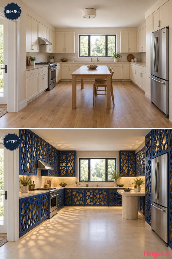
This kitchen challenges the idea that stone must always look heavy and solid.
Before: The standard storage façades are flat, with inexpensive neutral backsplash and laminate worktops.
After: A monumental installation of intricate lapis-blue lace-like stone panels rises across the left and rear cabinet elevations. Large irregular openwork patterns reveal recessed brass-toned backing panels, producing extraordinary shadow and texture. Beneath the decorative screens, functional cabinetry remains practical, while smooth cream-stone countertops and pale sand flooring prevent the interior from becoming overwhelming.
Why it works: Delicate-looking carved detail in a visually heavy material creates a striking contradiction between solidity and transparency.
Try this: Use CNC-cut lightweight mineral-composite screens mounted over full-depth cabinet doors, leaving sufficient access for cleaning and maintenance.
23. Finish With a Spectacular Spectral-Wave Kitchen Installation
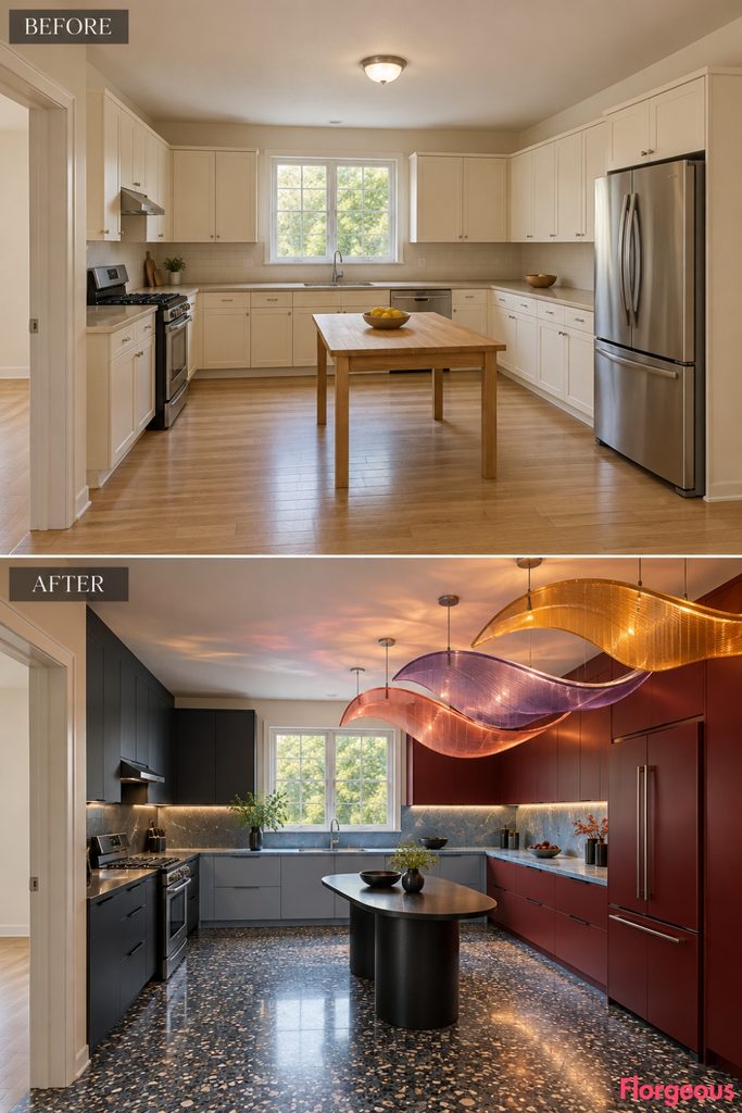
The final concept creates a room-scale artwork from color, transparency, and three-dimensional movement.
Before: The original cream cabinetry, beige countertops, pale oak floor, and basic utility table make the room functional but visually ordinary.
After: A monumental suspended standing-wave sculpture spans the upper-right preparation zone, formed from three broad translucent polycarbonate waves in coral, smoky lilac, and amber. Beneath it, bold oxblood cabinetry meets pale-blue mineral counters, while a compact black preparation workstation sits just outside the sculptural footprint. A dark terrazzo floor anchors the extraordinary composition, and carefully controlled lighting creates layered colored shadows without making the surfaces appear artificially luminous.
Why it works: The suspended waves create a strong sculptural identity that reorganizes how the room is visually experienced while leaving essential cooking and movement functions intact.
Try this: Start with one safely suspended translucent sculptural light above a clear preparation zone, using professionally rated ceiling fixings.
Finding the Right Artistic Direction for Your Kitchen
An Avant-Garde Kitchen becomes most convincing when the artistic concept influences the entire interior, not just one unusual piece of furniture. A sculptural cabinet wall, translucent installation, expressive material system, or unexpected storage structure should guide the surrounding finishes, preparation layout, and lighting.
These 23 transformations demonstrate how one ordinary room can support radically different visual identities without altering its architectural shell. The strongest designs balance artistic experimentation with practical counter space, accessible storage, safe appliance clearances, and open circulation.
Before choosing a concept, identify the one architectural feature that should dominate the room. Then plan every other element around it, allowing quieter surfaces to give the strongest forms space to stand out.