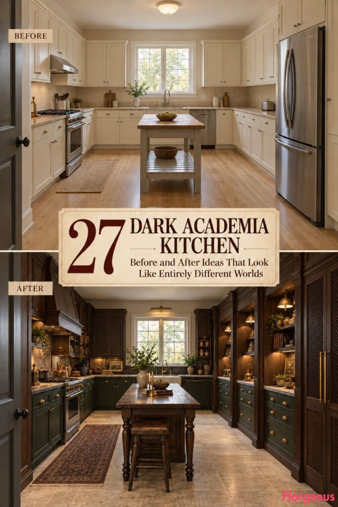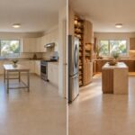
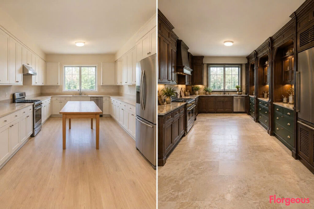
There is something irresistible about a kitchen that feels as though it belongs inside an old university, a private scholar’s residence, or a beautifully preserved academic institution. Rich materials and historic details certainly help, but the most captivating Dark Academia Kitchen designs go further, giving ordinary rooms an entirely new architectural personality.
Imagine starting with a perfectly functional yet forgettable builder-grade kitchen. Cream cabinets line the walls, beige laminate covers the countertops, pale oak flooring stretches across the room, and an ordinary utility table occupies the center. Nothing about the space suggests craftsmanship, history, or intellectual character.
Now imagine reworking that exact room into 27 dramatically different interiors. One becomes a collegiate examination room with individual preparation bays. Another resembles an antiquarian printing workshop. Others explore architectural models, rotating storage, aged leather wall treatments, monumental lighting, and unusual furniture compositions.
Every concept preserves the same original walls, entrance, window, sink, cooking range, and refrigerator. The transformations come from architecture-inspired joinery, thoughtful spatial arrangements, distinctive materials, and creative details that make each design immediately recognizable.
1. Create a Collegiate Kitchen With Individual Scholar’s Carrels
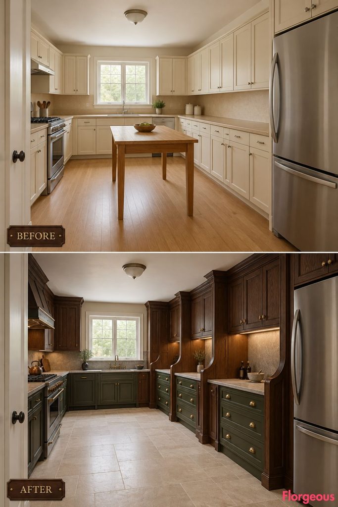
Historic university study carrels provide a surprisingly compelling starting point for kitchen design. Their enclosed, repetitive proportions can organize a long working wall into distinctive preparation stations.
Before: The right-side cabinets are conventional cream cupboards, with beige counters and no meaningful divisions between activities.
After: Three dark-oak preparation bays sit within a continuous right-wall cabinet installation. Each bay has projecting paneled side dividers, a recessed stone counter, and discreet individual task lighting. Deep bottle-green lower cabinets and warm limestone floors complete the scholarly atmosphere.
Why it works: The unusual bay arrangement gives the kitchen a recognizable academic identity while creating practical work zones.
Try this: Use two wider bays rather than three in smaller kitchens, keeping every workstation deep enough for real preparation.
2. Turn a Blank Kitchen Wall Into a Scholarly Slate Planning Surface
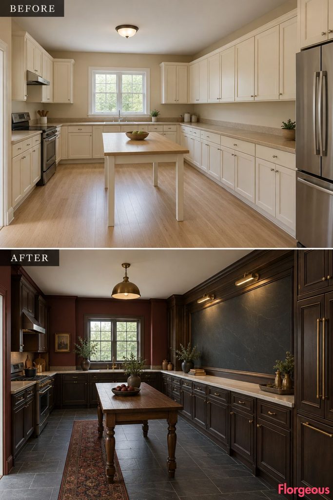
A traditional academic blackboard can become a remarkably strong architectural feature when incorporated into a sophisticated working kitchen.
Before: The kitchen has uninterrupted off-white wall surfaces and ordinary upper cabinets.
After: A monumental charcoal slate planning panel occupies a dry section of the right wall, framed by substantial ebonized oak molding. Beneath it, a long pale-stone preparation counter sits over blackened-walnut cupboards. Narrow brass rails and small shaded lamps create the atmosphere of an old lecture room, without readable chalk writing.
Why it works: The enormous matte-black surface introduces a completely different visual scale from conventional kitchen cabinetry.
Try this: Use a large slate-effect magnetic panel in a timber frame instead of applying chalkboard paint directly to the wall.
Designer Tip: Keep the main planning surface visually quiet. Dark Academia looks more authentic when the architecture feels considered rather than covered with decorative writing.
3. Redesign the Kitchen as a Double-Galley Collegiate Workroom
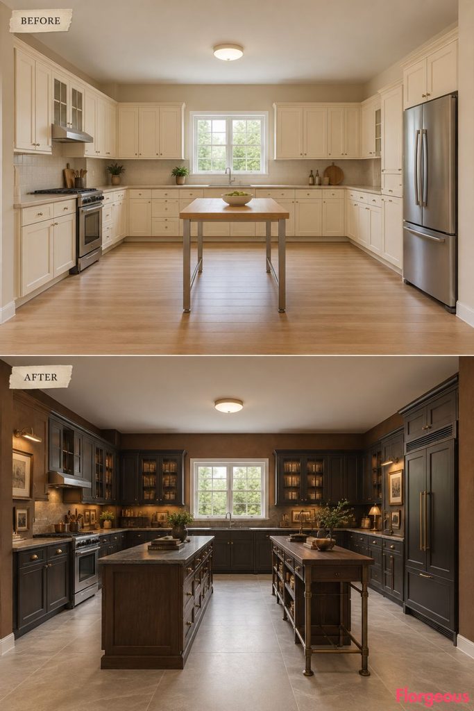
Instead of creating another conventional central island, this makeover uses parallel work surfaces to completely reorganize the room’s visual rhythm.
Before: A lone utility table sits within the central floor, surrounded by ordinary cream cabinetry.
After: Two slim, differently scaled working counters establish a purposeful galley arrangement. One is a dark walnut preparation cabinet with a durable stone surface, while the other is a narrower standing-height service counter with a bronze-framed lower structure. Charcoal cabinetry and tobacco-colored plaster connect the arrangement to historic academic workshops.
Why it works: Parallel counters create two distinct working paths and a strong linear composition without moving fixed appliances.
Try this: Carefully plan the working aisles before introducing freestanding cabinets. The circulation routes matter more than achieving perfect symmetry.
4. Add a Scriptorium-Inspired Inclined Recipe Workstation
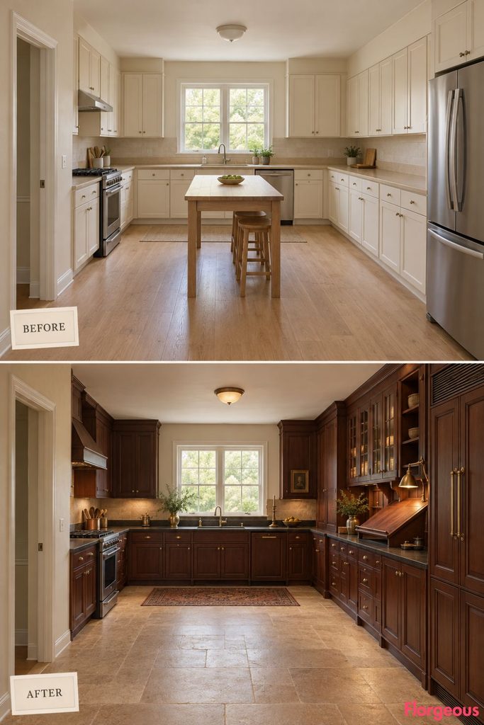
Medieval and early-modern scriptoria inspire a kitchen that treats recipe preparation as a deliberate working ritual.
Before: The right-side countertop is flat and generic, without a dedicated planning or reference area.
After: A furniture-like dark cherrywood workstation combines a standard stone preparation surface with a fixed inclined timber reference platform at one end. Deep manuscript-red cabinets, substantial wood framing, and a carefully positioned brass reading lamp reinforce the scriptorium influence.
Why it works: The sloping surface adds a distinctive architectural silhouette and a useful dry reference area without replacing the primary food-preparation counter.
Try this: Incorporate an inclined recipe holder into one dry countertop section while keeping the surrounding surfaces level.
5. Create an Antiquarian Printing-House Kitchen With Pewter Relief Panels
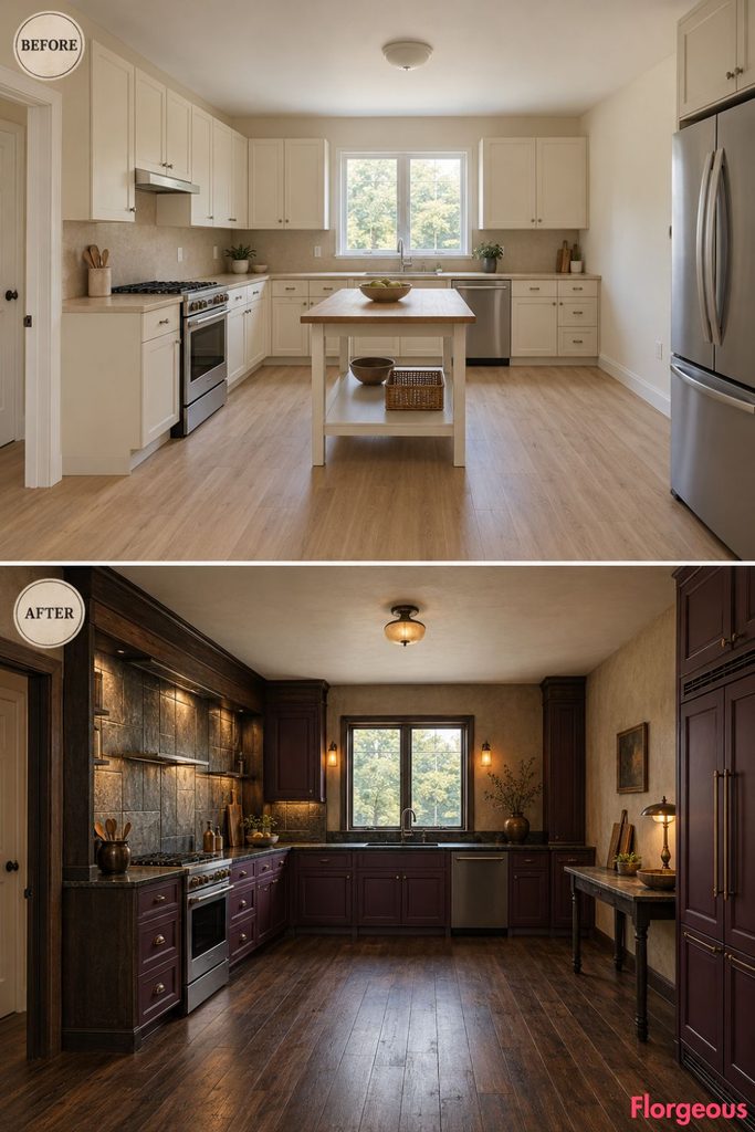
An early printing workshop provides a fresh direction for Dark Academia, particularly through the textures of metal engraving and traditional timber furniture.
Before: The original left cooking wall has a simple beige backsplash and standard cream cabinets.
After: Broad, matte pewter relief panels form a dramatic backdrop around the unchanged range, featuring abstract impressed geometry without letters. Charred-oak cabinet frames, dark plum lower cupboards, and sturdy black-stone countertops give the composition a historic workshop character.
Why it works: The embossed metal surface becomes the architectural feature, replacing the usual dependence on a large decorative range hood.
Try this: Use heat-appropriate embossed metal backsplash panels in a restrained non-textual pattern.
6. Build an Oxford-Style Buttery Servery Into the Cabinetry
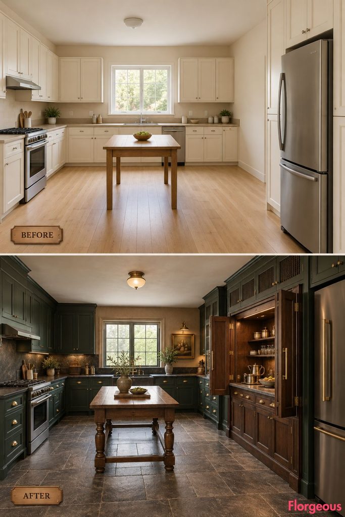
Historic college butteries were associated with food and drink service, making them an especially appropriate reference for kitchen design.
Before: The right wall has conventional storage without a clearly defined serving area.
After: A substantial oak servery occupies the central portion of the right-side cabinetry. Its two wide framed doors open outward to reveal an inset dark-stone serving counter, deep lower storage, and elegant brass details. The doors create a furniture-scale service opening, not a new opening in the actual wall.
Why it works: The servery introduces an engaging change between enclosed storage and open working space.
Try this: Use ordinary hinged cabinet doors with properly planned clearance instead of a complicated hidden-door system.
7. Reimagine the Sink Wall as a Geological Stratigraphy Display
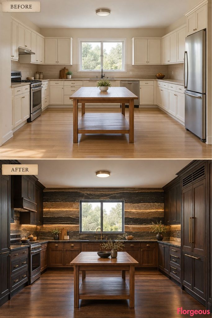
A scholarly interest in geology becomes the foundation for a remarkable composition of layered natural materials.
Before: The rear sink wall has plain cream cupboards and a generic beige backsplash.
After: Long horizontal bands of charcoal slate, muted sandstone, and dark fossil-toned limestone run across the rear working elevation, carefully fitted around the unchanged window. Low dark walnut cabinets and bronze fixtures create a restrained foundation.
Why it works: The layered mineral surfaces resemble geological strata, producing an academic reference through construction rather than accessories.
Try this: Use thin stone-effect porcelain strips in coordinated thicknesses to control installation cost and maintenance.
8. Add a Revolving Scholar’s Storage Drum
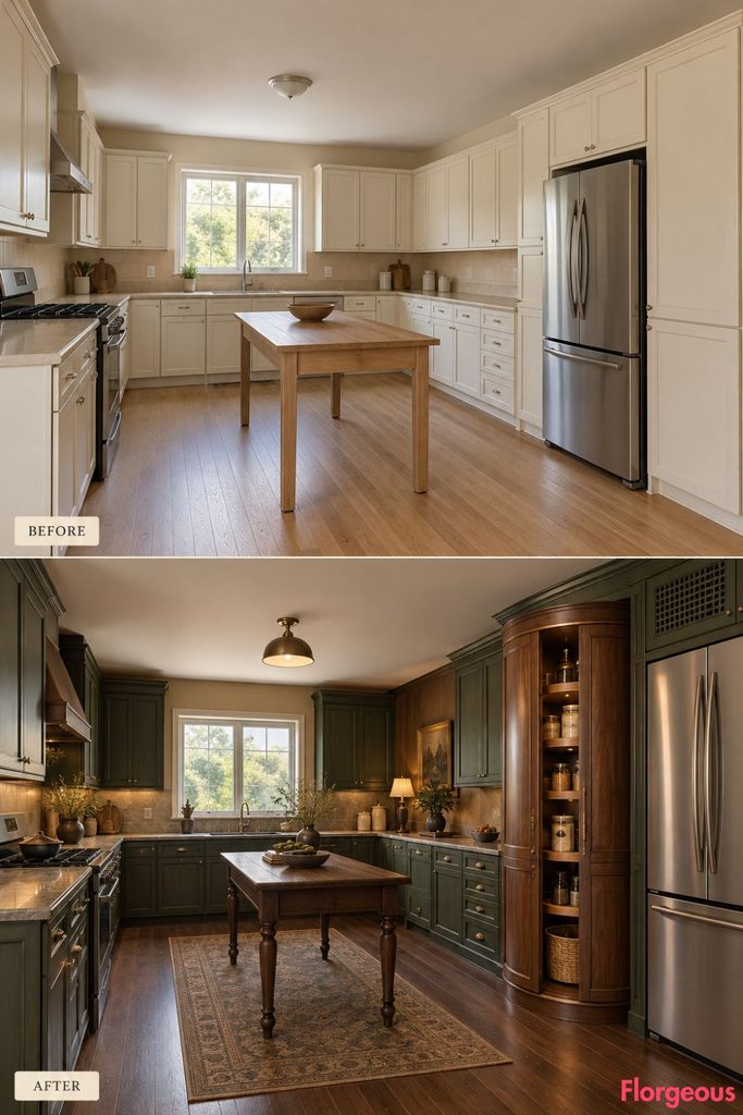
Instead of another long cabinet wall, this concept introduces a single extraordinary storage feature inspired by rotating scholarly reference furniture.
Before: The right-side storage is arranged as ordinary static cupboards.
After: A tall, compact cylindrical walnut storage drum sits within a full-depth right-wall cabinet installation. Its outer section rotates around an engineered internal axis to reveal organized dry storage, while surrounding dark green cabinetry remains stationary.
Why it works: The moving furniture element creates a highly distinctive silhouette and practical storage experience.
Try this: A certified rotating cabinet mechanism can provide the effect on a smaller scale without requiring a custom full-height assembly.
9. Give the Kitchen a Cordovan-Leather Academic Wall
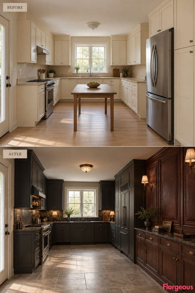
Beautifully aged leather evokes scholarly interiors, but it can be interpreted architecturally rather than through furniture alone.
Before: The kitchen’s exposed dry wall surfaces are painted off-white and lack texture.
After: A large dry wall is covered in substantial framed cordovan-colored leather panels with subtle pressed borders. Beneath them, a low walnut serving cabinet uses dark-stone counters and enclosed storage. Smoky charcoal kitchen cabinets balance the warmer wall treatment.
Why it works: The softly reflective leather panels introduce a tactile quality that contrasts with harder kitchen materials.
Try this: Use durable, wipe-clean leather-look architectural panels only in areas away from cooking splashes and moisture.
10. Introduce a Sliding Bronze-Grille Cabinet System
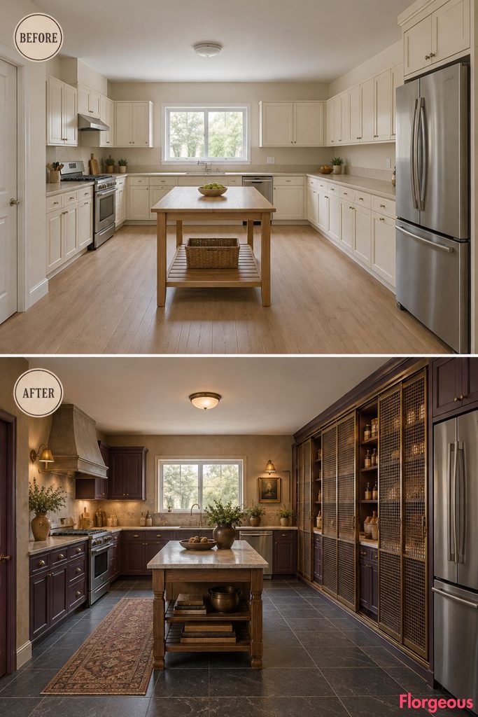
This transformation takes its character from secure academic collections and the refined metalwork of historic institutional furniture.
Before: The original cabinets have ordinary solid doors and fixed shelves.
After: A sequence of large sliding bronze-mesh grille doors covers a deep right-wall storage installation. Behind the movable grilles are practical pantry shelves, framed timber compartments, and closed lower cupboards. Dark aubergine cabinetry and warm limestone worktops complete the composition.
Why it works: The layered sliding panels create depth and movement that ordinary hinged cabinet doors cannot provide.
Try this: Use rigid architectural bronze-finish mesh designed for cabinet doors, with a reliable track and accessible end stops.
11. Create an Antiquarian Engraving Gallery Above a Low Kitchen Cabinet
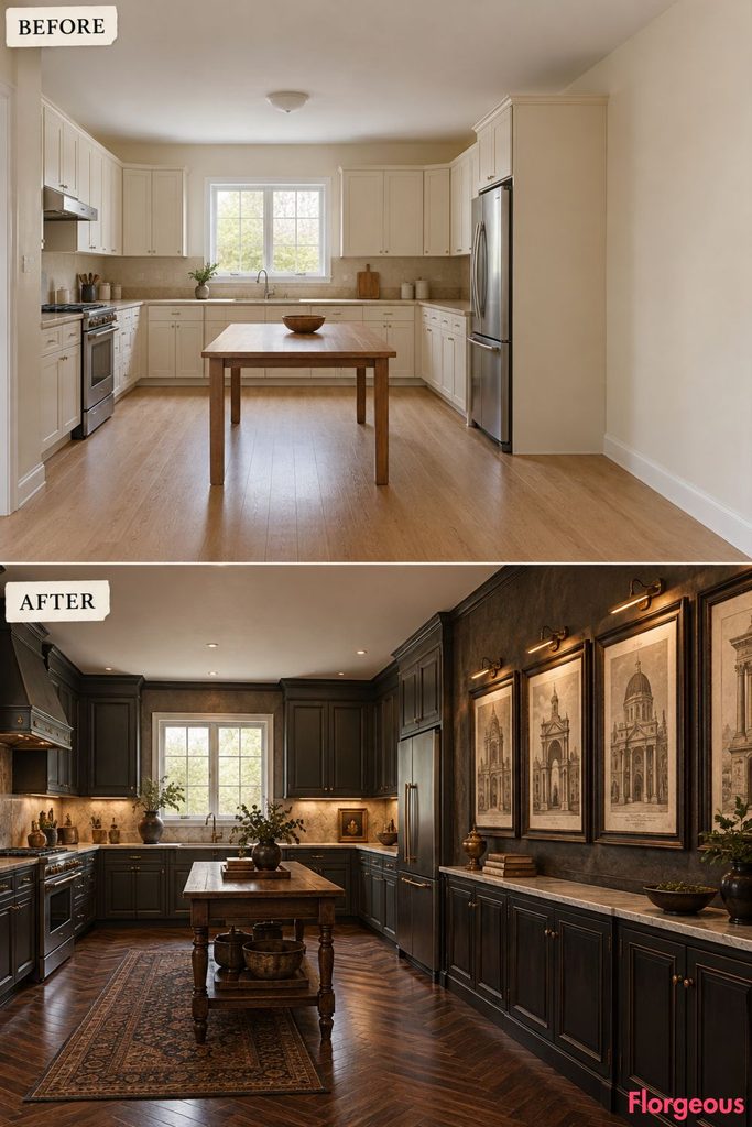
Historic copperplate engravings provide a refined artistic direction that can make a kitchen feel more like a private academic residence.
Before: The plain right wall has little visual interest apart from conventional cabinets.
After: A long, low ebonized cabinet anchors a carefully composed arrangement of large antique-style architectural engravings. The artwork is placed within deep walnut frames, while dark plaster, a continuous stone serving ledge, and slim museum-style picture lighting complete the installation.
Why it works: The composition combines art and architectural cabinetry into one intentional wall design.
Try this: Choose reproduction architectural engravings with strong shapes and minimal visual clutter, keeping frames away from kitchen splashes.
12. Make an Oversized Astronomical Instrument Light the Focal Point
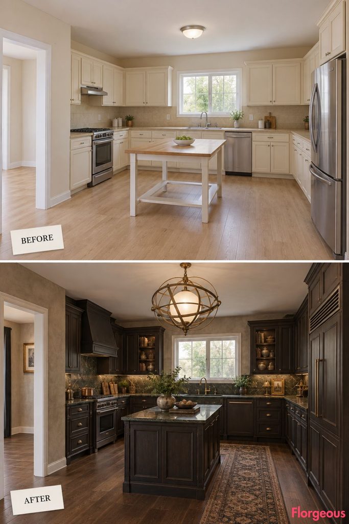
This design draws inspiration from the precise metalwork of historic astronomical instruments, translating it into one extraordinary overhead lighting composition.
Before: The ceiling has a single ordinary light fixture and almost no decorative significance.
After: A beautifully crafted antique-brass ceiling fixture consists of several fixed, intersecting circular bands surrounding a warm opal diffuser. Beneath it, simple blackened-oak cabinetry, dark green stone counters, and restrained traditional paneling keep the room grounded.
Why it works: The overhead geometry introduces a distinctive scholarly focal point without introducing a literal globe or star decoration.
Try this: Choose a fixed, lightweight ring-style fixture with adequate ceiling clearance and a warm diffused light source.
13. Build an Architect’s Model Workshop Into the Kitchen
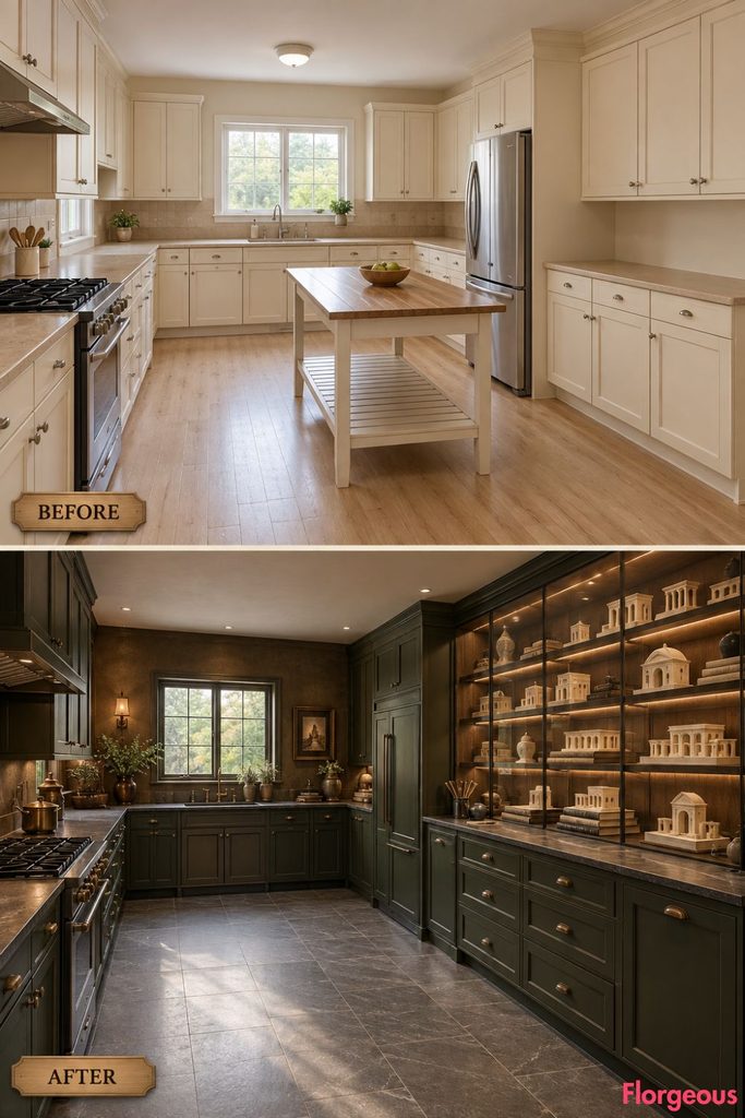
An architecture studio provides a new interpretation of Dark Academia through the display of carefully constructed study models.
Before: Ordinary wall cabinets hide everyday objects without offering a meaningful design focal point.
After: A broad architectural-model display runs along the dry right wall, featuring stepped horizontal presentation shelves protected by glazed fronts. Below, a substantial walnut preparation counter provides everyday functionality. The models are abstract plaster and timber studies, without lettering or miniature landmarks.
Why it works: The display celebrates academic craftsmanship rather than generic antique collections.
Try this: Use a limited collection of simple architectural model forms and keep the display protected from dust and kitchen moisture.
14. Introduce Rare Japanned Cabinetry With an Academic Collector’s Feel
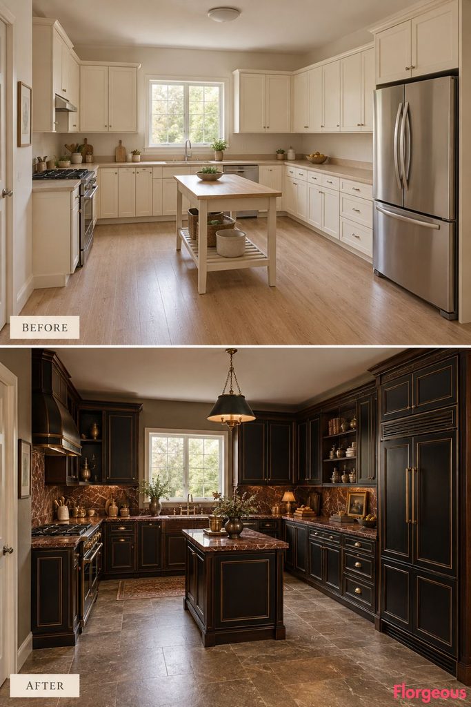
Historic japanned furniture introduces a different surface character from ordinary stained wood and painted cabinetry.
Before: Cream stock cupboards give the kitchen a standard, contemporary appearance.
After: Deep black-brown japanned cabinet fronts feature carefully controlled raised geometric framing and restrained antique-gold borders. The cabinets form a highly composed sequence of furniture-like volumes, contrasted with oxblood stone countertops and dark walnut structural surrounds.
Why it works: The richly finished doors create the atmosphere of carefully preserved historic furniture while remaining practical kitchen storage.
Try this: Use cabinet-grade lacquer finishes with minimal metallic detailing rather than attempting fragile decorative gilding across every surface.
15. Make the Entrance Feel Like a Historic College Hall Threshold
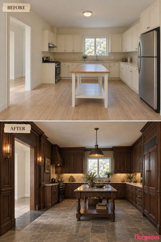
This concept shifts the transformation toward the room’s point of entry, changing how the kitchen is perceived before any cabinets are examined.
Before: The front-left entrance opens directly onto pale flooring and ordinary cream cabinetry.
After: A precisely fitted dark-stone threshold apron marks the existing entrance, accompanied by dark oak applied wall paneling and a pair of shallow classical timber pilasters. Beyond this framing, subdued walnut cabinetry and creamy stone working surfaces create a controlled transition into the kitchen.
Why it works: The entrance becomes an architectural event without moving or rebuilding the actual doorway.
Try this: A contrasting stone threshold and fitted decorative timber surround can establish the same effect on a smaller scale.
16. Introduce a Deep Canted Corner Pantry
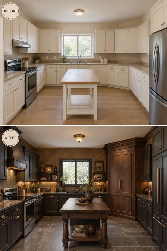
A striking diagonal cabinet can turn an ordinary ninety-degree corner into the defining feature of the room.
Before: The rear-right corner contains standard orthogonal cabinet returns.
After: A substantial forty-five-degree canted pantry cabinet connects the two existing working elevations. Its angled front contains large inset doors, deep internal storage, and an exaggerated walnut cornice, creating an unusual furniture-like silhouette. Dark ochre walls and basalt-toned floors complement the architectural geometry.
Why it works: The diagonal pantry changes the shape of the cabinetry without changing the actual walls.
Try this: Use a carefully measured angled cabinet module and verify that door swings clear the surrounding worktops.
17. Create a Velvet-Lined Academic Conversation Alcove
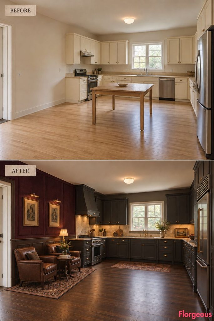
This interpretation introduces the hushed atmosphere of a scholar’s private discussion room through a compact, carefully designed dry-side seating zone.
Before: The original central utility table offers nowhere especially comfortable to sit or talk.
After: A small freestanding walnut conversation arrangement occupies a dry section of the kitchen, backed by deep aubergine performance-velvet acoustic panels. Two compact leather chairs face a small oval coffee table, while the remaining cooking and preparation zones retain clear working access.
Why it works: The room gains a second purpose without relying on a built-in banquette or changing its structure.
Try this: Use removable acoustic upholstery panels only on walls safely separated from cooking and washing areas.
18. Divide the Kitchen With a Freestanding Ebonized-Oak Lattice Screen
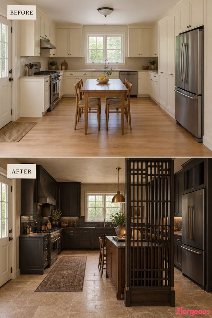
A decorative screen offers a powerful way to create distinct spatial zones while keeping the original architecture intact.
Before: The central area feels visually undifferentiated, with a plain utility table and uninterrupted sightlines.
After: A substantial freestanding ebonized-oak lattice screen divides a dry serving zone from the main working area. Its rectangular openwork pattern allows daylight and views to pass through, while dark soapstone counters and muted walnut cabinetry establish a quiet academic character.
Why it works: The open screen introduces depth, transparency, and layered space without creating a new structural wall.
Try this: Use a stable, properly anchored furniture screen that does not obstruct the kitchen’s principal circulation route.
19. Design a Scholar’s Optical Cabinet With Circular Glass Fronts
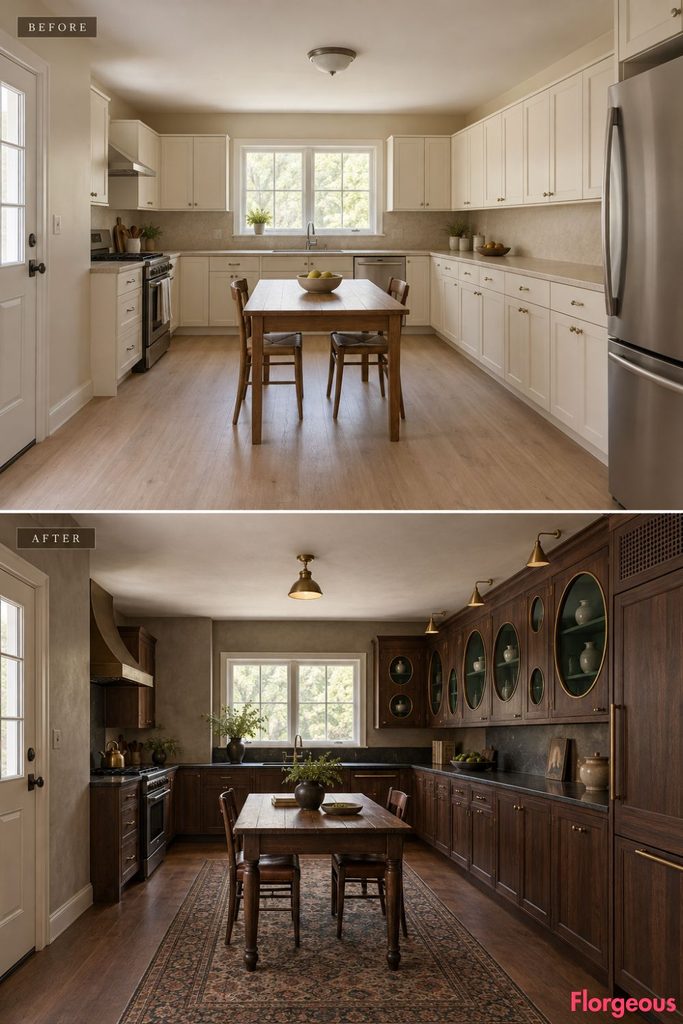
Historical optical instruments inspire an unusual furniture treatment that looks nothing like conventional glazed kitchen cupboards.
Before: The upper cabinets have ordinary rectangular solid-front doors.
After: Large circular glass openings are set into substantial walnut cabinet faces, revealing carefully organized ceramics and traditional serving equipment. The circles vary subtly in diameter but follow a measured composition. Bronze rings, deep green backs, and lower soapstone counters give the wall an unmistakably scholarly character.
Why it works: The unusual round cabinet openings create a memorable architectural pattern without altering the room’s windows.
Try this: Use safe circular glazing within properly engineered rectangular doors, retaining realistic cabinet access.
20. Introduce a Continuous Stone Ribbon Across the Working Elevations
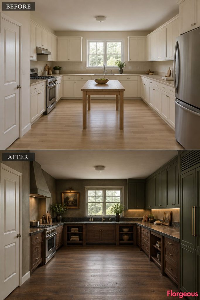
This makeover uses an unusually strong horizontal architectural gesture to connect the kitchen’s separate working zones.
Before: Beige countertops sit above ordinary cupboards with little visual continuity.
After: A thick-looking but properly supported dark limestone counter ribbon runs along the available right and rear working elevations, turning the original corner with careful precision. Below, cabinets alternate between recessed walnut drawer banks and open leg-supported sections, creating a measured rhythm of solid and empty space.
Why it works: The uninterrupted counter becomes the defining architectural line, with contrasting cabinet forms providing depth.
Try this: Use mitered stone edges to suggest thickness without requiring excessively heavy slabs.
21. Create Folded Walnut Cabinetry Inspired by Architectural Geometry Studies
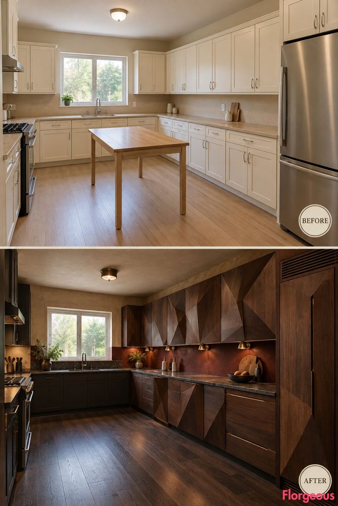
An architecture-school design experiment becomes the basis for a dramatic, fully functional cabinet composition.
Before: Plain cabinet doors create a predictable sequence of flat rectangles.
After: Large folded walnut cabinet faces have carefully controlled angled edges and recessed shadow lines, forming a series of geometric planes across the right working wall. A dark graphite stone counter and matte oxblood backing surfaces accentuate the three-dimensional construction.
Why it works: The cabinets become a coherent sculptural system rather than a standard row of cupboards with decorative trim.
Try this: Use veneered cabinet-grade panels and concealed hinges to achieve crisp folded details while keeping the door openings practical.
22. Reimagine the Kitchen With British Campaign-Chest Cabinetry
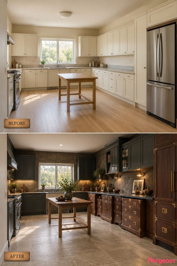
Historical campaign furniture was built for movement and careful organization, offering a distinct alternative to permanent-looking traditional millwork.
Before: The original storage appears as one continuous run of inexpensive cream cabinets.
After: A series of separate chest-like walnut cabinet modules lines the right wall, each with heavy corner protectors, recessed brass pulls, and individual plinths. Slight variations in cabinet height create a collected but practical arrangement, united by a continuous working surface.
Why it works: The kitchen looks furnished with beautifully crafted independent pieces rather than ordinary fitted cupboards.
Try this: Add recessed brass handles and distinctive corner hardware to selected cabinet modules, not every door.
23. Use Antiqued Mirror Panels to Create a Chiaroscuro Kitchen
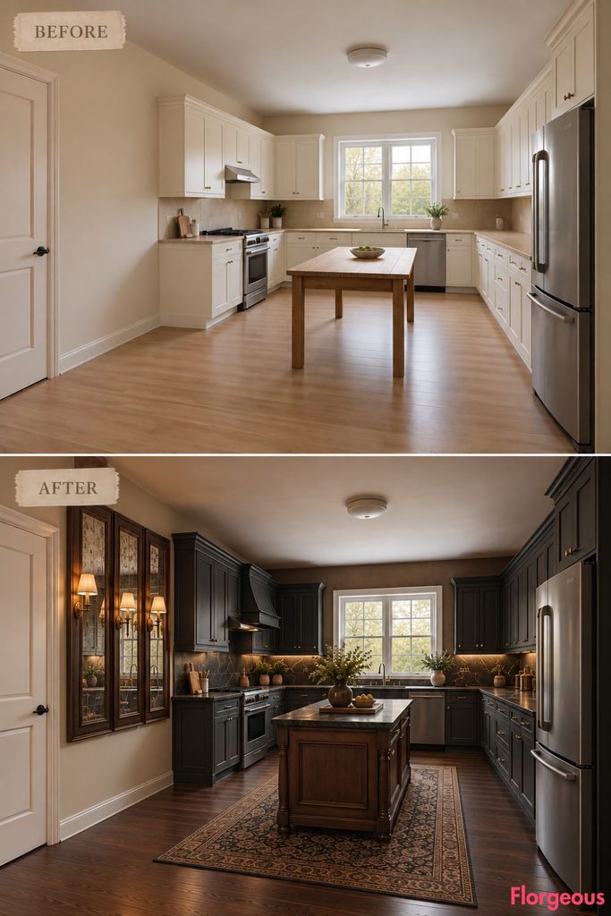
Light and shadow are central to the Dark Academia atmosphere, and aged mirror can produce a surprisingly rich architectural effect.
Before: The plain walls and light cabinetry offer little variation in depth or reflection.
After: Tall antiqued-mirror panels occupy a dry wall between dark walnut pilasters, reflecting the kitchen’s natural window light and warm shaded lamps. Matte charcoal cabinets, dark stone worktops, and warm walnut furniture provide contrast.
Why it works: The aged reflections create depth and atmosphere while leaving the room’s structure unchanged.
Try this: Use small samples of antiqued mirror before installing large panels, and avoid reflective surfaces directly behind active burners.
24. Build an Architect’s Vertical Drawing and Tray Rack
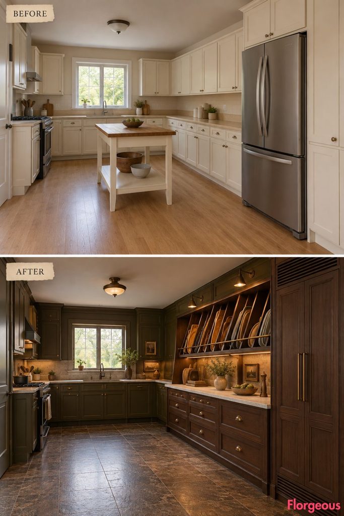
A historic drafting room inspires a kitchen wall organized around large upright storage slots rather than conventional shelves.
Before: The original right wall uses ordinary deep cabinets without visible organizational character.
After: A substantial angled storage rack holds large cutting boards, baking trays, serving platters, and pastry tools in individually divided upright compartments. Dark walnut framing, bronze rails, and a broad limestone preparation counter give the workstation an academic workshop character.
Why it works: The diagonal storage rhythm is immediately recognizable and genuinely helpful for everyday kitchen equipment.
Try this: Use adjustable dividers sized for the actual trays and boards you own, with removable washable inserts.
25. Introduce a Monumental Opal-Glass Reading-Room Lantern
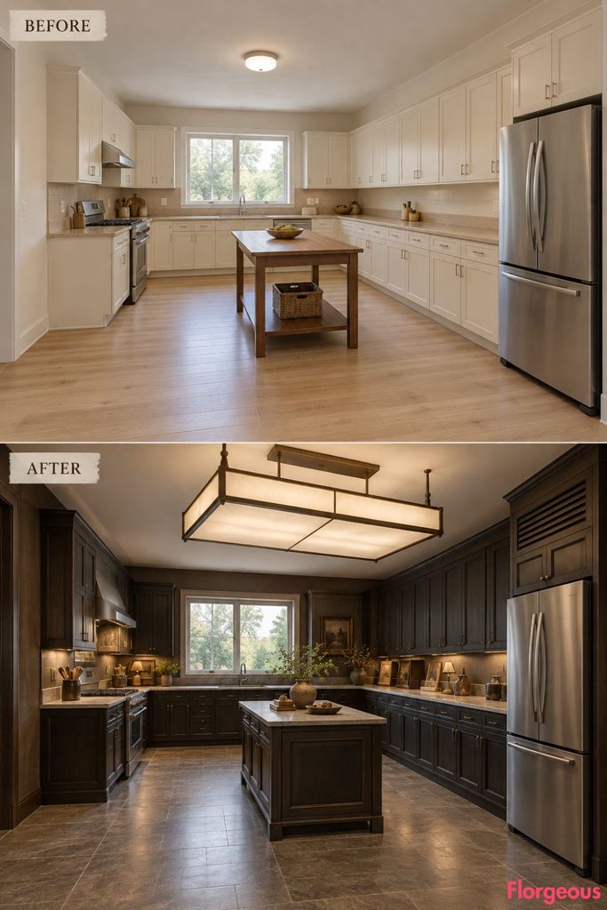
Unlike the intricate astronomical fixture in idea 12, this transformation centers on a single large enclosed lantern inspired by traditional institutional reading rooms.
Before: The flat white ceiling contains a small basic light that does little for the kitchen.
After: A broad, shallow rectangular opal-glass lantern hangs from a dark bronze ceiling frame. Warm diffused light falls over a restrained black-oak working arrangement, while substantial paneled walls and dark stone floors create a richly atmospheric setting.
Why it works: The oversized geometric fixture creates an architectural ceiling focal point without requiring beams or changing ceiling height.
Try this: Select a shallow, safely mounted lantern scaled to the room, then supplement it with separate under-cabinet task lighting.
26. Create a Dark Academia Kitchen With Suspended-Looking Cabinet Volumes
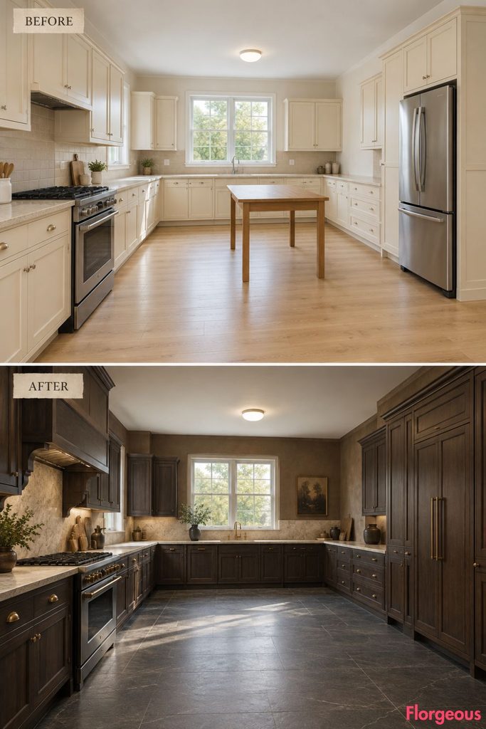
The visual drama here comes from the contrast between heavy cabinetry and carefully placed negative space.
Before: Conventional cream base cabinets sit directly on the floor beneath beige laminate countertops.
After: Large blackened-walnut cabinet volumes appear to hover above recessed charcoal stone plinths, with deep shadow gaps running along the lower edges. Broad closed cupboard faces and precisely aligned pale limestone counters create a striking architectural composition.
Why it works: Deep recesses beneath the cabinets give a surprisingly monumental effect without relying on decorative ornaments or elaborate historical motifs.
Try this: Use recessed load-bearing cabinet plinths instead of actual cantilevers, preserving safe and realistic support.
27. Finish With a Dramatic Twin-Podium Scholarly Kitchen
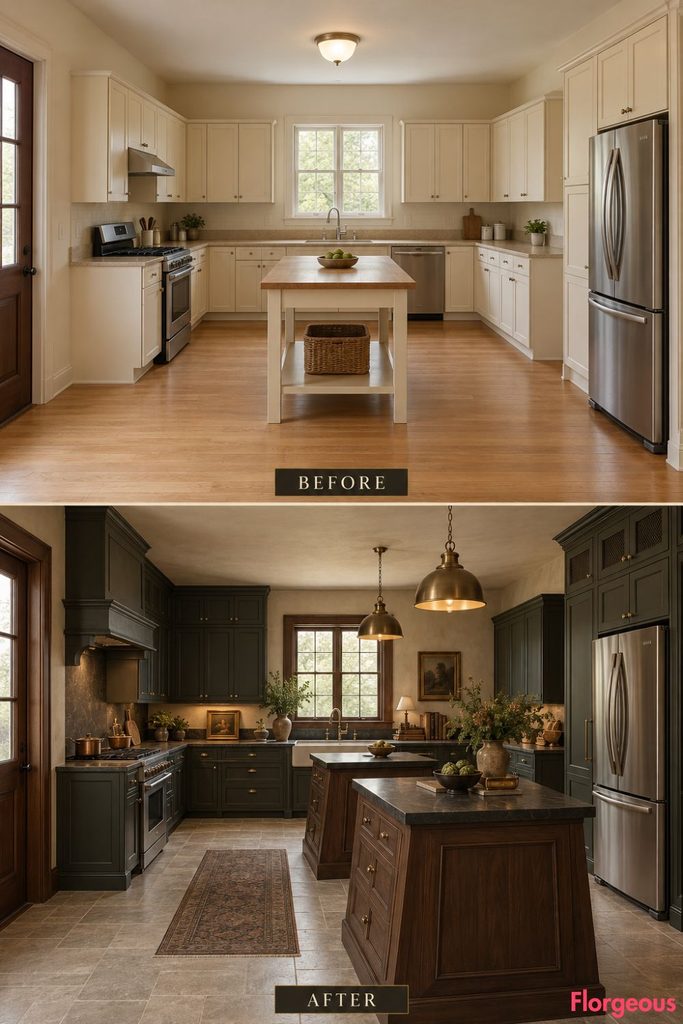
The final transformation uses two independent preparation podiums to create a striking sense of depth and movement.
Before: A plain rectangular utility table occupies the center, surrounded by basic cream cupboards and beige counters.
After: Two compact trapezoidal walnut preparation podiums sit in a carefully staggered arrangement, separated by a clear central passage. Their angled ends, framed cabinet faces, dark limestone tops, and bronze details create a powerful geometric centerpiece.
Deep ink-green perimeter cabinetry, warm stone flooring, and restrained historical joinery complete the Dark Academia character.
Why it works: Two independently scaled podiums change the spatial experience far more dramatically than one conventional rectangular island.
Try this: Use lightweight movable versions first to test positioning, working reach, and appliance clearance.
Finding the Right Scholarly Character for Your Kitchen
The beauty of these 27 makeovers is that they approach the same ordinary room through entirely different architectural ideas. Some explore the organization of academic workrooms, while others draw inspiration from historic furniture, old scientific instruments, the craftsmanship of traditional printers, or the spatial arrangement of institutional interiors.
The most compelling Dark Academia Kitchen does not rely on darkness alone. It develops an identifiable design concept and carries that idea consistently through the cabinetry, working surfaces, lighting, and overall layout.
Start by choosing the element you want to define the room. A wall of individual preparation bays creates a different experience from a dramatic mineral installation or a carefully arranged pair of working podiums.
Next, consider what the existing architecture can realistically accommodate. Keep major plumbing and appliance positions in place where possible, protect clear circulation routes, and choose materials that can handle ordinary cooking and cleaning.
Finally, balance the room’s dark finishes with natural daylight, warm task lighting, and a few carefully selected contrasts. When every component supports the same concept, the result feels richly established without becoming theatrical or impractical.