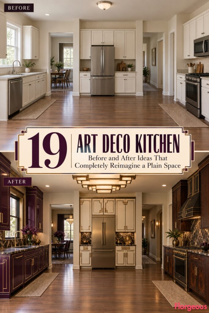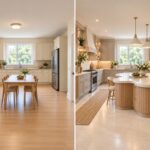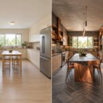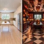
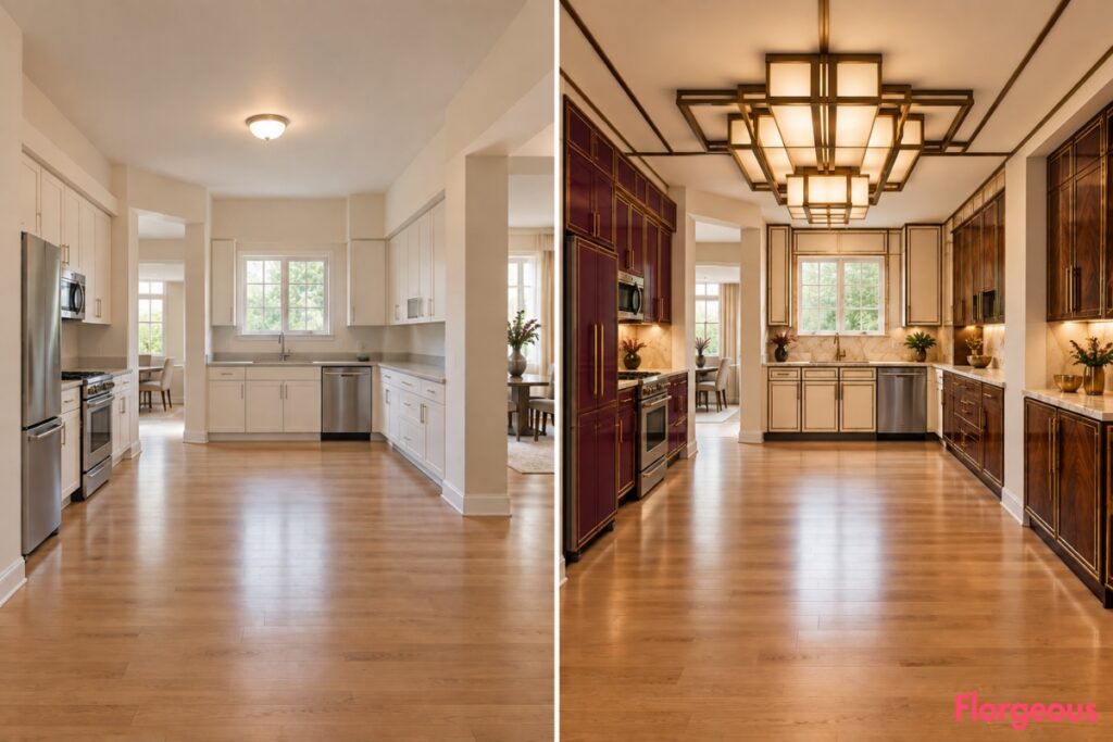
A plain builder-grade kitchen can be perfectly usable and still feel forgettable. Light cabinets, neutral counters, standard appliances, basic lighting, and empty worktops give you function, but not much personality.
An Art Deco Kitchen makeover offers a much richer starting point. Deco design can reshape the visual experience of a kitchen through lacquer, crafted wood, architectural metalwork, opaque glass, sculptural lighting, dramatic geometry, and beautifully controlled contrast.
For this collection, the builder-grade BEFORE styling stays deliberately simple, but the room shell changes from idea to idea so every transformation feels genuinely different. Within each individual before-and-after pair, however, the walls, openings, windows, ceiling form, plumbing, appliance positions, cabinet footprint, circulation, camera position, lens, perspective, and daylight direction remain exactly the same.
The result is 19 kitchens with distinctly different personalities, not 19 versions of the same island-and-cabinet layout.
1. Turn a Keyhole-Plan Kitchen Into a Lacquered Deco Passage
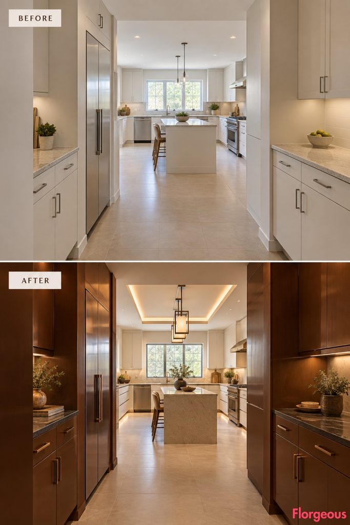
A kitchen that begins with a narrow entry throat and opens into a wider workroom already has a natural sense of reveal.
Before: Pale builder-grade cabinetry, neutral counters, generic lighting, and almost no visual emphasis between the narrow entrance and wider kitchen.
After: Deep tobacco lacquer cabinetry lines the transition zone with fine horizontal shadow joints. In the wider room, the same cabinetry becomes lighter parchment lacquer so the kitchen visually opens as you enter. Curved-profile bronze handles create a controlled rhythm without changing the cabinet footprint.
Why it works: The makeover uses the existing room sequence as part of the design.
Try this: Make the narrowest zone darker and the widest area lighter to exaggerate depth.
2. Give a Dogleg Kitchen a Hammered Pewter Spine
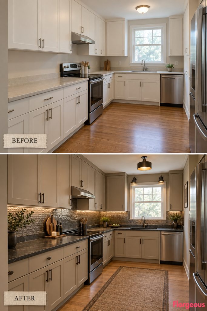
A room that turns 90 degrees can feel disconnected, so this makeover uses one material to visually join both halves.
Before: Simple pale cabinets continue around the bend with no strong relationship between cooking and preparation areas.
After: A broad hammered-pewter band travels continuously through the existing backsplash zone, wrapping the corner and connecting both legs. Warm putty cabinetry, charcoal counters, and dark metal lighting give the bend a stronger architectural identity.
Why it works: The eye follows one continuous material around the corner.
3. Make a Central Chimney Breast the Main Deco Monument
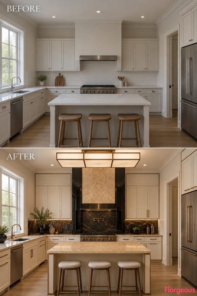
This shell has a fixed projecting chimney breast in the center of the rear wall, with cabinetry arranged on both sides.
Instead of hiding it, the makeover makes the projection the strongest feature in the room.
After: The chimney breast becomes glossy black lacquer framed by pale bird’s-eye maple panels. Cabinetry on either side stays warm ivory with slim bronze reveals, creating a symmetrical composition around the central volume.
Designer Tip: Strong symmetry works especially well when the architecture already provides a natural center.
4. Turn Twin Wall Recesses Into Luminous Deco Display Bays
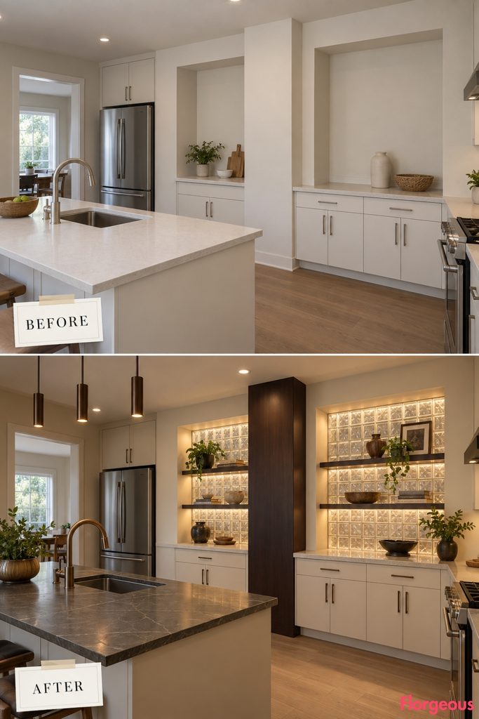
A rear wall with two shallow matching recesses can become far more than unused architectural depth.
Before: Both recesses contain plain shelves and minimal styling.
After: Each recess becomes a luminous display bay using translucent glass-block backing, dark bronze shelf frames, and soft concealed lighting. The solid wall pier between them is finished in muted espresso lacquer, creating a bold light-dark-light rhythm.
The surrounding cabinetry remains pale enough to let the architecture lead.
5. Design Around a High Clerestory Wall
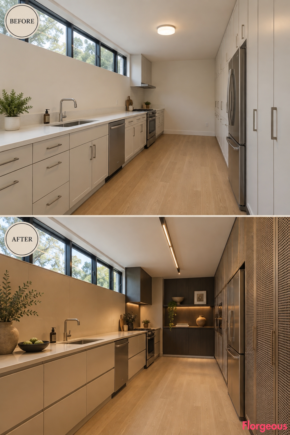
This kitchen has a continuous clerestory window band high along one wall, so tall cabinets would fight the architecture.
After: Low cabinetry stays beneath the windows, finished in warm biscuit lacquer. The opposing wall becomes the storage focus with tall cabinets fronted by finely perforated nickel screens over dark backing panels.
A long ceiling light follows the direction of the clerestory.
Small Space Tip: Keeping cabinetry low beneath high windows preserves daylight and makes the room feel longer.
6. Frame a Breakfast-Room Opening Like a 1930s Hotel Interior
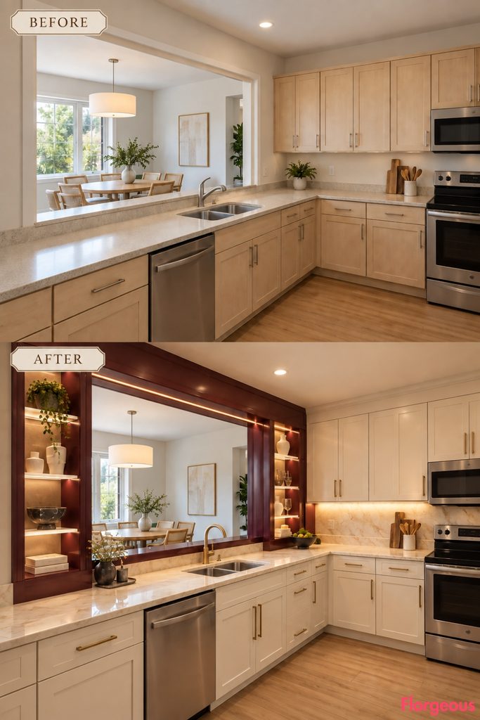
A large cased opening to an adjacent breakfast nook gives this kitchen a natural focal point.
Before: The opening is plain and surrounded by standard cabinetry.
After: The opening is wrapped with deep aubergine lacquer millwork and shallow opaline display shelves contained entirely within the existing wall zone. Pale cream kitchen cabinets balance the darker surround.
Lighting is built into the shelving so the opening glows softly after dark.
7. Connect Two Work Zones Across a Structural Wall Nib
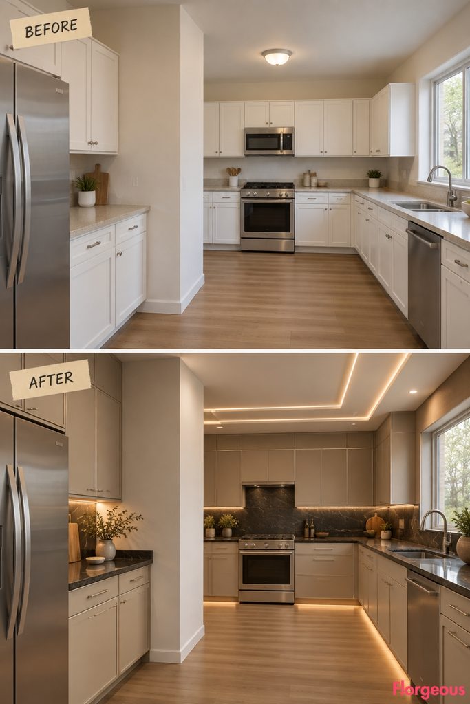
A short fixed wall nib divides this kitchen into preparation and cooking zones without closing either area.
The AFTER uses lighting to turn that interruption into part of the composition.
Nickel-edged putty cabinetry occupies both zones, while a sequence of slim stepped ceiling lights visually crosses the nib and ties the spaces together.
A narrow dark stone line continues through both work areas for additional continuity.
8. Make a Deep Sink Alcove Feel Like a Jewel Box
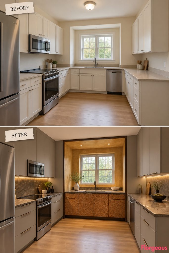
This layout places the sink inside a deep side-wall alcove.
After: The alcove is finished in polished ochre mineral plaster with a thin dark-bronze perimeter trim. Cabinet fronts inside the niche use lacquered cork, bringing a warm natural texture into an otherwise sleek Deco room.
Outside the alcove, cabinetry stays muted stone-gray.
Why it works: The sink becomes a destination without changing its plumbing location.
9. Use Three High Windows as a Graphic Rhythm
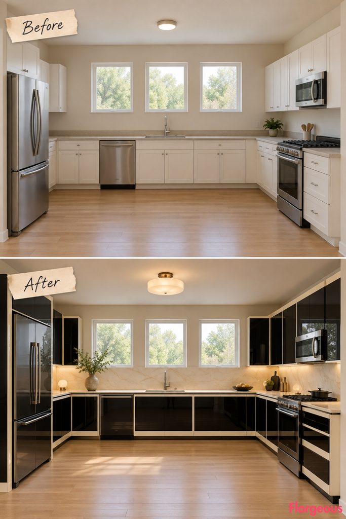
Three small square windows positioned high on the rear wall create a strong existing beat.
The makeover reinforces that rhythm rather than covering it.
After: Low cabinetry beneath the windows becomes piano-black enamel with broad ivory edge bands. Each window is visually aligned with one large cabinet division below, creating a clean vertical cadence.
Cream stone worktops prevent the dark lower half from feeling too heavy.
10. Turn a Projecting Pantry Vestibule Into Furniture
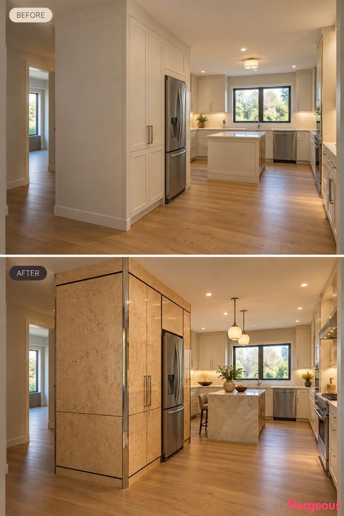
A pantry volume projecting into the room creates two clear passages around it.
Rather than trying to make the block disappear, this makeover treats it like a freestanding Deco cabinet.
After: The entire pantry volume is wrapped in pale bird’s-eye maple with polished nickel corner guards and slim espresso shadow joints. Surrounding cabinetry is kept warm cream.
The two passages remain completely clear.
11. Turn a Recessed Appliance Bay Into a Deco Service Wall
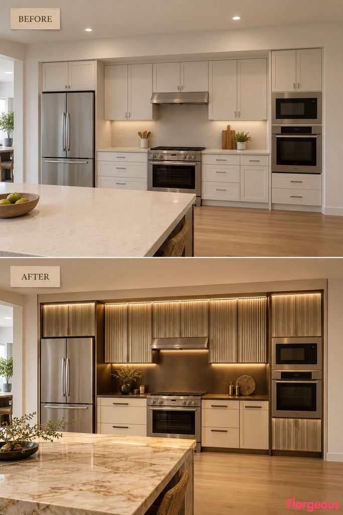
This kitchen contains one long recessed wall holding the major appliances.
Before: Standard appliances and basic cabinets sit inside the recess with little visual hierarchy.
After: The entire recessed zone becomes a dark bronze and parchment service wall. Appliance fronts are visually integrated behind accordion-fold inspired metal-faced panels where practical, while fixed cabinetry uses smooth parchment lacquer.
Outside the recess, the opposite wall remains deliberately simple.
12. Make a Fixed Ceiling Cove Glow Like an Opaline Lantern
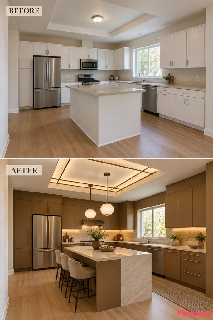
This square kitchen already has a large rectangular ceiling cove, giving the makeover a strong overhead opportunity.
After: The cove becomes a luminous opaline ceiling tray divided by thin dark-bronze bars into an asymmetric geometric composition. Matte ochre-brown cabinetry below keeps the room grounded.
The entire visual hierarchy shifts upward without changing the ceiling shape or height.
13. Turn a Side Dining Niche Into a Deco Café Corner
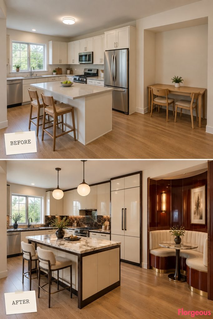
A shallow niche beside the kitchen creates room for a completely different type of makeover.
After: The niche becomes a tailored café-style banquette with curved cream upholstery, a lacquered mahogany surround, and a compact stone table. The working kitchen remains visually separate with pale enamel cabinetry and dark edging.
This gives the room a glamorous social zone without stealing worktop space.
14. Link Three Cabinet Segments With One Metallic Horizon
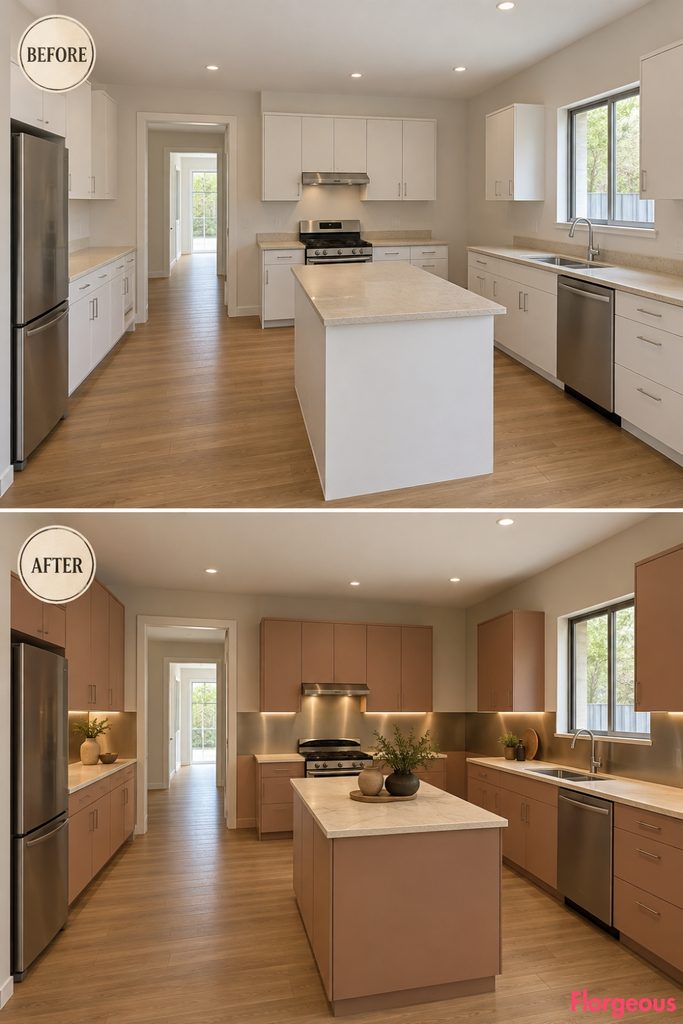
An offset rear doorway divides this kitchen into three separate stretches of cabinetry.
Instead of treating the breaks as a problem, the makeover connects them visually with one uninterrupted line.
After: A broad satin anodized-aluminum band runs at consistent height across all three wall segments, passing around the doorway reveals without covering the opening. Warm clay cabinetry sits above and below.
Why it works: One horizon line creates unity across a fragmented plan.
15. Turn a Transverse Skylight Into the Room’s Main Axis
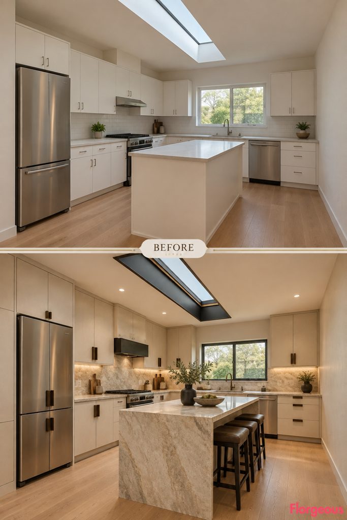
A narrow skylight slot runs across the ceiling rather than along the kitchen.
After: Its existing perimeter is framed with blackened metal and fine bronze inner trim, turning the skylight into a crisp Deco light slot. Pale parchment cabinetry below uses blocky dark hardware, while worktops remain quiet.
The natural daylight now feels intentionally framed.
16. Use a Stepped Wall-Return Shell as the Decoration
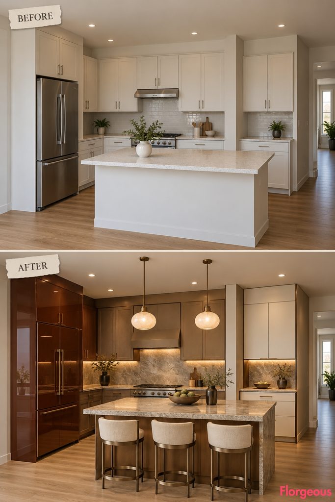
One side wall already steps inward twice, creating three shallow depth planes.
The AFTER makes those planes visible through finish rather than construction.
The nearest plane uses high-gloss chestnut lacquer, the middle plane satin tobacco, and the deepest plane matte parchment. Fine bronze edge strips mark each change in depth.
Cabinetry follows the existing wall returns exactly.
17. Contrast the Main Kitchen With a Satin-Metal Utility Annex
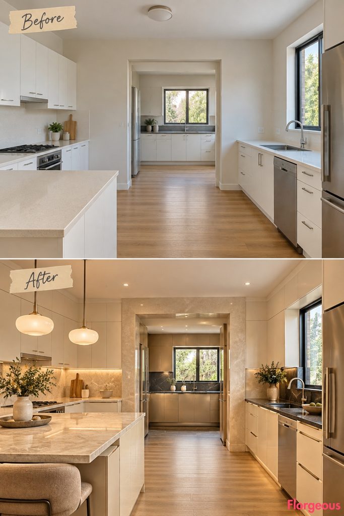
A wide rectangular opening connects the main kitchen to a shallow utility annex.
After: The main room uses warm cream lacquer and pale stone, while the annex becomes dramatically different in satin champagne-metal cabinetry with dark worktops.
A thick polished mineral-plaster reveal frames the existing opening between the two areas.
Style Note: The contrast works because each zone has a clear material identity.
18. Use a Diagonal Entry to Launch a Faceted Deco Rhythm
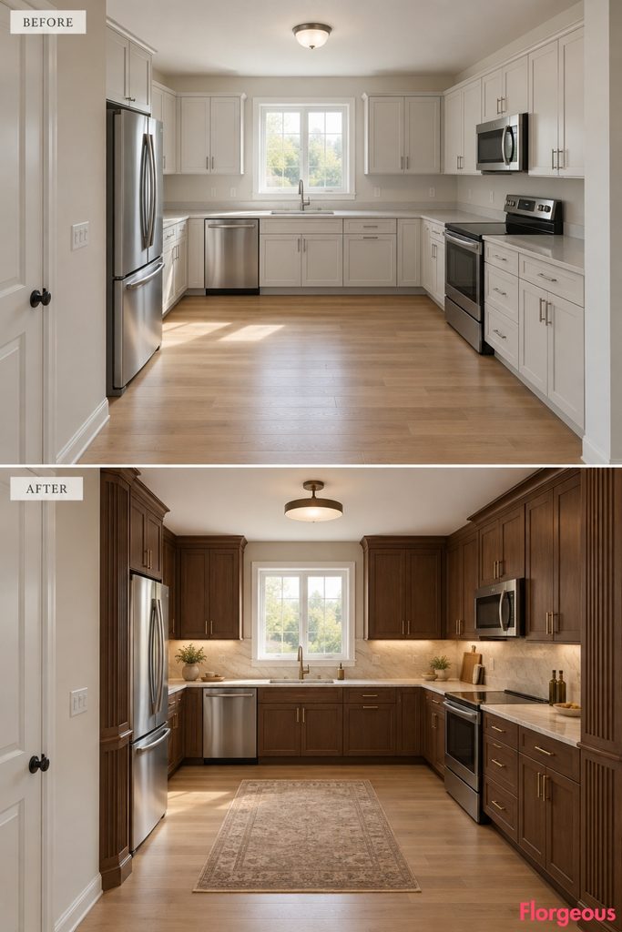
This room begins with one short diagonal entry wall, while the kitchen itself remains orthogonal.
The AFTER uses that change of angle as the starting point for its geometry.
Faceted cabinet end panels begin near the diagonal entrance, then gradually become flatter as they continue into the room. Deep auburn lacquer and pale stone make the transition easy to read.
19. Turn Three Separate Work Walls Into a Deco Furniture Collection
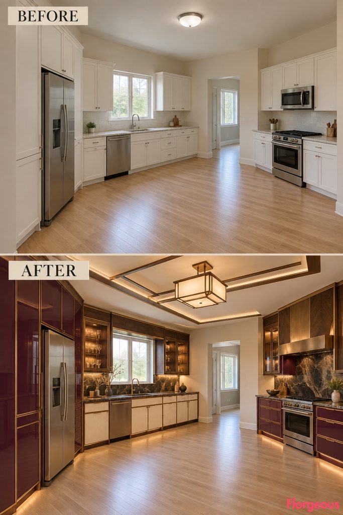
The final room keeps the center completely open.
Three sections of cabinetry sit on separate wall fragments divided by architectural openings. Instead of forcing them into one continuous kitchen, the makeover treats each block like a piece of custom furniture.
One becomes deep plum lacquer with pale edging, one uses warm cream with bronze-framed doors, and the third uses dark figured wood. A single geometric ceiling-light composition links all three without adding an island.
How to Choose the Right Art Deco Direction for Your Kitchen
A convincing Art Deco makeover does not need every Deco material in the same room. In fact, the strongest spaces usually begin with one dominant architectural idea.
If your room has an unusual feature already, use it. A chimney breast can become a central monument. A ceiling cove can become a luminous panel. A dogleg layout can be unified by one continuous metal band. A sink alcove can become a jewel box. An awkward pantry projection can become beautiful furniture.
The second step is to make the supporting finishes reinforce that decision. Cabinetry, lighting, worktops, hardware, and wall treatments should feel related without repeating the same motif everywhere.
For a smaller Art Deco Kitchen, choose one visually rich surface and keep the surrounding palette quieter. In a larger room, you can layer contrasting lacquer, crafted wood, metal, and architectural lighting more confidently.
Before beginning any makeover, map the existing circulation first. Keep doors clear, protect comfortable work aisles, avoid adding projections into narrow paths, and make sure decorative treatments do not interfere with appliance doors or practical prep space.
The goal is not to make a kitchen look themed. The goal is to make its existing architecture look intentional.