Mid-century modern design becomes much more interesting when it is allowed to respond to architecture instead of being applied to the same kitchen layout again and again.
For this collection, each transformation begins with a different believable builder-grade kitchen shell. One is a narrow galley, another wraps three sides of a square room, another works around a structural column, while later ideas explore a peninsula, bay window, split-level floor, curved end wall, sloped ceiling, pass-through plan, and other less predictable room configurations.
Within every individual BEFORE and AFTER pair, however, the architecture is completely locked. Walls, corners, doors, windows, ceiling geometry, floor footprint, plumbing, appliances, circulation, camera position, lens, framing, and daylight direction remain identical.
Only the design changes. This makes every makeover visually dramatic while still feeling architecturally believable.
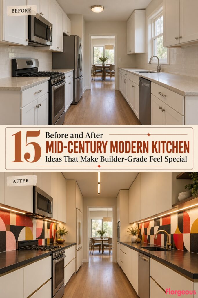
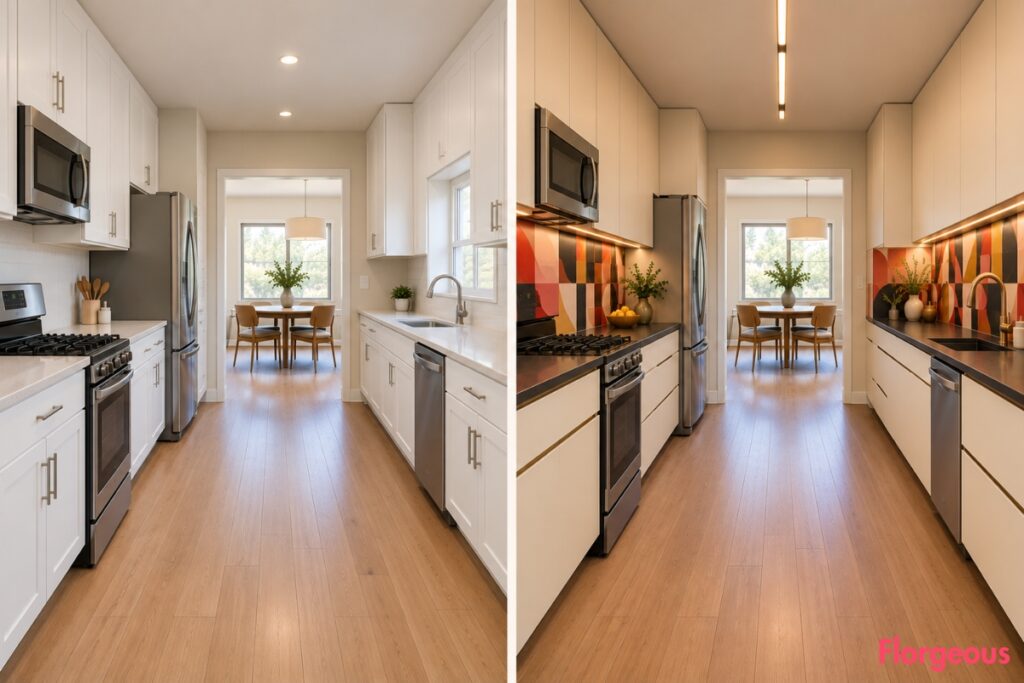
1. Turn a Narrow Through-Galley Into a Graphic Art Kitchen
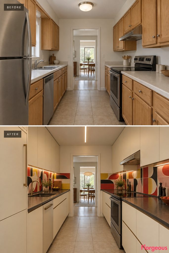
Room structure: A long narrow kitchen with two parallel cabinet runs, one doorway behind the camera, a second opening at the far end, and no island.
Before: Basic pale cabinets line both walls, thin neutral counters run continuously, the refrigerator sits near the entry, and a plain ceiling fixture emphasizes the corridor-like feeling.
After: One entire galley wall becomes warm ivory cabinetry, while the opposite backsplash transforms into a dense mid-century graphic composition in tomato red, black, cream, dusty pink, and citron. A continuous dark counter sharpens the perspective and coordinated refrigerator panels remove visual clutter.
Slim ceiling lights run longitudinally instead of crossing the room.
Why it works: The strong horizontal lines make the narrow architecture feel intentional rather than cramped.
2. Rework a Square U-Shaped Kitchen as a Sculptural Color Composition
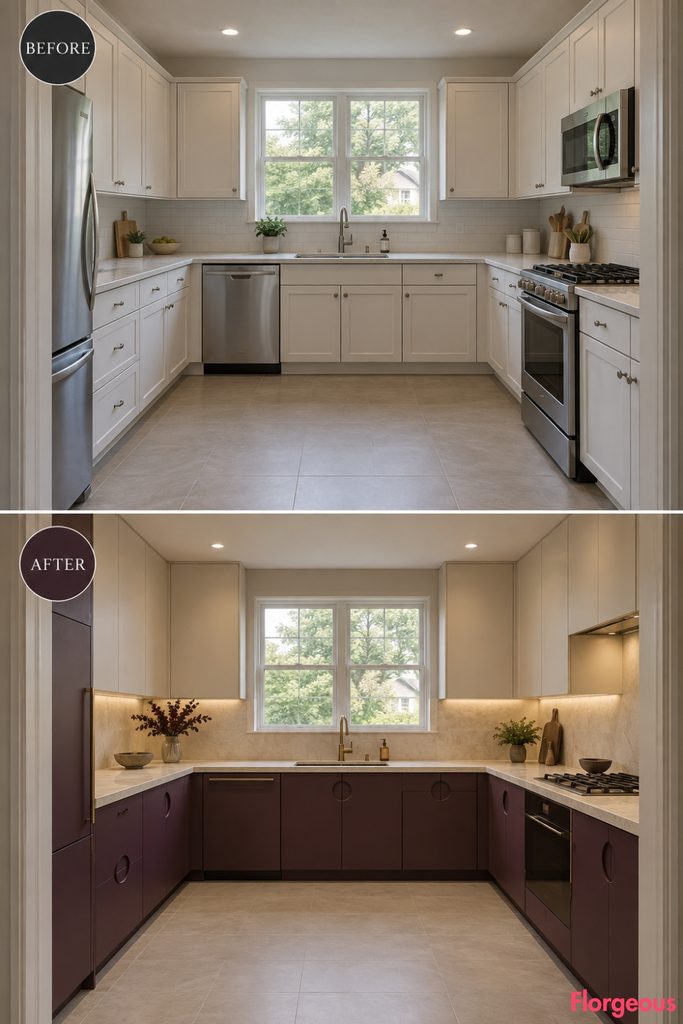
Room structure: A nearly square room with cabinetry on three walls, a broad window centered on the rear wall, and an open center with no island.
Before: Generic cabinets wrap the left, rear, and right walls, with the sink beneath the window.
After: Deep aubergine lower cabinetry wraps all three sides while warm parchment uppers visually disappear into the walls. The existing window becomes the center of a symmetrical composition framed by broad cream work surfaces.
Two opposite cabinet sections receive oversized circular recessed pulls, creating a strong visual rhythm without introducing pattern elsewhere.
Why it works: The U-shape becomes a continuous architectural composition rather than three unrelated cabinet runs.
3. Make a Peninsula Kitchen Feel Like a Mid-Century Design Studio
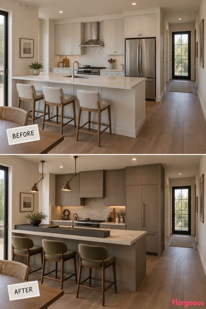
Room structure: A rectangular kitchen with cabinetry along the rear wall and a long peninsula projecting perpendicular from the left side, leaving a generous passage on the right.
Before: The peninsula is an ordinary builder-grade counter dividing the kitchen from an adjacent dining area.
After: The peninsula becomes a sharply tailored two-sided architectural element with a pale work surface on the kitchen side and a narrow raised graphite serving ledge facing the dining zone.
Muted clay cabinetry fills the rear wall, while adjustable articulated task lights give the room a drafting-studio character.
Try this: Keep the right-side passage fully open so the stronger peninsula design never interferes with circulation.
4. Transform a Wide One-Wall Kitchen Without Adding an Island
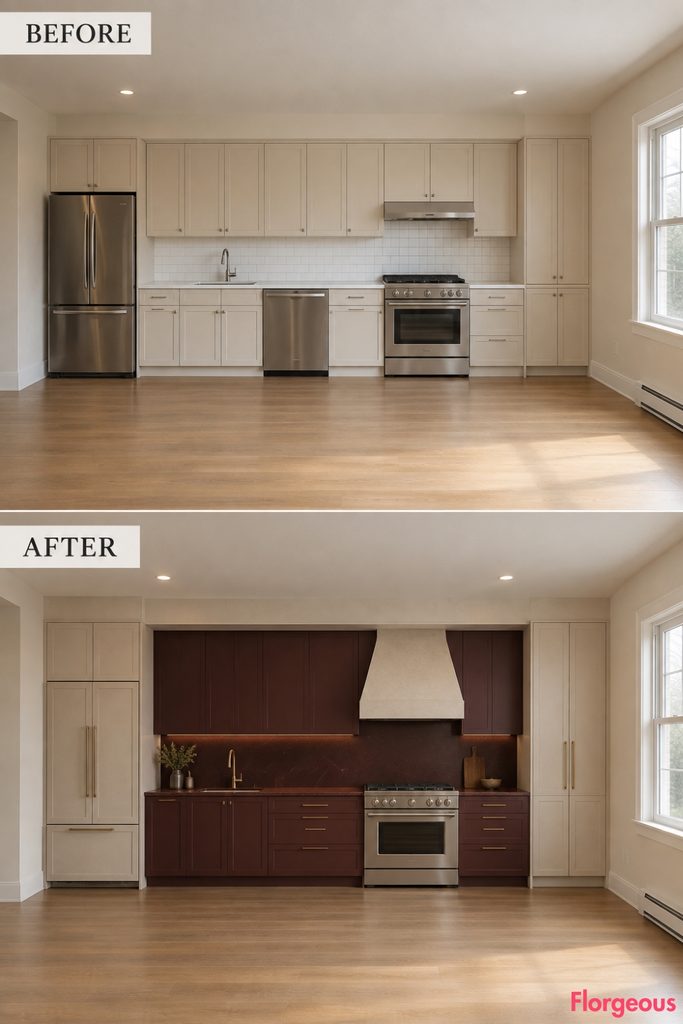
Room structure: A wide shallow room with all kitchen functions concentrated along one uninterrupted rear wall and a completely open foreground.
Before: Basic cabinets, exposed refrigerator, range, sink, and upper storage form one generic horizontal strip.
After: The entire rear wall becomes a designed elevation. Full-height pale mineral cabinetry frames the ends, while the central working zone is recessed visually in deep burgundy.
A monumental tapered range hood becomes the focal sculpture, balanced by open negative space rather than an island.
Why it works: Treating the entire wall as one composition gives a simple one-wall kitchen far more presence.
5. Give a Trapezoid Kitchen With Corner Glazing a Bold Geometric Identity
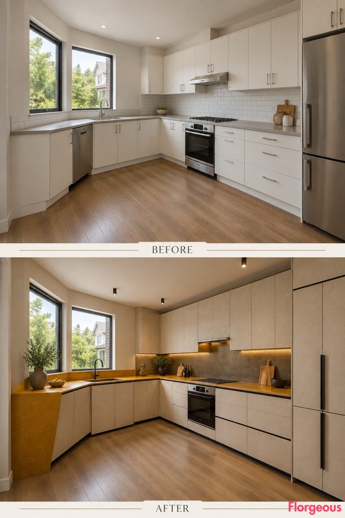
Room structure: An irregular trapezoid room with one angled exterior wall containing two large corner windows and cabinetry only on the straight interior walls.
Before: Builder-grade storage ignores the unusual room geometry.
After: Matte stone cabinetry follows the straight walls while a sharply angled saffron counter termination responds directly to the diagonal window wall. Thin black lines repeat the unusual room angles across selected cabinet joints.
The center remains completely open.
Why it works: Instead of fighting the irregular shell, the design turns its angles into the main motif.
6. Redesign a Split-Level Kitchen Around the Existing Step
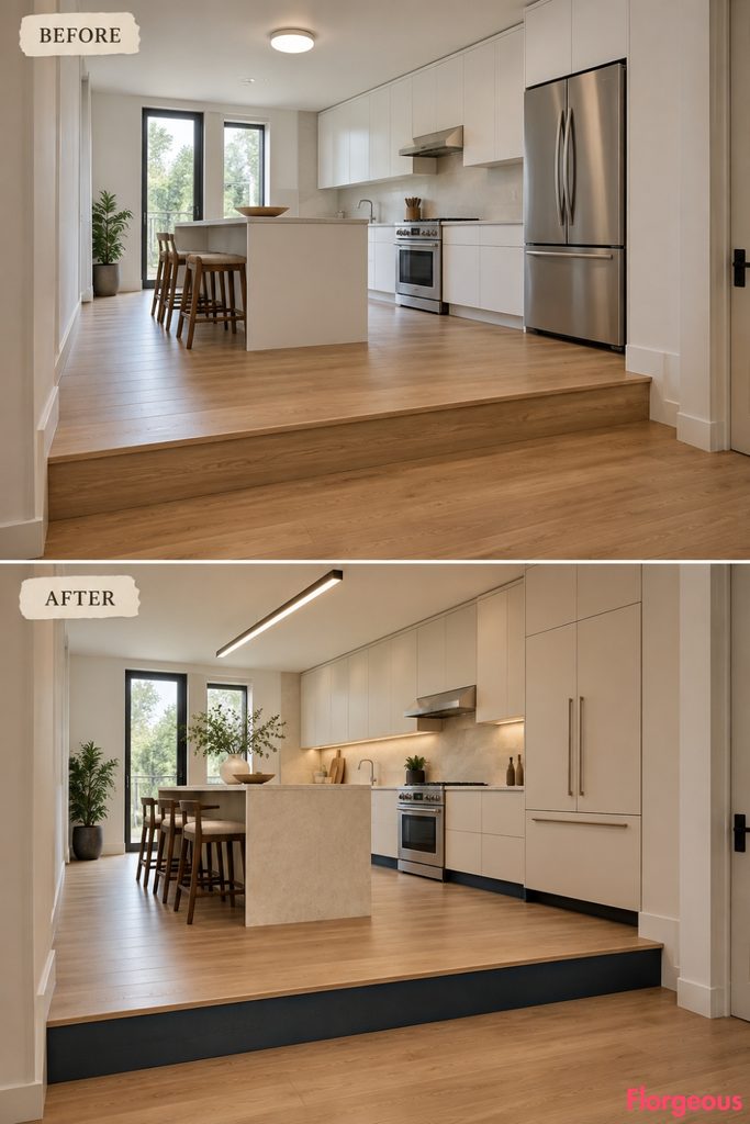
Room structure: A lower entry deck leads up one broad full-width step to a raised cooking floor. Cabinetry occupies the upper rear and side walls.
Before: The level change feels accidental and visually disconnected from the cabinets.
After: The step riser becomes a deep ink band that continues visually through the cabinetry plinths. Warm chalk cabinet faces sit above it, creating a strong floating horizontal datum around the raised zone.
A long luminous ceiling strip follows the direction of the step.
Why it works: The existing level change becomes the organizing device for the whole makeover.
7. Build a Bay-Window Kitchen Around the View
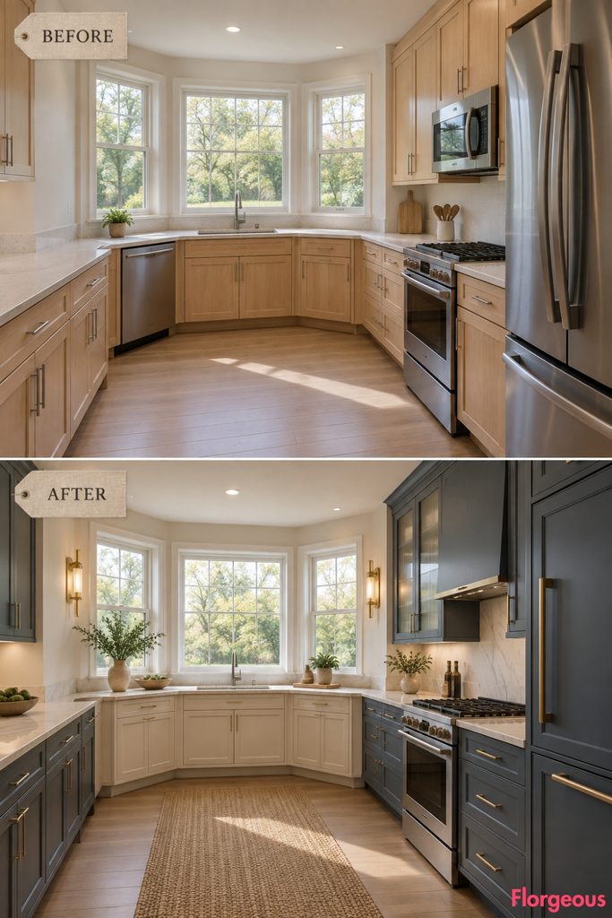
Room structure: A rectangular kitchen terminates in a three-sided shallow bay window. Low cabinetry wraps beneath the bay with the sink centered in front of the middle pane.
Before: The builder-grade cabinets treat the bay like an awkward interruption.
After: Low cream cabinetry follows all three bay segments precisely, creating a continuous faceted work surface. Dark blue-gray cabinetry along the side walls frames the lighter window zone.
One thin suspended shelf crosses only the solid wall portions beside the bay, keeping all glazing clear.
Designer Tip: Never allow upper storage or curtains to compete with the geometry of the bay.
8. Turn a Kitchen With a Structural Column Into a Radial Composition
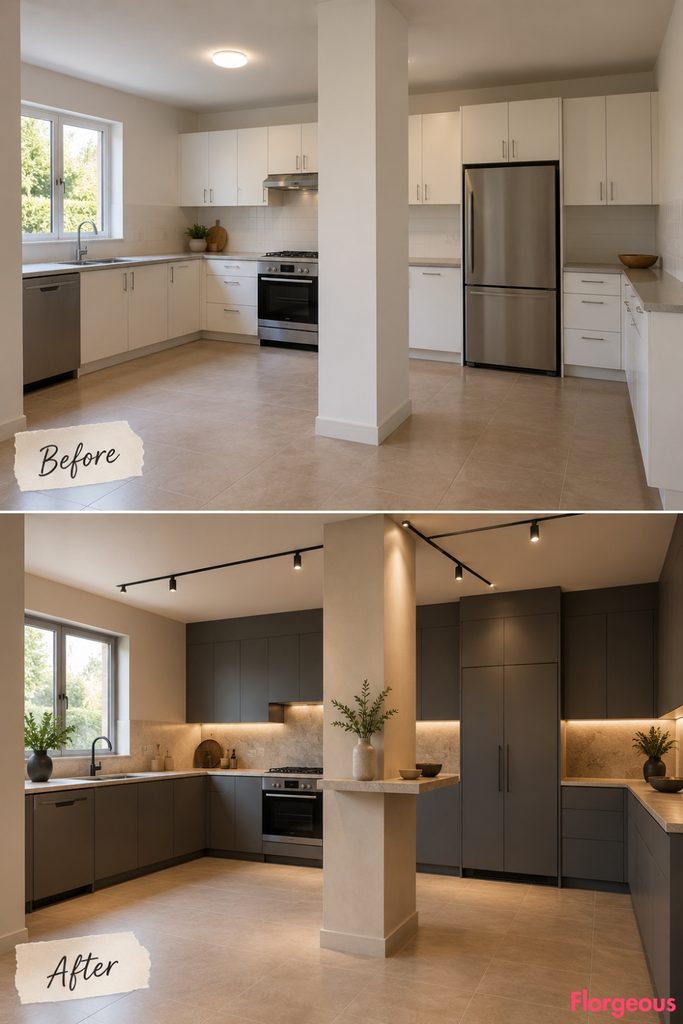
Room structure: A square room contains one fixed structural column positioned slightly off center. Cabinetry is divided into separate wall runs around it.
Before: The column feels like an obstruction.
After: The column is wrapped in warm bone and becomes the visual pivot of the room. Thin ceiling tracks radiate outward from it toward the three cabinet zones.
Soft graphite cabinetry surrounds the perimeter, while one compact counter shelf attaches to the column without expanding the floor footprint.
Why it works: A structural obstacle becomes the element that organizes the room.
9. Reimagine a G-Shaped Kitchen as a Continuous Architectural Ribbon
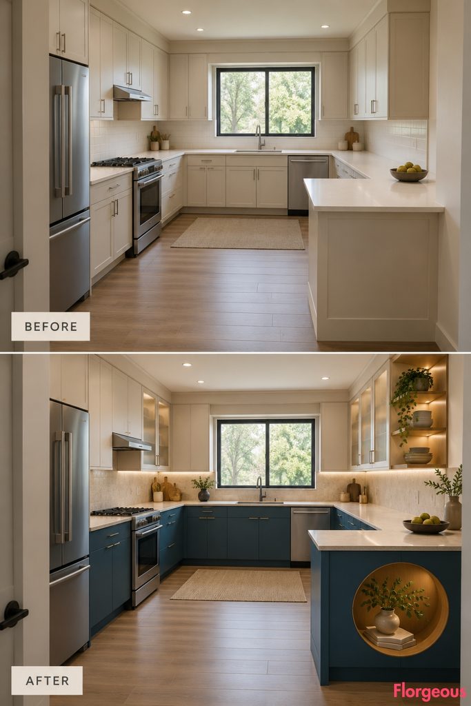
Room structure: Cabinets wrap three walls and continue into a short return counter near the entrance, forming a G-shaped working enclosure.
Before: The short return feels bulky and dated.
After: The entire cabinet sequence becomes one continuous muted petrol-blue band with a thin pale counter tracing the full G-shape.
The entrance return receives an open circular cutout below the counter, visually lightening it while preserving the exact footprint.
Why it works: One uninterrupted material language makes the complex layout easier to read.
10. Make a Curved End-Wall Kitchen Feel Purpose-Built
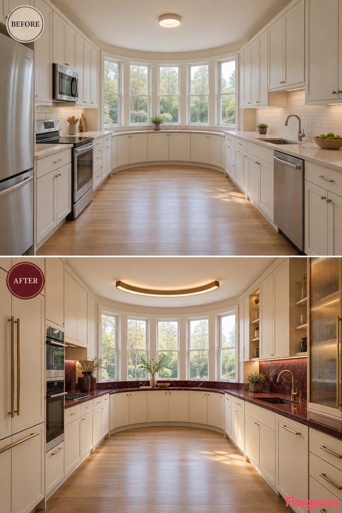
Room structure: A long room terminates in a shallow semicircular rear wall. Cabinets occupy the two straight side walls and partially follow the curved end.
Before: Straight generic cabinetry makes the curved architecture feel unresolved.
After: Low cabinet fronts follow the shallow curve in segmented sections, creating a faceted semicircular work zone. Warm ivory fronts contrast with a dark oxblood counter band tracing the curve.
A ceiling fixture follows the same arc without touching the wall.
Why it works: The makeover finally responds to the room’s most distinctive architectural feature.
11. Give a Sloped-Ceiling Kitchen a Strong Low-to-High Rhythm
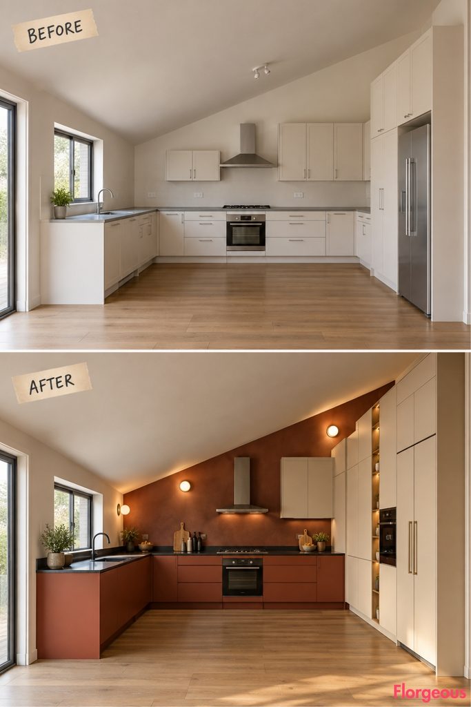
Room structure: The ceiling slopes upward from a low left wall toward a tall right wall. Cabinets remain low on the left and taller on the right.
Before: Generic cabinetry ignores the ceiling direction.
After: Low paprika cabinetry hugs the lower wall while taller cream storage rises progressively toward the high side. A dark horizontal counter line provides visual stability beneath the diagonal ceiling.
A sequence of small wall-mounted lights climbs subtly with the slope.
Why it works: The cabinetry composition reinforces the architecture rather than pretending the room is rectangular.
12. Turn a Double-Entry Pass-Through Kitchen Into a Strong Axis
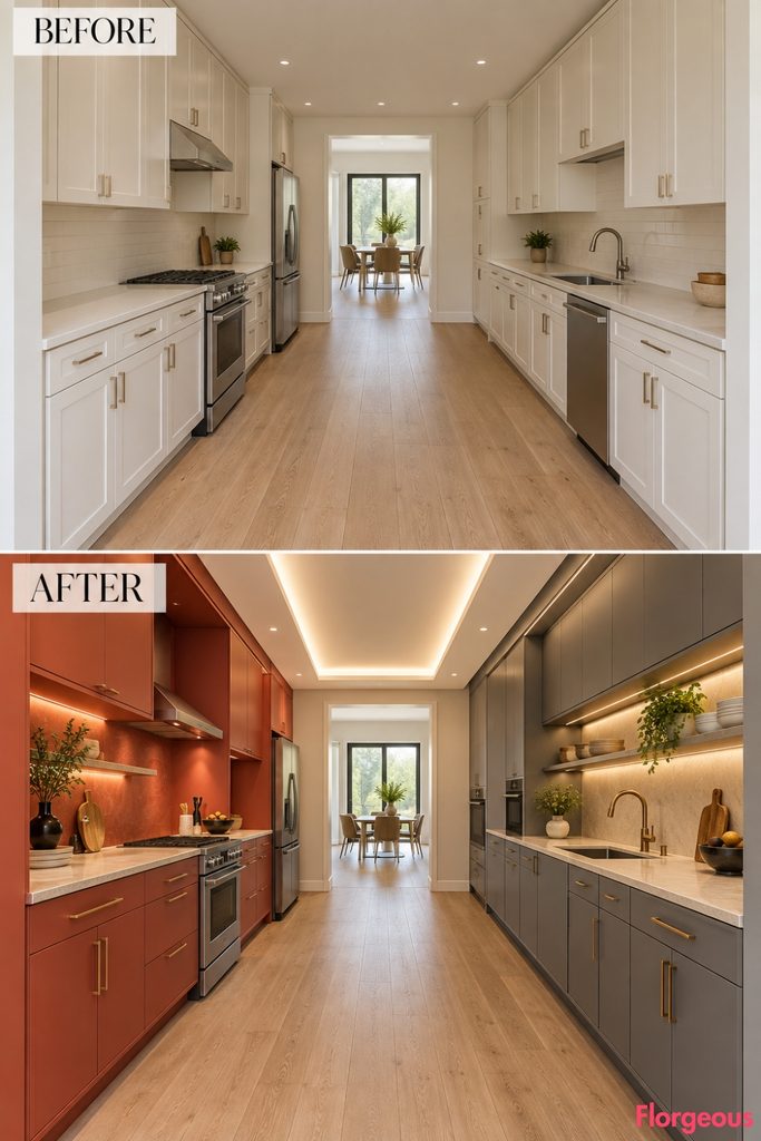
Room structure: A rectangular kitchen connects two rooms through large openings at opposite short ends. Cabinetry runs along both long walls, but the room is wider than a conventional galley.
Before: The kitchen reads as a transitional corridor.
After: A deep coral service wall dominates one side while pale graphite cabinetry occupies the opposite wall. A continuous ceiling beam of diffused light visually connects the two doorways.
Nothing occupies the central passage.
Why it works: The makeover celebrates the room’s through-axis rather than trying to make it behave like an island kitchen.
13. Create a Broken-Plan Kitchen Around an Interior Window
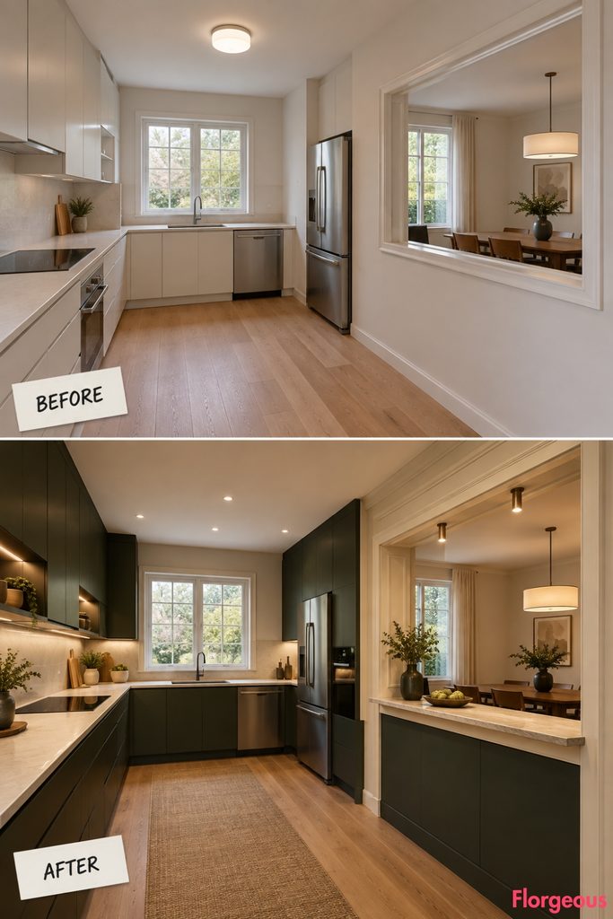
Room structure: One side wall contains a large interior window opening to an adjacent dining room. Kitchen cabinetry occupies the back wall and the solid portions surrounding the opening.
Before: The interior window feels like a leftover structural cutout.
After: A deep cream frame wraps the existing opening, turning it into a deliberate visual connection. A narrow serving ledge sits at its base but stays completely within the existing wall thickness and kitchen footprint.
Deep green-black cabinetry creates contrast around it.
Why it works: The opening becomes the centerpiece of the layout without changing its dimensions.
14. Rework a Kitchen With Two Opposing Windows and No Upper Cabinets
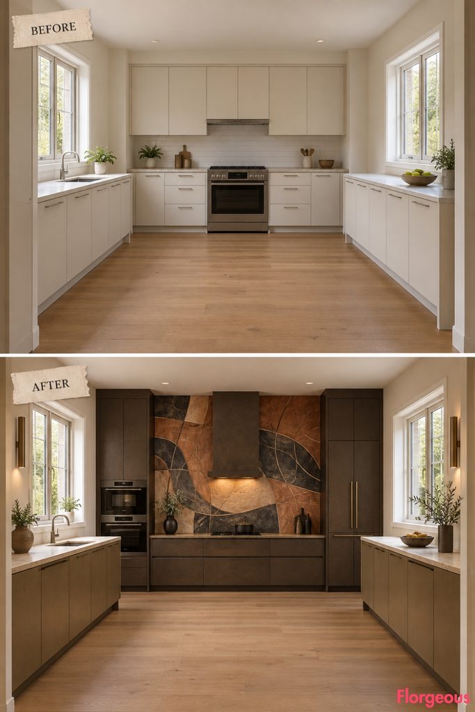
Room structure: A compact rectangular room has one window on each opposing side wall, leaving limited space for upper cabinetry. The cooking wall is solid at the far end.
Before: The room feels fragmented because storage is squeezed between windows.
After: All major storage shifts visually into full-height units on the solid far wall, while the two window walls receive only low cabinetry.
A huge abstract sgraffito composition surrounds the cooking zone on the far wall, giving the room one strong destination.
Why it works: The remodel stops fighting the windows and lets them define the low horizontal edges of the room.
15. Finish With an Offset T-Shaped Kitchen
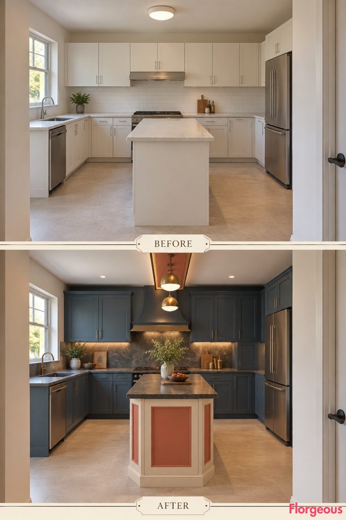
Room structure: A rear cabinet wall is intersected by a narrow perpendicular preparation counter extending from its center, creating a T-shaped plan. The prep counter stops well before the entry and has circulation on both sides.
Before: The unusual central counter looks like a generic builder-grade appendage.
After: The stem of the T becomes a highly sculptural preparation bar with muted cream sides, deep coral recessed panels, and a narrow graphite upper plane. The rear cabinet wall becomes dark blue-gray with coordinated appliances.
A linear lighting composition follows the T geometry overhead without altering the flat ceiling.
Why it works: The existing layout becomes the actual design motif rather than something to disguise.
How to Keep Mid-Century Kitchen Makeovers From Looking Like the Same Room
A strong Mid-Century Modern Kitchen gallery should not look like one rectangular kitchen photographed fifteen times with different cabinet colors.
Architecture needs to participate in the design.
A galley naturally emphasizes long perspective lines. A U-shaped kitchen can become a continuous wraparound composition. A bay window should influence cabinetry geometry. A structural column can become a visual pivot. A sloped ceiling should change the height and rhythm of storage. A split-level floor can determine horizontal details throughout the room.
The same principle applies to unusual features such as an interior window, curved wall, peninsula, T-shaped counter, or double-entry circulation axis. Rather than hiding those conditions, the AFTER should make them feel deliberate.
For every makeover, lock the BEFORE and AFTER pair first. Keep the same walls, windows, doors, floor footprint, plumbing, appliances, circulation, camera, lens, framing, and daylight. Then redesign aggressively inside those boundaries.
That is how the viewer can immediately recognize the same room while still feeling that a genuine renovation has taken place.