
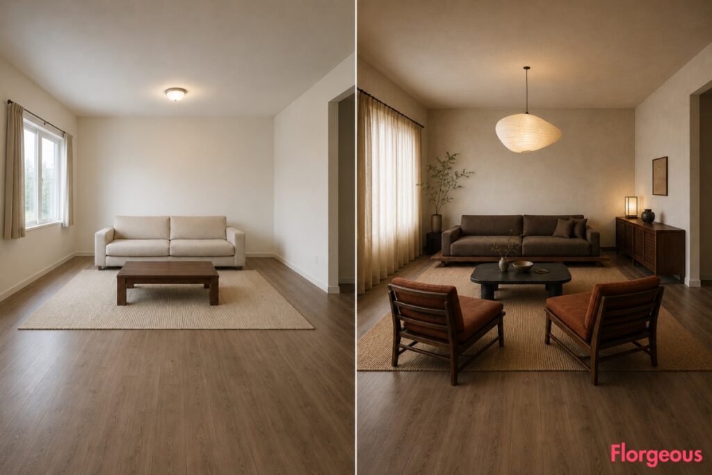
The room itself never changes. It still has the same doorway, window, ceiling, floor, proportions, and fixed camera angle. What changes is everything we layer inside it.
Our starting point is deliberately ordinary: warm off-white walls, a straight beige sofa, bare rectangular coffee table, neutral rug, short curtains, basic ceiling light, and almost no styling. It is clean and usable, but there is no real focal point and very little atmosphere.
We used that exact room to test 15 very different Japanese Living Room directions. Instead of repeating the familiar cream-sofa-and-pale-oak formula, each makeover explores a separate design idea, from translucent screens and woven floor texture to dark shibui materials, compact Tokyo-style planning, handcrafted storage, deep color, and gallery-like restraint.
The architecture stays locked throughout, so you can see exactly what furniture scale, material, light, color, and negative space can accomplish on their own.
1. Start Softly With Pale Ash, Warm Ivory, and One Floating Paper Light
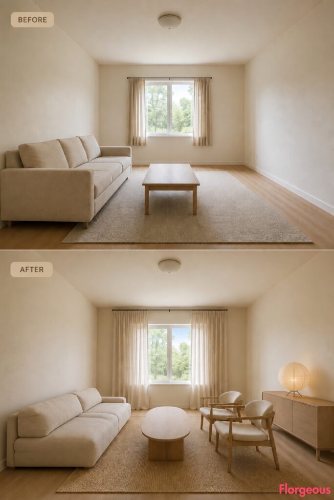
The first room is deliberately approachable. Its impact comes from proportion rather than decoration.
Before: The established builder-grade room has warm off-white walls, a straight beige sofa, bare rectangular table, neutral rug, short curtains, basic ceiling light, empty walls, and soft daylight.
After: Warm ivory mineral paint creates a quieter backdrop for a low oatmeal sofa. Two pale-ash curved lounge chairs sit side by side opposite it, with a slim oval oak table between them. A flax wool rug, full-height linen curtains, low ash console, and one floating paper globe complete the room.
Why it works: Everything sits lower, wider, and calmer than the original furniture.
2. Let Imperfect Clay Plaster Set the Tone for a Wabi-Sabi Room
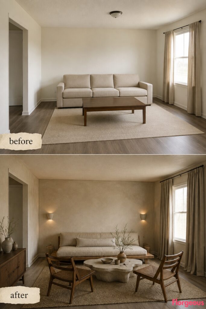
This makeover is less polished on purpose. Texture becomes the main decorative layer.
Before: The same smooth, generic room feels visually flat despite its neutral palette.
After: Putty-colored clay plaster covers the walls. A relaxed flax daybed-style sofa sits with two aged elm lounge chairs, an irregular honed-stone slab table, a coarse undyed wool rug, mushroom linen curtains, and three mismatched handmade stoneware vessels.
Nothing is distressed for effect. The beauty comes from subtle irregularity and material honesty.
Designer Tip: Choose one imperfect wall finish and one aged wood. If every surface looks deliberately weathered, the room can slip into rustic territory.
3. Turn the Existing Window Into the Main Feature With Translucent Grid Screens
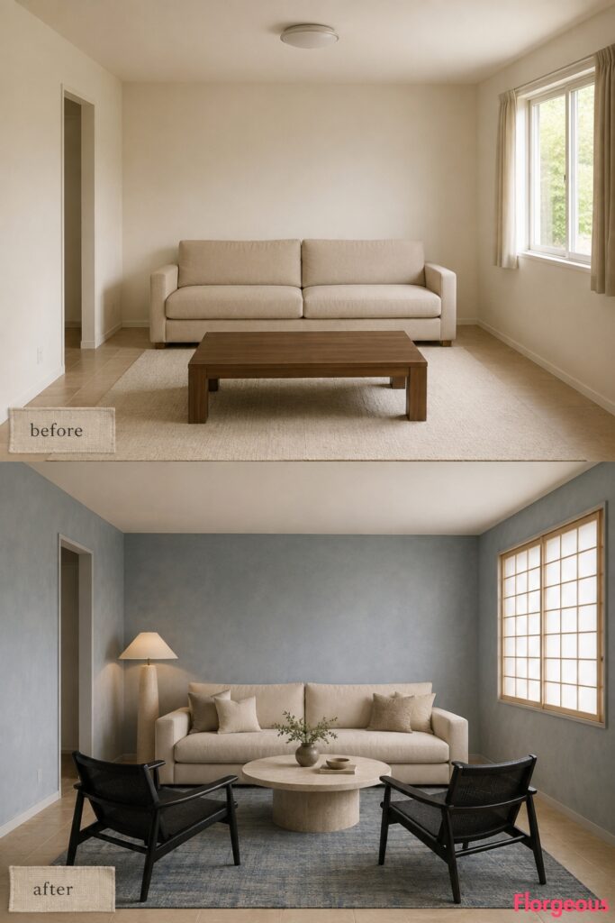
Instead of adding artwork, this room makes filtered daylight the focal point.
Before: Short curtains make the existing window look small and disconnected from the furniture.
After: Removable pale-wood grid panels with translucent paper-effect inserts sit within the existing window opening. The rest of the palette stays deliberately cool: chalky blue-gray walls, a slim parchment sofa, two blackened-ash chairs, a round pale travertine table, faded blue flatweave, and a single ceramic floor lamp.
Try this: A translucent roller shade with a removable slim timber grid can suggest the effect without rebuilding a window.
4. Borrow Tatami Proportions With a Graphic Woven Floor Zone
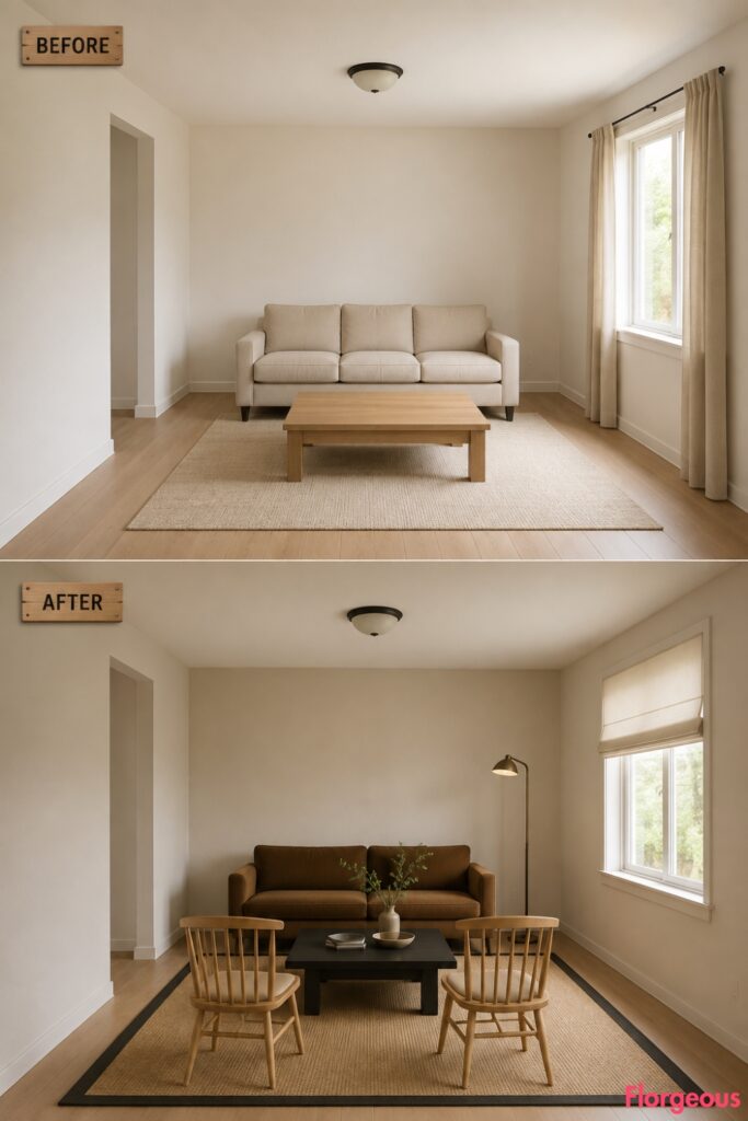
Here, the transformation begins underfoot.
Before: A small generic rug does little to organize the seating area.
After: A large straw-colored rush-look flatweave with a crisp charcoal border defines the entire conversation zone. Pale mushroom walls surround a compact tobacco-colored settee, two light maple spindle-back chairs, and a square low blackened-oak table. Cream roller shades and a narrow bronze floor lamp keep the upper half of the room spare.
The floor treatment suggests traditional proportion without pretending the Western room has genuine tatami construction.
5. Give Natural Oak a Stronger Counterpoint With Saturated Indigo
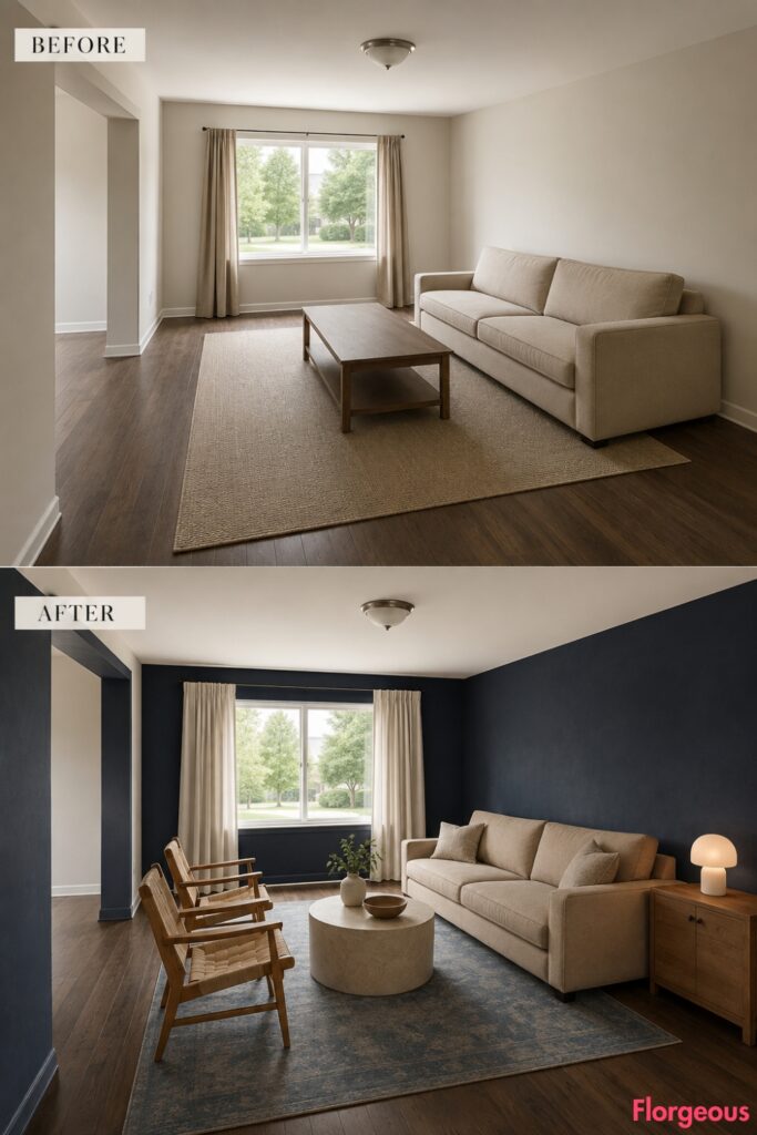
This is the color-driven makeover in the group.
Before: The original neutrals have almost no contrast.
After: Deep muted indigo mineral paint wraps the walls while a warm sand sofa prevents the room from becoming cold. Two natural-oak sling chairs use parchment upholstery, and a pale limestone drum table sits on a faded indigo-and-flax rug. Full ivory curtains, an oak storage chest, and a small opaline table lamp soften the stronger wall color.
Color Story: Keep indigo concentrated on one large surface. Repeating it through dozens of accessories weakens the graphic clarity.
6. Take a Japanese Living Room Into Dark Shibui Territory
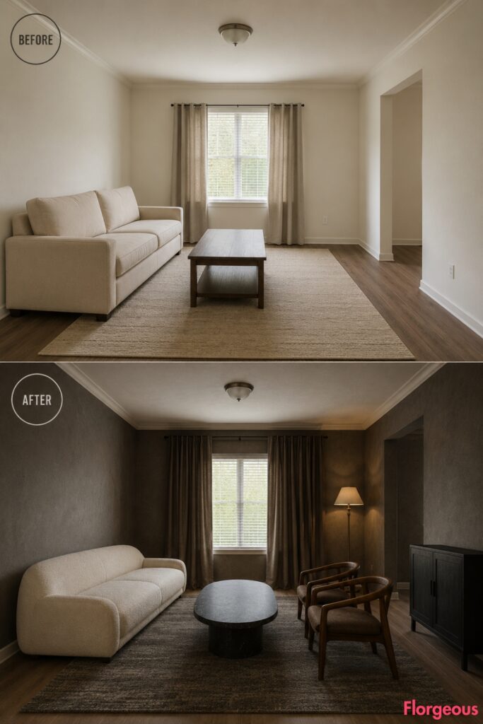
Minimal does not have to mean pale.
Before: The ordinary room feels light but lacks depth.
After: Soft charcoal mineral plaster surrounds a low parchment wool sofa. Two smoked-walnut sculptural chairs face it across a dark soapstone oval table. A charcoal-and-sand flatweave, tobacco-gray curtains, blackened low cabinet, and a slender oxidized-bronze floor lamp build richness without adding clutter.
The contrast between warm upholstery and nearly black wood is what makes this room feel deliberate.
7. Make Pale Hinoki-Inspired Wood the Dominant Material
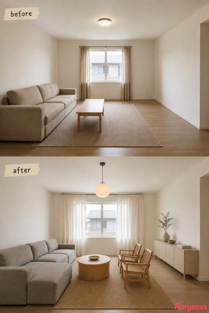
Unlike the first makeover, which uses pale wood as an accent, this room treats it almost like an architectural language.
Before: The builder-grade shell lacks a clear material identity.
After: Rice-white walls pair with a stone-gray modular sofa, two hinoki-toned slatted chairs, a cylindrical blond timber table, a natural jute-wool rug, and low matching storage stretching horizontally along one wall. A small milky opaline pendant replaces the expected paper lantern, while warm white curtains keep the composition nearly monochromatic.
8. Let a Tansu-Inspired Cabinet Carry the Entire Room
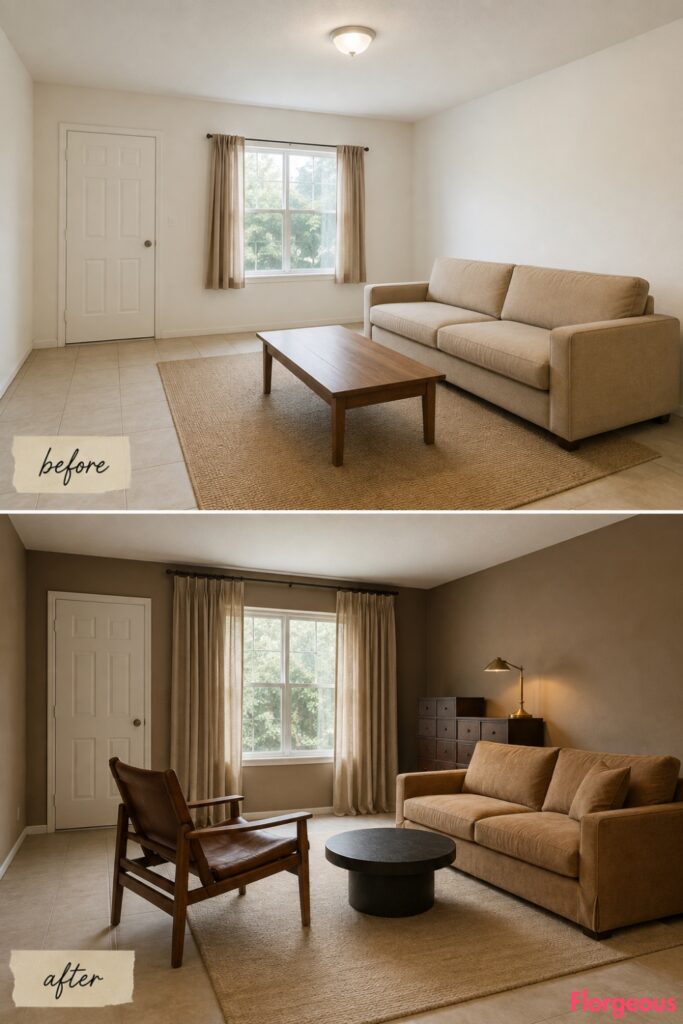
This makeover is built around storage rather than seating or wall color.
Before: The original room has empty walls but nowhere intentional to conceal everyday objects.
After: A compact dark elm cabinet with asymmetrical drawer proportions becomes the main focal point against muted tea-brown walls. Pair it with a camel linen sofa, one broad chestnut lounge chair, a small circular black stone table, parchment wool rug, flax curtains, and a simple brass-shaded task light.
The larger empty area opposite the chair is intentional, giving the cabinet enough visual room.
9. Create Tea-Room Calm Through Intimacy Rather Than Decoration
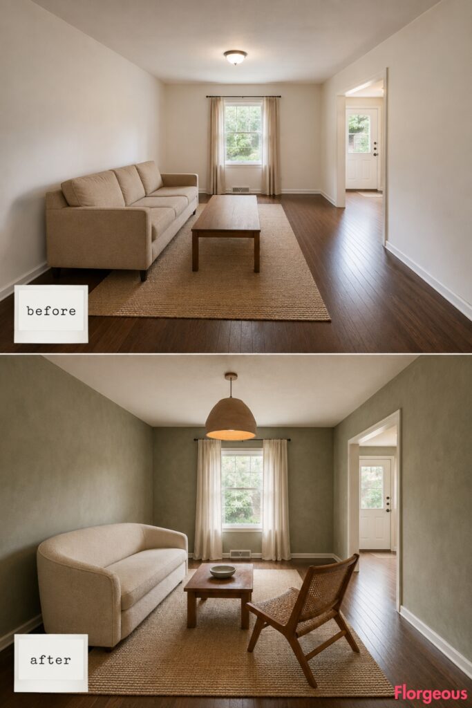
This version feels quieter because the furniture group is smaller and more focused.
Before: Conventional pieces spread across the neutral room without creating a strong sense of enclosure.
After: Dusty sage limewash surrounds a compact cream settee and one low woven-back elm chair. A small square cedar table replaces the larger coffee table. The rug is a finely woven straw-and-cream textile, while a clay pendant and one shallow ceramic bowl provide the only decorative notes.
Why it works: The room leaves more floor and wall visible, which makes the occupied areas feel purposeful.
10. Replan the Space Like a Compact Tokyo Apartment
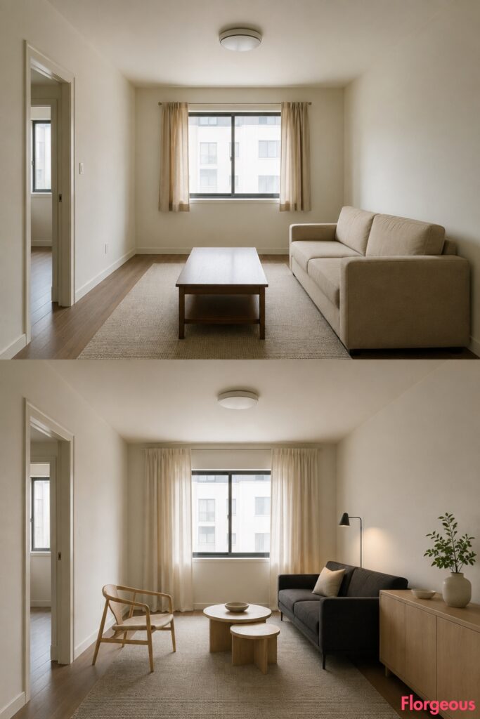
The priority here is efficiency, not visual tradition.
Before: Standard furniture takes up more physical and visual space than necessary.
After: A slim charcoal two-seat sofa sits above recessed-looking but fully freestanding low ash storage. One compact bentwood lounge chair replaces a pair of armchairs. Two nesting tables, one pale oak and one honed stone, can separate when needed. A tightly woven greige rug, full cream curtains, and a wall-mounted-style plug-in reading light keep the footprint lean.
Small Space Tip: Fewer full-size pieces usually create more usable space than filling the room with miniature furniture.
11. Use Moss, Walnut, and One Architectural Branch Instead of Houseplant Clutter
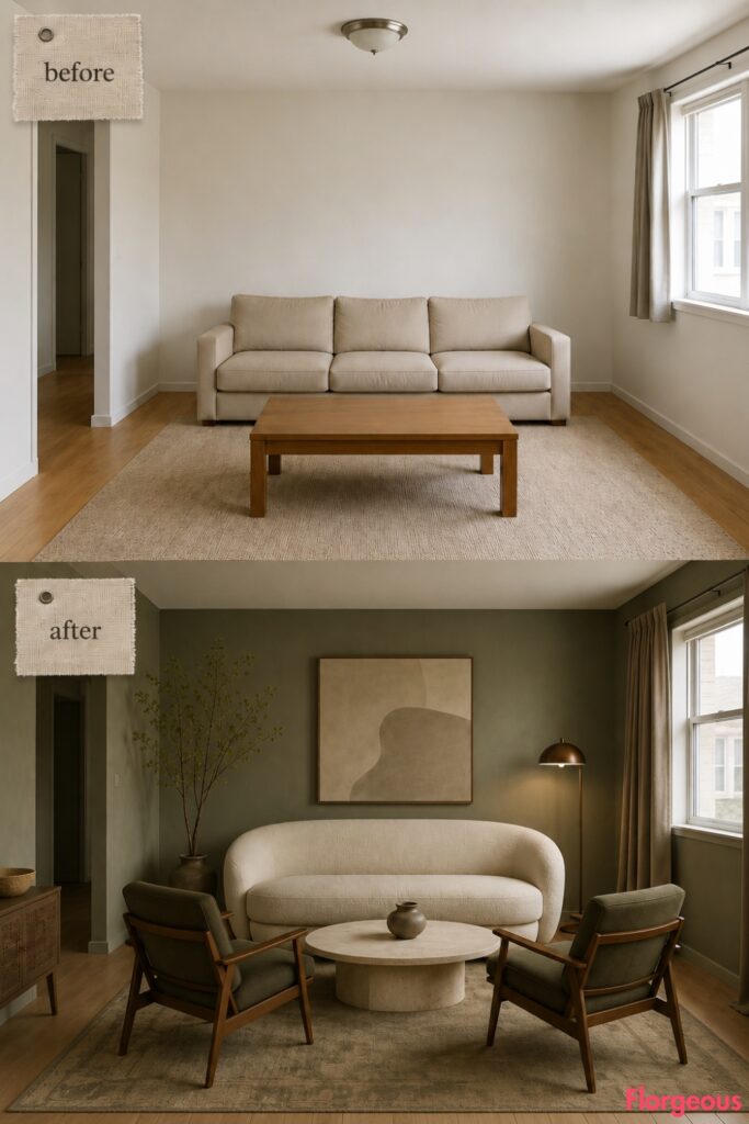
This is the nature-focused room, but it contains almost no greenery.
Before: The base room feels neutral but disconnected from natural material and color.
After: Muted moss walls provide the backdrop for an ivory curved sofa and two walnut-framed chairs upholstered in loden wool. A pale limestone oval table sits on a parchment-and-olive rug. Mushroom curtains soften the window, while one tall branch arrangement in a dark vessel creates the only organic focal point.
12. Build a Renter-Friendly Version Entirely From Reversible Layers
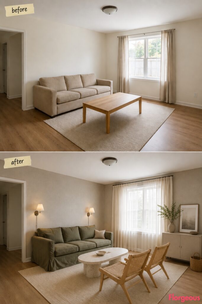
Nothing in this makeover depends on permanent construction.
Before: The standard rental-like room remains untouched beneath the redesign.
After: Removable soft-greige wall finish, translucent peel-away window film, an olive slipcovered sofa, two freestanding beech lounge chairs, portable terrazzo-look oval table, parchment flatweave, ready-made full-height ivory curtains, slim freestanding storage, and plug-in shaded wall lights create the change.
Everything can move out with the renter.
13. Make the Calm Look Work for a Family With Rounded, Washable Pieces
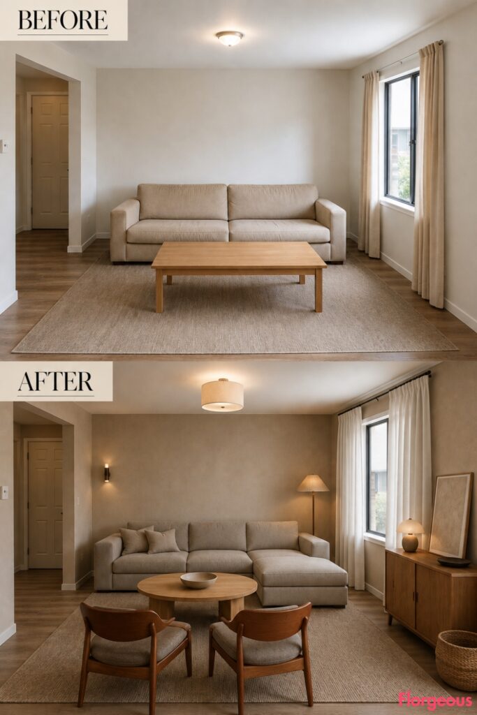
This interpretation is designed around durability rather than delicacy.
Before: The original room is functional, but its generic furniture and bare storage do little to support daily family life.
After: Clay-beige washable paint surrounds a low greige performance-fabric sectional. Two rounded cherrywood chairs in washable mushroom upholstery face the sofa across a broad oval oak table with softened edges. A durable low-pile wool-look rug, closed oak cabinet, full cotton curtains, and layered shaded lighting keep practical items controlled.
14. Treat the Room Like a Small Gallery With One Monumental Artwork
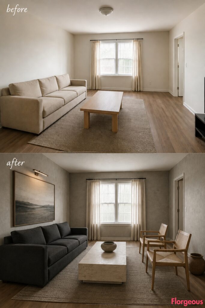
This scheme deliberately removes decorative objects rather than adding them.
Before: The blank main wall has no focal point.
After: Warm stone-gray lime plaster surrounds a straight charcoal linen sofa, two pale elm architectural chairs, and a monolithic rectangular limestone table. A tonal gray wool rug and translucent cream curtains fade into the background. One oversized abstract landscape in ink, clay, and stone tones fills the main wall, lit by a single restrained picture light.
Common Mistake: Once the artwork is large enough, resist adding smaller frames around it.
15. Finish With Persimmon, Dark Cedar, and a More Layered Traditional-Modern Mix
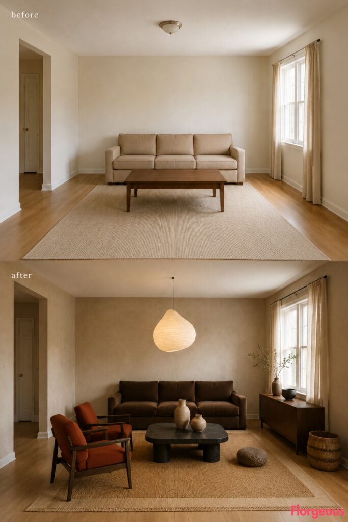
The last transformation is the richest, but it is still carefully edited.
Before: The familiar builder-grade room has pale neutral surfaces, generic furniture, and no material hierarchy.
After: Parchment mineral walls support a deep tea-brown low sofa. Two dark cedar framed chairs use muted persimmon wool, while a softened black stone table grounds the center. Add a fine woven rush-and-wool rug, warm flax curtains, a narrow dark cedar cabinet, one asymmetrical paper pendant, and two handmade ceramic vessels.
It references traditional material relationships without copying a historic room.
How to Choose the Right Japanese Direction for Your Own Room
These makeovers work precisely because they do not treat Japanese interiors as one fixed formula. One room is defined by translucent light, another by a woven floor plane, another by dark smoked wood, another by storage, and another by a single piece of art.
For your own Japanese Living Room, begin with the feature that will influence the largest part of the composition. That might be the wall finish, the height of the seating, the dominant wood tone, the rug, or the lighting. Make that decision first, then choose secondary pieces that support it rather than compete with it.
Pay special attention to what you can remove. A larger gap beside a chair, an empty section of wall, or a clear path through the seating group can contribute as much as another lamp or decorative object.
Finally, choose the version that suits the way the room is actually used. A renter may benefit most from reversible screens and freestanding storage, a family needs washable textiles and softened edges, while a smaller home may gain more from compact furniture and concealed storage than from decorative styling.